My chart for ICAEW this week looks ahead to the Spring Budget and asks how much headroom the Chancellor will have available for tax cuts or higher spending while still meeting his fiscal targets.
The Chancellor is currently getting ready for his Spring Budget on Wednesday 6 March 2024, with rumours, leaks and misinformation swirling around ahead of what will be a keenly watched event – quite probably the last fiscal event before the general election.
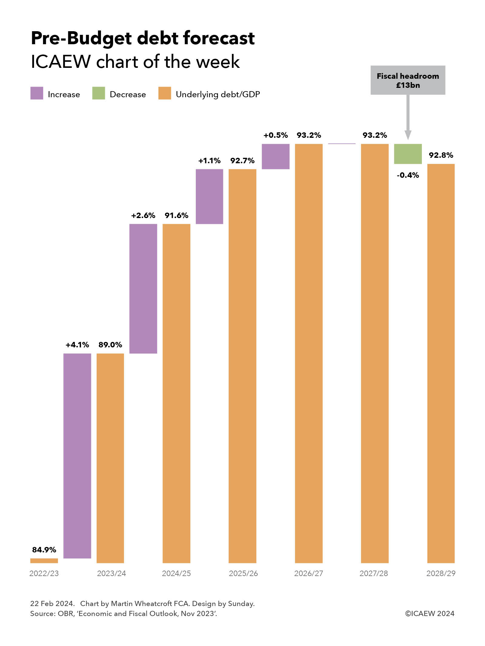
As our chart illustrates, the Office for Budget Responsibility (OBR) at the time of the Autumn Statement last November projected that the ratio of underlying debt to GDP would increase in the current financial year (2023/24) and further over the first four years of the forecast period, before starting to fall in the final year (2028/29).
Underlying debt is defined as public sector net debt (PSND) excluding Bank of England liabilities (PSNDexBoE). This alternative metric avoids distortion in the headline measure of debt caused by £170bn of Term Funding Scheme loan receivables not netted against related Bank of England liabilities that will reduce PSND as these loans are repaid, even though net financial assets and liabilities are not changing.
The projected increases are +4.1% from 84.9% at March 2023 to 89.0% at the end of 2023/24, +2.6% to 91.6% in 2024/25, +1.1% to 92.7% in 2025/26 and +0.5% to 93.2% in 2026/27, before staying flat in 2027/28 and then falling -0.4% to 92.8% in March 2029.
The fall in 2028/29 projected by the OBR in November provided the Chancellor with £13bn of fiscal headroom in the final year of the forecast. In theory this meant he could have planned to spend more, or cut taxes, by up to £13bn in 2028/29 and still met his primary fiscal target, which is for underlying debt/GDP to be declining in the final year of the fiscal forecast period.
Building such a relatively small amount of headroom into a forecast – less than four days of total government spending – is perhaps surprising given the high degree of uncertainty in predicting future receipts, spending and borrowing, not to mention GDP. These numbers can all move by tens of billions between forecasts, as the economic situation changes and policy and budgetary decisions are made.
GDP can be especially variable, with the Office for National Statistics making frequent revisions to its estimates, sometimes many years later. Several commentators also believe the numbers for planned public spending from April 2025 onwards are unrealistic and that there will be a need to revise these numbers upwards in subsequent fiscal events.
Although there has been a modest boost to the public finances in the reported numbers for the first 10 months of the current financial year, underlying debt/GDP at January 2023 was 88.1%, on track to end the financial year at close to the 89.0% in the November OBR forecast.
The news that the UK had entered recession in the last quarter of 2023 will not have been positive for the Chancellor in his search for additional headroom but, despite this, it is believed that the forecasts will improve sufficiently to allow him some capacity to either increase the total amounts allocated to public spending, or announce tax cuts, while still keeping with his fiscal targets. Of these options, tax cuts are considered much more likely.
Either way, underlying debt/GDP will be expected to be higher in five years’ time – potentially even higher than in previous forecasts. From a fiscal target perspective, what is important is whether the ratio is falling in the fifth year of the forecast period, not the overall change in the level between now and then.
For more information about the Spring Budget 2024 and ICAEW’s letters to the Chancellor and HM Treasury, click here.