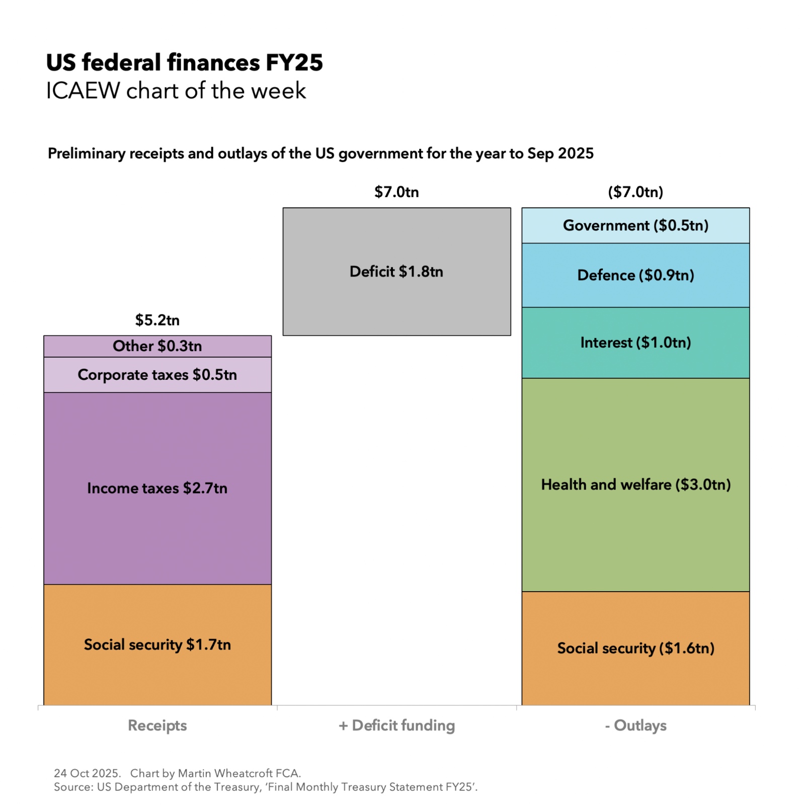
Every week I prepare a chart on the economy or the public finances for The Institute of Chartered Accountants in England and Wales (ICAEW).
For the latest chart visit the ICAEW website.
Chart of the week: fuel prices
Our chart this week is on fuel prices, illustrating both how the price at the pump is made up and how prices have risen over the last four months.
www.icaew.com
Chart of the week: UK defence spending
Our chart this week returns to the subject of defence spending and how the extra money for defence being announced by the government is only a small step on the way to the NATO target of spending 3.5% of GDP.
www.icaew.com
Chart of the week: car exports and imports
Our chart this week is on the car market in the UK, showing how most of the cars made in the UK are exported (our third biggest goods export) and most of the new cars registered in the UK are imported (our biggest goods import).
www.icaew.com
Chart of the week: top 20 military spenders
Our chart this week is on the 20 countries that incurred the most military expenditure in 2025, starting with the US spending the most at $954bn, followed by China spending $336bn and the UK in sixth place at $89bn (£71bn).
www.icaew.com
Chart of the week: more people living longer
Our chart this week looks at how the number of people aged 65 or older is projected to increase by 34% over the next 25 years in contrast with a projected rise of just 1% in the number of working age adults. This will be a major challenge for the UK’s public finances.
www.icaew.com
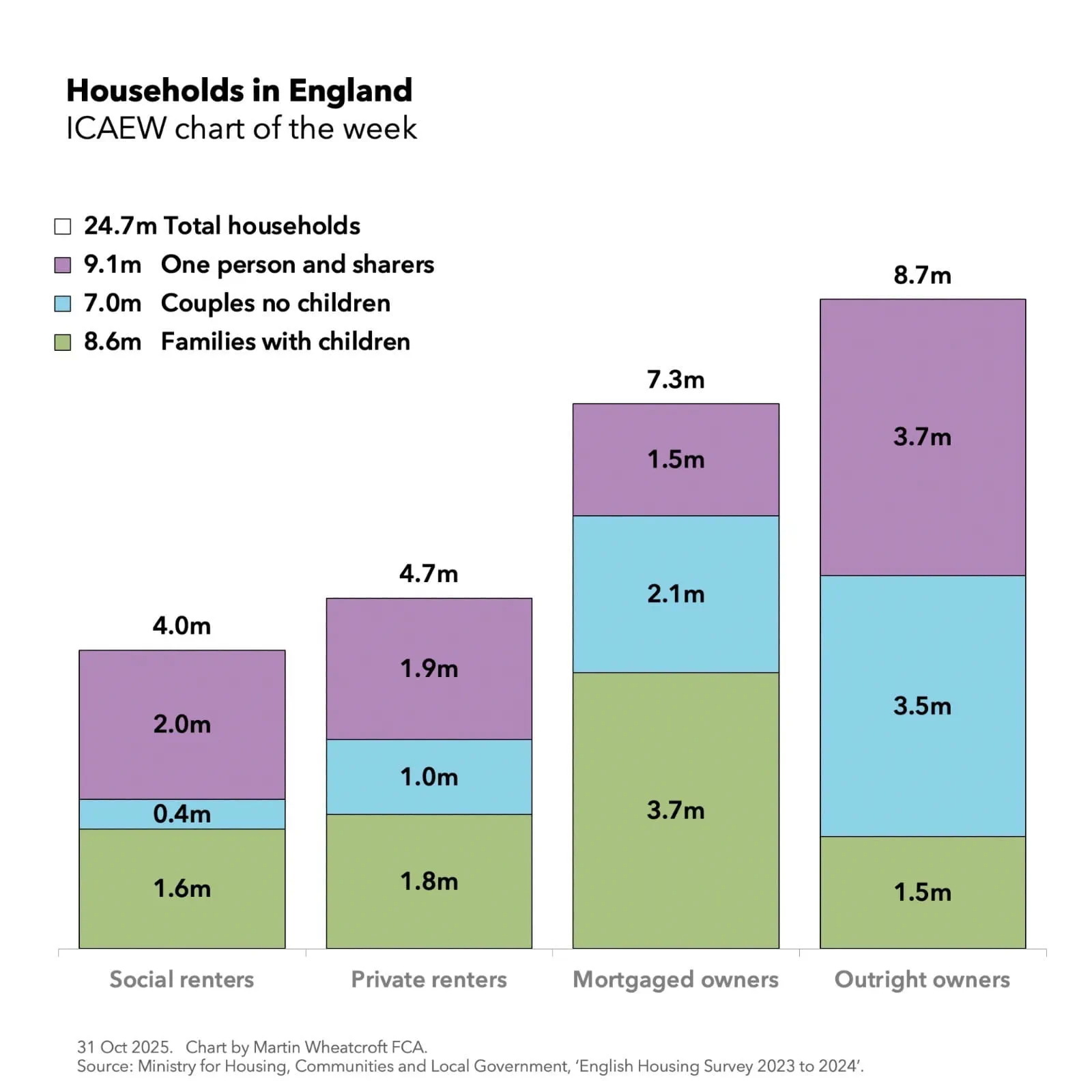
Chart of the week: home living
Our chart this week is on how people in the UK still live in broadly the same type of households as they did 25 years ago, despite the population growing by 18% over that time.
www.icaew.com
Chart of the week: a £3tn economy
Our chart this week is on how GDP for the UK reached £3.0tn for the first time in 2025. This is a 58% increase over the course of a decade, mostly driven by a combination of inflation and a rising population, resulting in a relatively small amount of per capita economic growth.
www.icaew.com
Chart of the week: international trade
This week’s chart illustrates how a £205bn surplus on trade in services was offset by a £243bn deficit on trade in goods to result in a net trade deficit of £38bn in 2025 – or £16bn if trade in precious metals is excluded.
www.icaew.com
Chart of the week: council tax in England 2026/27
Our chart this week celebrates the start of a new financial year by looking at the average level of council tax across England.
www.icaew.com
Chart of the week: public investment
Our chart this week looks at how public investment in assets is expected to increase over the next couple of years as the government seeks to stimulate the economy and “build build build”.
www.icaew.com
Chart of the week: educational decline
Our chart this week looks at how school rolls in England are projected to decline by 7% in state nurseries and primaries and 3% in state secondaries over the next five years, and what that means for school closures and mergers across the country.
www.icaew.com
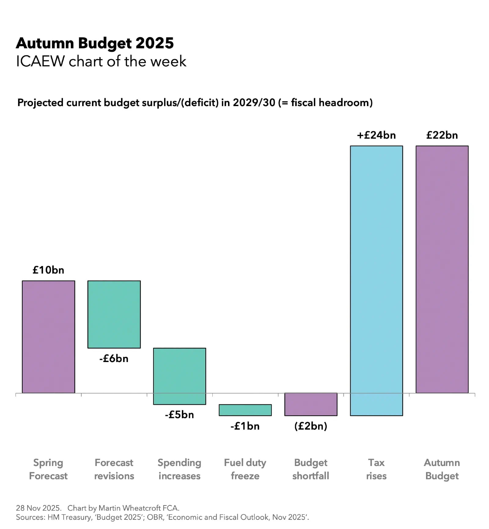
Chart of the week: Spring Forecast 2026
Our chart this week looks at how the Chancellor’s fiscal headroom increased by £2bn to £24bn in the latest fiscal forecast from the Office for Budget Responsibility.
www.icaew.com
Chart of the week: student loans
Our chart this week looks at how the Department for Education has impaired 40% of the value of its student loans outstanding as at 31 March 2025.
www.icaew.com
Chart of the week: Real average pay in the UK
Our chart this week illustrates how UK average total pay fell by 0.2% in real terms over the 12 months to December 2025, following much stronger growth in the previous two years.
www.icaew.com
Chart of the week: business births and deaths in the UK
Our chart looks at the cycle of business life since 2017, as the number of business births exceeded business deaths in 2025 for the second year in succession.
www.icaew.com
Chart of the week: quarterly public sector finances
This week’s chart looks at how the government is relying on a strong inflow from self-assessment and employee bonuses to meet its revised fiscal targets for the financial year to March 2026.
www.icaew.com
Chart of the week: global stock markets
Our chart looks at how the top 10 stocks from nine companies made up more than a fifth of global stock market values on 31 December 2025.
www.icaew.com
Chart of the week: Australian Government balance sheet
Our chart marks Australia Day by looking at the federal government balance sheet over the last decade.
www.icaew.com
Chart of the week: A peak in the civil service?
Our chart looks at civil service numbers given that restructuring is in the air in Whitehall. Will the government really be able to deliver on its plans to cut administration costs and civil service headcount over the coming three years?
www.icaew.com
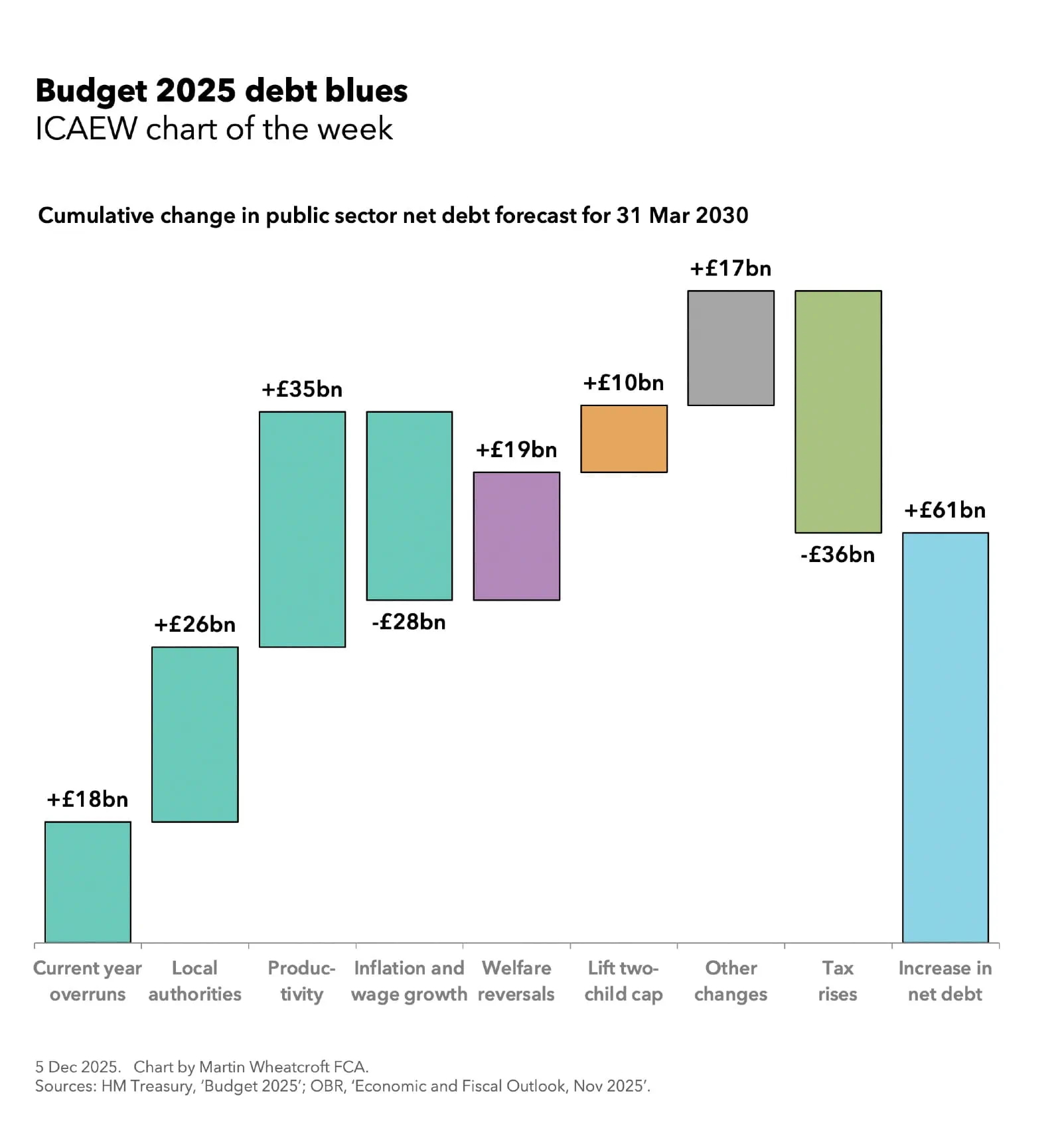
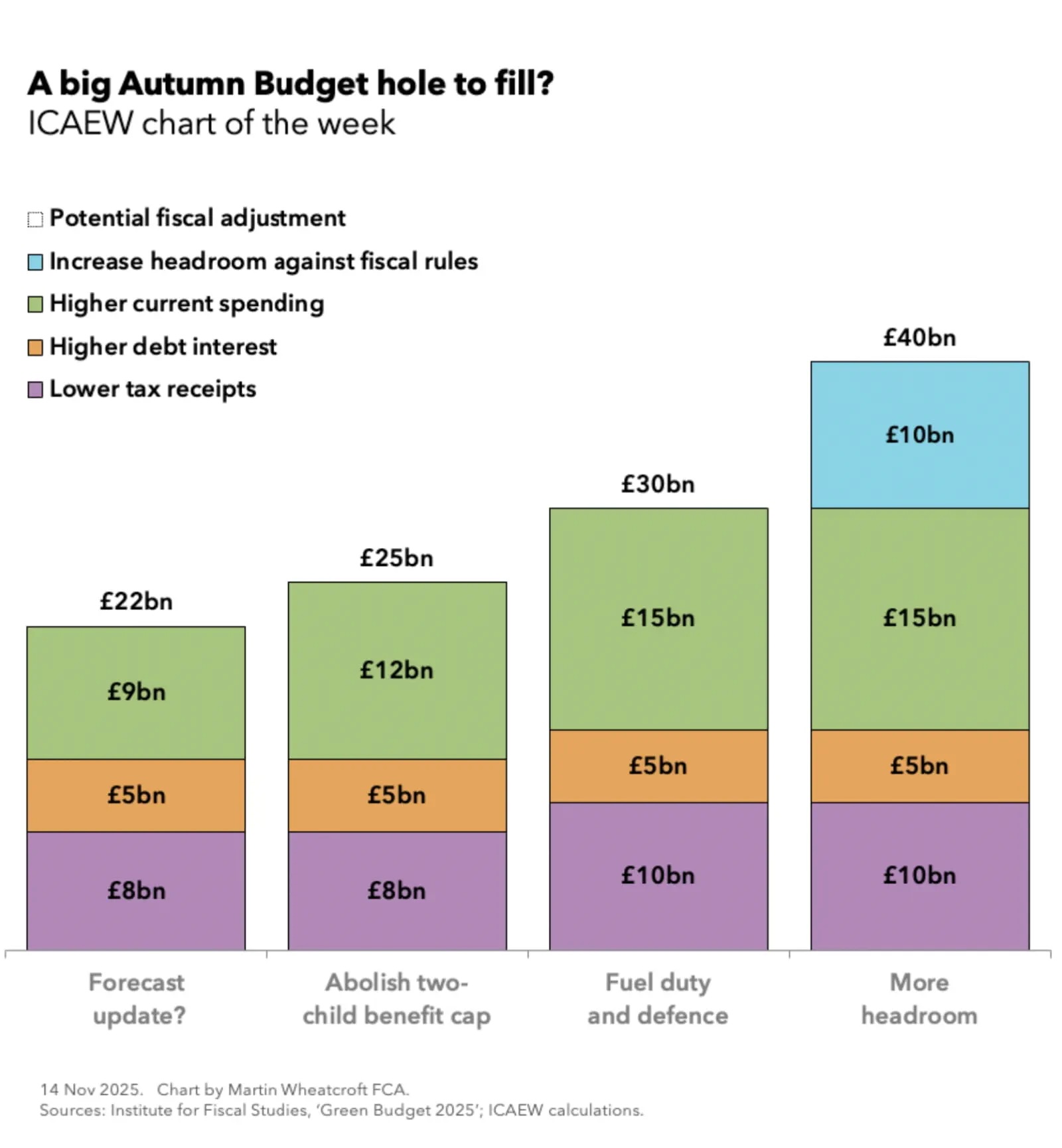
Chart of the week: Budget 2025 Fiscal Insight
Our chart this week returns to the scene of the Budget as we publish an in-depth analysis of its effect on the public finances and how it was ‘all about the headroom’.
www.icaew.com
Visit ICAEW News for the latest updates on accounting, finance and tax.