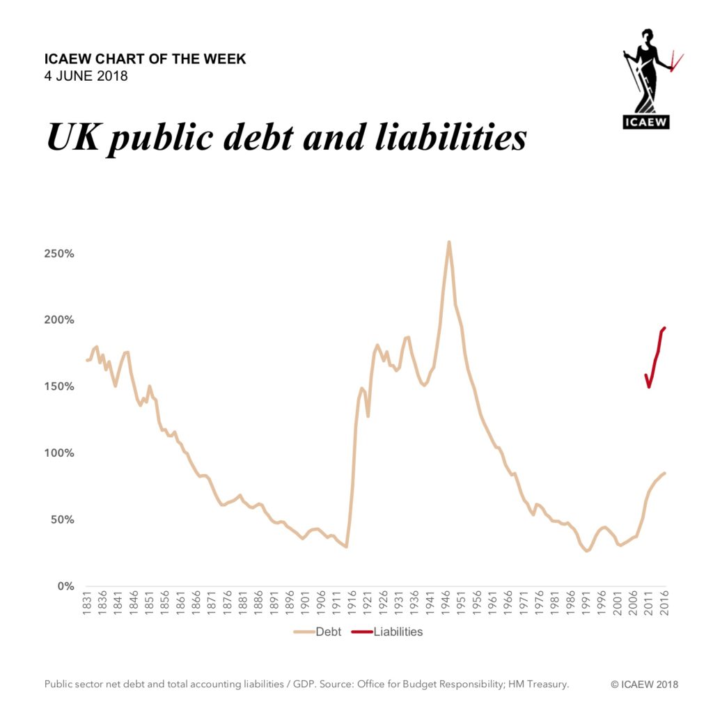
Deloitte Chief Economist Ian Stewart’s excellent Monday Briefing last week on ‘300 years of public spending’ made for a fascinating read. Over a relatively short period, we have gone from a very small administration to the highly developed welfare state that we have today.
Ian ends with the reassurance that: “Those who worry about the current level of indebtedness of the UK government might take some comfort from the fact that the UK ran far higher levels of debt through much of the last three centuries”.
Unfortunately, we are not comforted.
As our chart this week illustrates, while debt may have been much higher (as a proportion of GDP) in the past, once other liabilities are added in (the red line) things are less rosy. Accounting data only goes back to 2010, but we know that significant liabilities, such as those for employee pensions, have been built up since the 1940s.
In practice, we think the financial position of government is actually much worse than that shown in the accounts because of the even greater commitments made by government to pay for state pensions and other welfare benefits in retirement. Accurate valuations aren’t available, but it is likely that the UK government’s overall financial position is the worst that it has ever been.
