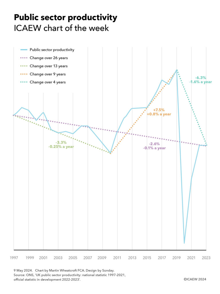
My chart for ICAEW this week suggests that the public sector is less productive than it was, but difficulties in measuring productivity make it hard to say for sure.

According to the Office for National Statistics, public sector productivity has not recovered following the pandemic and is now lower than it was in 1997, despite technological advances since then.
My chart highlights how public sector productivity fell between 1997 and 2010 as spending and investment increased – a fall of 3.3% or 0.25% a year on average over 13 years – before climbing during the austerity years until 2019 – an improvement of 7.5% or 0.8% a year over nine years. The pandemic led to productivity collapsing as public services were severely disrupted before partially recovering, with productivity flat between 2022 and 2023 – overall a net drop of 6.3% or 1.6% a year on average over four years.
Overall, this means public sector productivity as measured by the ONS has fallen by 2.6% or 0.1% a year on average over the last 26 years. It is important to note that these changes do not cover all of the public sector – in some areas such as defence spending, productivity (value of outputs / cost of inputs) is assumed to be a constant 1, reflecting how difficult and subjective it would be to attempt to measure our military preparedness for war.
Despite that, the picture shown by this metric aligns with our more general understanding of what happened in these periods. The decline in productivity between 1997 and 2010 as the then Labour government improved pay and conditions for public sector employees makes sense, while the austerity policies of the Coalition and Conservative governments between 2010 and 2019 constrained the cost of delivering public services. And the pandemic resulted in many public services being closed or curtailed, and we know that many public services – particularly the NHS and schools – are still struggling to recover from the pandemic.
The chart provokes questions about how well this statistic values outputs given that while it is very easy to measure inputs, it is less easy to assess the value produced. For example, larger class sizes might give rise to an apparent productivity improvement as measured (more children taught for the same input of teaching time), but this may not capture any deterioration in quality that may result.
Not only is the quality of outputs difficult to measure in calculating productivity, but it also doesn’t measure outcomes, often much more important than outputs. In the health context this is whether the patient survives rather than how many operations were performed, for education it means how well-equipped our young people are for the world rather than how many hours they spent in a classroom, and for the criminal justice system how few crimes are committed rather than how many criminals are prosecuted.
Public sector productivity is an important metric, even if an imperfect one. It is helpful to understand how well public service activities are being delivered from a cost perspective – and how there is a need for improvement. But it doesn’t tell us whether those activities are improving our well-being, growing our economy, improving our environment, or building our resilience as a nation.