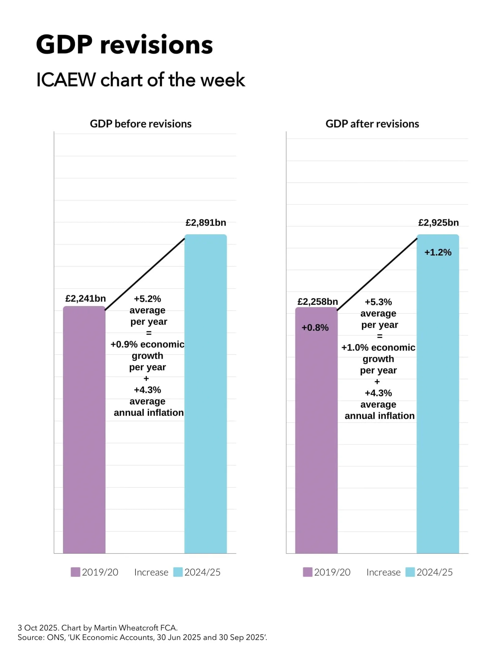
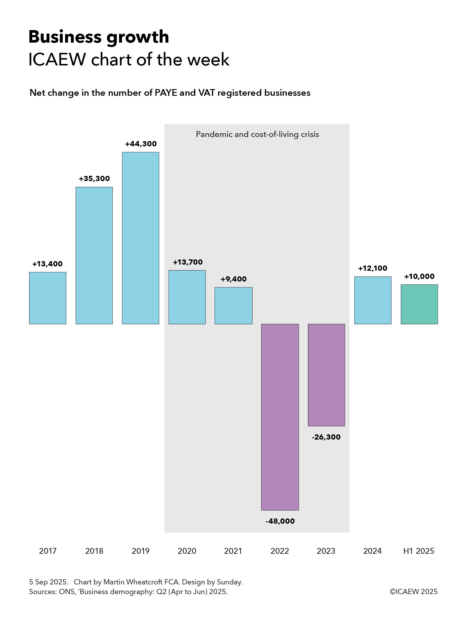
Our chart this week illustrates the fall, rise and fall again of net inward migration over the past eight years and asks whether it will bounce back to hit the OBR’s long-term assumption by the end of the decade.
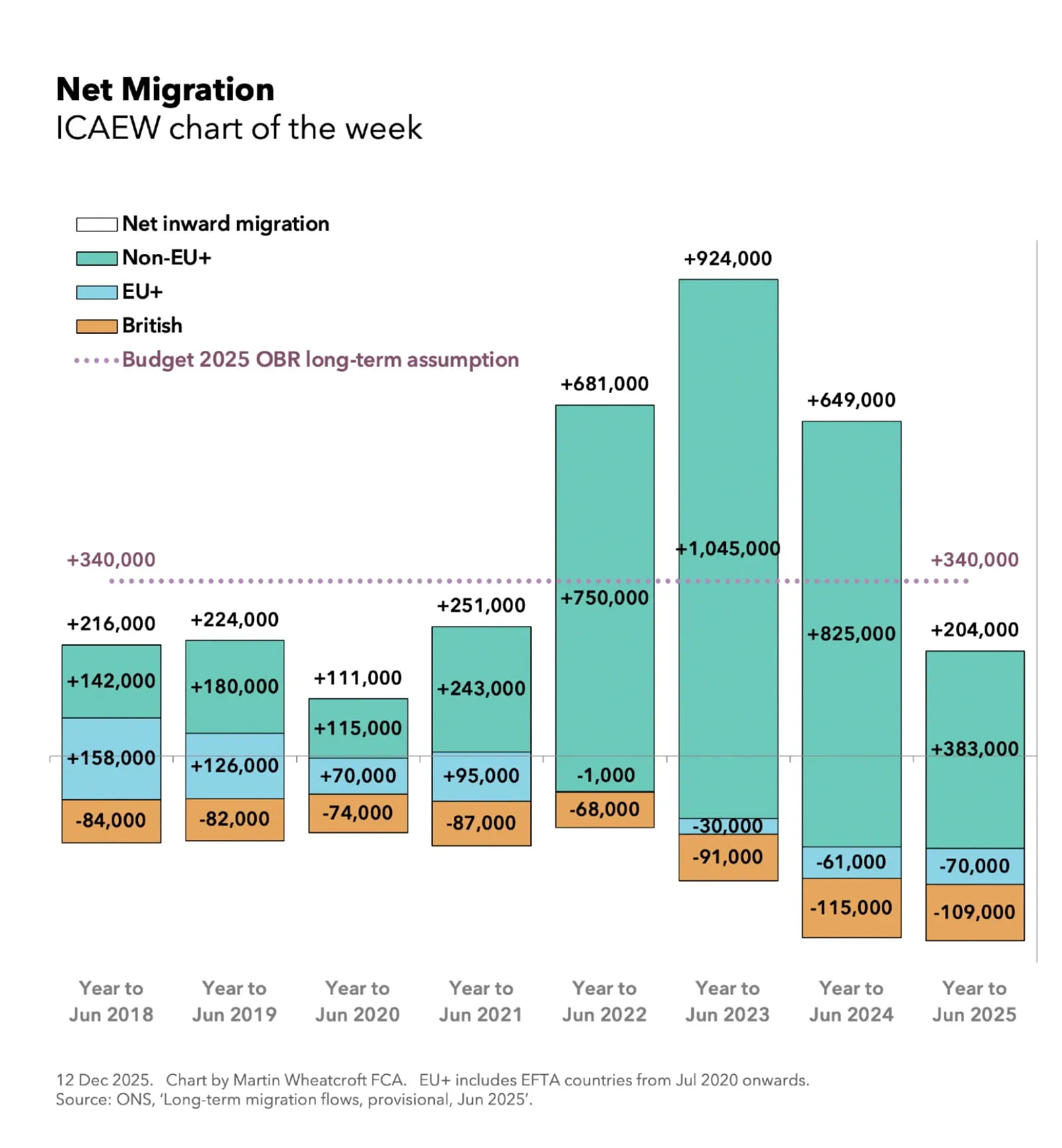
The eight-year period presented in our chart this week has seen significant change in the movement of people to and from the UK. The end of free movement for citizens of EU and EFTA countries (other than Ireland) after Brexit was followed by the introduction of a points-based immigration system, disruption to international movements of people caused by the pandemic, the resettlement of significant numbers of Ukrainians, Afghans and Hong Kong British Overseas Subjects, and then a clamp-down on immigration at the end of the last government that has continued under the current government.
These factors can be seen in the provisional and otherwise heavily caveated numbers from the Office for National Statistics (ONS) illustrated by the chart. Overall net inward migration fell from 216,000 and 224,000 in the years to June 2018 and 2019 to 111,000 in the year to June 2020, rose to 251,000, 681,000 and 924,000 in the years to June 2021, 2022, and 2023 respectively, and then fell to 649,000 and then 204,000 in the years to June 2024 and 2025. A net total over eight years of 3,260,000 additional people living in the UK.
Not shown on the chart are the gross totals for immigration and emigration over the eight years to June 2025, with the former adding up to +7,962,000 (757,000, 821,000, 736,000, 818,000, 1,167,000, 1,467,000, 1,299,000 and 897,000 respectively) and the latter to -4,702,000 (541,000, 597,000, 625,000, 567,000, 486,000, 543,000, 650,000 and 693,000).
The chart highlights net inward migration from outside the European Union single market area was a key driver over the eight years to June 2025 with 3,683,000 net additions to the UK population (142,000, 180,000, 115,000, 243,000, 750,000, 1,045,000, 825,000, and 383,000 respectively). Over the same period, net immigration from the EU and EFTA countries turned into net emigration, reducing the net additions to the UK population to 287,000 (+158,000, +126,000, +70,000, +95,000, -1,000, -30,000, -61,000 and -70,000), while there was a contraction and then expansion in the 710,000 net number of Brits leaving the UK to live abroad (84,000, 82,000, 74,000, 87,000, 68,000, 91,000, 115,000, and 109,000).
The large rise and then sharp fall in net inward migration in the last five years of the chart up to June 2025 was mainly driven by those coming from outside the EU and EFTA. Net inward migration in this group for work-related reasons (including dependents) increased and then fell over the five years to June 2025 (59,000, 184,000, 359,000, 381,000, 107,000), while those arriving for study-related reasons (including dependents) also rose and fell (59,000, 265,000, 382,000, 244,000, 144,000).
Net long-term arrivals under resettlement schemes, principally from Hong Kong, Afghanistan and Ukraine, also rose and fell in the five years to June 2025 (10,000, 151,000, 125,000, 52,000 and 21,000), while the net inflow of asylum seekers increased over the same period (38,000, 70,000, 84,000, 77,000 and 90,000).
The chart includes the OBR’s long-term assumption in Budget 2025 for net inward migration to recover to 340,000 a year by the end of the five-year forecast period in 2030/31. As the OBR calculates that most immigrants make a net positive contribution to the UK economy in the years following their arrival, a lower net inflow of people into the UK than projected could have an adverse impact on the amount of headroom the Chancellor has against her fiscal rules.
So, while ministers and civil servants at the Home Office may be congratulating themselves about the sharp fall in the number of people coming to live in the UK, their colleagues at HM Treasury may be less cheerful.