Our chart this week looks at how quarterly GDP has risen from £610.3bn in the first quarter of 2022 to £738.6bn in the first quarter of 2025.
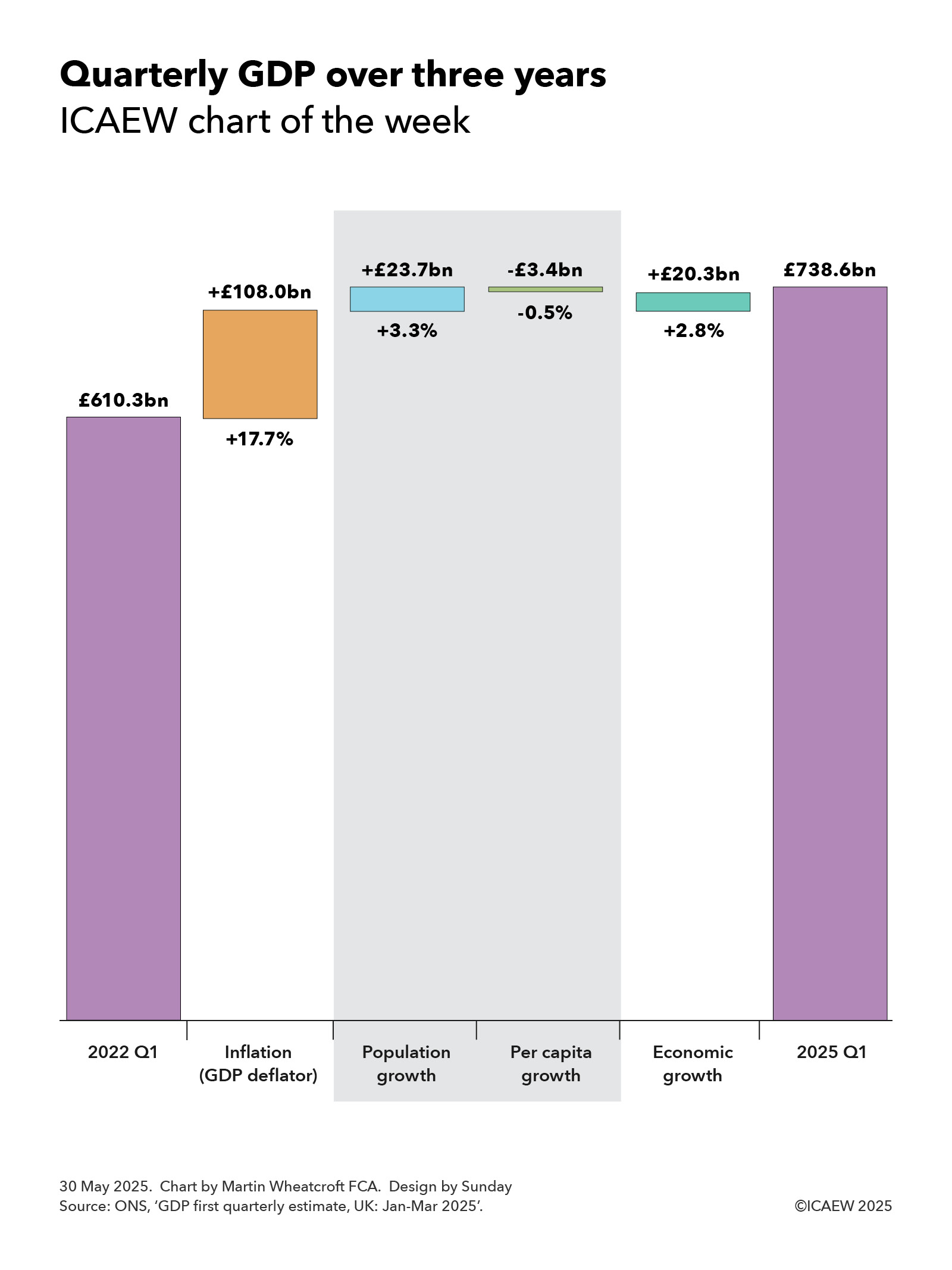
According to the Office for National Statistics (ONS), GDP was £738.6bn in the quarter from January to March 2025, £128.3bn or 21.0% higher than the £610.3bn reported for the same quarter three years ago.
Our chart of the week illustrates how quarterly GDP was £108.0bn or +17.7% higher in the first quarter of 2025 compared with the same quarter in 2022 as a result of inflation (using the GDP deflator measure) while economic growth contributed a further £20.3bn or +2.8%.
The chart also breaks down economic growth over the past three years between a contribution from there being more people of £23.7bn or +3.3% and a decline in economic activity per person of £3.4bn or -0.5%.
Not shown on the chart are the changes by year, which comprised annual inflation of +8.2%, +4.1% and +4.5% and annual economic growth of +0.8%, +0.7% and +1.3% in 2022/23, 2023/24 and 2024/25 respectively, with the latter split between annual population growth of +1.2%, +1.1% and +1.0%, and annual per capita economic growth of -0.4%, -0.4% and +0.3%.
Also not shown in the chart is economic growth over the last four quarters, which was +0.5%, +0.0%, +0.1% and +0.7% between the first and second quarters of 2024, the second and third quarters, the third and fourth quarters, and the fourth quarter of 2024 and the first quarter of 2025 respectively. These comprised quarterly population growth of +0.3%, +0.2%, +0.2% and +0.2% and quarterly per capita economic growth of +0.2%, -0.2%, -0.1% and +0.5%.
Lower levels of net inward migration are expected to reduce the rate of population growth over the next three years to closer to 0.5% a year, which means that growing the economy faster than inflation will depend on our ability to improve productivity and hence increase real economic activity per person.
In theory, that should be eminently possible given how per capita economic growth averaged 2.4% per year for the 50 years before the financial crisis. Unfortunately, with per capita growth averaging just 0.6% a year over the past decade, productivity will need to increase significantly if we are to turn the situation around over the coming decade.
The good news is that a 21% increase in GDP means tax receipts should be that much higher. The bad news is that public spending has been going up, too.