My chart for ICAEW this week looks at the relationship between population and GDP around the world.
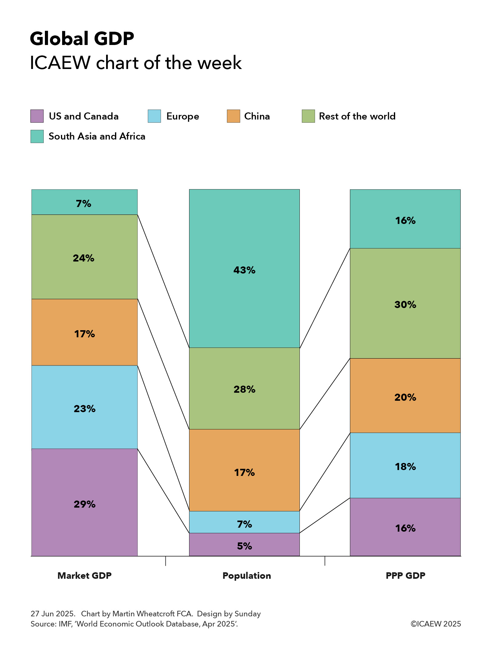
According to the latest World Economic Outlook Database published by the International Monetary Fund in April 2025, the 387m people that live in the US and Canada, some 5% of the global population of 8.1bn, are together expected to generate about 29% of global economic activity as measured by GDP converted at market exchange rates in 2025.
The US – the largest economy in the world – is expected to generate 27% with 4.3% of the global population, while Canada with 0.5% of the world’s people represents 2% of the global economy.
My chart this week also shows how the US and Canada together constitute 16% of the global economy using GDP converted on a Purchasing-Power-Parity (PPP) basis that adjusts for the relative cost of living between countries. The US is the world’s second largest economy on this basis with 15% of total economic output, while Canada represents 1.3% of the total.
Europe’s 602m people are 7% of the global population (excluding Russia, but including Georgia) and are expected to generate around 23% of global economic output at market exchange rates in 2025 or around 18% on a PPP basis.
This includes the 452m people or 5.6% of the total living in the EU that generate 18% of global output or 14% on a PPP basis, the second largest economy on a market exchange rate basis and the third largest after adjusting for purchasing power. Germany with 1% population generates 4.3% and 3% of market GDP and PPP GDP respectively, followed by France (0.8% generating 2.9% and 2.2%), Italy (0.7% generating 2.2% and 1.8%), Spain (0.6% generating 1.6% and 1.4%), the Netherlands (0.2% generating 1.2% and 0.7%) and Poland (0.5% generating 0.9% and 1%).
Outside the EU, the 70m people in the UK, 0.9% of the world’s total, generate 3.4% of global economic activity on a market exchange rate basis and 2.2% on a purchasing power basis.
China’s 1.4bn people constitute 17% of the world’s population and generate 17% of market GDP, in effect the average level of global economic activity on a per capita basis at current exchange rates. However, on a cost-of-living adjusted basis, they are the world’s biggest economy at 20% of PPP GDP and above average on a per capita basis.
The chart groups the rest of East Asia, South East Asia, Oceania, the Middle East, Russia, Central Asia, Latin America and the Caribbean into a ‘rest of the world’ category with 2.3bn people or 28% of the world’s population. They generate 24% of the global economy on a market exchange rate basis and 30% on a purchasing power basis.
This category includes the 10 ASEAN countries in South East Asia that together make up 8.5% of the world’s population, 3.6% of market GDP and 6.4% of PPP GDP led by Indonesia (3.5%, 1.2% and 1.4%). Others include Japan (1.5% population, 3.6% market GDP and 3.3% PPP GDP), Russia (1.5%, 2.3% and 3.5%), Türkiye (1.3%, 1.1% and 1.8%), Mexico (1.6%, 1.6% and 1.6%), South Korea (0.6%, 1.6% and 1.6%), Australia (0.3%, 1.5% and 1%), Brazil (2.6%, 1.0% and 2.4%), Taiwan POC (0.3%, 1% and 0.8%) and Saudi Arabia (0.4%, 0.8% and 1%).
The final category is South Asia and Africa, which together include many of the poorest countries on Earth, with 43% of the global population but just 7% of the global economy based on market exchange rates and 16% on a cost-of-living adjusted basis.
South Asia’s 2bn people are 24.3% of the world’s population, generating 4.4% of market GDP and 10.3% of PPP GDP. This includes India’s 1.5bn people (17.9% of the global population generating 3.6% and 8.5% respectively), the world’s fifth largest national economy at market exchange rates behind the US, China, Germany and Japan, and the third largest on a PPP basis behind China and the US. It also includes Pakistan (3% of the world’s people generating 0.3% and 0.8% of economic activity) and Bangladesh (2.1% generating 0.4% and 0.9%).
Africa’s 1.5bn people constitute 18.3% of the world’s total, generating just 2.7% of market GDP and only 5.3% of PPP GDP. This includes South Africa (0.8%, 0.4% and 0.5%), Egypt (1.3%, 0.3% and 1.1%), Nigeria (2.9%, 0.2% and 0.8%), Ethiopia (1.4%, 0.1% and 0.2%) and the Democratic Republic of the Congo (1.3%, 0.1% and 0.1%).
The chart illustrates how economic activity, both before and after adjusting for purchasing power, is weighted towards the US and Europe, while South Asia and Africa have a long way to go to become as prosperous.
While this may seem a stiff mountain to climb economically, China’s transformation over the last 30 years provides an example of what is possible, especially as ageing populations in many developed countries reduce their ability to grow as quickly as those countries with much younger demographics such as in South Asia and Africa.
As they say, watch this space.