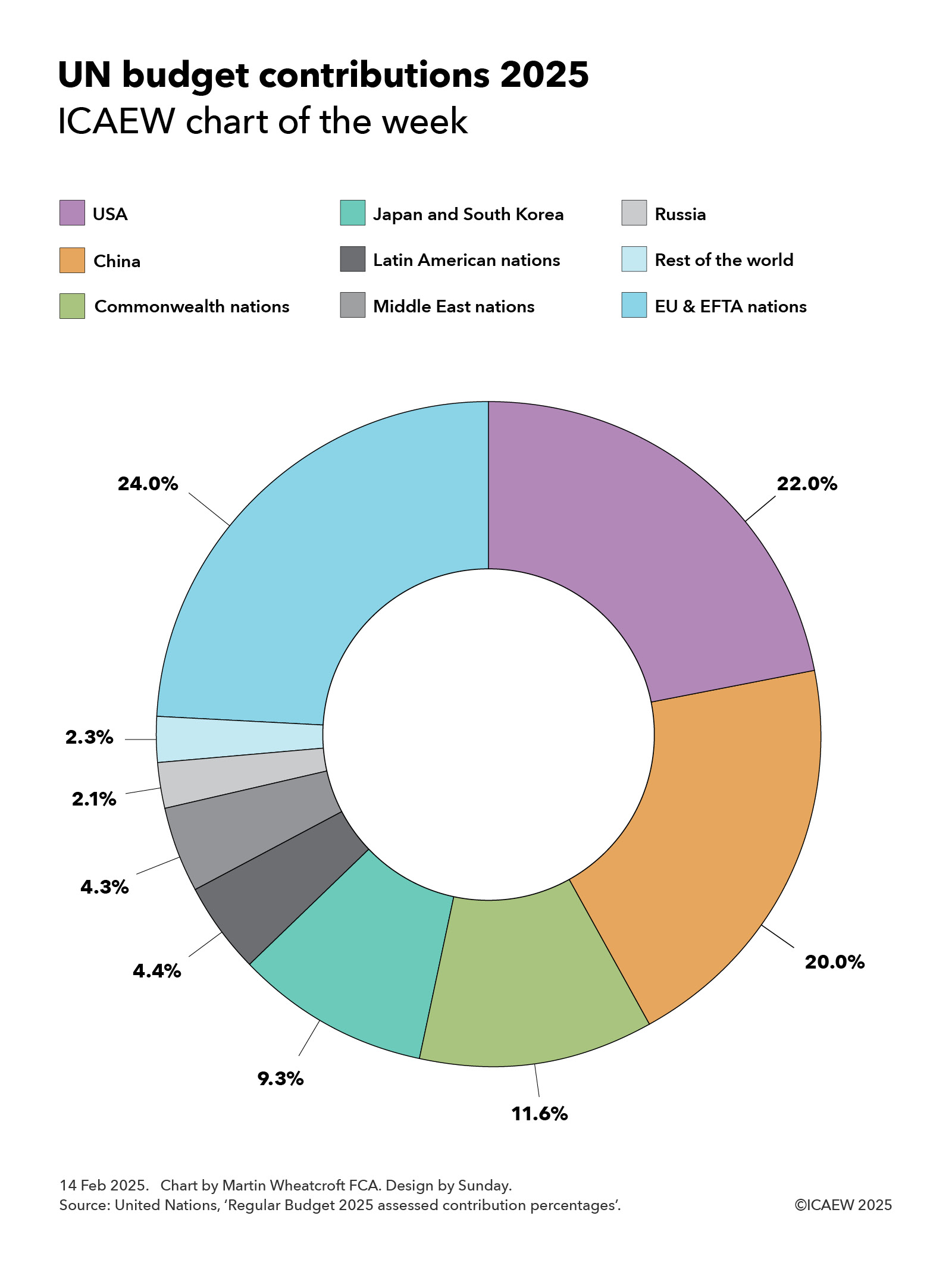
ICAEW chart of the week: EU Budget 2024

My chart for ICAEW this week illustrates how Ireland has displaced Luxembourg in contributing the most to the EU Budget on a per capita basis.

EU Budget 2024
ICAEW chart of the week

Vertical bar chart showing contributions per person per month to the EU budget for 2024 by country (blue bars) and the EU average (purple bar).

Ireland: €53.20
Luxembourg: €50.70
Belgium: €44.10
Netherlands: €39.00
Denmark: €37.80
Finland: €31.30
Germany: €29.70
Slovenia: €28.90
France: €28.60
Austria: €28.50
Sweden: €25.20
EU average: €25.20
Italy: €24.40
Malta: €23.20
Spain: €21.80
Estonia: €21.70
Cyprus: €20.70
Czechia: €20.30
Lithuania: €20.00
Portugal: €17.80
Latvia: €16.90
Hungary: €16.20
Poland: €15.70
Greece: €15.40
Slovakia: €15.00
Croatia: €13.10
Romania: €12.00
Bulgaria: €10.50

25 Jan 2024.
Chart by Martin Wheatcroft FCA. Design by Sunday.
Sources: European Union, 'EU Budget 2024'; Eurostat, 'Population projections'; ICAEW calculations.

(c) ICAEW 2024

The European Union’s Budget for the 2024 calendar year amounts to €143bn, with national governments contributing €137bn and EU institutions generating the balance of €6bn. At a current exchange rate of £1:€1.17 this is equivalent to a budget of £122bn comprising national contributions of £117bn and other income of £5bn.

My chart illustrates how much national governments contribute to the EU budget on a per capita basis, ranging from Ireland contributing the most to Bulgaria the least. Ireland’s recent economic success has seen it overtake Luxembourg as the country with the highest GDP per capita, and hence the highest per capita contributor to the EU Budget. 

The average contribution for the EU’s population works out at just over €302 (£258) per person per year or €25.20 (£21.50) per person per month, based on a total population of 453m living in the 27 EU member countries.

The chart shows how Ireland’s contributions are equivalent to €53.20 per person per month, followed by Luxembourg on €50.70, Belgium on €44.10, Netherlands on €39.00, Denmark on €37.80, Finland on €31.30, Germany on €29.70, Slovenia on €28.90, France on €28.60, Austria on €28.50, Sweden on €25.20, Italy on €24.40, Malta on €23.20, Spain on €21.80, Estonia on €21.70, Cyprus on €20.70, Czechia on €20.30, Lithuania on €20.00, Portugal on €17.80, Latvia on €16.90, Hungary on €16.20, Poland on €15.70, Greece on €15.40, Slovakia on €15.00, Croatia on €13.10, Romania on €12.00, and Bulgaria on €10.50.

Total contributions of €137bn amount to approximately 0.8% of the EU’s gross national income of €17.7trn. They comprise €25bn from 75% of customs duties and sugar sector levies, a €24bn share of VAT receipts, €7bn based on plastic packaging that is not recycled (providing countries with an economic incentive to reduce it), and €82bn calculated as a proportion of gross national income. 

While the UK ‘rebate’ no longer exists, these numbers in the chart are net of the equivalent but proportionately smaller ‘rebate’ totalling €9bn that continues to go to Germany, Netherlands, Sweden, Austria and Denmark. The EU Commission had proposed removing it during the negotiations for the 2021 to 2027 multi-year financial framework but was unsuccessful in persuading these five countries to give it up.

The chart only shows the gross contributions paid by national governments – it doesn’t show the amount that comes back to each country through EU spending, whether in the form of economic development funding and agricultural subsidies, through science, technology, educational or other programmes, or through the economic benefits of hosting EU institutions. This will reduce the effective net contribution for most of the richer nations, while poorer member states will benefit by more coming from the EU than they are paying in.

The numbers also do not include €113bn (£97bn) of spending through the NextGenerationEU programme that is funded by direct borrowing by the EU. This is equivalent to additional spending of €20.80 per person per month that will need to be repaid over the next few decades – hopefully through the benefits of higher economic growth.

This chart was originally published by ICAEW.

ICAEW chart of the week: Coronavirus

My chart this week looks at one of the big questions being looked at by the UK COVID-19 Inquiry: why did the UK experience one of the highest death rates in the developed world?

Coronavirus

Column chart showing deaths per million population, with each column broken into 2020, 2021, 2022 and 2023 (to 2 Nov) components.

Year components only labelled for the UK 

Japan - 603 (28 in 2020, 120 in 2021, 316 in 2022, 139 in 2023 up to 2 Nov) 
Australia - 893 (35, 58, 587, 212)
Canada - 1,395 (397, 382, 498, 118)
Ireland - 1,848 (451, 761, 480, 156)
Germany - 2,099 (564, 848, 576, 111)
France - 2,599 (983, 938, 580, 98)
Italy - 3,259 (1,247, 1,078, 805, 129)
USA - 3,365 (1,041, 1,381, 786, 157)
UK - 3,421 (1,382, 1237, 583, 219)
Greece - 3,635 (451, 1,524, 1,393, 267)


9 Nov 2023.
Chart by Martin Wheatcroft FCA. Design by Sunday.

Source: Our World In Data, ‘COVID-19 data explorer’ / WHO, ‘Covid-19 dashboard’.

My chart for ICAEW this week is on the coronavirus pandemic and how, according to World Health Organisation (WHO) data as summarised by Our World in Data’s Covid-19 Data Explorer, the UK suffered one of the highest death rates in the developed world.

According to the official statistics, there were 3,421 deaths per million population attributed to COVID-19 in the UK between 1 January 2020 and 2 November 2023. This compares with 603 deaths per million in Japan, 893 in Australia, 1,395 in Canada, 1,848 in Ireland, 2,099 in Germany, 2,599 in France, 3,259 in Italy, 3,365 in the US and 3,635 in Greece.

Not shown in the chart are the total number of cumulative deaths attributed to COVID-19 (ie before dividing by the population) of 74,694 in Japan, 23,289 in Australia, 53,297 in Canada, 9,281 in Ireland, 174,979 in Germany, 167,985 in France, 192,406 in Italy, 1.14m in the USA, 230,974 in the UK, and 37,738 in Greece.

Both Our World In Data and the WHO give warnings about the data, especially given difficulties in identifying which deaths were caused by the coronavirus (especially in 2020 before testing was widely available), whether deaths are recorded when they happened or when they were reported, and differences in how countries attribute deaths to causes. 

Despite those factors, these statistics give an overall impression of how badly the coronavirus affected different countries, especially when combined with other data, such as excess mortality (also not shown in the chart). According to Our World In Data, the cumulative difference between total deaths reported from all causes and projected deaths (based on an extrapolation from the years prior to the pandemic) changes the rankings for the countries in our chart, improving the UK’s position to an extent with the US has more excess deaths proportionately than the UK, and Italy more than Greece. Australia has the lowest level of excess deaths for these countries, below Japan, while France is between Canada and Ireland.

The chart also illustrates the deaths per million of population by year, highlighting how for the UK this was 1,382 in 2020, 1,237 in 2021, 583 in 2022, and 219 in 2023, up to 2 November 2023.

The UK COVID-19 Inquiry is looking at much more than the number of deaths as it considers how coronavirus affected all of us over the past few years, how people were affected, including short- and long-term impacts on health and how people died, as well as the impact on the economy and our lives more generally of COVID-19 – and the UK Government’s response to it.

This chart was originally published by ICAEW.

ICAEW chart of the week: Ireland Budget 2021

20 November 2020: The #icaewchartoftheweek takes a look at the Irish Government’s fiscal plans for 2021 and how it plans to tackle the twin headwinds of COVID and Brexit.

Ireland Budget 2021:

2019 Revenue £89bn, expenditure £87bn

2020 Revenue £84bn, expenditure £106bn

2021 Revenue £89bn, expenditure £109bn

The Irish Government held its Budget 2021 announcement last month, setting out how the coronavirus pandemic has damaged the public finances in 2020 and how it plans to help the economy recover in 2021.

There was a fiscal surplus of €2bn in 2019 with general government revenue of €89bn exceeding expenditure of €87bn, but the pandemic has squeezed revenues (expected to fall to €84bn in 2020) and increased spending (expected to increase to €106bn), resulting in an expected shortfall of €22bn this year. This is equivalent to 6.2% of GDP or 10.7% of Gross National Income (GNI).

General government revenues are forecast to recover to €89bn in 2021, well below the level they would have been without the pandemic. Although much of the emergency spending incurred in 2020 will not be repeated, the Irish Government still plans to increase total spending in 2021 to €109bn. This reflects social payments continuing to run at a higher level (€32bn in 2019, €39bn in 2020 and €38bn in 2021) and greater capital investment (€10bn, €12bn and €12bn), but mainly reflects extensive Brexit-related spending to soften the anticipated adverse economic impacts of increased trade frictions with the UK from 1 January 2021, as well as a €3bn COVID recovery fund intended to help the economy recover from the pandemic. 

As a consequence, the fiscal deficit in 2021 is forecast to be €20bn, 5.7% of GDP and 9.8% of GNI.

General government debt is expected to increase from €204bn at the end of 2019 to €219bn in December 2020 and €239bn in December 2021. This is equivalent to 57%, 63% and 67% of GDP which may not appear to be that high, but with a much wider gap between GDP and GNI than most countries, the debt-GNI ratios of 96%, 108% and 115% are much more of a concern.

Fortunately, interest costs in 2021 are expected to be around €1bn lower despite the significant increase in debt, reflecting the extremely low interest rates available to Ireland as a member of the Eurozone.

The uncertainties surrounding the Irish economy, the pandemic and Brexit mean that Ireland’s Department of Finance decided to publish a one-year economic and fiscal forecast this year instead of the normal five years. They will be hoping for clarity to emerge over the coming year!

This chart was originally published on the ICAEW website.