ICAEW chart of the week: Eurozone government bond yields

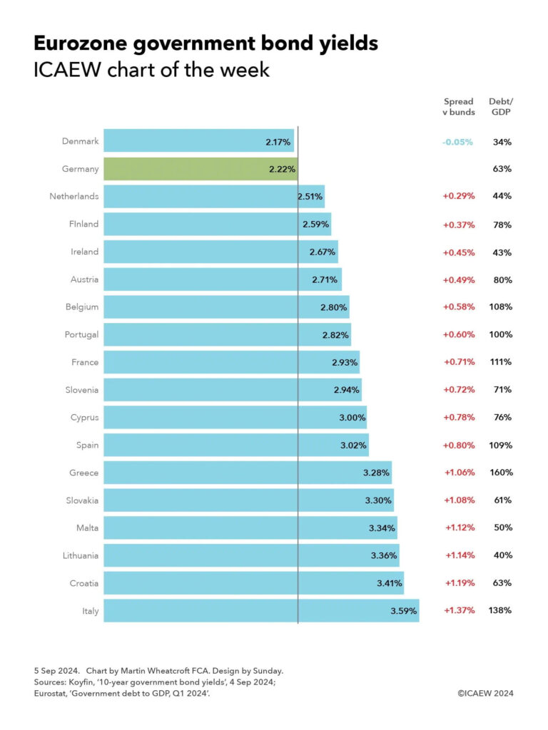
My chart for ICAEW this week is on the cost of government borrowing in the Eurozone, which on 4 September ranged from 2.17% for Danish 10-year bonds up to 3.59% for their Italian equivalents.

ICAEW chart of the week: Eurozone government bond yields. 
 
Bar chart showing the yields on 10-year government bonds on 4 September 2024, the spread versus German bunds, and each countries’ debt to GDP at the end of the first quarter of 2024. 

Denmark: 2.17% yield, -0.05% spread, 34% debt/GDP. 
Germany: 2.22%, -, 63%. 
Netherlands: 2.51%, +0.29%, 44%. 
Finland: 2.59%, +0.37%, 78%. 
Ireland: 2.67%, +0.45%, 43%. 
Austria: 2.71%, +0.49%, 80%. 
Belgium: 2.90%, +0.58%, 108%. 
Portugal: 2.82%, +0.60%, 100%. 
France: 2.93%, +0.71%, 111%. 
Slovenia: 2.94%, +0.72%, 71%. 
Cyprus: 3.00%, +0.78%, 76%. 
Spain: 3.02%, +0.80%, 109%. 
Greece: 3.28%, +1.06%, 160%. 
Slovakia: 3.30%, +1.08%, 61%. 
Malta: 3.34%, +1.12%, 50%. 
Lithuania: 3.36%, +1.14%, 40%. 
Croatia: 3.41%, +1.19%, 63%. 
Italy: 3.59%, +1.37%, 138%. 

5 Sep 2024.   Chart by Martin Wheatcroft FCA. Design by Sunday. 

Source: Koyfin, ’10-year government bond yields’, 4 Sep 2024; Eurostat, ‘Government debt to GDP, Q1 2024’.  

© ICAEW 2024.

My chart this week is on the range of yields payable on 10-year government bonds by 18 out of the 20 countries in the Eurozone for which data is available.

The chart illustrates how investors in German 10-year government bonds (known as ‘bunds’) would have received a yield to maturity of 2.22% – or conversely the German government could have borrowed at an effective interest rate of 2.22% if issuing fresh debt at that point in time. Yields on German bunds are used as benchmark rates for government debt not just in the Eurozone, but globally.

Just one country in the Eurozone has a lower 10-year bond yield than Germany, which is Denmark at 2.17% on 4 September, which is a 0.05 percentage points or 5 basis points (bp) ‘spread’ below the benchmark bund rate. 

While quoted yields move up and down all the time, sometimes by quite large amounts, spreads are much less volatile, providing an insight into how debt investors perceive the relative risks of investing in different countries’ sovereign debt.

The next lowest yields were the Netherlands at 2.51%, with a spread of 0.29 percentage points above bunds, and Finland at 2.59% (+0.37%). This is then followed by Ireland on 2.67% (+0.45%), Austria on 2.71% (+0.49%), Belgium on 2.80% (+0.58%), Portugal on 2.82% (+0.60%), France on 2.93% (+0.71%), Slovenia on 2.94% (+0.72%), Cyprus on 3.00% (0.78%) and Spain on 3.02% (+0.80%). There is then a small jump to Greece on 3.28% (+1.06%), Slovakia on 3.30% (+1.08%), Malta on 3.34% (+1.12%), Lithuania on 3.36% (+1.14%) and Croatia on 3.41% (+1.19%). 

The highest yield for investors among Eurozone countries – and hence the highest borrowing cost for its government – is Italy with 3.59%, which is 1.37 percentage points above the effective interest rate at which Germany could in theory borrow.

Comparing the bond yields in the Eurozone provides an insight into the relative strengths and weaknesses of these countries’ public finances and economies given that they all share a currency, a central bank base interest rate (currently 3.75%), and are all in the EU Single Market and Customs Union. Comparing yields with other currencies, such as the UK’s 3.95% for example (not shown in the chart), needs to take other factors into account, such as the UK’s much higher central bank base rate of 5%.

The chart also reports the government debt to GDP levels of each country for the second quarter of 2024 according to Eurostat, which may help explain why Denmark (with debt/GDP of 34%) pays a significantly lower borrowing cost than Spain (109%). 

However, debt/GDP doesn’t explain all of the differences, with the 10-year yield on Greek government debt (debt/GDP 160%) of 3.28% for example being significantly lower than the 10-year yield on Italian government debt (debt/GDP 138%) of 3.59%. 

Not shown in the chart are Estonia (debt/GDP 24%) and Latvia (45%), both of which tend to borrow at shorter maturities.

The lack of a firm correlation between debt/GDP and bond spreads should not be surprising as debt/GDP is a relatively crude measure of public finance strength or weakness. It excludes most government assets and non-debt liabilities, the funded or unfunded nature of their social security systems, as well as a country’s medium- and longer-term economic prospects and the perceived stability of that country’s government. These are all factors debt investors take into account when deciding the level of risk that they are willing to accept when investing.

This chart was originally published by ICAEW.

ICAEW chart of the week: EU Budget 2024

My chart for ICAEW this week illustrates how Ireland has displaced Luxembourg in contributing the most to the EU Budget on a per capita basis.

EU Budget 2024
ICAEW chart of the week

Vertical bar chart showing contributions per person per month to the EU budget for 2024 by country (blue bars) and the EU average (purple bar).

Ireland: €53.20
Luxembourg: €50.70
Belgium: €44.10
Netherlands: €39.00
Denmark: €37.80
Finland: €31.30
Germany: €29.70
Slovenia: €28.90
France: €28.60
Austria: €28.50
Sweden: €25.20
EU average: €25.20
Italy: €24.40
Malta: €23.20
Spain: €21.80
Estonia: €21.70
Cyprus: €20.70
Czechia: €20.30
Lithuania: €20.00
Portugal: €17.80
Latvia: €16.90
Hungary: €16.20
Poland: €15.70
Greece: €15.40
Slovakia: €15.00
Croatia: €13.10
Romania: €12.00
Bulgaria: €10.50

25 Jan 2024.
Chart by Martin Wheatcroft FCA. Design by Sunday.
Sources: European Union, 'EU Budget 2024'; Eurostat, 'Population projections'; ICAEW calculations.

(c) ICAEW 2024

The European Union’s Budget for the 2024 calendar year amounts to €143bn, with national governments contributing €137bn and EU institutions generating the balance of €6bn. At a current exchange rate of £1:€1.17 this is equivalent to a budget of £122bn comprising national contributions of £117bn and other income of £5bn.

My chart illustrates how much national governments contribute to the EU budget on a per capita basis, ranging from Ireland contributing the most to Bulgaria the least. Ireland’s recent economic success has seen it overtake Luxembourg as the country with the highest GDP per capita, and hence the highest per capita contributor to the EU Budget. 

The average contribution for the EU’s population works out at just over €302 (£258) per person per year or €25.20 (£21.50) per person per month, based on a total population of 453m living in the 27 EU member countries.

The chart shows how Ireland’s contributions are equivalent to €53.20 per person per month, followed by Luxembourg on €50.70, Belgium on €44.10, Netherlands on €39.00, Denmark on €37.80, Finland on €31.30, Germany on €29.70, Slovenia on €28.90, France on €28.60, Austria on €28.50, Sweden on €25.20, Italy on €24.40, Malta on €23.20, Spain on €21.80, Estonia on €21.70, Cyprus on €20.70, Czechia on €20.30, Lithuania on €20.00, Portugal on €17.80, Latvia on €16.90, Hungary on €16.20, Poland on €15.70, Greece on €15.40, Slovakia on €15.00, Croatia on €13.10, Romania on €12.00, and Bulgaria on €10.50.

Total contributions of €137bn amount to approximately 0.8% of the EU’s gross national income of €17.7trn. They comprise €25bn from 75% of customs duties and sugar sector levies, a €24bn share of VAT receipts, €7bn based on plastic packaging that is not recycled (providing countries with an economic incentive to reduce it), and €82bn calculated as a proportion of gross national income. 

While the UK ‘rebate’ no longer exists, these numbers in the chart are net of the equivalent but proportionately smaller ‘rebate’ totalling €9bn that continues to go to Germany, Netherlands, Sweden, Austria and Denmark. The EU Commission had proposed removing it during the negotiations for the 2021 to 2027 multi-year financial framework but was unsuccessful in persuading these five countries to give it up.

The chart only shows the gross contributions paid by national governments – it doesn’t show the amount that comes back to each country through EU spending, whether in the form of economic development funding and agricultural subsidies, through science, technology, educational or other programmes, or through the economic benefits of hosting EU institutions. This will reduce the effective net contribution for most of the richer nations, while poorer member states will benefit by more coming from the EU than they are paying in.

The numbers also do not include €113bn (£97bn) of spending through the NextGenerationEU programme that is funded by direct borrowing by the EU. This is equivalent to additional spending of €20.80 per person per month that will need to be repaid over the next few decades – hopefully through the benefits of higher economic growth.

This chart was originally published by ICAEW.

ICAEW chart of the week: Coronavirus

My chart this week looks at one of the big questions being looked at by the UK COVID-19 Inquiry: why did the UK experience one of the highest death rates in the developed world?

Coronavirus

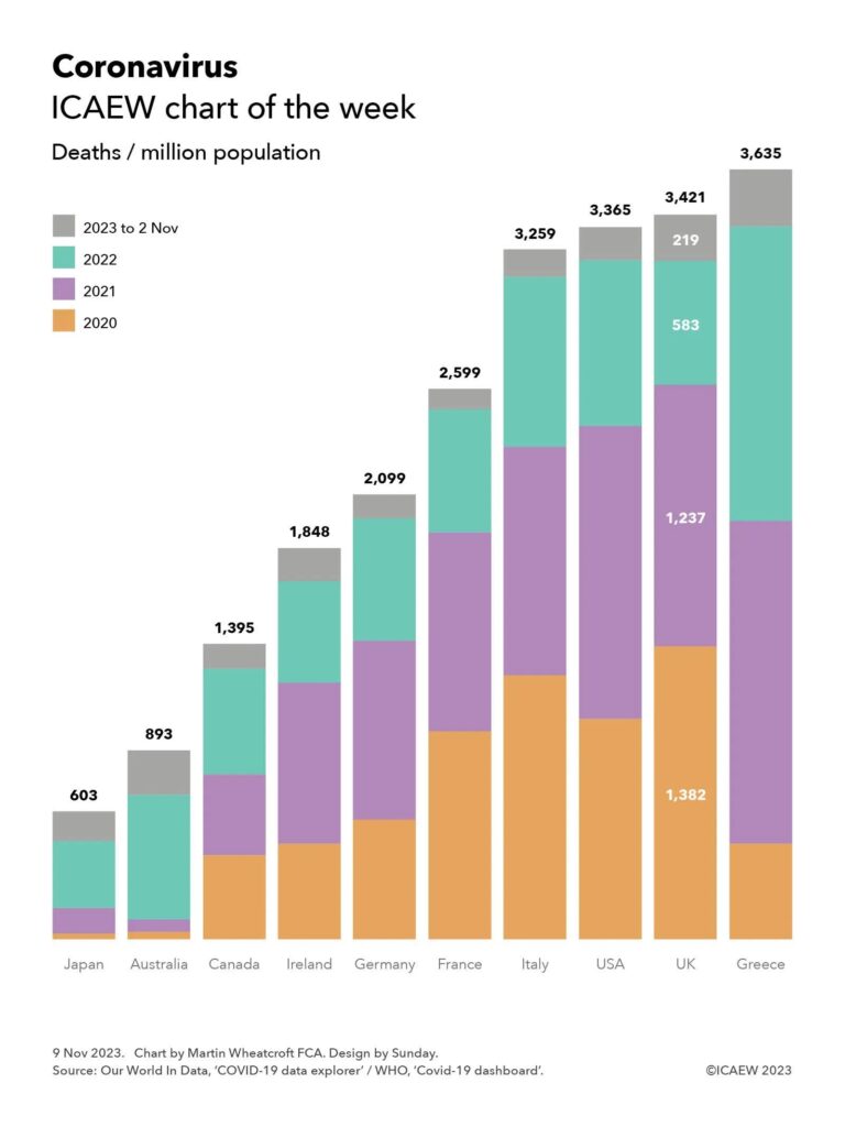
Column chart showing deaths per million population, with each column broken into 2020, 2021, 2022 and 2023 (to 2 Nov) components.

Year components only labelled for the UK 

Japan - 603 (28 in 2020, 120 in 2021, 316 in 2022, 139 in 2023 up to 2 Nov) 
Australia - 893 (35, 58, 587, 212)
Canada - 1,395 (397, 382, 498, 118)
Ireland - 1,848 (451, 761, 480, 156)
Germany - 2,099 (564, 848, 576, 111)
France - 2,599 (983, 938, 580, 98)
Italy - 3,259 (1,247, 1,078, 805, 129)
USA - 3,365 (1,041, 1,381, 786, 157)
UK - 3,421 (1,382, 1237, 583, 219)
Greece - 3,635 (451, 1,524, 1,393, 267)


9 Nov 2023.
Chart by Martin Wheatcroft FCA. Design by Sunday.

Source: Our World In Data, ‘COVID-19 data explorer’ / WHO, ‘Covid-19 dashboard’.

My chart for ICAEW this week is on the coronavirus pandemic and how, according to World Health Organisation (WHO) data as summarised by Our World in Data’s Covid-19 Data Explorer, the UK suffered one of the highest death rates in the developed world.

According to the official statistics, there were 3,421 deaths per million population attributed to COVID-19 in the UK between 1 January 2020 and 2 November 2023. This compares with 603 deaths per million in Japan, 893 in Australia, 1,395 in Canada, 1,848 in Ireland, 2,099 in Germany, 2,599 in France, 3,259 in Italy, 3,365 in the US and 3,635 in Greece.

Not shown in the chart are the total number of cumulative deaths attributed to COVID-19 (ie before dividing by the population) of 74,694 in Japan, 23,289 in Australia, 53,297 in Canada, 9,281 in Ireland, 174,979 in Germany, 167,985 in France, 192,406 in Italy, 1.14m in the USA, 230,974 in the UK, and 37,738 in Greece.

Both Our World In Data and the WHO give warnings about the data, especially given difficulties in identifying which deaths were caused by the coronavirus (especially in 2020 before testing was widely available), whether deaths are recorded when they happened or when they were reported, and differences in how countries attribute deaths to causes. 

Despite those factors, these statistics give an overall impression of how badly the coronavirus affected different countries, especially when combined with other data, such as excess mortality (also not shown in the chart). According to Our World In Data, the cumulative difference between total deaths reported from all causes and projected deaths (based on an extrapolation from the years prior to the pandemic) changes the rankings for the countries in our chart, improving the UK’s position to an extent with the US has more excess deaths proportionately than the UK, and Italy more than Greece. Australia has the lowest level of excess deaths for these countries, below Japan, while France is between Canada and Ireland.

The chart also illustrates the deaths per million of population by year, highlighting how for the UK this was 1,382 in 2020, 1,237 in 2021, 583 in 2022, and 219 in 2023, up to 2 November 2023.

The UK COVID-19 Inquiry is looking at much more than the number of deaths as it considers how coronavirus affected all of us over the past few years, how people were affected, including short- and long-term impacts on health and how people died, as well as the impact on the economy and our lives more generally of COVID-19 – and the UK Government’s response to it.

This chart was originally published by ICAEW.

ICAEW chart of the week: Government bond yields

11 December 2020: Ultra-low or negative yields provide governments with an opportunity to borrow extremely cheaply, but what will happen if and when interest rates rise?

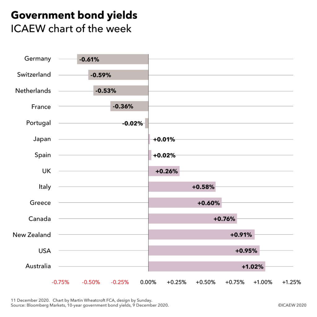
Government 10-year bond yields

Germany -0.61%, Switzerland -0.59%, Netherlands -0.53%, France -0.36%, Portugal -0.02%, Japan +0.01%, Spain +0.02%, UK +0.26%, Italy +0.58%, Greece +0.60%, Canada +0.76%, New Zealand +0.91%, USA +0.95%, Australia +1.02%

On 9 December, the benchmark ten-year government bond yield for major western economies ranged from -0.61% for investors in German Bunds through to 0.95% for US Treasury Bonds and 1.02% for Australia Government Bonds, as illustrated in the #icaewchartoftheweek.

One of the more astonishing developments of the last decade or so has been the arrival of an era of ultra-low or negative interest rates, even as governments have borrowed massive sums of money to finance their activities. This is not only a consequence of weak economic conditions and the slowing of productivity-led growth, but it has also been driven by the monetary policy actions of central banks through quantitative easing operations that have driven down yields by buying long-term fixed interest rate government bonds in exchange for short-term variable rate central bank deposits.

For bond investors this has been a wild ride, with the value of existing bonds sky-rocketing as central banks have come calling to buy a proportion of their holdings, crystallising their gains. The downside is the extremely low yields available to debt investors on fresh purchases of government bonds, which in some cases involve paying governments for the privilege of doing so.

Yields vary according to maturity, with yields on UK gilts ranging from -0.08% on two-year gilts through to 0.26% for 10-year gilts (as shown in the chart) up to 0.81% on 30-year gilts. In practice, the UK issues debt with an average maturity between 15 and 20 years, so the current average cost of its financing is higher than that shown in the chart at between 0.48% and 0.77% being the yields on 15-year and 20-year gilts respectively. This has the benefit of locking in low interest rates for longer, in contrast with most of the other countries shown that tend to issue debt with an average maturity of less than ten years.

Quantitative easing complicates the picture, as by repurchasing a significant proportion of government debt and swapping it for central bank deposits, central banks have reversed the security of fixed interest rates locked in to maturity with a variable rate exposure that will hit the interest line immediately if rates change. 

In theory, this should not be a problem, as higher interest rates are most likely to accompany stronger economic growth and hence higher tax revenues with which to pay the resultant higher debt interest bills, but in practice treasury ministers are not so sanguine. In leveraging public balance sheets to finance their responses to COVID-19 – on top of the legacy of debt from the financial crisis – governments have significantly increased their exposure to movements in interest rates, just as other fiscal challenges are growing more pressing.

Expect to hear a lot more over the coming decade about the resilience of public finances as governments seek to reduce gearing and reduce their vulnerability to the next unexpected crisis, whenever that may occur.

This chart was originally published on the ICAEW website.