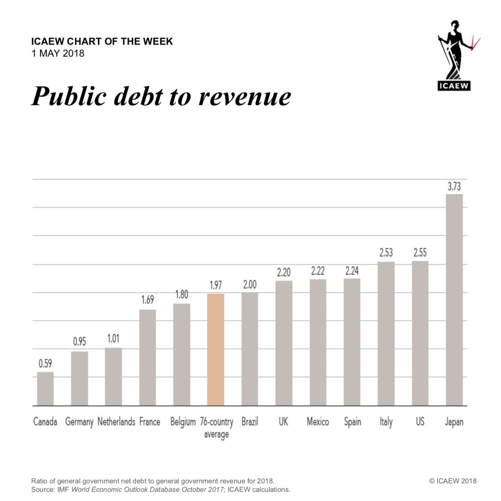
Our chart this week again comes from our recently published report: The debt of nations – definitely worth a read.
The usual measure used to compare borrowing between countries is the ratio of net public debt to GDP. We do not think this is a good measure: there are problems with the way GDP is calculated and GDP also fails to reflect the financial positions of different governments.
We prefer the ratio of net public debt to the government revenues actually available to service that debt. Our chart this week shows this ratio for the 12 most indebted nations – ranging from Canada with a ratio of 0.59 (less than one year’s revenues) through to Japan, which owes 3.73 times the revenue its government expects to receive in 2018.
This ratio also takes into account different fiscal approaches. E.g. France’s net debt to GDP ratio of 89% is greater than the UK’s 81%, but it has a significantly lower net debt to revenue ratio of 1.69 times compared with 2.20 for the UK. The UK’s lower level of tax as a proportion of the economy means it has less money available to service its public debt.
Why isn’t Japan bust? Negative real interest rates means it is expected to have an interest bill of close to zero this year.