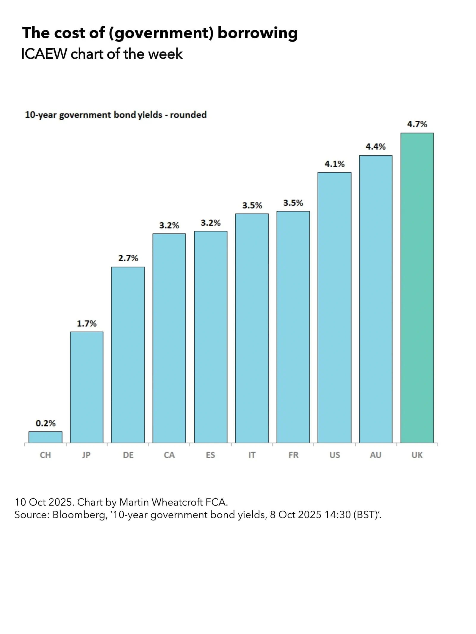
My chart for ICAEW this week looks at how the US federal government is funded and what it spends its money on.
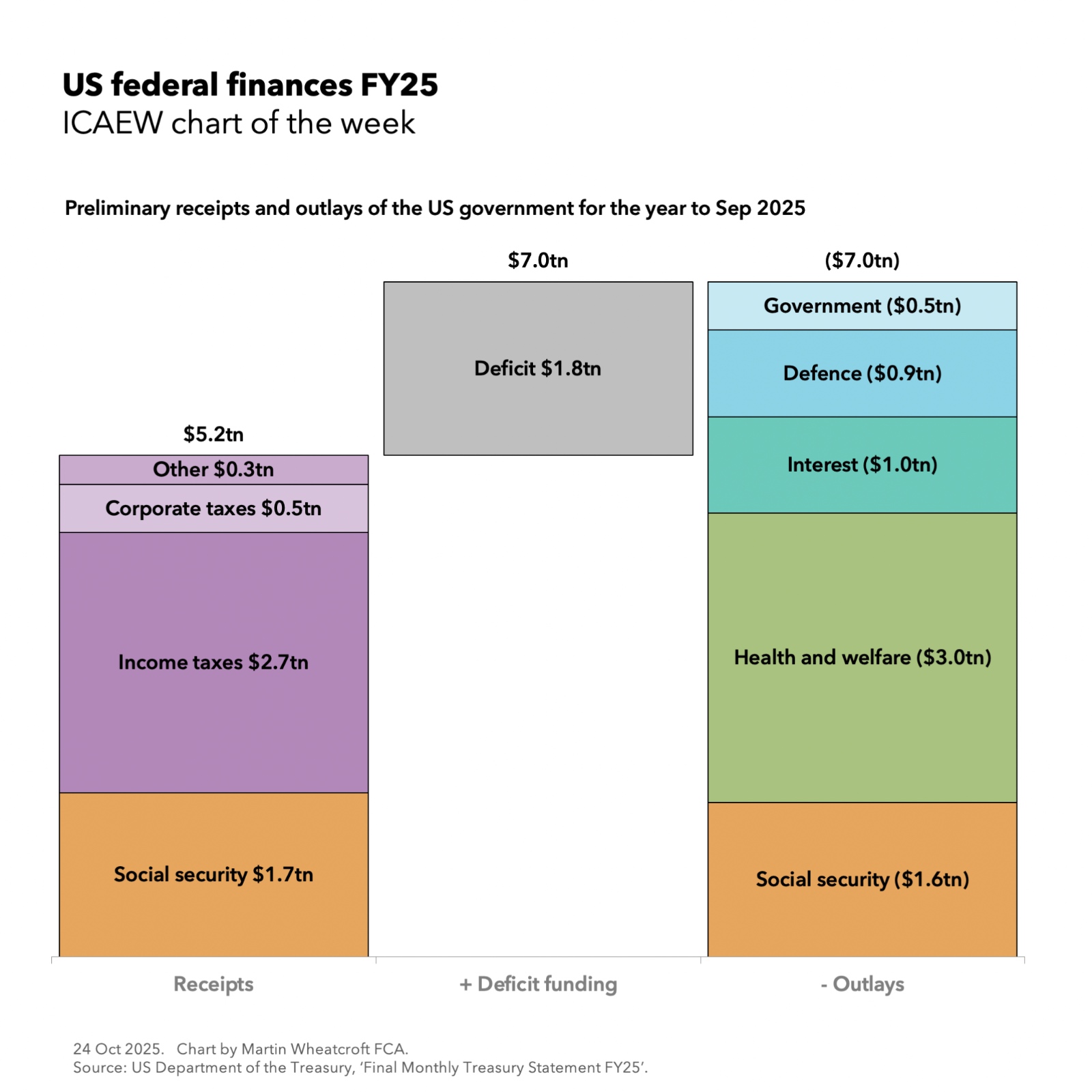
The US federal government financial year ends in September each year and our chart this week takes a look at the provisional monthly receipts and payments statement for September 2025 (FY25).
According to preliminary numbers from the Bureau of the Fiscal Service, part of the US Department of the Treasury, the US federal government collected $5.2tn (17% of GDP or $1,275 per person per month) in taxes during the year ended 30 September 2025 and paid out $7.0tn (23% of GDP or £1,710 per person per month).
The shortfall of $1.8tn (6% of GDP or £435 per person per month) was funded by borrowing.
As our chart illustrates, the federal government’s tax receipts of $5.2tn comprised $1.7tn (6% of GDP or $425 per person per month) from social security contributions, $2.7tn (9% or $655) from income taxes, $0.5tn (1% or $110) from corporate taxes, and $0.3tn (1% or $85) from customs duties, excise taxes, and miscellaneous taxes.
Outlays comprised $1.6tn (5% of GDP or $385 per person per month) on social security programmes (principally pensions and unemployment insurance), $3.0tn (10% or $745) on health care programmes and subsidies (principally Medicare for retirees, Medicaid for children, the poor and those with disabilities, and Affordable Care Act subsidies for lower earners), $1.0tn (3% or $235) on net debt interest, $0.9tn (3% or $225) on US Department of Defense military expenditures, and $0.5tn (2% or $120) on the federal government excluding the military.
These numbers are (for the most part) cash receipts and payments. The US federal government’s accrual-based audited financial statements, prepared in accordance with standards issued by the US Governmental Accounting Standards Board, are normally published in the following February.
They may also seem quite low when compared with the UK’s public finances for example, but that is primarily because they exclude receipts and payments by the states, counties and city governments that provide most public services in the US in addition to their own welfare programmes.
Despite that, it may still be surprising to see how little the federal government costs once welfare programmes, debt interest and military programmes are excluded – just $0.5tn or $120 per person, less than 2% of GDP. This is the result of benefits of scale, a strong economy and the decentralised nature of government in the US.
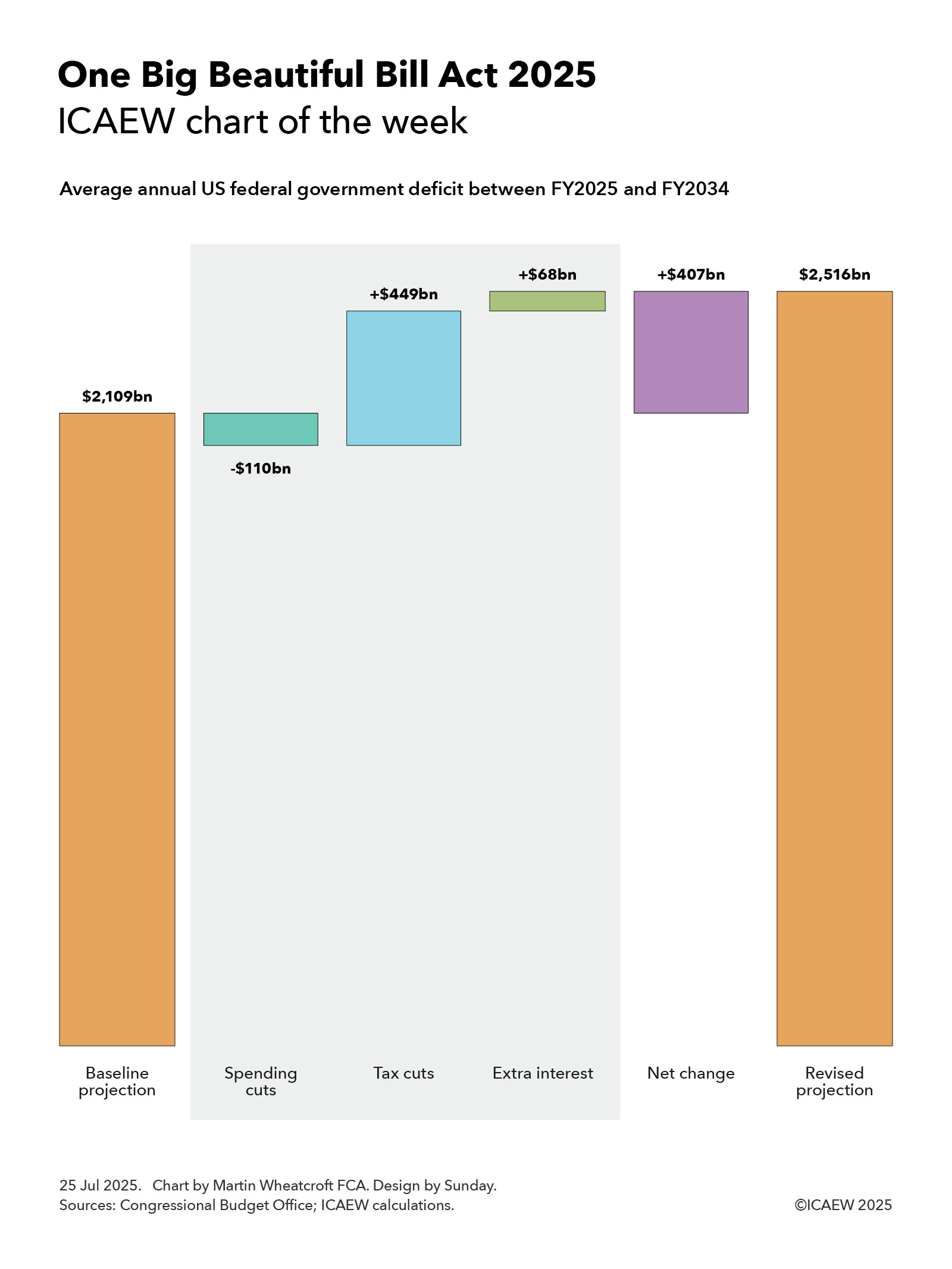
Having said that, policymakers are concerned about rising debt interest and a widening deficit, which is expected to grow further in 2026 as the current administration’s tax cuts take effect and outweigh the planned spending reductions for FY26.
For more information about the US federal finances, visit FiscalData on the US Department of the Treasury website.