ICAEW chart of the week: Spending Review 2025

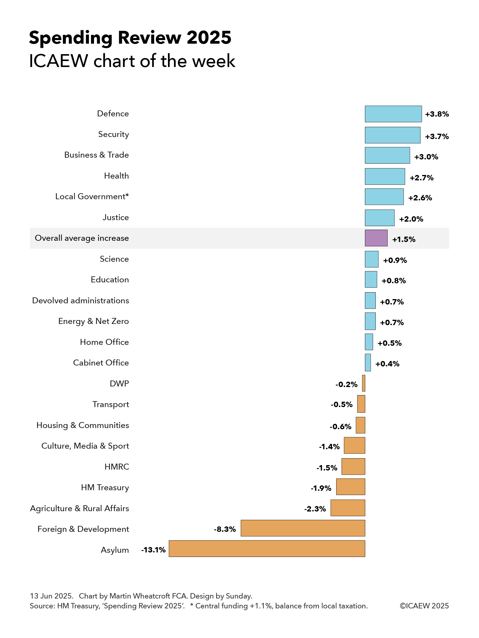
My chart for ICAEW this week looks at the government’s priorities as expressed through departmental budgetary allocations over the next three years.

A bar chart showing the average annual real-term percentage increase in departmental spending over the three years to 2028/29.

Defence +3.8%. 
Security +3.7%. 
Business & Trade +3.0%. 
Health +2.7%. 
Local Government. +2.6% (central funding +1.1%, balance from local taxation). 
Justice +2.0%. 
Overall average increase +1.5%. 
Science +0.9%. 
Education +0.8%. 
Devolved administrations +0.7%. 
Energy & New Zero +0.7%. 
Home Office +0.5%. 
Cabinet Office +0.4%. 
DWP -0.2%. 
Transport -0.5%. 
Culture, Media & Sport -1.4%. 
HMRC -1.5%. 
Hm Treasury -1.9%. 
Agriculture & Rural Affairs -2.3%. 
Foreign & Development -8.3%. 
Asylum -13.1%. 

13 Jun 2025. Chart by Martin Wheatcroft. Design by Sunday. Source: HM Treasury, 'Spending Review 2025'.

The Spending Review 2025 establishes base operating budgets for government departments for the three financial years from 1 April 2026 (2026/27, 2027/28 and 2028/29) and base capital budgets for four financial years (extending to 2029/30).

Departmental budgets for the current financial year ending on 31 March 2026 (2025/26), total £648bn and are expected to rise to £678bn in 2026/27, £697bn in 2027/28, and £717bn in 2028/29, an increase of 10.6% over the three years or 3.4% a year. This is equivalent to an average increase of 1.5% a year in real terms after adjusting for inflation of 1.9% a year on average over the spending review period.

The totals can be analysed between operating or ‘day-to-day’ budgets of £517bn, £536bn, £552bn and £568bn in 2025/26, 2026/27, 2027/28 and 2028/29 respectively and capital budgets of £131bn, £143bn, £145bn and £149bn. These are real terms increases of 1.2% and 2.4% a year on average over three years. 

The capital budget in 2029/30 is £152bn, a cut in real terms that reduces the average annual increase in capital budgets over four years to 1.8% a year on average.

My chart this week highlights how the 1.5% average annual real increase over three years in total budgets (operating and capital) has been allocated across departments, starting with the Ministry of Defence, which leads the pack with an average increase in its budget of 3.8% a year, followed closely by the security services, with an average annual increase of 3.7%. This reflects the elevation of national defence and security to the top of the government’s priorities since the general election last year, even though this increase will only move defence and security spending from 2.3% of GDP currently to 2.6% of GDP by 2027, a long way off the proposed 3.5% of GDP new minimum to be discussed at the NATO summit.

Economic growth and the NHS are the next highest priorities for the government and so it is perhaps unsurprising that the Department of Business & Trade does well with an annual average increase of 3.0%, closely followed by the Department of Health & Social Care, which receives 2.7%. The latter is the biggest increase in cash terms, at £31bn in total or about £12bn more in 2028/29 after adjusting for inflation.

Local government finances are in a parlous state and so the government has pencilled in a 2.6% average annual increase in core budgets for local authorities in England over the next three years. However, it is only increasing central funding by 1.1% a year on average, implying the balance will need to be made by local taxation, principally council tax.

The Ministry of Justice has been awarded 2.0% a year on average as the government seeks to tackle significant backlogs in the courts, overcrowded prisons and significantly under-resourced probation services.

The Department of Science, Innovation and Technology has received a below average annual increase of 0.9% over the next three years, but this follows an almost 12% increase over the past two years as the government has sought to increase investment in research and development to boost economic growth.

Despite being a key priority for the government, the Department for Education has only received a 0.8% average annual increase, partly because of falling primary school rolls in line with a significant fall in the birth rate over the last decade.

The devolved administrations – Scotland (0.8%), Wales (0.7%) and Northern Ireland (0.5%) – are budgeted to receive an average of 0.7% a year over three years as a consequence of the Barnett formula that links UK national government spending in England to the block grants provided to each devolved administration, adjusted for relative changes in population among other factors.

The Cabinet Office is expected to receive just 0.4% on average reflecting the contribution that planned efficiency savings are expected to contribute to administrative budgets. This is also the reason for the 0.2% a year real-terms fall in the Department for Work and Pensions (DWP) budget as automation helps reduce the cost of administering the welfare system.

The budget of the Department for Transport is expected to fall by 0.5% a year overall, but this partly reflects a fall in spending on High Speed 2 as it comes closer to completion. If that is excluded, the department’s budget is expected to increase by 0.5% a year on average. The actual increase in spending should be even higher, as the budget is net of passenger revenues that are expected to grow at a faster rate over the next three years.

Extra money for housing was found within the spending review, but this wasn’t enough to stop the budget for the Department of Housing, Communities and Local Government from shrinking by an annual average of 0.6% a year as other activities are cut back, while the Department for Culture, Media & Sport (-1.4% a year on average) has also been asked to cut back its activities.

HMRC (-1.5% a year) and HM Treasury (-1.9% a year) see their budgets reduced significantly, with digitisation and efficiency savings expected to contribute significant sums.

The Department for Farming, Agriculture, and Rural Affairs (-2.3%) is also expected to see significant cuts over the next three years, as is the Foreign, Commonwealth and Development Office (-8.3%), although in the latter case that is principally driven by the decision to reduce overseas development assistance from 0.5% of GDP to 0.3% of GDP although some will come from back office savings.

Not shown in the chart are small and independent bodies and the government legal function, which are together expected to increase by 0.4% a year on average, although this comprise a -0.5% annual reduction in the former and a 5.3% average annual increase in the latter. The net changes after inflation are a fall of less than £0.1bn and an increase of just over £0.1bn respectively, which are rounding errors in the hundreds and hundreds of billions of pounds spent by government departments each year. 

ICAEW chart of the week: End of the first quarter (century)

Our chart this week marks the end of the first fiscal quarter of the 21st century on 31 March 2025 by comparing it with the previous four quarters in the 20th century.

A five column chart showing changes in the public sector net debt to GDP ratio from 1 April 1900 to 31 March 2025 by quarter century. 

1900s Q1: Borrowing of +£7bn or +184% of GDP less debt inflated away of -42% of GDP = +142% of GDP. 

1900s Q2:   +£18bn or +210% of GDP - 182% of GDP = +28% of GDP. 

1900s Q3:   +£26bn or +48% of GDP - 203% of GDP = -155% of GDP. 

1900s Q4:   +£301bn or +72% of GDP - 88% of GDP = -16% of GDP. 

2000s Q1:   +£2,461bn or +130% of GDP - 66% of GDP = +64% of GDP. 

9 May 2025. Chart by Martin Wheatcroft FCA. Design by Sunday. Sources: Bank of England, 'Historical public finances database'; OBR, 'Public finances databank'.

March 2025 marked the end of the first fiscal quarter of the 21st century, comprising the 25 financial years from 2000/01 to 2024/25. Our chart this week takes a look at how it compares with the previous four quarters in the 20th century.

Our chart starts with the first quarter of the 20th century that started on 1 April 1900 and ended on 31 March 1925 – the comparative period a century ago. Public sector net debt increased by £7bn (from just under £1bn to just under £8bn) and by 142 percentage points of GDP (from 33% of GDP to 175% of GDP) over the 25 years. 

As the chart illustrates, the increase in the net debt to GDP ratio reflected an increase in the numerator from borrowing of 184% of GDP, partially offset by 42% of GDP from the ‘inflating away’ effect of economic growth and inflation on the denominator. 

Almost all of the borrowing in the first quarter a century ago was incurred to finance the First World War, while the severe contraction in the UK economy after the war (partly because of the global ‘Spanish flu’ influenza pandemic) meant that the erosion of net debt as a share of GDP from economic growth and inflation was just 42% instead of the 84% it had been in the first 20 years of the century.

Around £15bn of the £18bn or 210% of GDP that was borrowed during the second quarter of the 20th century was during the Second World War years from 1940/41 to 1945/46. This was substantially offset by strong economic growth during the quarter (especially in the five years up to 1949/50 as the nation emerged from the war) that saw debt ‘inflated away’ by 182% of GDP. The consequence was an increase of just 28 percentage points in net debt as a share of GDP to 203% of GDP on 31 March 1950.

The third quarter of the 20th century saw the government borrow a further £26bn, resulting in net debt doubling to £52bn on 31 March 1975. However, net debt fell as a share of GDP by 155 percentage points to 48% of GDP, with borrowing of 48% of GDP being more than offset by a 203-percentage point reduction from economic growth and inflation increasing the denominator in the net debt/GDP ratio.

The last quarter of the 20th century saw a further reduction in the ratio of net debt to GDP of 16 percentage points, from higher borrowing of £301bn or 72% of GDP being offset by an 88% of GDP inflating away effect of economic growth and inflation. Net debt reached £353bn on 31 March 2000, equivalent to 32% of GDP.

The first quarter of the 21st century, based on provisional numbers for the year ended 31 March 2025, saw net debt/GDP increase by 64 percentage points, with £2,461bn or 130% of GDP borrowed over the past 25 years, taking net debt to £2,814bn and net debt/GDP to 96% of GDP after reflecting a 66% of GDP inflating away effect from economic growth and inflation.

One positive from these comparisons is that at least the latest quarter was not as bad as the comparative quarter a century ago. However, for a period of peacetime we still managed to borrow approaching ‘warlike’ sums to fund the costs of a financial crisis, a pandemic (although the comparative period had one of those too) and an energy crisis that all combined to increase public sector net debt massively. Meanwhile, lower levels of economic growth than in the second half of the 20th century mean that we have not inflated debt away as quickly as we might hope.

As we start the second quarter of the 21st century, the hope is that we can avoid wars, boost economic growth, control spending to keep borrowing under control and – at the same time – increase the speed at which debt is inflated away. Doing so will be essential if we are to move the public finances back onto a sustainable path.

ICAEW chart of the week: One trillion pounds (almost)

Our chart this week takes a look at how UK public sector net debt has increased from £1,816bn to £2,814bn over the past five years – an increase just £2bn short of £1tn.

According to the provisional public sector finance numbers for March 2025 released by the Office for National Statistics (ONS) on 23 April, public sector net debt was £2,814bn on 31 March 2025. This comprised gross debt of £3,198bn, less cash and other liquid financial assets of £384bn.

Our chart this week illustrates how the net amount the nation owes to its creditors has changed over the last five years, starting with net debt of £1,816bn on 31 March 2020. Debt repayments of £541bn were financed by replacement borrowing of £541bn, followed by borrowing of £847bn to fund deficits over the five years (£315bn in 2020/21, £122bn in 2021/22, £127bn in 2022/23, £131bn in 2023/24 and a provisional £152bn in 2024/25) and borrowing for other reasons of £151bn (principally to fund government lending and working capital requirements). The result is an increase of £998bn to reach net debt of £2,814bn on 31 March 2025.

At just short of a trillion pounds, this is the largest amount ever borrowed by the UK government in a five-year period, with only the £0.8tn (£799bn) borrowed over the five years to March 2013 following the financial crisis coming close – when net debt went from £567bn on 31 March 2008 to £1,366bn on 31 March 2013. 

The pandemic and the subsequent energy and cost-of-living crises are, of course, the main drivers behind the need to borrow so much in such a short time, but the worry is that annual borrowing levels are not coming down as quickly as might have been hoped (or budgeted).

Either way, the consequences of building up so much debt will be with us for a long time to come, with debt interest squeezing the amounts available to pay for public services and the tax burden approaching an all-time high, just as demographic change is reducing the proportion of working-age adults, compared with those in retirement.

Of course, as the latest numbers are provisional and the historical ones are often subject to revision, it would only take a couple of relatively small adjustments to the starting or closing debt balances to turn this from just under a trillion pounds to just over a trillion. 

Perhaps a reminder that while a couple of billion pounds is a huge sum of money to you or me (or even to many billionaires), in terms of the UK public finances it is not much more than a rounding error.

This chart was originally published by ICAEW.

ICAEW chart of the week: Pre-Spring Forecast forecast

Our chart looks ahead to next week’s Spring Statement by looking back at the fiscal forecast prepared by the OBR last October.

A seven-column chart showing the OBR forecast for the deficit from October 2024, prior to its March 2025 to accompany the Spring Statement. 

2023/24 Outturn: Current budget deficit (£61bn) + net investment (£70bn) = Fiscal deficit (£131bn). 

2024/25 Forecast: (£55bn) + (£72bn) = (£127bn). 

2025/26 Forecast: (£26bn) + (£80bn) = (£106bn). 

2026/27 Forecast: (£5bn) + (£83bn) = (£88bn). 

2078/28: £11bn current budget surplus + (£83bn) net investment = (£72bn). 

2028/29: £9bn + (£81bn) = (£72bn).  

2029/30: £10bn + (£81bn) = (£71bn). 

21 Mar 2025. Chart by Martin Wheatcroft FCA. Design by Sunday. Sources: ONS, 'Public sector finances, Jan 2025'; OBR, 'Economic and fiscal outlook, Oct 2024'.

There has been some confusion on both the title of next week’s Spring Forecast and whether it will or will not constitute a formal ‘fiscal event’. 

Traditionally, each Chancellor of the Exchequer stands up in Parliament twice a year to announce policy decisions on tax, spending and borrowing, and to set out the latest economic and fiscal forecasts, which since 2010 have been prepared by the independent Office for Budget Responsibility (OBR). One of these fiscal events is a ‘Budget’, which involves requesting parliamentary approval of the annual budget for the upcoming financial year, while the alternate has historically been described as a ‘Statement’.

Chancellor Rachel Reeves set out an ambition on taking office for there to be only one fiscal event a year – an Autumn Budget – mostly in the hope of creating a more stable tax system by reducing the frequency of tax changes, but also to provide a more stable budgeting framework for the public sector. However, she is still legally required to present fiscal forecasts to Parliament twice a year, and so HM Treasury’s decision to relabel the second event as a Spring Forecast was originally intended to emphasise that there wouldn’t be any major tax or spending changes between Budgets.

Unfortunately for the Chancellor, weak economic data – and what that implies for the profile of public spending of tax receipts and public spending over the next five years – mean that she has been unable to achieve her hope of a policy-decision-free Spring Forecast on this, her first attempt. 

Instead, the government has brought forward from later in the year its anticipated reform of disability benefits to ensure the associated cost savings are reflected in the new OBR forecast, while there are also rumours that she may, for the same reason, revise down the total amount of public spending allocated to this summer’s three-year Spending Review.

The tight fiscal situation is illustrated by our chart this week, which sets out how the current budget balance was expected to turn from deficits of £61bn, £55bn, £26bn and £5bn between 2023/24 and 2026/27 to surpluses of £11bn, £9bn and £10bn between 2027/28 and 2029/30.

Our chart also shows how public sector net investment of £70bn, £72bn, £80bn, £83bn, £83bn, £81bn and £81bn between 2023/24 and 2029/30 added to the current budget balance was expected to result in fiscal deficits of £131bn, £127bn, £106bn, £88bn, £72bn, £72bn and £71bn between 2023/24 and 2029/30 respectively.

The Chancellor’s primary fiscal rule is to achieve a current budget surplus by 2029/30, but the £10bn headroom against this target represents just 0.9% of projected receipts of £1,440bn and 0.7% of projected total managed expenditure of £1,510bn in 2029/30. 
A deteriorating economic outlook is believed to have seen this headroom evaporate in the working projections presented by the OBR to the Chancellor as part of the Spring Forecast process – at least before taking account of any offsetting decisions by the Chancellor.

Similarly, the Chancellor may also need to take action to ensure that her secondary fiscal rule – for the debt-to-GDP ratio to fall between March 2029 and March 2030 – is met. This test (not shown in the chart) also had a relatively low headroom of £16bn in the Autumn Budget forecast and further changes to government plans may also be required to stay within it.

Many of the references in the media and elsewhere to the Spring Statement next week are likely to be from people who didn’t see the announcement from HM Treasury about the name change. We did get the memo, but on reflection we think sticking with the former title is going to be more appropriate on this occasion.

This chart was originally published by ICAEW.

ICAEW chart of the week: Quangos

Talk of a ‘bonfire of quangos’ prompted our chart this week to look at how the number of central government public bodies has grown significantly over the past decade.

A three-column chart showing the number of quangos in January 2015, 2020 and 2025. 

2015 - 24 ministerial departments, 23 non-ministerial departments, 346 agencies and public bodies, 12 public corporations and 70 high-profile groups = 474 in total.

2020 - 25, 20, 408, 12 and 90 = 555.

2025 - 24, 20, 424, 19 and 116 = 603. 


14 Mar 2025. Chart by Martin Wheatcroft FCA. Design by Sunday. Source: HM Government, 'gov.uk/government/organisations'.

The prime minister’s recent pledge to tackle the “flabby” state has brought into focus the growth over the past decade in the number of what used to be called quangos (quasi-autonomous non-governmental organisations) but now tend to be described as arms-length public bodies.

Our chart this week is taken from the list of government departments, agencies and public bodies on gov.uk, showing how the number of central government public bodies has grown from 474 in January 2015, to 555 in January 2020 and to 603 in January 2025. 

These numbers exclude the three devolved administrations, local authorities, schools, hospitals, police and fire services etc, and so are only a subset of the estimated 10,000 public bodies that exist in the UK. Scottish and Welsh government departments and many Scottish and Welsh public bodies are excluded from the list, but Northern Ireland public bodies are included, presumably because they are run from London during periods when the Northern Ireland executive is suspended.

The number of government departments increased from 24 in 2015 to 25 in 2020 with the creation of the Department for Exiting the European Union (DExEU) and the Department for International Trade (DIT) offset by the merger of the energy and business departments. This fell back to 24 in 2025 following the abolition of DExEU, the merger of the Department for International Development with the Foreign Office, and the merger of DIT with the business department (a reduction of three) offset by the recreation of a separate Department for Energy Security and Net Zero and the establishment of a new Department for Science, Innovation and Technology (an increase of two).

Non-ministerial departments are 20 arms-length bodies that have budgets voted on in Parliament, including the Supreme Court, HM Revenue & Customs, National Savings & Investments, Crown Prosecution Service, National Crime Agency, Serious Fraud Office, Government Legal Department, Government Actuary’s Department, Food Standards Agency, Forestry Commission, HM Land Registry, the National Archives and the UK Statistics Authority, as well as assorted regulators comprising the Charity Commission, Competition and Markets Authority, the Office for Rail and Road, Ofgem, Ofqual, Ofsted and the Water Services Regulation Authority. There were 22 in 2015, but Ordnance Survey was reclassified to be a public corporation, while UK Trade & Investment became part of DIT when it was formed and is now part of the Department for Business and Trade.

The number of agencies and public bodies increased from 346 in January 2015 to 408 in 2020 and 424 in January 2025. These are arms-length public bodies generally funded from government departmental budgets, ranging from the Advisory Committee on the Microbiological Safety of Food, Arts Council England, the British Business Bank, the Civil Nuclear Police Authority and Companies House to the Imperial War Museum, Law Commission, Maritime and Coastguard Agency, National Lottery Heritage Fund, Office for Students, Peak District National Parks Authority, Pubs Code Adjudicator, Rail Accident Investigation Branch, Royal Mint, Sport England, Student Loans Company, UK Atomic Energy Authority, UK Space Agency, and Youth Justice Board for England and Wales, to name but a few.

The increase between 2015 and 2020 was exaggerated by the inclusion of Northern Ireland public bodies and some reclassifications of existing bodies to the public sector, such as Network Rail and the Financial Reporting Council. However, after the cull undertaken by the coalition government between 2010 and 2015, there was a steady pace of new public bodies created, ranging from the Birmingham Organising Committee for the 2022 Commonwealth Games, College of Policing, Commission for Countering Extremism, Independent Anti-Slavery Commissioner to the Oil and Gas Authority (now North Sea Transition Authority), Office of Tax Simplification and the UK Holocaust Memorial Foundation.

Despite the abolition of the Office of Tax Simplification, the number of quangos has continued to rise since 2020, with many more created over the past five years. These have included the Advanced Research and Invention Agency, Electricity Settlements Company, Flood Re, Great British Energy, Incubator for Artificial Intelligence, Infected Blood Compensation Authority, Regulatory Horizons Council and Queen Elizabeth Memorial Committee, among many others.

Our chart also illustrates how the number of public corporations has increased from 12 in January 2015 and 2020 to 19 in January 2025, despite the reclassification of BBC World Service and S4 as agencies. These are self-funded public bodies or publicly owned businesses owned by the state, which in January 2025 comprised the Architects Registration Board, BBC, Channel 4, Civil Aviation Authority, Crossrail International, DfT Operator, Historic Royal Palaces, London and Continental Railways, National Energy System Operator, NEST, National Physical Laboratory, Office for Nuclear Regulation, Oil and Pipelines Agency, Ordnance Survey, Pension Protection Fund, Post Office, Royal Parks, Sheffield Forgemasters and the UK National Nuclear Laboratory.

The remaining category is what are described as high-profile groups, which grew from 70 identified bodies in January 2015 to 90 in January 2020 and 116 in January 2025. These are mostly organisations inside government departments, such as the Defence Infrastructure Organisation and National Space Operations Centre within the Ministry of Defence, HM Passport Office and Immigration Enforcement within the Home Office, and the Office for Product Safety and Standards and Office of Trade Sanctions Implementation within the Department for Business and Trade. This group also includes professions within government, such as the government economic and statistical services, policy, legal, planning, property, security, tax, social research, and science and engineering professions, and the commercial, finance and operational research functions, for example. 

The planned bonfire of quangos is likely to find that it is a lot more difficult than it sounds. While it is possible to scrap, merge or reform many of these organisations – whether they meet the definition of a quango or not – almost all of these organisations exist for a reason.

This chart was originally published by ICAEW.

ICAEW chart of the week: Gold

With President Trump planning to visit Fort Knox to check up on the US government’s gold reserves, my chart for ICAEW this week looks at just how much gold is owned by governments around the world.

According to the latest statistics from the World Gold Council, sourced principally from the International Monetary Fund (IMF), governments and international financial institutions around the world own 35,864 tonnes of gold. Much of this gold sits in the Bank of England, Fort Knox and in central bank vaults around the world.

At a price of around £74 per gram, the total value of ‘government gold’ adds up to somewhere in the region of £2.7trn. This is estimated to be around one-sixth of the total above-ground stock of gold in the world.

While the US is the largest individual holder of official gold reserves with 8,133 tonnes of gold worth around £600bn, the 27 countries of the EU and the European Central Bank collectively own a total of 11,719 tonnes of gold worth approximately £870bn. This includes Germany with 3,352 tonnes, Italy 2,452 tonnes, France 2,437 tonnes, Netherlands 615 tonnes, the European Central Bank 507 tonnes, Poland 448 tonnes, Portugal 383 tonnes, Spain 282 tonnes, Austria 280 tonnes, Belgium 227 tonnes, Sweden 126 tonnes, Greece 115 tonnes, Hungary 110 tonnes, Romania 104 tonnes and other EU member states with 281 tonnes.

The next biggest holder of gold is the IMF with 2,814 tonnes (worth around £210bn), followed by Russia with 2,336 tonnes (£175bn), China 2,280 tonnes (£170bn), Switzerland 1,040 tonnes (£77bn), India 876 tonnes (£65bn), Japan 846 tonnes (£63bn), Türkiye 615 tonnes (£46bn), Taiwan 424 tonnes (£31bn), Uzbekistan 383 tonnes (£28bn), Saudi Arabia 323 tonnes (£24bn), the UK 310 tonnes (£23bn), Lebanon 287 tonnes (£21bn) and Kazakhstan 284 tonnes (£21bn).

The total for other countries adds up to 3,194 tonnes worth, or around £235bn or so, including Thailand 235 tonnes, Singapore 220 tonnes, Algeria 174 tonnes, Iraq 163 tonnes, Venezuela 161 tonnes, Libya 147 tonnes, Brazil 130 tonnes, Philippines 130 tonnes, Egypt 127 tonnes, South Africa 125 tonnes, Mexico 120 tonnes, Qatar 111 tonnes, South Korea 104 tonnes and the Bank for International Settlements 102 tonnes. 

While the level of official gold holdings is partly driven by the economic size of the countries concerned, it also depends on their reserve strategies, with US, German, French and Italian gold holdings making up around 75%, 74%, 72% and 71% of their official reserves respectively, in contrast with 6%, 9%, 11% and 15% for China, Switzerland, India and the UK, for example. 

President Trump’s plan to visit Fort Knox to personally inspect his nation’s gold holdings reflects one of the benefits of investing in a physical commodity such as gold – you can count gold bars, weigh them and check their purity, as well as admire its shiny quality. He may have a less satisfying experience in verifying any future strategic crypto-currency reserve, where entries in a ledger are somewhat more ephemeral.

This chart was originally published by ICAEW.


ICAEW chart of the week: UN budget contributions 2025

My chart for ICAEW this week looks at the assessed contributions of member states to the United Nations Regular Budget for 2025.

Pie chart showing proportion of contribution to the UN regular budget. 

EU & EFTA nations 24.0%, USA 22.0%, China 20.0%, Commonwealth nations 11.6%, Japan and South Korea: 9.3%, Latin American nations 4.4%, Middle East nations 4.3%, Russia 2.1%, Rest of the world 2.3%. 

14 Feb 2025. Chart by Martin Wheatcroft FCA. Design by Sunday. Source: United Nations, 'Regular Budget 2025 assessed contribution percentages'.

The United Nations is funded through a mix of assessed contributions from member states, voluntary contributions from both member states and others, and revenue generated from operations.

In 2023, total revenue for all UN entities comprised $67.6bn, of which $13.8bn was from assessed contributions, $46.8bn from voluntary contributions ($41.0bn earmarked and $5.8bn non-earmarked), and $7.0bn in revenue from operations.

Of the $13.8bn in assessed contributions from member states, $3.3bn in 2023 was for the core activities of the UN itself and our chart this week illustrates the assessed contribution percentages for 2025 for the $3.4bn UN Regular Budget set for 2025.

This highlights how European Union (EU) and European Free Trade Area (EFTA) nations have been assessed to pay 24.0% of the core budget in 2025, followed by the USA (22.0%), China (20.0%), Commonwealth nations (11.6%), Japan and South Korea (9.3%), Latin American nations (4.4%), Middle East nations (4.3%), Russia (2.1%), and the rest of the world (2.3%).

EU and EFTA national contributions are led by Germany (5.7%), France (3.9%), Italy (2.8%), Spain (1.9%), Netherlands (1.3%), Switzerland (1.0%), Poland (0.8%), Sweden (0.8%), Belgium (0.8%), Norway (0.7%), Austria (0.6%), Denmark (0.5%) and Ireland (0.5%). The remaining 18 EU and EFTA members (and three microstates) are expected to contribute a further 2.7% in 2025.

Of the Commonwealth nations, the UK (4.0%), Canada (2.5%), Australia (2.0%), India (1.1%) and Singapore (0.5%) contributed the most, with the remaining 49 members not including Cyprus and Malta (who are included in the EU in this chart) contributing a further 1.5%.

Japan (6.9%) and Korea (2.4%) are assessed to contribute 9.3% between them, while Latin American nations are down to contribute 4.4%, led by Brazil (1.4%), Mexico (1.1%) and Argentina (0.5%) with 1.4% coming from the rest.

Middle East countries are expected to contribute 4.3% between them, with Saudi Arabia (1.2%), Türkiye (0.7%), Israel (0.6%) and UAE (0.6%) being the largest. Another 11 Middle Eastern nations are down to contribute a further 1.2%.

Russia has been assessed to contribute 2.1%, while countries in the rest of the world are expected to put in a further 2.3%, of which Indonesia (0.6%) is the only one to contribute more than half a percent of the total assessment, with the remaining 68 member states collectively contributing a further 1.7% in total.

The assessed contributions for UN agencies and other activities vary from the percentages shown in the chart as they depend on which countries participate in each agency or activity and several other factors. For example, the US has been assessed to pay 26.2% of the UN peacekeeping budget in 2025 (higher than their 22% regular budget contribution), although the US is expected to pay only 25% because of a cap of 25% set by Congress. The UK and France are expected to pay 4.7% and 4.6% respectively (higher than their 4.0% and 3.9% regular budget contributions), while China has been assessed to pay 18.7% (lower than its 20.0% regular budget contribution).

Another example is the World Trade Organisation (WTO) where the US and China are assessed to contribute 11.4% and 11.2% respectively and most other nations contribute a larger share.

One big question for the UN in 2025 will be the extent to which the new US administration reduces the amount it pays to the UN compared with previous years. The total paid by the US was $13bn in 2023, comprising $3.2bn in assessed contributions and $9.7bn in voluntary contributions. 

In theory, if the US leaves a UN agency, such as already announced departures from the World Health Organisation and the UN Human Rights Council, then the assessed contributions for the remaining members can be increased to compensate. 

The White House has also announced that it is reviewing its membership of the UN Educational, Scientific and Cultural Organisation and that it will withhold a proportionate share of its regular budget contribution that goes towards the UN Relief and Works Agency for Palestinian Refugees in the Near East.

A bigger question will be the extent to which the US cuts its voluntary contributions to UN programmes. A substantial proportion of these voluntary contributions have traditionally come through the US Agency for International Development, where payments have recently been suspended.

This chart was originally published by ICAEW.

ICAEW chart of the week: the end of year capital rush

My chart of the week for ICAEW highlights the big rush in UK public sector capital expenditure in the final quarter of each financial year, prompting us to ask why March is the best time of the year to build new assets.

Column chart illustrating UK public sector capital expenditure by quarter, comprising three financial years each made up of four quarters: Q1 (Apr-Jun), Q2 (Jul-Sep), Q3 (Oct-Dec), and Q4 (Jan-Mar). 

2022/23 £85.3bn: £14.4bn, £18.4bn, £20.2bn, and £32.3bn. 
2023/24 £102.7bn: £18.6bn, £22.8bn, £24.2bn and £37.1bn. 
2024/25 £109.0bn (forecast): £20.4bn, £23.8bn, £25.8bn and £39.0bn (forecast). 
 

7 Feb 2025. Chart by Martin Wheatcroft FCA. 
Sources: ONS, 'Public sector finances, Dec 2024’; OBR, ‘Economic and fiscal outlook, Oct 2024’.

Over the years, the process for delivering capital expenditure in the public sector in the UK has had a pretty bad reputation. The anecdote goes that the first quarter is spent arguing about budgets, in the second everyone goes on holiday, and it is only in the third quarter that programmes finally get up and running, before everything stops for the Christmas break. The final quarter is then a mad rush to spend the remaining budget before the end of the financial year.

Unfortunately, there does appear to be some support for this conjecture when we take a look at the actual numbers.

According to the public sector finance release for December 2024, together with the latest Office for Budget Responsibility forecast for the current financial year to March 2025, public sector gross capital formation (in effect capital expenditure) is lowest in the first quarter, picks up in the second (despite the summer holidays), rises slightly again in the fourth (despite the Christmas break) and then explodes in the fourth quarter of each financial year (despite winter).

Our chart shows capital expenditure in 2022/23 of £85.3bn comprised £14.4bn in Q1 (Apr-Jun), £18.4bn in Q2 (Jul-Sep), £20.2bn in Q3 (Oct-Dec) and £32.3bn in Q4 (Jan-Mar). A similar pattern occurs in 2023/24 when a total £102.7bn of capex was incurred, with £18.6bn in Q1, £22.8bn in Q2, £24.2bn in Q3, and £37.1bn in Q4. Meanwhile in the current 2024/25 financial year, £20.4bn was incurred in Q1, £23.8bn in Q2, and £25.8bn in Q3, with a forecast of £39.0bn in Q4 to reach a forecast total of £109.0bn.

In practice the fourth quarter jump is principally seen in the final month of the financial year, as seen in 2023/24 when fourth quarter capital expenditure of £37.1bn consisted of £9.6bn in January 2024 (£1.0bn more than the monthly average capital expenditure of £8.6bn that financial year), £10.2bn in February 2024 (£1.6bn more than the monthly average), and £17.3bn in March 2024 (£8.7bn more than the monthly average).

This pattern is a stubbornly consistent feature of the public finances in the UK, even after numerous attempts within government to improve capital budgeting and delivery processes. For example, departments are able to carry over some of their capital budgets to future years, which in theory should reduce the incentive to spend every last penny of their allocation in-year. The new spending review process coming into force this summer should also help by setting out a four-year capital budget for 2026/27 to 2029/30, providing much greater forward certainty for investment programmes and (in theory) reducing the concern of future budgets disappearing if the current year budget is not spent in full.

Of course, it is possible that our concerns about the quality of government’s investment delivery process are not fully justified. There could after all be some very good practical reasons as to why March is the best time of the year for carrying out public capital works!

This chart was originally published by ICAEW.

ICAEW chart of the week: Pensioners on the rise

My chart for ICAEW this week highlights how the number of pensioners in the UK is expected to increase by 14% over the next 10 years. This will have major implications for the public finances.

Step chart. Starts with a projected UK population aged 66 or more in 2025 of 12,614,000 (21%), adds 2,677,000 over the next 10 years, then a reduction of 867,000 (7%) from the change in the state retirement age to equal a UK population aged 67 or more of 4,424,000 (+14%) in 2035.

31 Jan 2025. Chart by Martin Wheatcroft FCA. Source: ONS, 'Principal population projection (2022-based), Jan 2025'.

The Office for National Statistics (ONS) published its latest population projections for the UK on 28 January 2025. 

Extrapolated from the 2021 Census in England, Wales and Northern Ireland and the 2022 Census in Scotland, the ONS’s principal projection is for the UK population to increase by 5% over the next decade from a projected 69,868,000 in June 2025 to 73,426,000 in June 2035. This is on the basis of 132,000 more deaths than births in total over the next 10 years (6,979,000 versus 6,847,000) and net inward migration of 369,000 a year on average.

Our chart highlights how the number of pensioners is expected to increase by 14% over the next 10 years, from a projected 12,614,000 this summer to 14,424,000 in 2035, despite an increase in the state retirement age from 66 to 67. 

The main driver of this increase is an additional 2,677,000 people aged 66 or more, reflecting 8,522,000 people passing the age of 66 over the 10 years to June 2035, plus 28,000 from net inward migration (119,000 in and 91,000 out), less 5,873,000 deaths

This 21% increase is partially offset by a 7% reduction for the 867,000 66-year-olds who will still be waiting for their state pension in June 2035 as a result of the planned rise in the state retirement age from 66 to 67 between 2026 and 2028.

Over the same period the ONS is projecting a 7% fall in the number of children from 12,272,000 in June 2025 to 11,434,000 in June 2035, and a 6% increase in the size of the working age population from 44,982,000 to 47,569,000. The latter would have been a 4% increase if not for the statutory increase in the state pension age to 67.

The ONS stresses that its national population projections are not forecasts and do not attempt to predict potential changes in international migration in particular. It also notes that demographic assumptions for future fertility and mortality are based on observed demographic trends, which is no guarantee that these trends might not change in the future.

Despite those caveats, the projected increase in the number of pensioners is one of the more likely areas of the projections to turn into reality. This is because almost all of those future pensioners are alive today and already living in the country, while mortality rates tend to change gradually over time. 

A much more significant factor relates to the ONS’s long-term assumption for net inward migration of 340,000. While this is unlikely to affect the anticipated number of pensioners in a decade’s time, it will have a significant impact on the projected ratio between the number of pensioners and those of working age.

Either way, the projected rise in the number of pensioners compared with the size of the working-age population over the coming decade will have major implications for the public finances. 

Tax receipts will fall proportionately as retirees leave the workforce faster than new workers join. State pension payments will increase, even before taking account of the ratchet effect of the pension triple-lock on the amount payable to each pensioner. Health care and adult social care costs will rise substantially given how skewed these costs are to older generations. And pension credit, housing benefit and other welfare benefits that go to poorer pensioners are also likely to increase. 

Successive governments, including the current administration, have worked on the basis that they should be able to afford the higher costs of many more people living for longer in retirement through a combination of gradual rises in the state pension age (long hoped for but not delivered), higher levels of economic growth, and cuts in other areas of public spending such as the defence budget. 

With the number of pensioners increasing much faster than the government can raise the state pension age (given the decade or more advance notice that needs to be given), relatively low levels of economic growth even in more optimistic scenarios, calls for an increase in the defence budget and significant cost pressures affecting many other public services, the big question will be the extent to which taxes will have to go up even further over the next 10 years if the promises made by successive governments over the last century are to be kept.

Read more: ONS’s national population projections.

This chart was originally published by ICAEW.

ICAEW chart of the week: Public finances per capita

My chart for ICAEW this week divides some very big numbers for the public finances by an estimated 69.2m people living in the UK to highlight how UK public spending is now in excess of £1,500 per person per month.

Column chart showing UK public sector receipts and spending per capita for 2024/25. 

Left hand column: Taxes £1,235 per month + Other receipts £150 per month = Receipts per capita £1,385 per month. 

Right-hand column: Pensions and welfare £445 per month + Health and social care £370 per month + Education £160 per month + Other public services £410 per month + Interest £150 per month = Spending per capita £1,535 per month.

According to the Autumn Budget 2024, the UK public sector expects to bring in £1,149bn and spend £1,276bn in the financial year ended 31 March 2025 (2024/25). At more than a trillion pounds a year in each case, these are very big numbers that can be difficult to comprehend.

My chart of the week attempts to make these numbers more understandable by averaging them over an estimated UK population of 69.2m for the current financial year and dividing them by 12 to arrive at per person per month equivalents (rounded to the nearest £5).

On this basis, total receipts are expected to average £1,385 per month for each person living in the UK in 2024/25, comprising £1,235 a month from tax receipts (£1,025bn in total) and £150 a month in other receipts (£124bn). 

Not shown in the chart is the approximately £940 per person per month on average – just over two-thirds of total receipts – that comes from the top five taxes: income tax £375 per month, VAT £245 per month, employer national insurance £135 per month, corporation tax £120 per month, and employee national insurance £65 per month.

Public spending is expected to average £1,535 per person per month in 2024/25, comprising approximately £445 per month on pensions and welfare, £370 per month on health and social care, £160 per month on education, £410 per month on other public services, and £150 per month on debt interest, based on forecast total spending in 2024/25 of £370bn, £307bn, £134bn, £340bn, and £125bn respectively.

Spending on welfare

Welfare spending includes (but is not limited to) approximately £170 per person per month to cover the cost of paying the state pension, around £105 per month to pay for universal credit (including housing benefit), and in the order of £75 per month to fund disability and illness benefits.

Per capita spending on health and social care comprises close to £290 per person per month on the NHS, £55 on social care and £25 on public health, health research and other health-related spending. 

Education costs each of us an average of £160 per month, of which approximately £115 per month pays for schools, £35 funds university and higher education (including just over £10 for student loans that are not expected to be repaid) and around £10 per month goes on further education, training and other.

The £410 per month cost of other public services includes in the region of £85 per month on defence and security, approximately £75 per month on roads and railways, £65 on industry and agriculture, nearly £60 per month on public order and safety, £15 per month on dealing with waste, and around £10 per month on international development and aid. This leaves approximately £100 per month to pay for all the other services that central and local government provide, including 11p per person per month for the Royal Family and palaces.

These numbers are averages and of course the amounts individuals pay in taxes and receive either in pensions and welfare benefits or in public services will vary significantly. For example, while health and social care spend is £370 per month when spread over the whole population, average spending on teenagers and those in their 70s are estimated to be significantly different from each other at £130 per month and £700 per month respectively.

Forecast per capita taxes and other receipts of £1,385 per month fall short of planned public spending of £1,535 per month to give rise to an expected deficit of approximately £150 per month funded by borrowing, being £127bn in total in 2024/25, divided by the estimated population of 69.2m. As a consequence, public debt now exceeds £2.8tn, equivalent to just under £41,000 for each person living in the UK, or somewhere in the region of £98,000 per household.

Navigating the public finances can be difficult at the best of times, but it is often helpful to translate the huge numbers you hear on the news into per capita equivalents to make sense of them. £1bn when spread across the UK population works at being equivalent to just over £1.20 per month.

This chart was originally published by ICAEW.