The recent passing of the Renters’ Rights Act 2025 prompts my chart of the week for ICAEW to take a look at just how many households there are in England.
The Renters’ Rights Act 2025 was given royal assent on 27 October, providing a range of new protections for tenants of private sector landlords in England. Its passing prompted us to ask just how many private sector tenancies will be affected by these changes once they are introduced into law.
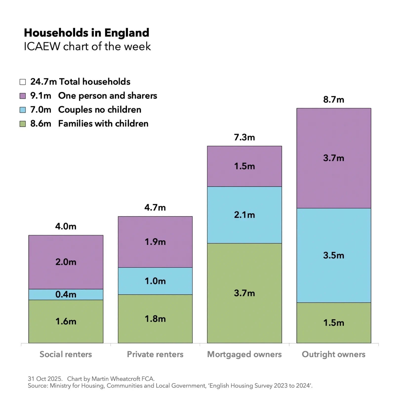
My chart for ICAEW this week illustrates that there were 24.7m households in England in 2023/24 according to the Ministry of Housing, Communities and Local Government. Of these, 4.0m, or 16% of households, were in social housing (2.5m housing association and 1.5m local authority properties), 4.7m, or 19%, were tenants of private sector landlords, 7.3m, or 30%, were in properties owned with a mortgage, and 8.7m or 35% were in properties owned outright.
The chart also shows a breakdown of the 8.6m families with children (1.6m social renters, 1.8m private renters, 3.7m mortgaged owners and 1.5m outright owners), 7.0m couples with no children (0.4m, 1.0m, 2.1m and 3.5m respectively), and 9.1m one person or shared households (2.0m, 1.9m, 1.5m and 3.7m respectively).
The 8.6m family households comprised 5.7m couples with children, 2.5m lone parents with children, and 0.4m two or more family households, while the 9.1m one person or shared households comprised 8.5m one person households (4.5m female and 4.0m male) and 0.6m shared households containing two or more lone persons.
The 4.0m social renter households, 4.7m private renters, 7.3m mortgaged owners and 8.7m outright owners comprise 8.6m, 10.7m, 19.6m and 16.0m people respectively – the latter reflecting the older demographic where we see more outright ownership, fewer children and a higher proportion living alone.
For both tenants and their landlords, the Renters’ Rights Act 2025 will result in significant changes to their contractual arrangements and legal rights. The measures include new restrictions on no fault evictions, the end of fixed-term tenancies, limitations on rent increases, a new ombudsman, a requirement on landlords to register their properties, more rights to have pets, higher property standards, deadlines for rectifying hazards, an end to discrimination against those on benefits or who have children, an end to post-advertisement bidding wars, strengthened local authority enforcement, and the ability for rent repayment orders to be recovered from superior landlords.
My chart for ICAEW this week looks at how the US federal government is funded and what it spends its money on.
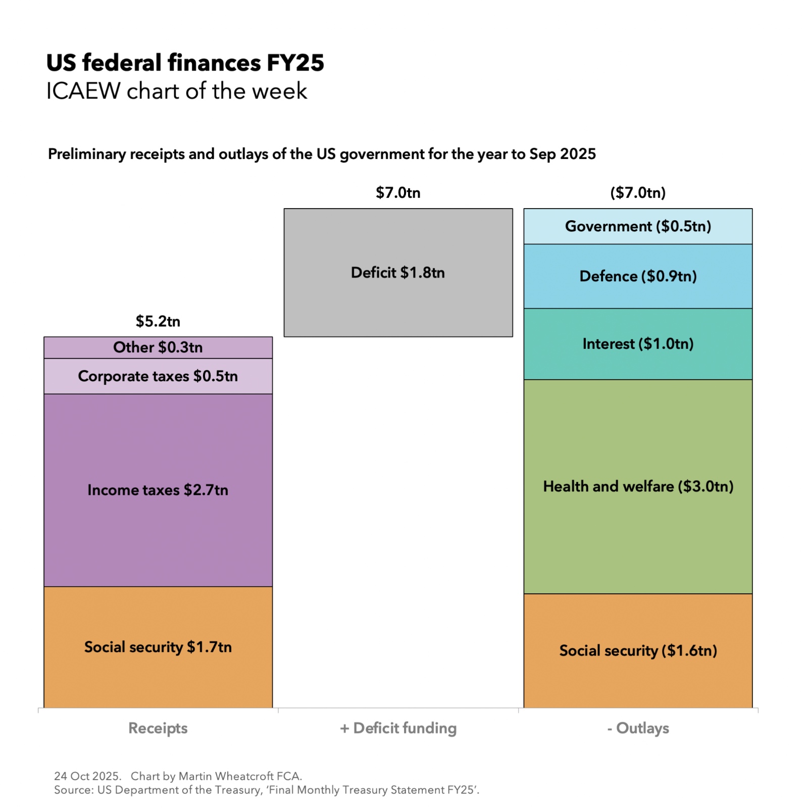
The US federal government financial year ends in September each year and our chart this week takes a look at the provisional monthly receipts and payments statement for September 2025 (FY25).
According to preliminary numbers from the Bureau of the Fiscal Service, part of the US Department of the Treasury, the US federal government collected $5.2tn (17% of GDP or $1,275 per person per month) in taxes during the year ended 30 September 2025 and paid out $7.0tn (23% of GDP or £1,710 per person per month).
The shortfall of $1.8tn (6% of GDP or £435 per person per month) was funded by borrowing.
As our chart illustrates, the federal government’s tax receipts of $5.2tn comprised $1.7tn (6% of GDP or $425 per person per month) from social security contributions, $2.7tn (9% or $655) from income taxes, $0.5tn (1% or $110) from corporate taxes, and $0.3tn (1% or $85) from customs duties, excise taxes, and miscellaneous taxes.
Outlays comprised $1.6tn (5% of GDP or $385 per person per month) on social security programmes (principally pensions and unemployment insurance), $3.0tn (10% or $745) on health care programmes and subsidies (principally Medicare for retirees, Medicaid for children, the poor and those with disabilities, and Affordable Care Act subsidies for lower earners), $1.0tn (3% or $235) on net debt interest, $0.9tn (3% or $225) on US Department of Defense military expenditures, and $0.5tn (2% or $120) on the federal government excluding the military.
These numbers are (for the most part) cash receipts and payments. The US federal government’s accrual-based audited financial statements, prepared in accordance with standards issued by the US Governmental Accounting Standards Board, are normally published in the following February.
They may also seem quite low when compared with the UK’s public finances for example, but that is primarily because they exclude receipts and payments by the states, counties and city governments that provide most public services in the US in addition to their own welfare programmes.
Despite that, it may still be surprising to see how little the federal government costs once welfare programmes, debt interest and military programmes are excluded – just $0.5tn or $120 per person, less than 2% of GDP. This is the result of benefits of scale, a strong economy and the decentralised nature of government in the US.
Having said that, policymakers are concerned about rising debt interest and a widening deficit, which is expected to grow further in 2026 as the current administration’s tax cuts take effect and outweigh the planned spending reductions for FY26.
For more information about the US federal finances, visit FiscalData on the US Department of the Treasury website.
Revisions and corrections help reduce the budget overrun to £7bn for the six months to September 2025, but the outlook remains bleak.
The UK government deficit hit £100bn in the six months to September 2025, according to the latest Office for National Statistics’ (ONS) monthly public sector finances release for September 2025, published on 21 October 2025.
The report also revealed a provisional shortfall between receipts and public spending of £20bn last month. The deficit for the month was £1bn higher than the previous year, in line with the budget. The cumulative deficit was £12bn higher than the first half of 2024/25, and £7bn more than budgeted.
Month of September 2025
Provisional receipts and total public spending for September – £95bn and £115bn respectively – were each 8% more than the previous year.
Current spending included depreciation of £108bn, comparable to the £108bn monthly average in the first five months of the financial year. Net investment was £7bn, higher than the £4bn monthly average investment between April and August 2025.
Excluding net investment, the current budget deficit for the month was £13bn – £2bn more than in the same month last year, £1bn more than budgeted. This was offset by a £1bn underspend on net investment.
Six months to September 2025
The provisional deficit for the six months to September 2025 was £12bn (14%) more than in the same six months last year. This was £7bn higher than budget, which can be analysed as a £13bn budget overrun on the current budget deficit (current receipts less current spending), less a £6bn underspend on net investment.
Table 1 highlights the changes in year-to-date receipts, up 7% overall on last year’s equivalents. These increases were mostly driven by factors such as inflation and fiscal drag from frozen tax allowances. The 20% increase in national insurance revenues reflects the increase in employers’ national insurance.
The 9% increase in current spending over the year has been driven by public sector pay rises, higher supplier costs, and the uprating of welfare benefits.
Net investment of £28bn in the first six months of 2025/26 was £1bn, or 4% higher than the same period last year. Capital expenditure of £46bn was up by £2bn and capital transfers (capital grants, research and development funding, and student loan write-offs) of £18bn were up by £1bn, offset by depreciation of £36bn, up by £2bn.
Table 1 Summary receipts and spending
6 months to Sep
2025/26 £bn
2024/25 £bn
Change %
Income VAT
145
133
+9%
VAT
104
100
+4%
National insurance
98
82
+20%
Corporation tax
52
48
+8%
Other taxes
115
112
+3%
Other receipts
63
62
+2%
Current receipts
577
537
+7%
Public services
(363)
(334)
+9%
Welfare
(155)
(146
+6%
Subsidies
(18)
(17)
+6%
Debt interest
(77)
(67)
+15%
Depreciation
(36)
(34)
+6%
Current spending
(649)
(598)
+9%
Current deficit
(72)
(61)
+18%
Net investment
(28)
(27)
+4%
Deficit
(100)
(88)
+14%
Budget for the rest of the financial year
The deficit is budgeted to be £118bn for the full year ending 31 March 2026, comprising £93bn in the first half of the year to September 2025 and £25bn in the second half of the year.
Borrowing and debt
Table 2 summarises government borrowing in the first six months of the financial year, taking public sector net debt to a provisional £2,916bn on 30 September 2025. This comprised £100bn in public sector net borrowing (PSNB) to fund the deficit and a further £6bn to fund government lending and working capital requirements.
The table also illustrates how the debt-to-GDP ratio increased by 1.6 percentage points, from a revised 93.7% of GDP at the start of the financial year to 95.3% on 30 September 2025, with incremental borrowing of £106bn, equivalent to 3.5% of GDP. It was partly offset by 1.9 percentage points due to inflation and economic growth adding to GDP.
Table 2 Public sector net debt and net debt/GDP
6 months to Sep
2025/26 £bn
2024/25 £bn
PSNB
100
88
Other borrowing
6
(14)
Net change
106
74
Opening net debt
2,810
2,686
Closing net debt
2,916
2,760
PSNB/GDP
3.3%
3.1%
Other/GDP
0.2%
(0.5%)
Inflating away
(1.9%)
(2.7%)
Net change
1.6%
(0.1%)
Opening net debt/GDP
93.7%
94.4%
Closing net debt/GDP
95.3%
94.3%
Public sector net debt on 30 September 2025 of £2,916bn comprised gross debt of £3,368bn less cash and other liquid financial assets of £452bn.
Public sector net financial liabilities were £2,565bn, comprising the net debt plus other financial liabilities of £715bn, less illiquid financial assets of £1,066bn. Public sector negative net worth was £908bn – net financial liabilities of £2,565bn less non-financial assets of £1,657bn.
Revisions
Caution is needed with ONS figures, which are repeatedly revised as estimates are refined, and gaps in the underlying data are filled. This includes local government, where numbers are updated in arrears and are based on budget or high-level estimates in the absence of monthly data collection.
This month, the ONS revised down the previously reported deficit for the five months to August 2025 by £4bn, including a £2bn error correction for understated VAT receipts. The ONS also increased the reported deficit for the previous financial year (2024/25) by £4bn to £150bn to incorporate estimates of local government actual expenditure.
More significantly, the ONS revised its methodology for calculating economic activity, resulting in an increase in GDP of 1%. Doing so causes historical percentages for deficit and debt as a proportion of GDP to be revised downwards. This includes a 1.1 percentage reduction in public sector net debt/GDP at the start of the financial year on 1 April 2025, from the previously reported 94.8% to the 93.7% shown in Table 2.
Martin Wheatcroft, external advisor on public finances to ICAEW, said that public finances were broadly as expected, with the £20bn deficit for the month in line with budget.
“Borrowing to fund the deficit was a fraction under £100bn in the six months to September, the second-highest half-year deficit on record after the pandemic year. This was despite a narrowing of the year-to-date budget overrun to £7bn, as a consequence of error corrections and other revisions to previous months. In addition, statistical revisions to the size of the economy resulted in around a percentage point fall in the ratio of public sector net debt to GDP.”
Tepid economic growth and high debt interest costs will continue to weigh on prospects for the rest of the financial year, he added. “The revisions do very little to alter the bleak outlook for the public finances that is driving the need for a significant fiscal correction in the Autumn Budget 2025.”
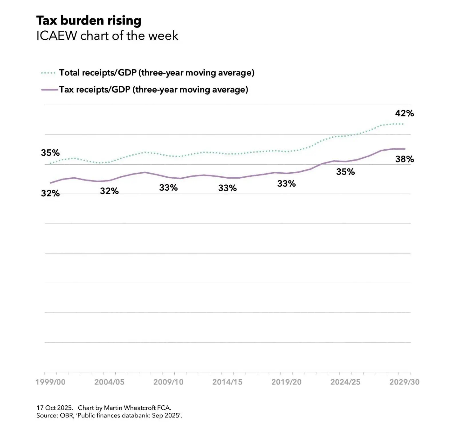
My chart for ICAEW this week shows how tax receipts as a proportion of national income have risen significantly since the turn of the century, begging the question as to whether taxes are too high or the UK economy is too small?
My chart of the week for ICAEW illustrates how tax receipts as a percentage of GDP averaged 32% over the three years to 1999/00, 32% to 2004/05, 33% to 2009/10, 33% to 2014/15, 33% to 2019/20, 35% to 2024/25 and are projected to hit 38% over the three years to 2029/30, based on data from the Office for Budget Responsibilities’ public finances databank for September 2025.
The chart also shows how total receipts including non-tax income averaged 35% in the three years to 1999/00 and a projected 42% to 2029/30.
The one caveat to these percentages is that they do not reflect recent revisions by the Office for National Statistics that increase GDP by the order of 1% across multiple years, which will cause the reported percentages to be a little smaller when they are recalculated by the OBR for the Autumn Budget 2025.
Either way, a projected rise of approaching 20% in the proportion of the economy taken in taxes since the end of last century is pretty significant, even if the projected tax burden will be lower than those of many countries in Europe.
The chart doesn’t show public spending as a proportion of national income. This averaged 35% of GDP over the three years to 1999/00 and 45% of GDP over the three years to 2024/25, with more people growing older driving up the cost of pensions, health and social care significantly and a much higher bill for debt interest being two of the main factors driving up costs.
Public spending as a share of national income is projected to fall slightly to an average of 44% over the three years to 2029/30 as the government tries to reduce the shortfall between total receipts and spending (aka the deficit) through a combination of higher taxes (as announced in the Autumn Budget 2024) and some constraint in public spending over the next five years.
Unfortunately, a lack of fiscal headroom, a disappointing economic outlook, and cost pressures are now expected to lead the Chancellor to increase taxes even further in the Autumn Budget 2025. This suggests that taxes may be too low, at least if the government is to deliver the level of public services and welfare provision it is committed to.
If taxes are not too high, then the problem must be that the economy is too small. This is evidenced by low productivity growth since the financial crisis and successive economic shocks that have together resulted in a UK economy that has not grown at anywhere near the speed it might have.
If tax cuts are unlikely, at least in the medium-term, the principal route to reduce the tax burden must be to drive up economic growth, as called for in ICAEW’s business growth campaign. This calls for the government to focus on business growth by addressing the many factors that make it too uncertain, too difficult and too expensive to do business in the UK.
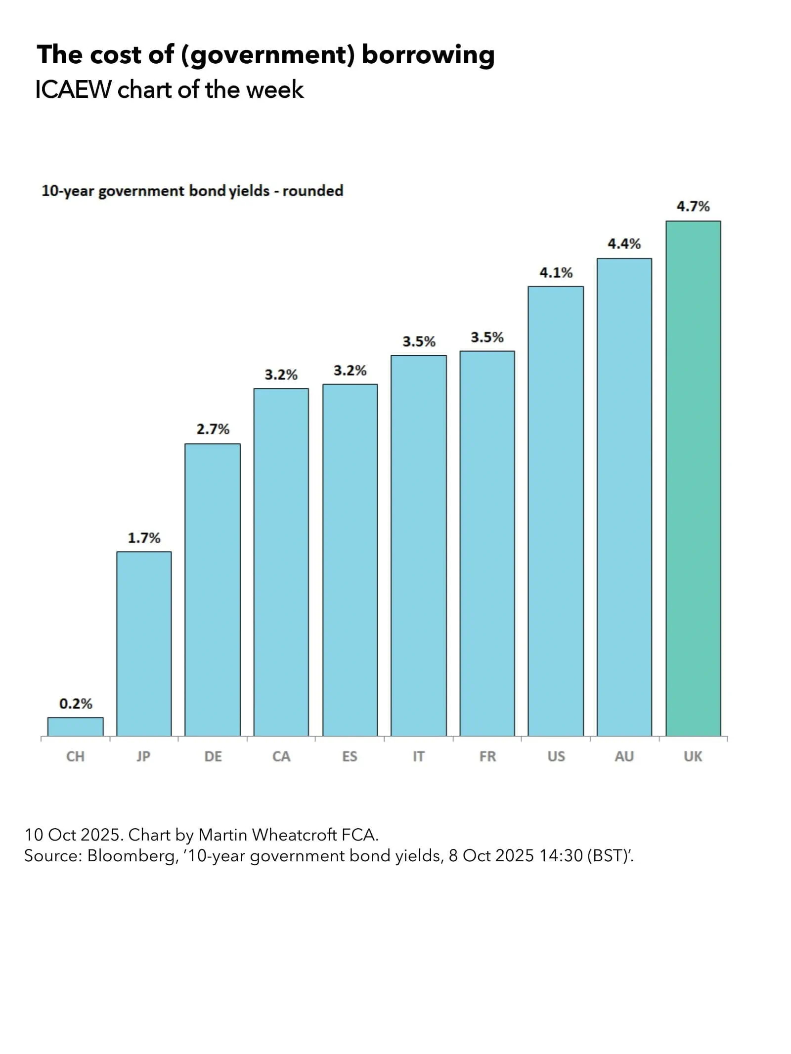
My chart for ICAEW this week looks at the cost of government borrowing by country based on 10-year government bond yields.
The calculated yield on 10-year UK government gilts on Wednesday 8 October 2025 at around 13:00 BST was 4.7% – the effective interest rate the government would need to pay if it had issued new debt at that time.
As my chart of the week for ICAEW illustrates, the UK now has the highest government borrowing cost among developed countries, compared with Switzerland 0.2%, Japan 1.7%, Germany 2.7%, Canada 3.2%, Spain 3.2%, Italy 3.5%, France 3.5%, the US 4.1% and Australia 4.4%.
With debt interest running at around 10% of total public expenditure, the cost of borrowing is a major issue for the Chancellor as she puts together the Autumn Budget 2025.
Reasons for the relatively high borrowing costs in the UK include persistently high inflation, growing public debt, an uncertain economic and fiscal outlook, the Bank of England’s quantitative tightening programme of selling its quantitative easing gilt holdings into the market, and reduced demand from debt investors.
This contrasts with Switzerland, where a strong currency, low public debt (around 37% of GDP), low inflation, and a lower-than-expected forecast for the fiscal deficit in 2025 permits the government to pay almost nothing to borrow at the moment.
Eurozone countries also pay less than the UK, even those with high debt levels such as Italy and France, with lower inflation (2.0% vs 3.8% in the UK in August 2025) being a major driver of lower yields on 10-year government bonds. Canada, with much stronger public finances than most developed countries but rising inflation and trade concerns, is paying more than Germany but approximately the same as Spain.
The US is currently paying 4.1% for new federal government borrowing, with rising inflation and growing fiscal deficits all contributing to a higher risk profile for debt investors. Australia is paying slightly more than the US despite much stronger public finances as it struggles to bring down inflation (3.0% in the year to August 2025).
Not shown on the chart are other countries with lower 10-year borrowing costs than the UK such as Singapore at 1.8%, the Netherlands at 2.8%, South Korea at 2.9%, Portugal at 3.1%, Greece at 3.3%, and New Zealand at 4.2%. There also countries with higher 10-year borrowing costs, including India at 6.5%, Mexico at 8.8%, and Brazil at 14.0%.
For the UK, the headlines have tended to focus on the 5.5% yield payable on 30-year government gilts, but in practice the Debt Management Office is currently issuing very little long-dated debt. The majority of gilts by value are being issued for less than 10 years, reflecting an expectation (or hope) that medium- and long-term borrowing costs will come down over the next few years as inflation returns to target and the volume of quantitative tightening slows.
A substantial proportion of the £3.2tn that the UK public sector current owes (£2.9tn after deducting cash and liquid financial assets) was borrowed when interest rates were much lower, meaning the government is currently paying somewhere in the region of 3% on its debts overall.
Unfortunately, the need to issue £1.3tn in new debt over the next five years (around half to refinance existing debt as it falls due for repayment and another half to finance planned fiscal deficits, lending and working capital requirements) means that the average weighted effective interest rate on UK debt is likely to increase even as the Bank of England base rate (currently 4.0%) is expected to come down.
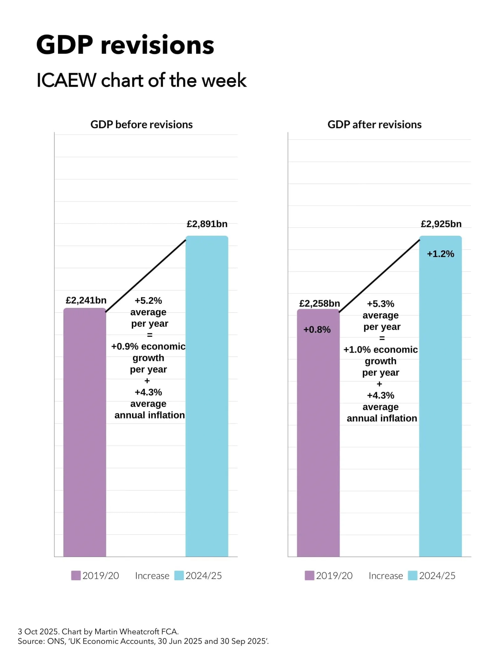
My chart for ICAEW this week looks at how a large upward revision in GDP for 2024/25 translates into a relatively modest 0.1 percentage point increase in economic growth per year since the pandemic.
On 30 September, the Office for National Statistics (ONS) published its latest quarterly GDP statistics for April to June 2025. The headline pointed to a slowdown in quarterly economic growth to 0.3% over that period, down from 0.7% growth in the first quarter of the year. However, more significant was a large revision that increased reported GDP for the year to March 2025 (2024/25) by 1.2%, taking it from £2,891bn to £2,925bn.
The ONS also revised GDP for previous years, including a 0.8% upward revision in reported GDP for 2019/20 from £2,241bn to £2,258bn.
My chart for ICAEW this week illustrates how this resulted in the increase in GDP over the five years to 2024/25, going from an average of 5.2% a year in GDP before revisions, to 5.3% a year after revisions. As inflation is similar before and after the revisions (at an average of 4.3% per year), this means that average annual real economic growth over the past five years has been revised up by 0.1 percentage points from 0.9% a year to 1.0% a year.
While the effect on economic growth over the past five years has been relatively modest, it will knock off at least a percentage point from the public sector net debt to GDP ratio – all without the Chancellor needing to lift a finger.
The statistical revisions reflect the typical process of updating historical numbers for more recent data, such as corporation tax returns that reported higher corporate profits than originally estimated and higher estimates of educational output, business inflation and output of pharmaceutical companies. However, the largest revision was a methodology change that increased the estimate of investment in research and development by approximately 1 percentage point of GDP, bringing the UK more in line with comparable countries in the developed world.
Unfortunately, even with this statistical boost to research and development, the UK still underperforms compared with the US, where economic growth since before the pandemic has been more than twice as fast, as well as lagging (albeit slightly) behind the Eurozone.
ICAEW’s business growth campaign has identified how it has become increasingly too uncertain, too difficult and too expensive to do business in the UK and calls for fundamental reform of tax, regulation and economic policy to support stronger business growth going forward.
Read more in ICAEW’s recommendations on how we can tackle the barriers to improving productivity in our business growth campaign.
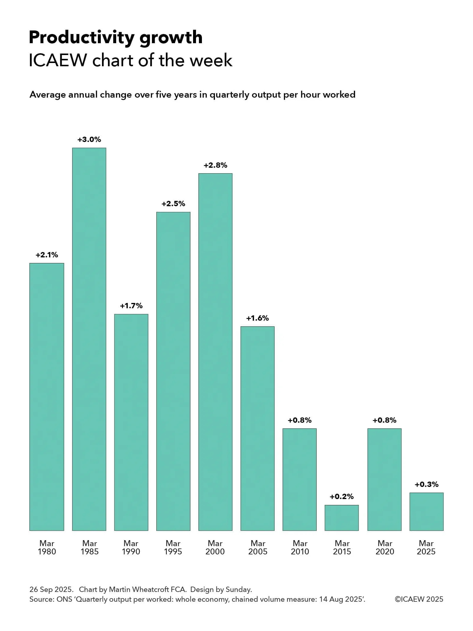
My chart for ICAEW this week looks at how productivity growth has slowed significantly over the past quarter of a century and asks what can be done to turn it around.
One of the biggest challenges facing the UK economy is the decline in productivity growth over the past quarter of a century as illustrated by my chart of the week for ICAEW. This shows how the average annual change over five years in quarterly output per hours worked in March 1980 was the equivalent of 2.1% a year higher than it was in the quarter to March 1975, five years earlier.
The chart also shows how output per hour rose by an annual average of 3.0% a year to March 1985, 1.7% to March 1990, 2.5% to March 1995, and 2.8% to March 2000.
Unfortunately, productivity growth has declined since then with quarterly output per hour increasing by an average of 1.6% a year over the five years to March 2005, 0.8% to March 2010, 0.2% to March 2015, 0.8% to March 2020 and 0.3% to March 2025.
These percentages go a long way to summarising how the UK economy has stalled since the start of the century, especially from the start of the financial crisis in 2007 through the austerity years, Brexit, the pandemic and the energy and cost-of-living crisis. We are producing less value per hour worked even as the population has grown and technology has further advanced.
While the crises we have gone through may partly explain some of the reduction in historical productivity growth over the last quarter of a century, the big question worrying many economists is why productivity has not returned to anywhere close to the levels seen before the turn of the century, or to even to those seen in the USA where, until recently, productivity growth has continued to hold up despite everything.
The Office for Budget Responsibility’s (OBR) most recent economic and fiscal forecast published in March 2025 was based on a central assumption of productivity growth averaging around 1.0% a year over five years to March 2030, significantly lower than the levels seen in the last century. There have been suggestions that the OBR intends to reduce this assumption when it updates its forecasts for the Autumn Budget 2025 in November, adding to the Chancellor’s headaches when she arrives at the despatch box.
One reason for the much lower levels of productivity growth this century may be the demographic change that has resulted in a much higher proportion of the population in retirement and a much older workforce on average. Another may be a question about whether the advent of the smart phone and ‘always on’ connectivity to the office has actually hindered rather than helped people be productive. A further reason could be the increasingly dire state of the public finances with debt rising from less than 35% of GDP in March 2005 to close to 95% of GDP, hampering the government’s ability to deliver the public services we need to thrive, in addition to raising the tax burden to historically high levels.
However, many of the reasons are likely to be driven by the challenges identified by ICAEW’s business growth campaign. This has identified how it has become increasingly too uncertain, too difficult, and too expensive to do business in the UK and calls for fundamental reform of tax, regulation and economic policy to support stronger business growth going forward.
Read more in ICAEW’s recommendations on how we can tackle the barriers to improving productivity in ICAEW’s business growth campaign.
Weaker receipts than expected combined with prior month corrections resulted in a £12bn year-to-date budget overrun in the August monthly public finances.
The monthly public sector finances release for August 2025 published by the Office for National Statistics (ONS) on 19 September reported a provisional shortfall between receipts and total public spending of £18bn in August 2025 and £84bn for the five months then ended. These were £6bn and £12bn over budget respectively and £4bn and £16bn higher than in the same periods in 2024.
Martin Wheatcroft, external adviser on public finances to ICAEW, says: “This month’s public finance numbers took a turn for the worse as not only did weaker than expected receipts drive a £6bn budget overrun in August, but revisions to prior months added a further £6bn to the deficit to turn a broadly neutral position a month ago into a £12bn year-to-date budget overrun for the first five months of the 2025/26 financial year.
“These numbers are far from helpful to a Chancellor in desperate need of some good financial news, adding to the prospect of even higher tax rises in the Autumn Budget 2025 than previously feared.”
Month of August 2025
Receipts of £93bn in August 2025 were £5bn or 5% higher than the same month last year, while total public spending was £111bn, £8bn or 8% more than in August 2024. The latter can be analysed between current spending including depreciation of £107bn, slightly below the £108bn monthly average in the first four months of the financial year, and net investment of £4bn, in line with the monthly average incurred between April and July 2025.
Excluding net investment, the current budget deficit for the month of £14bn represented a £4bn deterioration over the current budget deficit of £10bn in the same month last year, highlighting how receipts have failed to keep pace with increases in current spending.
The overall £18bn fiscal deficit for the month was £6bn over budget and £4bn more than in August 2024.
Five months to August 2025
Table 1 highlights how year-to-date receipts of £477bn were up 6% on last year’s equivalents. This included income tax receipts, up 8% from a combination of inflation and fiscal drag from frozen tax allowances, and national insurance receipts, up 18% as a consequence of the increase in employer national insurance from April 2025. VAT receipts were flat year-on-year, in effect a 3% to 4% fall after taking account of consumer price inflation, highlighting the weak economic conditions facing the UK.
Meanwhile, the 8% increase over last year in current spending including depreciation to £539bn in the first five months to August 2025 has principally been driven by public sector pay rises, higher supplier costs, and the uprating of welfare benefits.
This included a £7bn or 12% increase in debt interest to £64bn, which comprised a £6bn increase in indexation on inflation-linked debt as inflation resurged and a £1bn increase in interest on variable and fixed-interest debt. The latter reflects a higher level of debt compared with a year ago being partially offset by a lower Bank of England base rate.
The resulting current budget deficit of £62bn to August 2025 was 29% higher than the £48bn for the same five months last year, a major concern given that the government’s plan was to reduce the cumulative current budget deficit to £47bn at this point.
Net investment of £22bn in the first five months of 2025/26 was £2bn or 10% higher than the same period last year with capital expenditure of £39bn up by £3bn and capital transfers (capital grants, research and development funding, and student loan write-offs) of £13bn up by £1bn, offset by depreciation of £30bn up by £2bn.
The overall provisional deficit for the five months to August 2025 of £84bn is £16bn or 24% more than in the same five months last year and £12bn higher than budget. The latter can be analysed as a £15bn budget overrun on current receipts less current spending for the year-to-date, less a £3bn saving on net investment.
Table 1: Summary receipts and spending
5 months to Aug
2025/26 £bn
2024/25 £bn
Change %
Income tax
122
113
+8%
VAT
84
84
–
National insurance
80
68
+18%
Corporation tax
43
40
+7%
Other taxes
96
93
+3%
Other receipts
52
51
+2%
Current receipts
477
449
+6%
Public services
(301)
(276)
+9%
Welfare
(129)
(122)
+6%
Subsidies
(15)
(14)
+7%
Debt interest
(64)
(57)
+12%
Depreciation
(30)
(28)
+7%
Current spending
(539)
(497)
+8%
Current deficit
(62)
(48)
+29%
Net investment
(22)
(20)
+10%
Deficit
(84)
(68)
+24%
Borrowing and debt
Table 2 summarises how the government borrowed £99bn in the first five months of the financial year to take public sector net debt to a provisional £2,909bn on 31 August 2025. This comprised £84bn in public sector net borrowing (PSNB) to fund the deficit and a further £15bn to fund government lending and working capital requirements.
The table also illustrates how the debt to GDP ratio increased by 1.6 percentage points from 94.8% of GDP at the start of the financial year to 96.4% on 31 August 2025, with incremental borrowing of £99bn, equivalent to 3.3% of GDP, being partly offset by 1.7 percentage points from the ‘inflating away’ effect of inflation and economic growth adding to GDP, the denominator in the net debt to GDP ratio.
Table 2: Public sector net debt and net debt/GDP
5 months to Aug
2025/26 £bn
2024/25 £bn
PSNB
84
68
Other borrowing
15
7
Net change
99
75
Opening net debt
2,810
2,686
Closing net debt
2,909
2,761
PSNB/GDP
2.8%
2.4%
Other/GDP
0.5%
0.2%
Inflating away
(1.7%)
(2.3%)
Net change
1.6%
0.3%
Opening net debt/GDP
94.8%
95.6%
Closing net debt/GDP
96.4%
95.9%
Public sector net debt on 31 August 2025 of £2,909bn comprised gross debt of £3,339bn less cash and other liquid financial assets of £430bn.
Public sector net financial liabilities were £2,550bn, comprising net debt of £2,909bn plus other financial liabilities of £715bn less illiquid financial assets of £1,074bn.
Public sector negative net worth was £893bn, being net financial liabilities of £2,550bn less non-financial assets of £1,657bn.
Revisions
Caution is needed with respect to the numbers published by the ONS, which are repeatedly revised as estimates are refined and gaps in the underlying data are filled. This includes local government, where the numbers are only updated in arrears and are based on budget or high-level estimates in the absence of monthly data collection.
This month was no different, with the ONS revising the previously reported deficit for the four months to July 2025 up by £6bn, as well as updating prior year numbers for the annual results of the Bank of England and several other public bodies as well as other typical annual updates such as revised student loan calculations.
More significantly, the ONS revised reported deficits back to 1998 for methodology and classification changes and back to 2011 for local government outturn numbers that had not previously been incorporated. The reported deficits for 2020/21 and 2021/22 were decreased by £3bn and £2bn to £311bn and £120bn respectively, 2022/23 remained unchanged at £127bn, 2023/24 was increased by £2bn to £134bn, and 2024/25 was reduced by £2bn to £146bn.
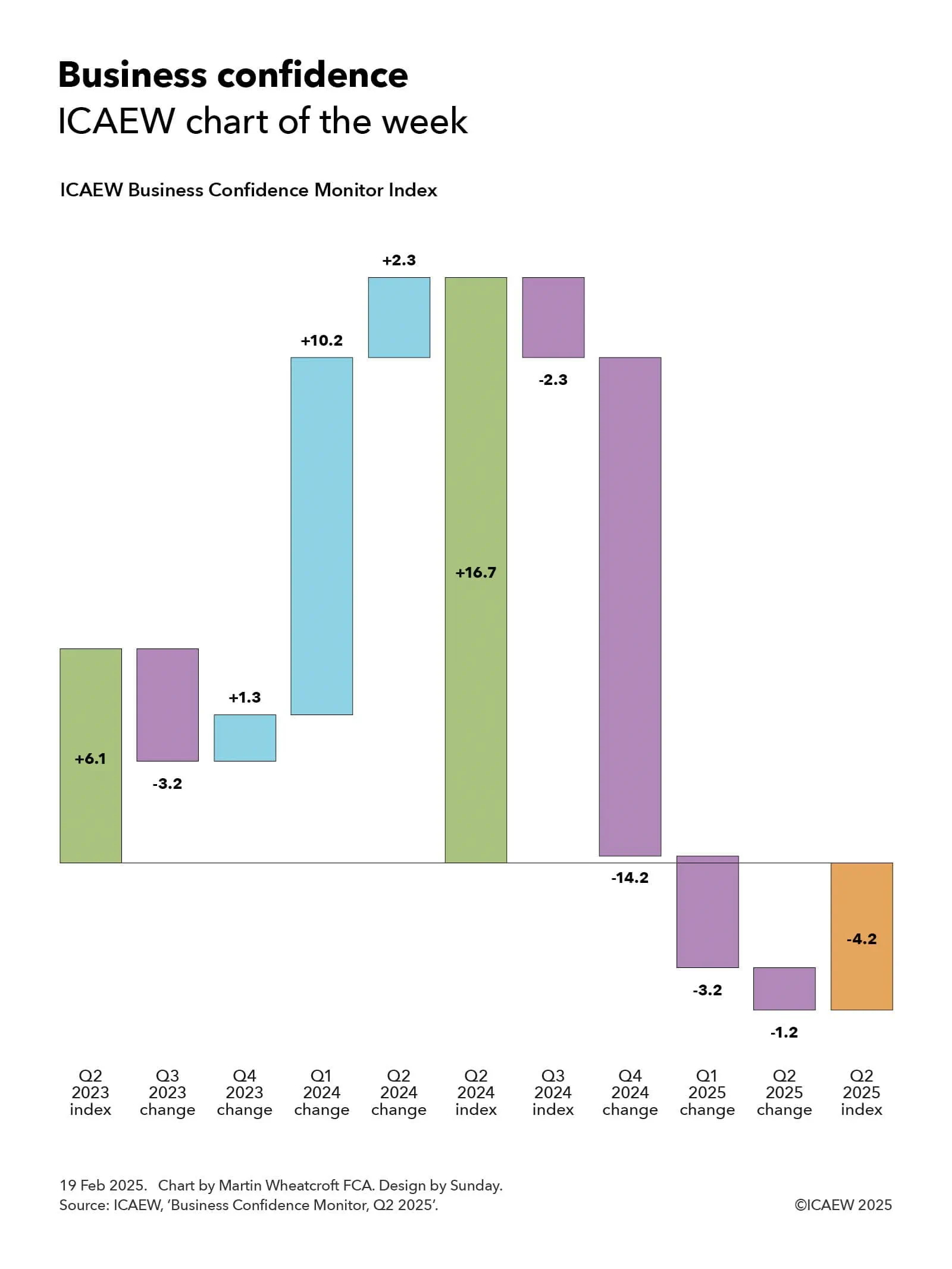
My chart for ICAEW this week looks at how business confidence has entered negative territory, driven by uncertainty about both the economic outlook and potential tax rises.
One of the major themes of ICAEW’s growth campaign is how uncertainty for businesses can be tackled in order to improve business sentiment and hence the appetite of businesses to invest.
My chart for ICAEW this week highlights how business confidence as measured by the ICAEW Business Confidence Monitor (BCM) Index rose from +6.1 in the second quarter 2023 to +16.7 a year later, before crashing over the past year to -4.2 in Q2 2025.
The +6.1 score in Q2 2023 was a significant improvement over the -20.1 registered half a year earlier in Q4 2022 at the height of the cost-of-living crisis. It was also better than the +4.1 pre-pandemic average and +5.0 overall average measured by the BCM Index.
As the chart shows, the index declined in Q3 2023 by -3.2 (to 2.9) but then rose by 1.3 in Q4 2023 (to 4.2), by 10.2 in Q1 2024 (to 14.4), and by a further 2.3 in the second quarter of 2024 to reach a peak of 16.7 following the general election and the consequent change in government.
Unfortunately, business sentiment has declined rapidly over the past year, with the BCM Index falling by 2.3 in Q3 2024 (back to 14.4) and by a huge 14.2 in the fourth quarter last year (to 0.2, only just positive). The index turned negative this year with a decline of 3.2 in Q1 2025 (to -3.0) and then a further fall of 1.2 in Q2 2025 to reach a score of -4.2 in the most recent calendar quarter.
According to the BCM commentary, the business sentiment score of -4.2 in Q2 2025 marked a fourth consecutive decline during a period of heightened global uncertainty and weakening UK activity. Confidence among exporters was particularly downbeat, falling into negative territory for the first time in almost three years.
Domestic sales growth had slowed during the second quarter and businesses had lowered their expectations about domestic and exports sales for the coming year. Concerns about customer demand and competition in the marketplace had risen sharply, while regulatory requirements continued to be the second biggest challenge for businesses.
The tax burden remained the greatest growing challenge in Q2 2025, with the reported rate close to the survey high, and these concerns rose to new record highs in some key sectors.
Expectations for employment growth in the year ahead dropped to the lowest level since Q3 2020, but businesses expected salary growth to continue to ease, adding to the more positive outlook for inflationary pressures than reported in the previous quarter.
Confidence declined in most sectors surveyed and sentiment remained highly unequal, with confidence most negative in manufacturing and engineering, and retail and wholesale; and most positive in information and communication, and construction.
More detail about business confidence by sector and by regions is available in the ICAEW Business Confidence Monitor section of the ICAEW website.
More detail on how it is too difficult, expensive and uncertain to do business in the UK, and ICAEW’s call for the government to do what it can to streamline regulations, reduce unnecessary costs, and provide businesses with the confidence that they need to invest, is available on ICAEW’s growth campaign.
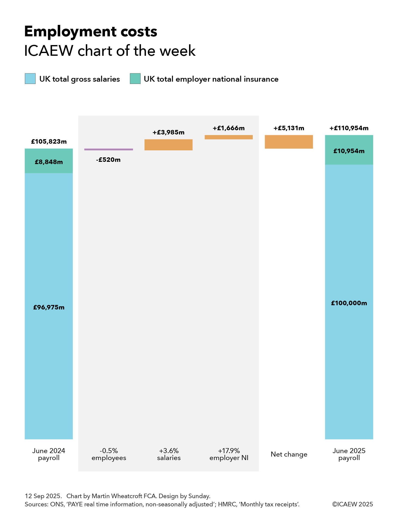
My chart for ICAEW this week looks at how employment costs in June 2025 have risen by 4.8% compared with the same month last year, adding to the expense of doing business in the UK.
According to the Office for National Statistics (ONS) and His Majesty’s Revenue and Customs (HMRC), UK employers paid a total of £111bn in gross salaries and employer national insurance in June 2025, an increase of £5.1bn or 4.8% over the same month a year ago.
My chart this week starts with the payroll in June 2024 of £105,823, comprising gross salaries paid by employers of £96,975m and employer national insurance of £8,848m, although it excludes employer pension contributions.
This monthly cost was reduced by £520m from a reduction in the national workforce, which saw the number of payrolled employees drop by 149,937 or 0.5% from 30,532,600 in June 2024 to 30,382,663 in June 2025. This arose from 7,296,859 leavers exceeding 7,146,922 joiners, most of which are people moving jobs. The reduction in the number of payrolled employees at a time of still-rising overall population numbers highlights the difficult economic situation currently facing the UK. The reduction comprised £476m in less pay and £44m in less employer national insurance (calculated at last year’s rates)
Salary increases since last year of approximately 3.6% added £3,985m or 3.8% to the cost of employment, with mean salaries increasing from £3,176 in the month of June 2024 to £3,291 in the month of June 2025. This comprised an increase of £3,501m or 3.6% in gross salaries and an estimated increase in employer national insurance of £484m or 5.5% (based on last year’s rates).
The median monthly salary increased from £2,389 in June 2024 to £2,530 in June 2025, which is a 5.9% increase compared with a year previously. This was less than monthly pay at the 25th percentile, which increased by 7.8% from £1,408 to £1,518, which was partly driven by a 6.7% increase in the minimum wage implemented in April 2025 (16.3% for those aged 18 to 20 and 18% for those aged under 18) that help lift the salaries of lower paid workers.
Pay at the 75th percentile increased by 4.7% (from £3,632 to £3,803) compared with a year previously, while pay at the 95th and 99th percentiles increased by 3.1% (from £7,461 to £7,692) and 2.6% (from £15,181 to £15,583) respectively. These lower rates of increase for higher paid workers primarily relate to base pay and so do not tell the full story as bonuses and other variable compensation for 2025 will in most cases not show up in pay packets until early next year.
A further £1,666m or 1.5% was added to the total cost of employment as a consequence of changes in employer national insurance effective from April 2025. These took the rate payable by employers from 13.8% of salaries over £792 a month to 15.0% of salaries above £417 per month, adding an extra 17.9% to the amount paid in employer national insurance after taking account of changes in the number of payrolled employees and salary increases since last year. Just under half of the increase (£808m) resulted from the change in the main rate of employer national insurance going up from 13.8% to 15.0% on salaries above £792 a month, with the balance (£858m) coming from lowering the threshold at which the 15.0% applies to £417 per month.
The overall effect was a net increase of £5,131m or 4.8% in total pay and employer national insurance to £110,954m in June 2025, comprising a net increase of £3,025m or 3.1% in total gross salaries to £100,000m and a net increase of £2,106m or 23.8% in employer national insurance to £10,954m.
The chart does not reflect the full cost of employment as it does not include employer pension contributions, non-payrolled benefits, and employment-related costs such as facilities, equipment, training and travel amongst others. However, it still gives a useful illustration of how payroll costs have changed significantly over the course of one year.
ICAEW’s growth campaign identifies how it is too difficult, expensive and uncertain to do business in the UK and calls for the government to do what it can to streamline regulations, reduce unnecessary costs, and provide businesses with the confidence they need to invest.