Our chart this week looks at trade with the US in light of the 10% tariffs imposed on the UK by President Trump on ‘liberation day’.
According to the UK Department for Business and Trade, the UK generated a trade surplus of £71bn during the four quarters ended 30 September 2024, being the difference between seasonally adjusted numbers for exports of £182bn from the UK to the US less imports from the US into the UK of £111bn.
As our chart of the week highlights, goods exports to and imports from the US comprised £58bn and £56bn respectively, while services exports to and imports from the US were £124bn and £55bn.
The trade surplus with the US of £71bn for the year to September 2024 can be analysed between a surplus on goods of just under £2bn and a surplus on services of slightly more than £69bn, according to the statistics collected by the UK Office for National Statistics (ONS).
The £2bn surplus on goods in favour of the UK contrasts with the corresponding US statistics, which report a trade surplus in goods in favour of the US of $12bn (£9bn) in 2024, based on exports from the US to the UK of $80bn (£62bn) less imports from the UK into the US of $68bn (£53bn).
According to non-seasonally adjusted data from the ONS, goods exports to the US in the four quarters to September 2024 totalled £60bn (£2bn more than the £58bn shown in the chart), comprising £37bn in manufactured goods (including £8bn cars, £5bn engines and £2bn aircraft), £7bn pharmaceuticals, £5bn other chemicals, £3bn metals, £3bn food, drink and tobacco, £3bn oil, and £2bn other goods and materials.
Meanwhile non-seasonally adjusted data on goods imports from the US in the same period of £57bn (£1bn more than in the chart) comprised £25bn manufactured goods (including £6bn engines, £3bn aircraft and £1bn cars), £15bn oil and gas, £4bn pharmaceuticals, £4bn other chemicals, £2bn metals, £1bn food, drinks and tobacco, and £6bn of other goods and materials.
The US is the UK’s biggest individual trading partner, with exports to the US representing 22% of total UK exports (goods: 16% of total goods exports; services: 27% of total services exports) and imports representing 13% of total imports (goods: 10% of total goods imports; services: 19% of total services imports).
These numbers compare with the UK’s trade with the EU in the year to September 2024, where exports to the EU were £346bn or 41% of total exports (goods: £178bn or 48% of total goods exports; services: £168bn or 36% of total services exports) and imports from the EU were £445bn or 52% of total imports (goods: £312bn or 55% of total goods imports; services: £133bn or 45% of total services imports).
The UK government was no doubt relieved to have ‘only’ been targeted with 10% tariffs by President Trump. It will also be hopeful that the position of both the UK and US believing they have a small surplus in their goods trade with each other will help in the negotiations for a UK-US trade deal that could potentially see those tariffs lifted.
The government will also be hoping that the global trade war on goods doesn’t affect the UK’s services trade too much, given its importance as an export earner.
Our chart looks ahead to next week’s Spring Statement by looking back at the fiscal forecast prepared by the OBR last October.
There has been some confusion on both the title of next week’s Spring Forecast and whether it will or will not constitute a formal ‘fiscal event’.
Traditionally, each Chancellor of the Exchequer stands up in Parliament twice a year to announce policy decisions on tax, spending and borrowing, and to set out the latest economic and fiscal forecasts, which since 2010 have been prepared by the independent Office for Budget Responsibility (OBR). One of these fiscal events is a ‘Budget’, which involves requesting parliamentary approval of the annual budget for the upcoming financial year, while the alternate has historically been described as a ‘Statement’.
Chancellor Rachel Reeves set out an ambition on taking office for there to be only one fiscal event a year – an Autumn Budget – mostly in the hope of creating a more stable tax system by reducing the frequency of tax changes, but also to provide a more stable budgeting framework for the public sector. However, she is still legally required to present fiscal forecasts to Parliament twice a year, and so HM Treasury’s decision to relabel the second event as a Spring Forecast was originally intended to emphasise that there wouldn’t be any major tax or spending changes between Budgets.
Unfortunately for the Chancellor, weak economic data – and what that implies for the profile of public spending of tax receipts and public spending over the next five years – mean that she has been unable to achieve her hope of a policy-decision-free Spring Forecast on this, her first attempt.
Instead, the government has brought forward from later in the year its anticipated reform of disability benefits to ensure the associated cost savings are reflected in the new OBR forecast, while there are also rumours that she may, for the same reason, revise down the total amount of public spending allocated to this summer’s three-year Spending Review.
The tight fiscal situation is illustrated by our chart this week, which sets out how the current budget balance was expected to turn from deficits of £61bn, £55bn, £26bn and £5bn between 2023/24 and 2026/27 to surpluses of £11bn, £9bn and £10bn between 2027/28 and 2029/30.
Our chart also shows how public sector net investment of £70bn, £72bn, £80bn, £83bn, £83bn, £81bn and £81bn between 2023/24 and 2029/30 added to the current budget balance was expected to result in fiscal deficits of £131bn, £127bn, £106bn, £88bn, £72bn, £72bn and £71bn between 2023/24 and 2029/30 respectively.
The Chancellor’s primary fiscal rule is to achieve a current budget surplus by 2029/30, but the £10bn headroom against this target represents just 0.9% of projected receipts of £1,440bn and 0.7% of projected total managed expenditure of £1,510bn in 2029/30. A deteriorating economic outlook is believed to have seen this headroom evaporate in the working projections presented by the OBR to the Chancellor as part of the Spring Forecast process – at least before taking account of any offsetting decisions by the Chancellor.
Similarly, the Chancellor may also need to take action to ensure that her secondary fiscal rule – for the debt-to-GDP ratio to fall between March 2029 and March 2030 – is met. This test (not shown in the chart) also had a relatively low headroom of £16bn in the Autumn Budget forecast and further changes to government plans may also be required to stay within it.
Many of the references in the media and elsewhere to the Spring Statement next week are likely to be from people who didn’t see the announcement from HM Treasury about the name change. We did get the memo, but on reflection we think sticking with the former title is going to be more appropriate on this occasion.
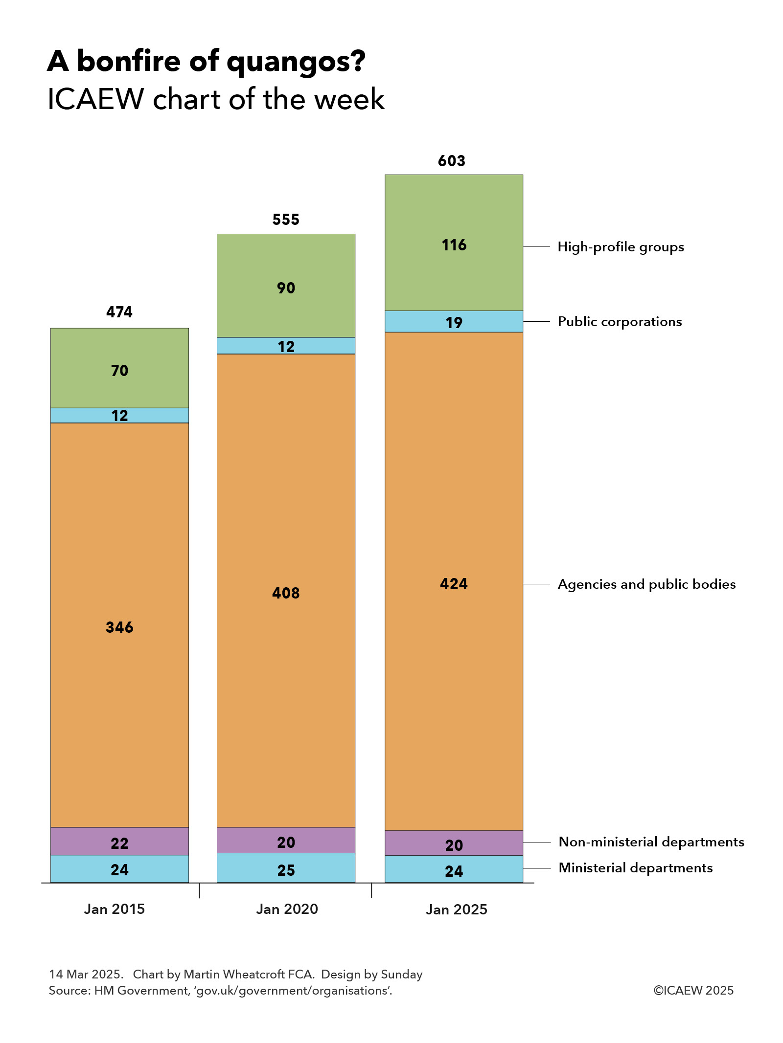
Talk of a ‘bonfire of quangos’ prompted our chart this week to look at how the number of central government public bodies has grown significantly over the past decade.
The prime minister’s recent pledge to tackle the “flabby” state has brought into focus the growth over the past decade in the number of what used to be called quangos (quasi-autonomous non-governmental organisations) but now tend to be described as arms-length public bodies.
Our chart this week is taken from the list of government departments, agencies and public bodies on gov.uk, showing how the number of central government public bodies has grown from 474 in January 2015, to 555 in January 2020 and to 603 in January 2025.
These numbers exclude the three devolved administrations, local authorities, schools, hospitals, police and fire services etc, and so are only a subset of the estimated 10,000 public bodies that exist in the UK. Scottish and Welsh government departments and many Scottish and Welsh public bodies are excluded from the list, but Northern Ireland public bodies are included, presumably because they are run from London during periods when the Northern Ireland executive is suspended.
The number of government departments increased from 24 in 2015 to 25 in 2020 with the creation of the Department for Exiting the European Union (DExEU) and the Department for International Trade (DIT) offset by the merger of the energy and business departments. This fell back to 24 in 2025 following the abolition of DExEU, the merger of the Department for International Development with the Foreign Office, and the merger of DIT with the business department (a reduction of three) offset by the recreation of a separate Department for Energy Security and Net Zero and the establishment of a new Department for Science, Innovation and Technology (an increase of two).
Non-ministerial departments are 20 arms-length bodies that have budgets voted on in Parliament, including the Supreme Court, HM Revenue & Customs, National Savings & Investments, Crown Prosecution Service, National Crime Agency, Serious Fraud Office, Government Legal Department, Government Actuary’s Department, Food Standards Agency, Forestry Commission, HM Land Registry, the National Archives and the UK Statistics Authority, as well as assorted regulators comprising the Charity Commission, Competition and Markets Authority, the Office for Rail and Road, Ofgem, Ofqual, Ofsted and the Water Services Regulation Authority. There were 22 in 2015, but Ordnance Survey was reclassified to be a public corporation, while UK Trade & Investment became part of DIT when it was formed and is now part of the Department for Business and Trade.
The number of agencies and public bodies increased from 346 in January 2015 to 408 in 2020 and 424 in January 2025. These are arms-length public bodies generally funded from government departmental budgets, ranging from the Advisory Committee on the Microbiological Safety of Food, Arts Council England, the British Business Bank, the Civil Nuclear Police Authority and Companies House to the Imperial War Museum, Law Commission, Maritime and Coastguard Agency, National Lottery Heritage Fund, Office for Students, Peak District National Parks Authority, Pubs Code Adjudicator, Rail Accident Investigation Branch, Royal Mint, Sport England, Student Loans Company, UK Atomic Energy Authority, UK Space Agency, and Youth Justice Board for England and Wales, to name but a few.
The increase between 2015 and 2020 was exaggerated by the inclusion of Northern Ireland public bodies and some reclassifications of existing bodies to the public sector, such as Network Rail and the Financial Reporting Council. However, after the cull undertaken by the coalition government between 2010 and 2015, there was a steady pace of new public bodies created, ranging from the Birmingham Organising Committee for the 2022 Commonwealth Games, College of Policing, Commission for Countering Extremism, Independent Anti-Slavery Commissioner to the Oil and Gas Authority (now North Sea Transition Authority), Office of Tax Simplification and the UK Holocaust Memorial Foundation.
Despite the abolition of the Office of Tax Simplification, the number of quangos has continued to rise since 2020, with many more created over the past five years. These have included the Advanced Research and Invention Agency, Electricity Settlements Company, Flood Re, Great British Energy, Incubator for Artificial Intelligence, Infected Blood Compensation Authority, Regulatory Horizons Council and Queen Elizabeth Memorial Committee, among many others.
Our chart also illustrates how the number of public corporations has increased from 12 in January 2015 and 2020 to 19 in January 2025, despite the reclassification of BBC World Service and S4 as agencies. These are self-funded public bodies or publicly owned businesses owned by the state, which in January 2025 comprised the Architects Registration Board, BBC, Channel 4, Civil Aviation Authority, Crossrail International, DfT Operator, Historic Royal Palaces, London and Continental Railways, National Energy System Operator, NEST, National Physical Laboratory, Office for Nuclear Regulation, Oil and Pipelines Agency, Ordnance Survey, Pension Protection Fund, Post Office, Royal Parks, Sheffield Forgemasters and the UK National Nuclear Laboratory.
The remaining category is what are described as high-profile groups, which grew from 70 identified bodies in January 2015 to 90 in January 2020 and 116 in January 2025. These are mostly organisations inside government departments, such as the Defence Infrastructure Organisation and National Space Operations Centre within the Ministry of Defence, HM Passport Office and Immigration Enforcement within the Home Office, and the Office for Product Safety and Standards and Office of Trade Sanctions Implementation within the Department for Business and Trade. This group also includes professions within government, such as the government economic and statistical services, policy, legal, planning, property, security, tax, social research, and science and engineering professions, and the commercial, finance and operational research functions, for example.
The planned bonfire of quangos is likely to find that it is a lot more difficult than it sounds. While it is possible to scrap, merge or reform many of these organisations – whether they meet the definition of a quango or not – almost all of these organisations exist for a reason.
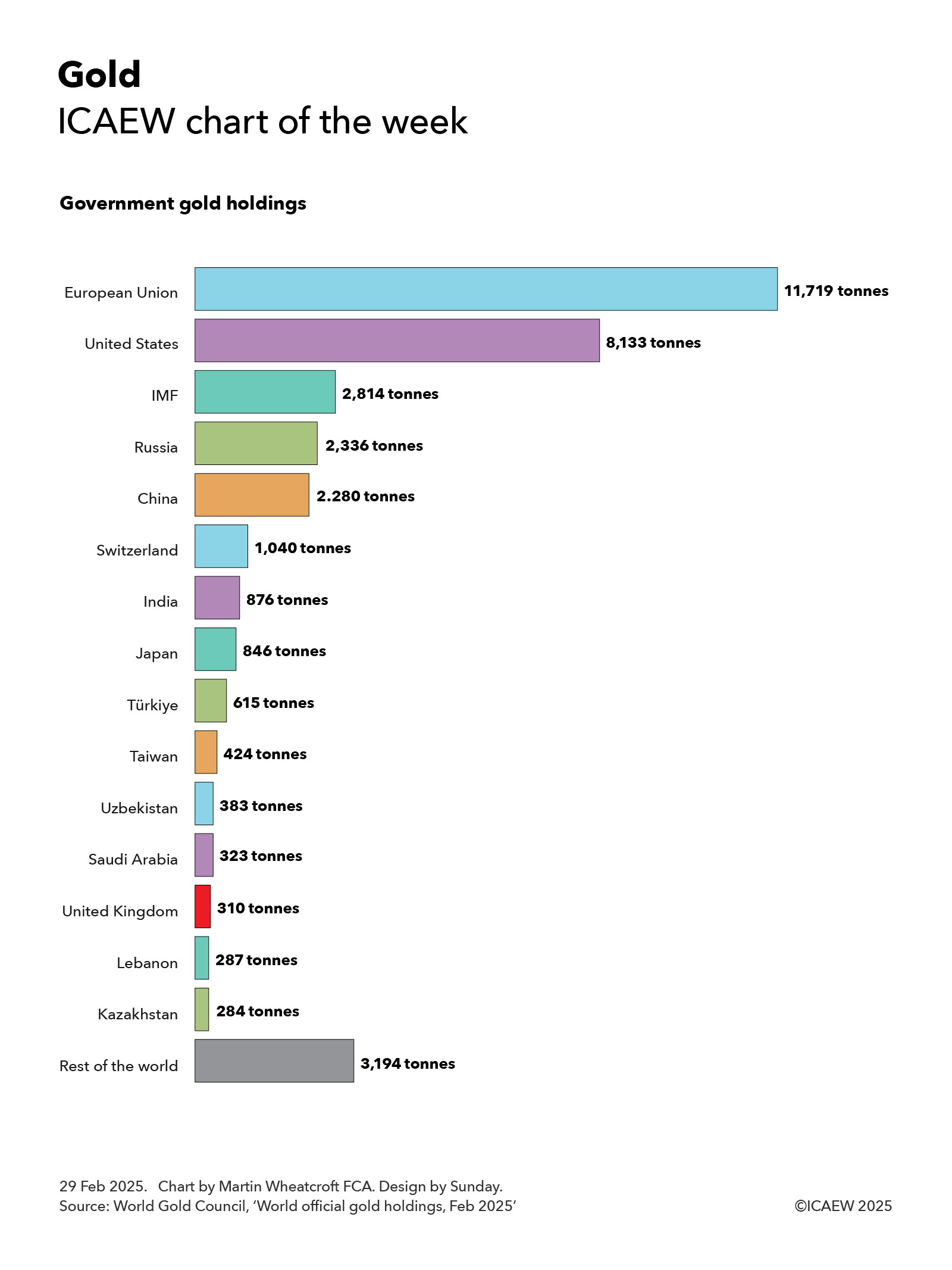
With President Trump planning to visit Fort Knox to check up on the US government’s gold reserves, my chart for ICAEW this week looks at just how much gold is owned by governments around the world.
According to the latest statistics from the World Gold Council, sourced principally from the International Monetary Fund (IMF), governments and international financial institutions around the world own 35,864 tonnes of gold. Much of this gold sits in the Bank of England, Fort Knox and in central bank vaults around the world.
At a price of around £74 per gram, the total value of ‘government gold’ adds up to somewhere in the region of £2.7trn. This is estimated to be around one-sixth of the total above-ground stock of gold in the world.
While the US is the largest individual holder of official gold reserves with 8,133 tonnes of gold worth around £600bn, the 27 countries of the EU and the European Central Bank collectively own a total of 11,719 tonnes of gold worth approximately £870bn. This includes Germany with 3,352 tonnes, Italy 2,452 tonnes, France 2,437 tonnes, Netherlands 615 tonnes, the European Central Bank 507 tonnes, Poland 448 tonnes, Portugal 383 tonnes, Spain 282 tonnes, Austria 280 tonnes, Belgium 227 tonnes, Sweden 126 tonnes, Greece 115 tonnes, Hungary 110 tonnes, Romania 104 tonnes and other EU member states with 281 tonnes.
The next biggest holder of gold is the IMF with 2,814 tonnes (worth around £210bn), followed by Russia with 2,336 tonnes (£175bn), China 2,280 tonnes (£170bn), Switzerland 1,040 tonnes (£77bn), India 876 tonnes (£65bn), Japan 846 tonnes (£63bn), Türkiye 615 tonnes (£46bn), Taiwan 424 tonnes (£31bn), Uzbekistan 383 tonnes (£28bn), Saudi Arabia 323 tonnes (£24bn), the UK 310 tonnes (£23bn), Lebanon 287 tonnes (£21bn) and Kazakhstan 284 tonnes (£21bn).
The total for other countries adds up to 3,194 tonnes worth, or around £235bn or so, including Thailand 235 tonnes, Singapore 220 tonnes, Algeria 174 tonnes, Iraq 163 tonnes, Venezuela 161 tonnes, Libya 147 tonnes, Brazil 130 tonnes, Philippines 130 tonnes, Egypt 127 tonnes, South Africa 125 tonnes, Mexico 120 tonnes, Qatar 111 tonnes, South Korea 104 tonnes and the Bank for International Settlements 102 tonnes.
While the level of official gold holdings is partly driven by the economic size of the countries concerned, it also depends on their reserve strategies, with US, German, French and Italian gold holdings making up around 75%, 74%, 72% and 71% of their official reserves respectively, in contrast with 6%, 9%, 11% and 15% for China, Switzerland, India and the UK, for example.
President Trump’s plan to visit Fort Knox to personally inspect his nation’s gold holdings reflects one of the benefits of investing in a physical commodity such as gold – you can count gold bars, weigh them and check their purity, as well as admire its shiny quality. He may have a less satisfying experience in verifying any future strategic crypto-currency reserve, where entries in a ledger are somewhat more ephemeral.
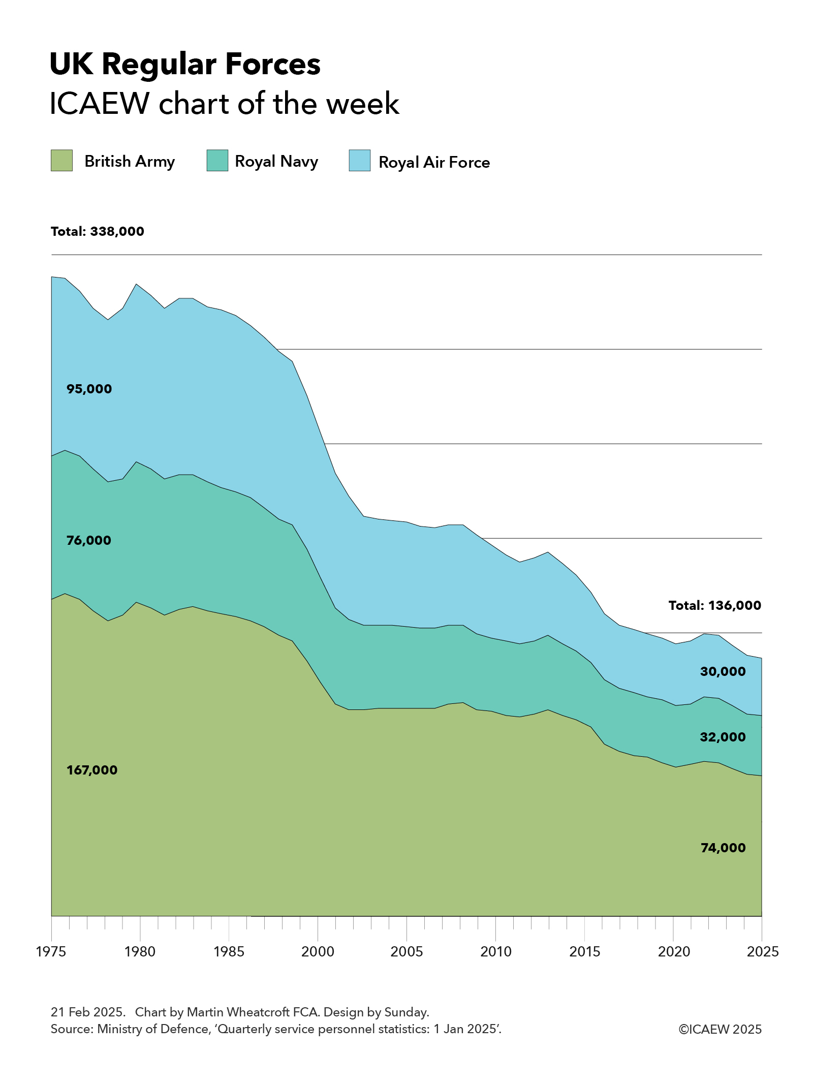
My chart for ICAEW this week illustrates how soldier, sailor and aircrew numbers have fallen from 338,000 fifty years ago to a new low of 136,000 on 1 Jan 2025. Could this be the turning point now that defence spending is back on the agenda?
The latest armed forces personnel statistics published by the Ministry of Defence on 20 February 2025 report that UK Regular Forces fell from 136,861 on 1 October 2024 to 136,117 on 1 January 2025, which we have rounded to 136,000 for the purpose of my chart this week. This is made up of just under 74,000 members of the British Army, just under 32,000 in the Royal Navy, and just over 30,000 in the Royal Air Force (RAF).
These numbers exclude around 4,000 Gurkhas, 32,000 volunteers in the Army, Navy and RAF Reserves (including some who are mobilised) and around 8,500 other military personnel.
This is a significant decline from the 338,000 regular service personnel (167,000 in the British Army, 76,000 in the Royal Navy and 95,000 in the RAF) that were in the UK’s armed forces on 1 April 1975.
While some of this decline is due to automation and a shift of some activities from military to civilian staff, the main reason for the decline has been decisions by government to reduce our military capabilities over the past 50 years. Starting with the ‘peace dividend’ following the end of the Cold War, defence spending has been cut by successive governments to fund an expanding welfare state.
As a result, serving military personnel fell rapidly during the 1990s to reach 208,000 on 1 April 2000 (110,000 in the British Army, 43,000 in the Royal Navy and 55,000 in the RAF). Numbers started to fall again from around 2005, before accelerating downwards during the austerity years of the 2010s, and then again in the past few years following the pandemic and the energy crisis.
Recent debate about the capacity of the British Army to deploy a peacekeeping force to Ukraine has highlighted how few soldiers the UK now has, given our existing commitments and an increasingly concerning international security position.
Overall, the 136,000 UK Regular Forces comprise around 4% of the 3.4 million total military personnel in NATO. In 2024 this comprised 1,300,000 in the US armed forces, 1,383,000 in EU countries who are also members of NATO (including 216,000 Polish, 205,000 French, 186,000 German, 171,000 Greek and 117,000 Spanish soldiers, sailors and aircrew), Türkiye 481,000, UK 138,000 (last year), Canada 77,000 and other non-EU European countries 39,000 (mainly Norway 24,000).
This may not be the nadir for the UK armed forces in terms of military strength, as numbers are likely to continue to fall over the next few quarters. However, the indications are that the UK is likely to switch to a path of increasing both defence spending and the number of soldiers, sailors and aircrew as it responds to calls from the US for European countries to increase their contribution to NATO and, more importantly, to address a much higher international risk environment.
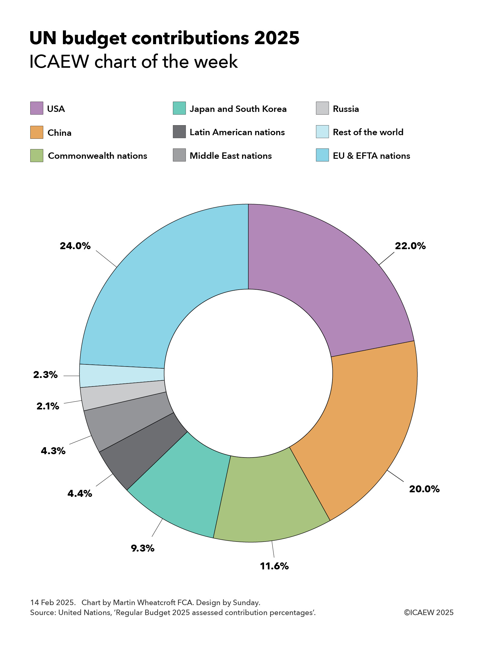
My chart for ICAEW this week looks at the assessed contributions of member states to the United Nations Regular Budget for 2025.
The United Nations is funded through a mix of assessed contributions from member states, voluntary contributions from both member states and others, and revenue generated from operations.
In 2023, total revenue for all UN entities comprised $67.6bn, of which $13.8bn was from assessed contributions, $46.8bn from voluntary contributions ($41.0bn earmarked and $5.8bn non-earmarked), and $7.0bn in revenue from operations.
Of the $13.8bn in assessed contributions from member states, $3.3bn in 2023 was for the core activities of the UN itself and our chart this week illustrates the assessed contribution percentages for 2025 for the $3.4bn UN Regular Budget set for 2025.
This highlights how European Union (EU) and European Free Trade Area (EFTA) nations have been assessed to pay 24.0% of the core budget in 2025, followed by the USA (22.0%), China (20.0%), Commonwealth nations (11.6%), Japan and South Korea (9.3%), Latin American nations (4.4%), Middle East nations (4.3%), Russia (2.1%), and the rest of the world (2.3%).
EU and EFTA national contributions are led by Germany (5.7%), France (3.9%), Italy (2.8%), Spain (1.9%), Netherlands (1.3%), Switzerland (1.0%), Poland (0.8%), Sweden (0.8%), Belgium (0.8%), Norway (0.7%), Austria (0.6%), Denmark (0.5%) and Ireland (0.5%). The remaining 18 EU and EFTA members (and three microstates) are expected to contribute a further 2.7% in 2025.
Of the Commonwealth nations, the UK (4.0%), Canada (2.5%), Australia (2.0%), India (1.1%) and Singapore (0.5%) contributed the most, with the remaining 49 members not including Cyprus and Malta (who are included in the EU in this chart) contributing a further 1.5%.
Japan (6.9%) and Korea (2.4%) are assessed to contribute 9.3% between them, while Latin American nations are down to contribute 4.4%, led by Brazil (1.4%), Mexico (1.1%) and Argentina (0.5%) with 1.4% coming from the rest.
Middle East countries are expected to contribute 4.3% between them, with Saudi Arabia (1.2%), Türkiye (0.7%), Israel (0.6%) and UAE (0.6%) being the largest. Another 11 Middle Eastern nations are down to contribute a further 1.2%.
Russia has been assessed to contribute 2.1%, while countries in the rest of the world are expected to put in a further 2.3%, of which Indonesia (0.6%) is the only one to contribute more than half a percent of the total assessment, with the remaining 68 member states collectively contributing a further 1.7% in total.
The assessed contributions for UN agencies and other activities vary from the percentages shown in the chart as they depend on which countries participate in each agency or activity and several other factors. For example, the US has been assessed to pay 26.2% of the UN peacekeeping budget in 2025 (higher than their 22% regular budget contribution), although the US is expected to pay only 25% because of a cap of 25% set by Congress. The UK and France are expected to pay 4.7% and 4.6% respectively (higher than their 4.0% and 3.9% regular budget contributions), while China has been assessed to pay 18.7% (lower than its 20.0% regular budget contribution).
Another example is the World Trade Organisation (WTO) where the US and China are assessed to contribute 11.4% and 11.2% respectively and most other nations contribute a larger share.
One big question for the UN in 2025 will be the extent to which the new US administration reduces the amount it pays to the UN compared with previous years. The total paid by the US was $13bn in 2023, comprising $3.2bn in assessed contributions and $9.7bn in voluntary contributions.
In theory, if the US leaves a UN agency, such as already announced departures from the World Health Organisation and the UN Human Rights Council, then the assessed contributions for the remaining members can be increased to compensate.
The White House has also announced that it is reviewing its membership of the UN Educational, Scientific and Cultural Organisation and that it will withhold a proportionate share of its regular budget contribution that goes towards the UN Relief and Works Agency for Palestinian Refugees in the Near East.
A bigger question will be the extent to which the US cuts its voluntary contributions to UN programmes. A substantial proportion of these voluntary contributions have traditionally come through the US Agency for International Development, where payments have recently been suspended.
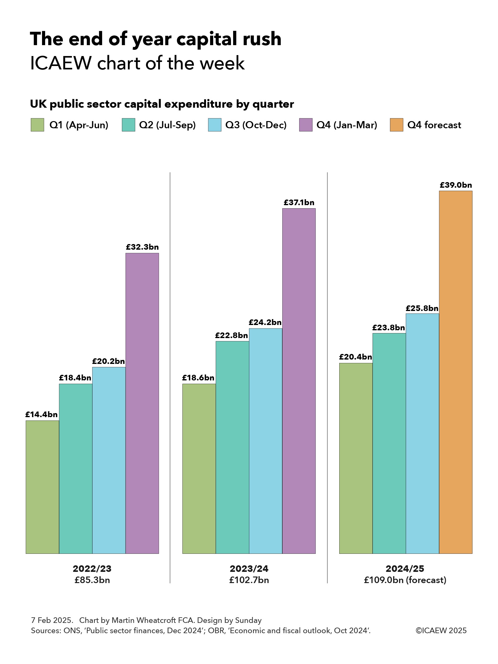
My chart of the week for ICAEW highlights the big rush in UK public sector capital expenditure in the final quarter of each financial year, prompting us to ask why March is the best time of the year to build new assets.
Over the years, the process for delivering capital expenditure in the public sector in the UK has had a pretty bad reputation. The anecdote goes that the first quarter is spent arguing about budgets, in the second everyone goes on holiday, and it is only in the third quarter that programmes finally get up and running, before everything stops for the Christmas break. The final quarter is then a mad rush to spend the remaining budget before the end of the financial year.
Unfortunately, there does appear to be some support for this conjecture when we take a look at the actual numbers.
According to the public sector finance release for December 2024, together with the latest Office for Budget Responsibility forecast for the current financial year to March 2025, public sector gross capital formation (in effect capital expenditure) is lowest in the first quarter, picks up in the second (despite the summer holidays), rises slightly again in the fourth (despite the Christmas break) and then explodes in the fourth quarter of each financial year (despite winter).
Our chart shows capital expenditure in 2022/23 of £85.3bn comprised £14.4bn in Q1 (Apr-Jun), £18.4bn in Q2 (Jul-Sep), £20.2bn in Q3 (Oct-Dec) and £32.3bn in Q4 (Jan-Mar). A similar pattern occurs in 2023/24 when a total £102.7bn of capex was incurred, with £18.6bn in Q1, £22.8bn in Q2, £24.2bn in Q3, and £37.1bn in Q4. Meanwhile in the current 2024/25 financial year, £20.4bn was incurred in Q1, £23.8bn in Q2, and £25.8bn in Q3, with a forecast of £39.0bn in Q4 to reach a forecast total of £109.0bn.
In practice the fourth quarter jump is principally seen in the final month of the financial year, as seen in 2023/24 when fourth quarter capital expenditure of £37.1bn consisted of £9.6bn in January 2024 (£1.0bn more than the monthly average capital expenditure of £8.6bn that financial year), £10.2bn in February 2024 (£1.6bn more than the monthly average), and £17.3bn in March 2024 (£8.7bn more than the monthly average).
This pattern is a stubbornly consistent feature of the public finances in the UK, even after numerous attempts within government to improve capital budgeting and delivery processes. For example, departments are able to carry over some of their capital budgets to future years, which in theory should reduce the incentive to spend every last penny of their allocation in-year. The new spending review process coming into force this summer should also help by setting out a four-year capital budget for 2026/27 to 2029/30, providing much greater forward certainty for investment programmes and (in theory) reducing the concern of future budgets disappearing if the current year budget is not spent in full.
Of course, it is possible that our concerns about the quality of government’s investment delivery process are not fully justified. There could after all be some very good practical reasons as to why March is the best time of the year for carrying out public capital works!
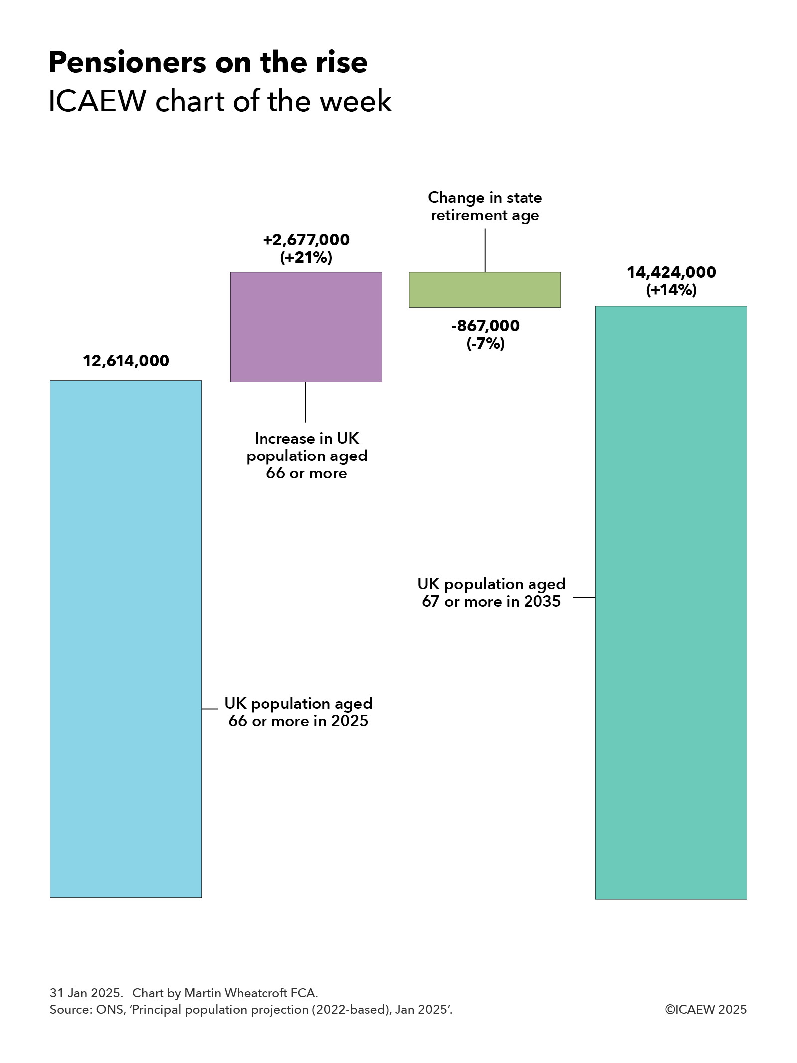
My chart for ICAEW this week highlights how the number of pensioners in the UK is expected to increase by 14% over the next 10 years. This will have major implications for the public finances.
The Office for National Statistics (ONS) published its latest population projections for the UK on 28 January 2025.
Extrapolated from the 2021 Census in England, Wales and Northern Ireland and the 2022 Census in Scotland, the ONS’s principal projection is for the UK population to increase by 5% over the next decade from a projected 69,868,000 in June 2025 to 73,426,000 in June 2035. This is on the basis of 132,000 more deaths than births in total over the next 10 years (6,979,000 versus 6,847,000) and net inward migration of 369,000 a year on average.
Our chart highlights how the number of pensioners is expected to increase by 14% over the next 10 years, from a projected 12,614,000 this summer to 14,424,000 in 2035, despite an increase in the state retirement age from 66 to 67.
The main driver of this increase is an additional 2,677,000 people aged 66 or more, reflecting 8,522,000 people passing the age of 66 over the 10 years to June 2035, plus 28,000 from net inward migration (119,000 in and 91,000 out), less 5,873,000 deaths
This 21% increase is partially offset by a 7% reduction for the 867,000 66-year-olds who will still be waiting for their state pension in June 2035 as a result of the planned rise in the state retirement age from 66 to 67 between 2026 and 2028.
Over the same period the ONS is projecting a 7% fall in the number of children from 12,272,000 in June 2025 to 11,434,000 in June 2035, and a 6% increase in the size of the working age population from 44,982,000 to 47,569,000. The latter would have been a 4% increase if not for the statutory increase in the state pension age to 67.
The ONS stresses that its national population projections are not forecasts and do not attempt to predict potential changes in international migration in particular. It also notes that demographic assumptions for future fertility and mortality are based on observed demographic trends, which is no guarantee that these trends might not change in the future.
Despite those caveats, the projected increase in the number of pensioners is one of the more likely areas of the projections to turn into reality. This is because almost all of those future pensioners are alive today and already living in the country, while mortality rates tend to change gradually over time.
A much more significant factor relates to the ONS’s long-term assumption for net inward migration of 340,000. While this is unlikely to affect the anticipated number of pensioners in a decade’s time, it will have a significant impact on the projected ratio between the number of pensioners and those of working age.
Either way, the projected rise in the number of pensioners compared with the size of the working-age population over the coming decade will have major implications for the public finances.
Tax receipts will fall proportionately as retirees leave the workforce faster than new workers join. State pension payments will increase, even before taking account of the ratchet effect of the pension triple-lock on the amount payable to each pensioner. Health care and adult social care costs will rise substantially given how skewed these costs are to older generations. And pension credit, housing benefit and other welfare benefits that go to poorer pensioners are also likely to increase.
Successive governments, including the current administration, have worked on the basis that they should be able to afford the higher costs of many more people living for longer in retirement through a combination of gradual rises in the state pension age (long hoped for but not delivered), higher levels of economic growth, and cuts in other areas of public spending such as the defence budget.
With the number of pensioners increasing much faster than the government can raise the state pension age (given the decade or more advance notice that needs to be given), relatively low levels of economic growth even in more optimistic scenarios, calls for an increase in the defence budget and significant cost pressures affecting many other public services, the big question will be the extent to which taxes will have to go up even further over the next 10 years if the promises made by successive governments over the last century are to be kept.
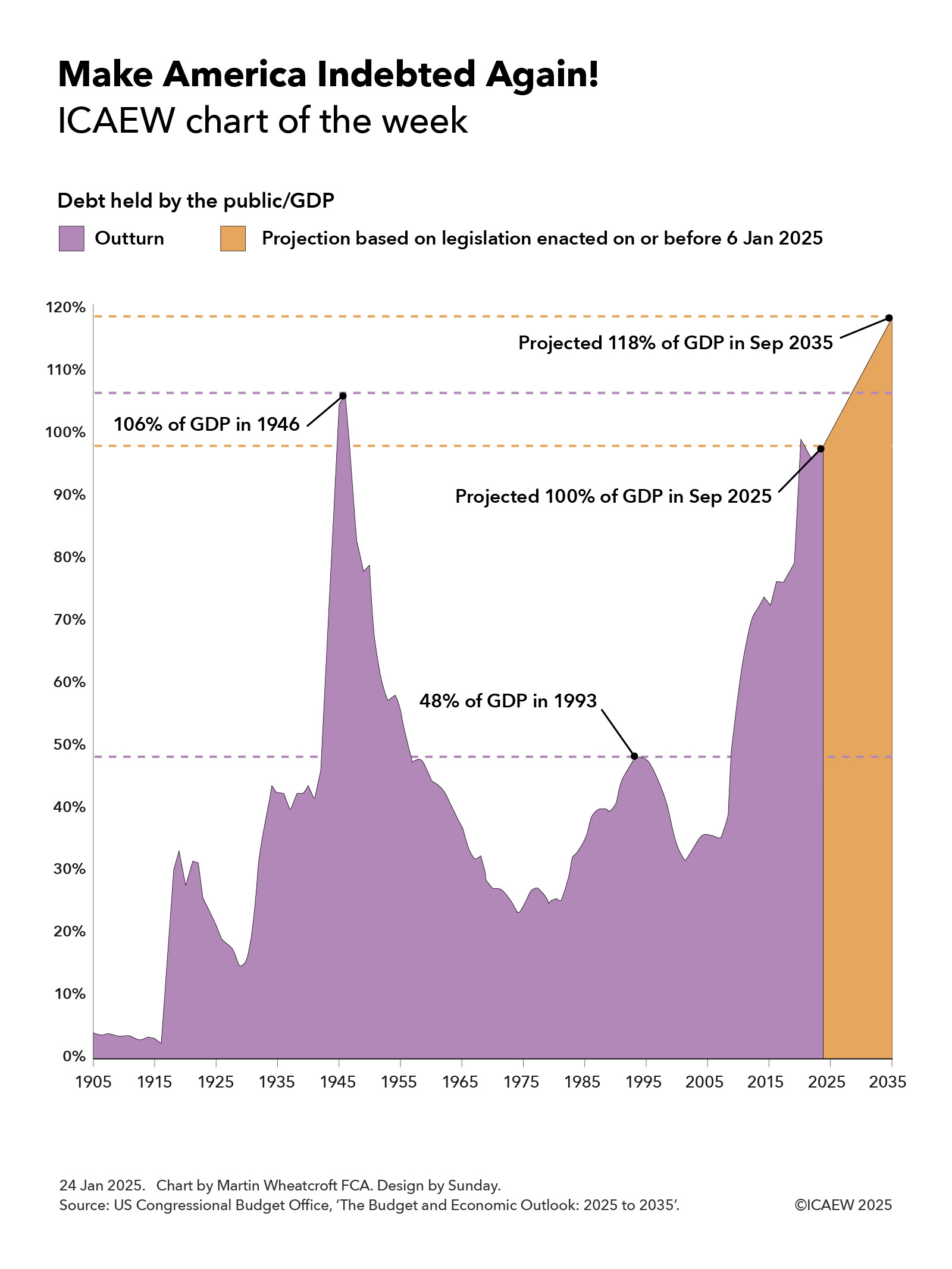
My chart for ICAEW this week looks at official projections, published three days before President Trump was inaugurated for the second time, that predict federal debt is on track to return to and exceed levels last seen in the 1940s.
The US Congressional Budget Office (CBO) published its latest 10-year projections for the US federal government finances on 17 January 2025, covering the decade from 2025 to 2035. These projections are based on legislation enacted up to 6 January 2025, prior to the start of President Trump’s second term as President on 20 January 2025.
As the chart of the week illustrates, debt held by the public in relation to the size of the economy was 4% of GDP in 1905, falling to 3% in 1916 before rising to 33% of GDP as a result of the US entering the First World War. Debt/GDP fell over the subsequent decade to 15% of GDP in 1929 before rising again during the Great Depression to 42% of GDP in 1936. A drop to 40% in 1937 was then followed by a rise to 106% of GDP in 1946 following the end of the Second World War.
A rapidly growing economy over the next quarter of a century or so saw debt inflated away despite a major expansion in the size of the federal government over that period, with debt/GDP falling to 23% in 1974. More difficult economic times in the 1970s and 1980s and continued governmental expansion saw debt/GDP rise to 48% in 1993, before a growing economy again eroded debt as a share of GDP to down to 35% in 2007.
Debt rose rapidly during the financial crisis and subsequently, to reach 79% of GDP by 2019, before the pandemic drove it up further to 99% in September 2020. The post-pandemic economic recovery saw debt falling back to 95% of GDP in September 2022, but since then continued deficit spending since then has seen debt held by the public/GDP rise to 98% last year on its way to a projected 100% of GDP in September 2025.
The CBO predicts that debt held by the public will increase from $28.2tn at the end of September 2024 to $30.1bn in September 2025 and then to $52.1tn in September 2035, equivalent 118% of GDP. This assumes economic growth of 1.8% a year over the ten years to 2035 and is based on extrapolating from approved budgets and legislation in place as of 6 January 2025.
The big question is how that projected path will change as a result of the incoming Trump administration. His plan to cut taxes (pushing up the level of borrowing further) and to cut federal spending (offsetting some of that increase) will have a direct fiscal impact, but the indirect effects his policies have on the US economy will also be very important. Faster growth would have the effect of slowing the rise in the debt/GDP ratio or even bringing it down, while slower growth could shorten the time it takes to make America as indebted as it was back in 1946.
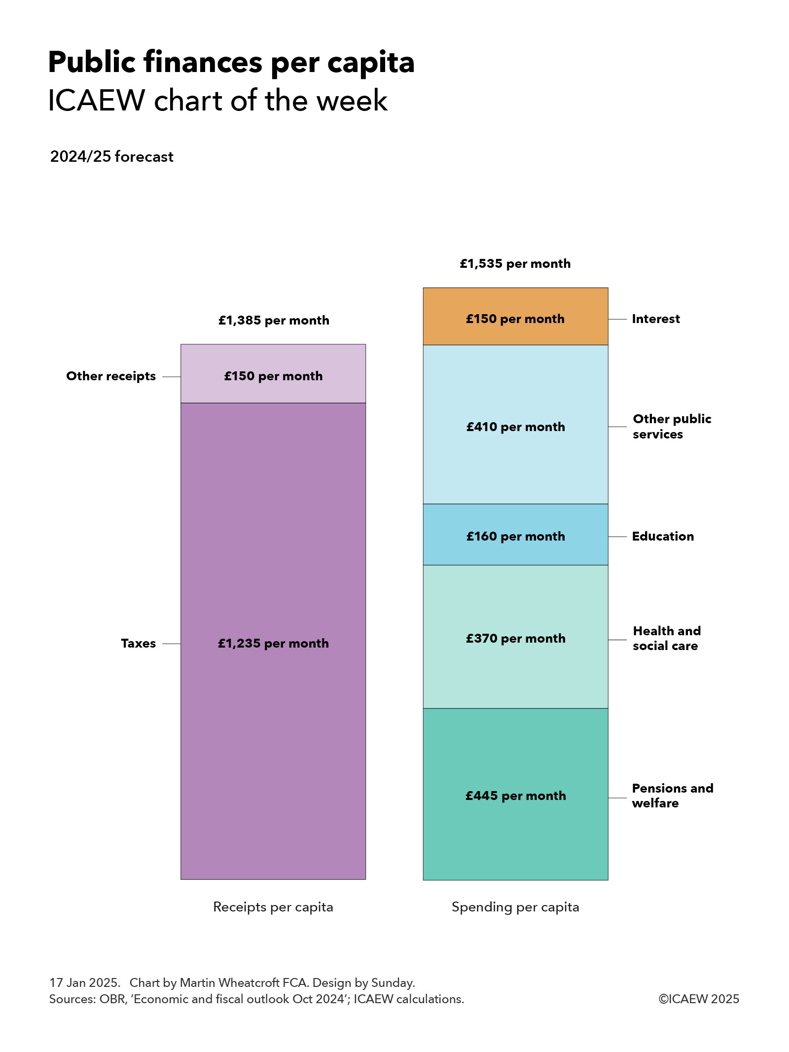
My chart for ICAEW this week divides some very big numbers for the public finances by an estimated 69.2m people living in the UK to highlight how UK public spending is now in excess of £1,500 per person per month.
According to the Autumn Budget 2024, the UK public sector expects to bring in £1,149bn and spend £1,276bn in the financial year ended 31 March 2025 (2024/25). At more than a trillion pounds a year in each case, these are very big numbers that can be difficult to comprehend.
My chart of the week attempts to make these numbers more understandable by averaging them over an estimated UK population of 69.2m for the current financial year and dividing them by 12 to arrive at per person per month equivalents (rounded to the nearest £5).
On this basis, total receipts are expected to average £1,385 per month for each person living in the UK in 2024/25, comprising £1,235 a month from tax receipts (£1,025bn in total) and £150 a month in other receipts (£124bn).
Not shown in the chart is the approximately £940 per person per month on average – just over two-thirds of total receipts – that comes from the top five taxes: income tax £375 per month, VAT £245 per month, employer national insurance £135 per month, corporation tax £120 per month, and employee national insurance £65 per month.
Public spending is expected to average £1,535 per person per month in 2024/25, comprising approximately £445 per month on pensions and welfare, £370 per month on health and social care, £160 per month on education, £410 per month on other public services, and £150 per month on debt interest, based on forecast total spending in 2024/25 of £370bn, £307bn, £134bn, £340bn, and £125bn respectively.
Spending on welfare
Welfare spending includes (but is not limited to) approximately £170 per person per month to cover the cost of paying the state pension, around £105 per month to pay for universal credit (including housing benefit), and in the order of £75 per month to fund disability and illness benefits.
Per capita spending on health and social care comprises close to £290 per person per month on the NHS, £55 on social care and £25 on public health, health research and other health-related spending.
Education costs each of us an average of £160 per month, of which approximately £115 per month pays for schools, £35 funds university and higher education (including just over £10 for student loans that are not expected to be repaid) and around £10 per month goes on further education, training and other.
The £410 per month cost of other public services includes in the region of £85 per month on defence and security, approximately £75 per month on roads and railways, £65 on industry and agriculture, nearly £60 per month on public order and safety, £15 per month on dealing with waste, and around £10 per month on international development and aid. This leaves approximately £100 per month to pay for all the other services that central and local government provide, including 11p per person per month for the Royal Family and palaces.
These numbers are averages and of course the amounts individuals pay in taxes and receive either in pensions and welfare benefits or in public services will vary significantly. For example, while health and social care spend is £370 per month when spread over the whole population, average spending on teenagers and those in their 70s are estimated to be significantly different from each other at £130 per month and £700 per month respectively.
Forecast per capita taxes and other receipts of £1,385 per month fall short of planned public spending of £1,535 per month to give rise to an expected deficit of approximately £150 per month funded by borrowing, being £127bn in total in 2024/25, divided by the estimated population of 69.2m. As a consequence, public debt now exceeds £2.8tn, equivalent to just under £41,000 for each person living in the UK, or somewhere in the region of £98,000 per household.
Navigating the public finances can be difficult at the best of times, but it is often helpful to translate the huge numbers you hear on the news into per capita equivalents to make sense of them. £1bn when spread across the UK population works at being equivalent to just over £1.20 per month.