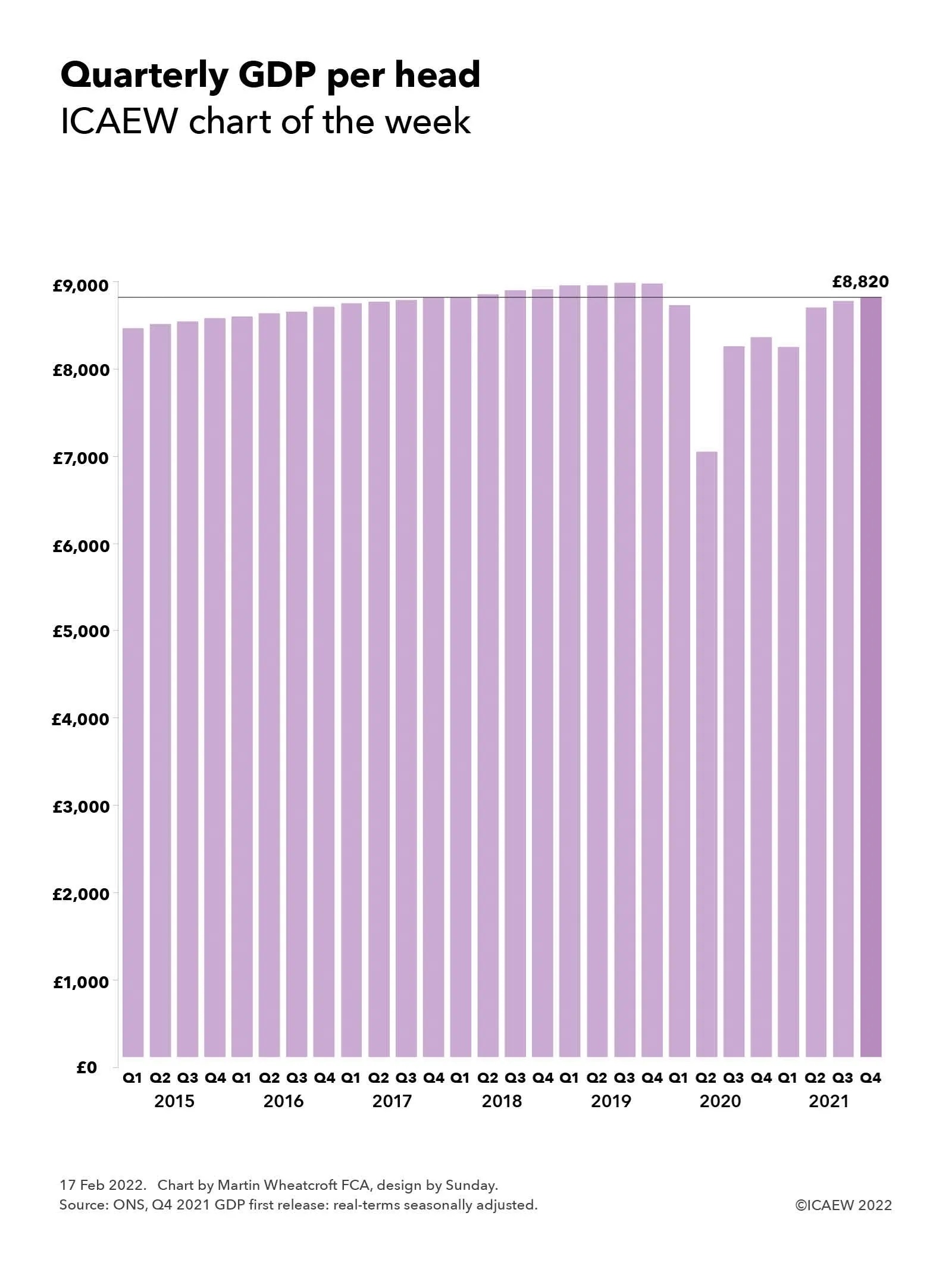
GDP statistics have become much more exciting, with low but steady growth in per capita GDP before the pandemic giving way to large swings as the economy adjusts to a major shock.
GDP for the fourth quarter of 2021 was calculated to be £596bn by the ONS in its first estimate of this statistic measuring economic activity in the UK, bringing the provisional estimate for the full year to £2,318bn for the 2021 calendar year. On a per capita basis, this was equivalent to approximately £8,820 per person for the fourth quarter and £34,330 per person for the year.
The ICAEW chart of the week looks at how quarterly GDP has changed in real-terms over the past few years on a seasonally adjusted basis – demonstrating how boring GDP statistical releases were in the ‘before times’. Then, a relatively steady average per capita increase of approximately 0.3% each quarter reflected the low but steady level of economic growth that has been seen since the financial crisis. The arrival of the pandemic has seen all that change, with a collapse in GDP during the last half of 2020, followed by a stop-and-start recovery over the past few quarters, with provisional GDP estimate growing by 0.9% in the fourth quarter – faster than the pre-pandemic years, but slower than the revised 1.0% reported for Q3 and the 5.5% rise in Q2 of 2021.
The change in real-terms quarterly GDP per head in 2020 and 2021 illustrated by the chart were -2.7%, -19.5%, +17.4%, +1.3% and -1.3%, +5.5%, +1.0%, +0.9% respectively. It is, of course, always important to note that the statistics reported by the ONS are subject to frequent revision, especially when trying to count up the trillions of transactions entered into each quarter in a large and complex economy like the UK’s. The population estimates used for calculating per capita amounts are also likely to be revised, in particular once the results of the 2021 census are finalised in a few months’ time.
Despite the recovery in the last three quarters, GDP and GDP per capita remained below their peaks in the third quarter of 2019 and more significantly below the trend the economy was on.
With rapidly rising inflation, supply chain disruptions and uncertainty regarding how society will transition from a coronavirus pandemic to an endemic, the likelihood is that quarterly GDP releases are likely to continue to be observed with some excitement by economists (and the rest of us) for some time to come.
We take a look at the Great Britain National Insurance Fund, illustrating how the balance in the fund grew from the equivalent of 4.2 months of annual payments to 4.6 months over the course of 2020-21.
One of the many myths about the UK’s public finances is around the use of the word ‘fund’. This is often assumed to imply there is a pot of money set aside to cover spending requirements, when in practice it tends to refer to a budget allocation. An example is the National Productivity Investment Fund that was announced in 2016, which turned out to refer to unallocated amounts within the government’s budget for capital expenditure over several years.
Despite this terminology there are some actual ‘funds’ that have a legal basis and which have money in them, such the Contingencies Fund, where cash of £425bn passed through its accounts in response to the pandemic last year (up from £17bn in the previous year). However, net assets remained unchanged by this tidal wave of money at just £2m, highlighting how many such funds are principally mechanisms to facilitate the flow of money around government on the way to its intended destination.
The Great Britain National Insurance Fund and the Northern Ireland National Insurance Fund are perhaps the most well known of these funds, being the source of payments for the state pension and contributory welfare benefits. Surprisingly, there is a balance in these funds, which caused some excitement in a House of Lords debate last year when a peer decided that this was a pot of money that could be used to fund more spending.
Before getting too excited, it is important to understand that although the £42bn in the Great Britain National Insurance Fund sounds like a large amount of money, the reality is that it is more akin to a float, representing less than five months’ worth of annual payments from the fund and a relatively small fraction of the trillions of pounds in future payments expected to be paid out of the fund over the next quarter of a century and beyond. Likewise for the £1bn in the Northern Ireland National Insurance Fund.
In addition, when you delve into the accounts, you discover that most of the balances are invested in HM Treasury’s Debt Management Account, which are in effect intercompany balances (or ‘intra-government’ to be more technically accurate).
As our chart illustrates, the Great Britain National Insurance Fund had a balance of £37bn on 1 April 2020, equivalent to about 4.2 months of expenditure in the 2019/20 financial year. National Insurance receipts in Great Britain (ie, not including Northern Ireland) amounted to £140bn during 2020/21, including £3bn from other tax receipts to make up for contributions not received for those on statutory maternity, paternity, parental or bereavement pay.
Some £26bn of the national insurance contributions was deducted and sent off to help pay for the NHS, reducing the amount added to the fund to £114bn, while payments from the fund during the year amounted to £109bn. The latter comprised £100.4bn for the state pension, £5.2bn to cover contributory welfare benefits (employment and support allowance and jobseeker’s allowance), £0.9bn in administration costs, £0.8bn in bereavement and maternity allowances, £0.7bn in transfers to the Northern Ireland equivalent fund, £0.5bn in redundancy payments and £0.2bn in other payments.
The £5bn or so of surplus was added to the balance of the fund, taking it to £42bn at 31 March 2021, equivalent to 4.6 months of annual payments.
To be fair to the noble lord concerned, it might well be possible to use some of the money in the fund by reducing the effective float balance by a month or two, at least on a one-off basis. However, in the context of public spending in excess of £1.2tn a year and public sector net debt of £2.3tn, it is not likely to go that far!
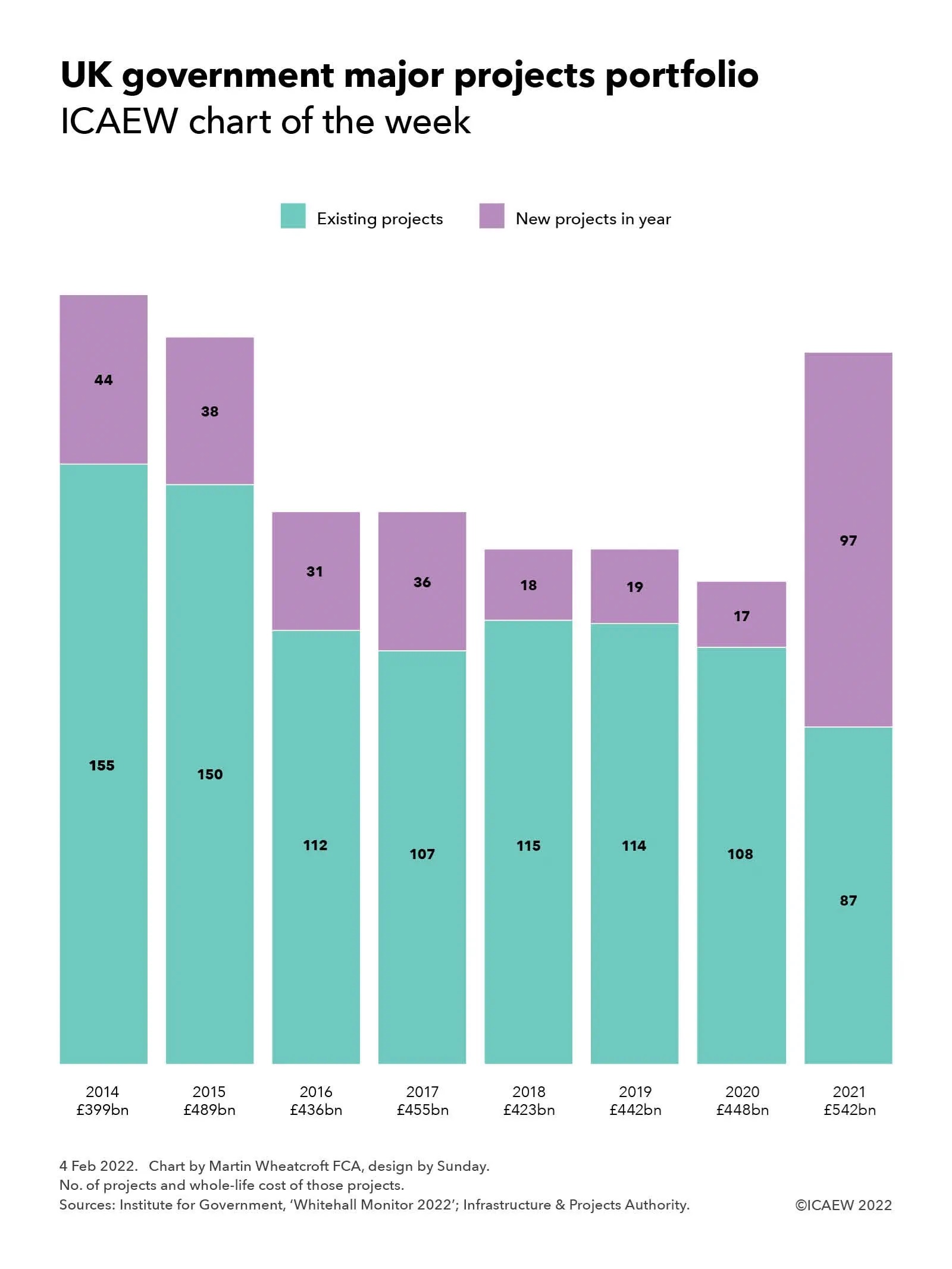
Our chart this week is based on the Institute for Government’s recently published Whitehall Monitor 2022, illustrating how the government has already started on many of the major projects that form part of the Levelling Up White Paper.
On 31 January 2022, the Institute for Government (IfG) published its latest annual Whitehall Monitor, an authoritative compendium of analysis about the functions and effectiveness of central government that makes for compelling reading and contains some great charts to bring to life what would otherwise be pretty dry content.
Our chart this week draws on a couple of the IfG’s charts from pages 60 and 61 in the 2022 edition that take a look at the activities of the Infrastructure and Projects Authority (IPA). One of the IPA’s key roles is to support central government departments with their most expensive and complex projects. As the chart highlights, there was a sizeable jump in 2021 with 97 new projects added to the 87 existing projects brought forward from previous years, bringing the estimated whole-life cost of the projects being supported by the IPA to £542bn, up from £448bn in 2020.
According to the IfG, the major projects portfolio includes infrastructure developments such as the creation of a Midlands Rail Hub, large-scale programmes to improve public services such as the recruitment of 20,000 police officers by 2023, and military projects such as building a new medium-lift helicopter. This is the largest number of new items added to the portfolio in a single year since the publication of the IPA’s first annual report in 2013, with many of the projects now branded as part of the Levelling Up agenda. For comparison, fewer than 20 projects were added to the portfolio each year between 2018 and 2020. The government is currently managing 184 major projects – about 1.5 times as many as it did the year before and the portfolio is now at its largest size since 2015.
From a conventional perspective it may seem strange that the government started many of the projects in its just published Levelling Up White Paper as much as a year before setting out the plan that they form part of, but in practice the main components, such as new investment in transport infrastructure outside London and the South East, have been known for some time – as has the additional capital expenditure funding that has been provided to departmental budgets. What is new is the insight into the metrics that the government intends to use to assess the effectiveness of its levelling up plans by 2030, with 12 key objectives to be achieved.
However, as discussed in ICAEW’s Autumn Budget and Spring Budget coverage last year, much tighter budget settlements for day-to-day spending mean that departments could struggle to deliver major projects successfully given all the other pressures they are under as well as rapidly rising input costs, with the IfG commenting that: “Ministers should be careful to maintain enough administrative resources in their departments to help officials undertake these projects well, on time and to budget.”
The chart illustrates how following the IPA’s inception in 2013, there were 155 existing projects carried forward into 2014 and 44 new projects that year, a total of 199 with a whole-life cost of £399bn. This was followed by 188 projects in 2015 (150 existing and 38 new) of £489bn, 143 in 2016 (112 + 31) of £436bn, 143 in 2017 (107 + 36) of £455bn, 133 in 2018 (115 + 18) of £423bn, 133 in 2019 (114 + 19) of £442bn, 125 in 2022 (108 + 17) of £448bn and 184 projects in 2021 (87 existing + 97 new) with a whole-life cost of £542bn.
The IfG says: “Major reform is needed for government to respond to crises like the pandemic while simultaneously delivering long-term policy goals. Whitehall Monitor 2022 reveals how the government has been handling the Covid crisis while at the same time trying to make progress on priorities such as levelling up and hitting net zero. New employment support schemes and the vaccination programme were delivered rapidly, but progress on pre-pandemic priorities was limited.”
The report also warns that without fundamental reform – such as clarifying ministerial and civil service accountability, better data, improving transparency and ensuring a targeted workforce plan underpins its goal of up to 55,000 civil service job cuts by 2025 – government will continue being knocked off course when faced with shocks to the system. The IfG concludes that whatever happens as a result of the prime minister’s current troubles, with a looming cost-of-living crisis, ongoing COVID-19 challenges, and crunch Brexit deadlines and decisions ahead, 2022 will bring further strain.
The Levelling Up White Paper sets out some big aspirations, but the jury is still out as to whether they can be delivered.
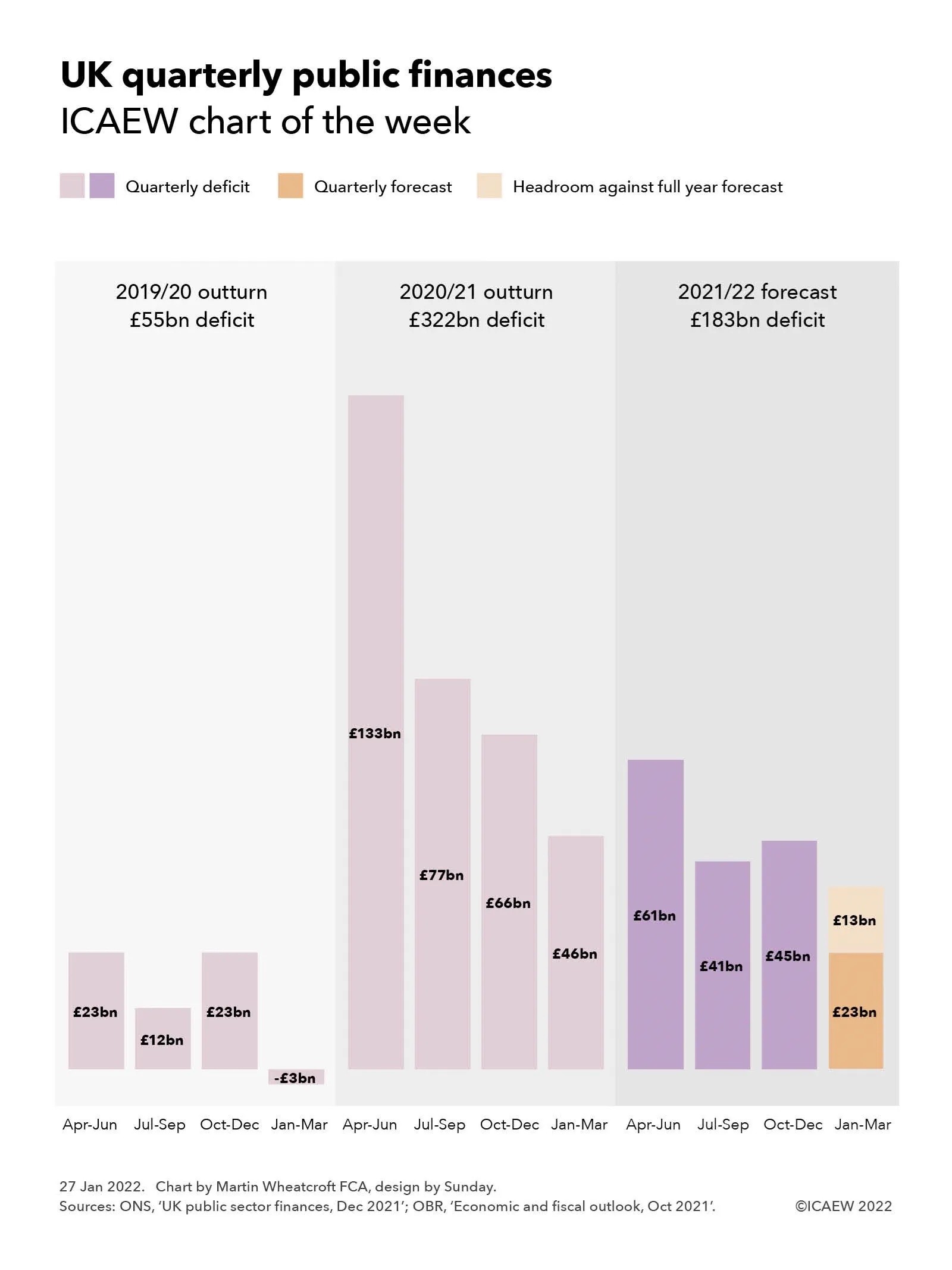
Our chart this week looks at the fiscal forecast for the final quarter of the government’s financial year ending in March 2022.
The December 2021 public sector finances published by the Office for National Statistics (ONS) on Tuesday 25 January provided numbers for the first three quarters of the current financial year. As our chart this week illustrates, this leaves the final quarter still to go, with £13bn of headroom against the official forecast prepared by the Office for Budget Responsibility (OBR) at the time of the Autumn Budget and Spending Review 2021 back in October.
To put the current fiscal year into context, our chart shows how the deficit of £55bn in 2019/20 comprised quarterly deficits of £23bn for April to June 2019, £12bn for July to September 2019 and £23bn for October to December 2019 less a surplus of £3bn for January to March 2020. Although there was some impact from the pandemic on the last month of that financial year, it broadly provides an indication of a ‘normal’ pattern of deficits across the year, with the second quarter and more especially the fourth quarter benefiting from self assessment tax receipts – the latter despite typically higher levels of capital expenditure in the run up to the end of the financial year.
This was followed by the first full year of the pandemic and associated lockdowns which saw tax receipts fall significantly and expenditures rise dramatically, resulting in an unprecedented peacetime deficit of £322bn in 2020/21, comprising £133bn, £77bn, £66bn and £46bn for the four quarters respectively.
The current forecast is also on course for a pretty eye-watering deficit, which despite being substantially below that seen last year is forecast to be as much as £183bn. The provisional numbers for the first three quarters of 2021/22 of £61bn, £41bn and £45bn respectively are currently £13bn below the October forecast, implying an equivalent amount of headroom for the final quarter, assuming the OBR’s forecast deficit of £23bn for the fourth quarter proves to be accurate.
In practice, it would be surprising if the fourth quarter did come in on target other than by coincidence. Better than expected tax revenues are expected to continue to reduce the deficit over the final quarter but this is likely to be offset to a greater or lesser extent by higher interest costs on index-linked debt driven by rising inflation. There are also significant uncertainties around expenditures given the continuation of pandemic restrictions into January and the potential for further interventions to support businesses and individuals struggling financially as a consequence.
There have been suggestions that this headroom of £13bn is a ‘windfall’ that the Chancellor should use to support households expected to be hit by a greater than 50% rise in energy prices from April 2022 as discussed in last week’s chart of the week.
However, this perspective has also been contradicted by Carl Emmerson, Deputy Director at the Institute for Fiscal Studies (IFS), who is reported to have commented: “While borrowing last month was in line with the Budget forecast, over the first nine months of 2021/22 it is now £13bn below that forecast for the same period in the October Budget – £147bn instead of the £160bn expected in October. The latest improvement to borrowing over this period has been driven by higher-than-expected corporation tax being paid by some very large companies.
“Some have suggested better borrowing figures provide the Chancellor room to act on the cost of living by, for example, delaying the rise in National Insurance contributions planned for April. The truth is these figures make no difference to that calculation. Mr Sunak certainly could find money to delay tax rises or find other one-off ways of supporting living standards such as uprating benefits in April with a more up-to-date measure of inflation. But the long-run pressures on public services, especially health and social care, remain just the same and tax rises are likely to be needed if these are to be met. If he acts now on the cost of living, Mr Sunak will also need to find a credible means of committing to taking tough action on the public finances in the not too distant future.”
Even if the deficit does come in below the official forecast of £183bn, it will still be at a much higher level than that expected before the pandemic, when the forecast deficits for 2019/20, 2020/21 and 2021/22 were £47bn, £55bn and £67bn respectively compared with the much larger numbers reported in our chart. A variance of £13bn is also relatively small in the context of the £547bn increase in public sector net debt between March 2020 and December 2021.
All this suggests that the next fiscal event scheduled for 23 March 2022 is likely to take on even more importance as the Chancellor seeks to navigate between the rock of fiscal responsibility and a hard place of a cost of living crisis.
My chart this week is about domestic energy prices and the Ofgem energy price cap rises expected in April and October 2022.
The collapse of all but the largest energy suppliers over the past six months or so has pretty much ended a competitive market for domestic energy in the UK. Most consumers are now on tariffs that are at or close to the energy price cap set by the Office for Gas and Electricity Markets (Ofgem).
Originally designed as a safeguard for individuals on standard variable tariffs who couldn’t, didn’t or never got around to entering into competitive fixed-price contracts, the energy price cap is now expected to apply to most households as consumers either roll off existing fixed-price deals or – in many cases – transfer to one of the ‘Big Six’ energy suppliers following the collapse of one of the 40 or so energy firms that have gone bust over the past year.
As a consequence, many consumers will have seen their energy bills increase by much more than that implied by our chart of the week, which shows how the energy price cap has increased from an average dual-fuel bill for direct debit customers of £1,042 a year (about £87 per month) between October 2020 and March 2021 to £1,138 (£95 per month) between April 2021 and September 2021, to the current cap of £1,277 (£106 per month) for the period from last October through to March this year.
These amounts assume ‘typical’ usage for a dual-fuel household paying by direct debit of 2,900kWh of electricity and 12,000kWh (410 therms or 41 million British thermal units) of gas, with consumers using prepayment meters or on credit paying higher prices – currently an average of £1,309 (£109 a month) and £1,370 (£114 a month) respectively. Those who use more or less will pay higher or lower amounts accordingly, while the price cap varies by region.
As the chart illustrates, the direct debit price cap during the six months ended 31 March 2020 of £1,042 per year comprised £184 for the standing charge, £498 for 2,900kWh of electricity at 17.2p per kWh and £360 for 12,000kWh of gas at 3p per kWh. This increased to £1,138 per year in the six months to 30 September 2021, comprising £188 for the standing charge, £550 for 2,900kWh of electricity at 19p per kWh and £400 for 12,000kWh of gas at 3.3p per kWh. The current price cap of £1,277 per year, which lasts until 31 March 2022, comprises £186 for the standing charge, £603 for 2,900kWh of electricity at 20.8p per kWh and £488 for 12,000kWh of gas at 4.1p per kWh.
The current price cap is based on annual wholesale energy costs of £528, network costs of £268, operating costs of £204, social and environmental contributions of £159, other costs of £34 and a profit margin of £23 before adding on £61 of VAT at a rate of 5%. These are equivalent to £44, £22, £17, £13, £3, £2 and £5 in an average bill of £106 per month, although in practice energy usage varies across the course of a year.
Recent industry forecasts and speculation from EnAppSys, Investec and Cornwall Insight, among others, suggest that the price cap is likely to increase by more than 50% to somewhere in the region of £2,000 a year (£167 per month) for the six-month period from 1 April and potentially to around £2,350 a year (£196 per month) for the six months from 1 October 2022. Publicly available forecasts do not provide a breakdown on what that means for per kWh prices and so the chart provides illustrative calculations based on gas prices doubling to around 8p per kWh in April and rising to 10p in October and electricity prices increasing by in the order of 40% to 29p in April and then further to 33p per kWh in October. Actual prices will depend on how Ofgem allocates costs between the fixed and variable parts of the bill, as well as how wholesale prices move before they are included in the final calculation. The cost of energy for prepayment meter and credit customers will be even higher.
The scale of these increases is likely to have a significant impact on poorer and middle-income households, with commentators suggesting that the government is likely to want to intervene in some way to cushion the blow. Some have argued for cutting VAT from 5% to zero, although the Institute for Fiscal Studies, the Resolution Foundation and HM Treasury have all noted that doing so would pass much of the benefit on to higher income households rather than helping those most affected. Others have argued for spreading higher wholesale prices over longer periods to reduce the hit to family budgets, while there are also calls for the taxpayer to provide temporary subsidies in order to keep bills down, potentially transferring some of the risk of higher wholesale costs on to the taxpayer.
Policymakers are unlikely to do nothing as – even if there was additional support provided to the very poorest through the welfare system – the anticipated prices are large enough to disturb household budgets for many middle-income families as well. This could have serious implications for the economy and for public finances, with a substantial proportion of households likely to cut back on spending in other areas just as the government is hoping for a post-pandemic bounce to drive economic growth. The government will also be acutely aware that energy prices are a key component of inflation indices, with the consumer prices index 5.4% higher in December than a year earlier, according to the Office for National Statistics, and expected to rise even further once the new price cap comes into force in April.
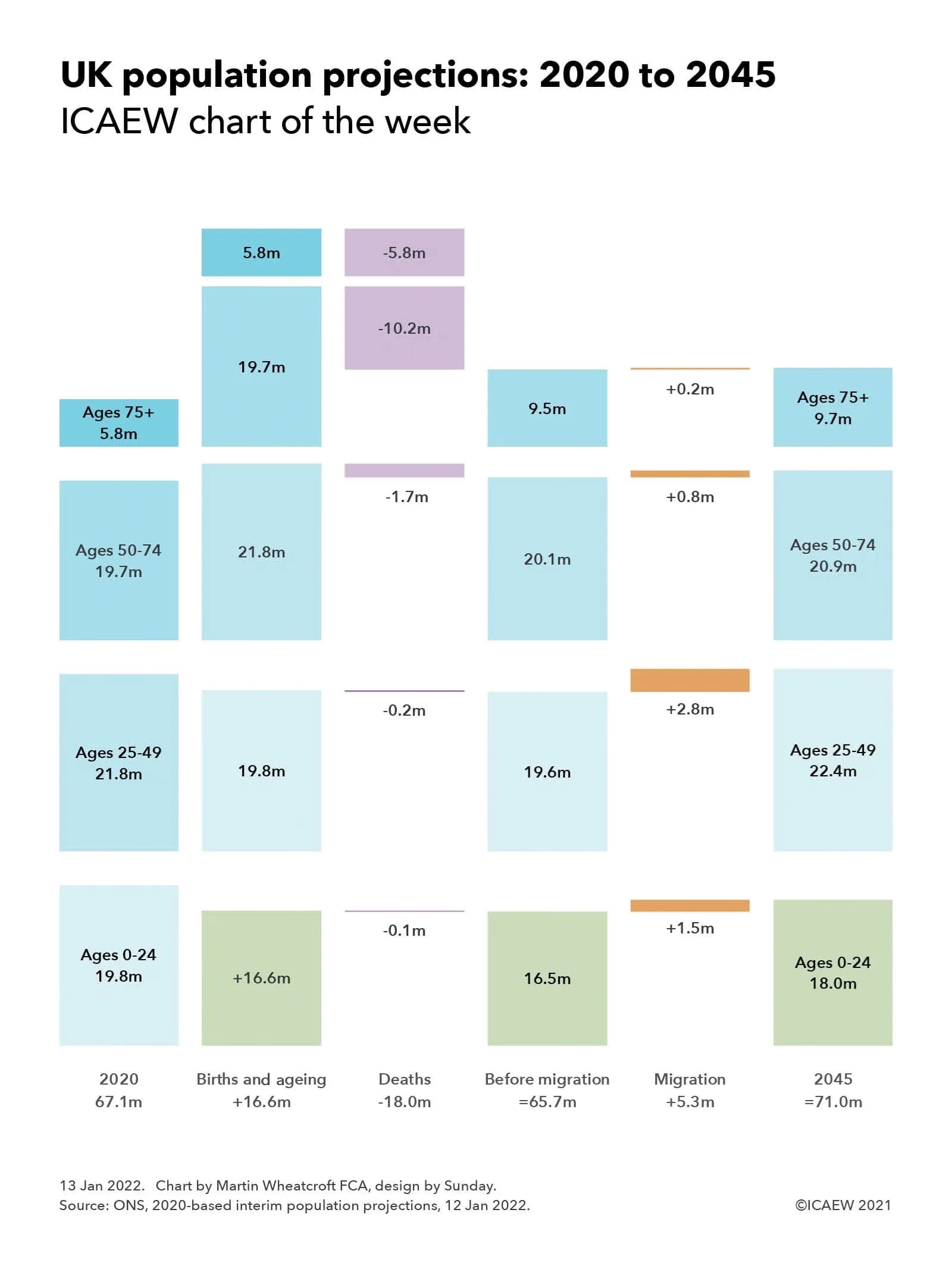
Our chart this week is based on the latest population projections for the UK, with an expected 67% increase in the number of people over the age of 75 and a fall in the number under the age of 25 over the next quarter of a century.
The Office for National Statistics (ONS) released 2020-based interim population projections on 12 January 2022 providing an insight into how the population of the UK is expected to change over the next 100 years. They are interim because they don’t include the results of the 2021 Census (which is still being worked on), but they do reflect updated assumptions from the 2018-based projections.
The main differences from the previous projections are a lower fertility rate (revised down from 1.78 to 1.59 per woman) reducing the numbers of births significantly, and slight reductions in anticipated life expectancy (from 82.8 years to 82.2 for males and from 85.7 to 85.3 for females) increasing the number of deaths. This has been partly offset by an increase in net annual long-term international migration from 190,000 a year to 205,000 a year, with a central projection last time of 72.8m people in 2045 revised down to 71.0m. The population is then expected to gradually increase to a peak of 71.8m in 2081, before declining back to 71.0m in 2120.
Our chart focuses on the first 25 years of the projections, illustrating how each generation is expected to change over that time. Overall, the estimated population of 67.1m in June 2020 is expected to change by 16.6m births (an average of around 665,000 a year) less 18.0m deaths (720,000 a year), which would result in a fall of 1.4m (55,000 a year) to 65.7m in 2045, at least before taking into account the effects of migration. Estimated net immigration of 5.3m (230,000 a year until 2026, then 205,000 a year) is expected to mean that the population will instead increase, reaching 71.0m in 2045.
There were an estimated 19.8m 0-24 year-olds in 2020, but in a quarter of a century they will all be in the 25-49 age group and so those under 25 will be formed from the 16.6m projected to be born in the 25 years from 2020, which after around 65,000 deaths would be 16.5m before taking account of migration. Some will leave the country and others will arrive, with a projected 1.5m net addition to take the total to 18.0m in 2045, a reduction of 1.8m compared with the previous cohort.
For the 19.8m under-25s in 2020 moving up a cohort to the 25-49 age group in 2045, deaths of 0.2m would reduce this to 19.6m before taking account of net inward migration of 2.8m to get to a projected 22.4m. This is a net increase of 0.6m compared with the previous generation of 21.8m. That generation, which would be aged 50-74 a quarter of a century later, would be reduced by 1.7m deaths to arrive at 20.1m before adding a net 0.8m from migration to get to 20.9m, a 1.2m increase over the 19.7m who were aged 50-74 in 2020.
A much greater proportion of this cohort will not be around in 2045, with a projected 10.2m deaths reducing numbers to 9.5m before adding 0.2m from net inward migration to arrive at a projected total of 9.7m. This is a 67% increase over the current generation of over-75s of 5.8m, with all bar the 38,000 expected to be over 100 in 2045 expected to have passed on, barring major developments in medical science. This compares with the approximately 15,000 people over the age of 100 in 2020.
Overall the rate of increase in the UK population is expected to fall from an estimated 0.4% a year in 2020 to 0.15% by 2045, an average of 0.2% over the coming quarter of a century. This compares with growth rates of 0.6% to 0.8% a year experienced in the last couple of decades, which has been a key driver of economic growth in that time.
The substantial increase in the numbers aged 75 and over is of course a hugely positive development as more people live much longer lives than in previous generations. However, this will have huge implications for the public finances given the cost implications of providing health services, social care and pensions to older generations, particularly those over the age of 75. With proportionately fewer workers (even with planned increases in the retirement age) this is expected to drive higher levels of taxation over the next quarter of a century without much higher levels of economic growth than are currently anticipated.
Fortunately a quarter of a century provides opportunity for governments to address the financial challenges posed by our success in extending lives if they are willing to do so, even with the added debt arising from the pandemic, which is why ICAEW continues to argue for the development of a long-term fiscal strategy to put the public finances on a sustainable path. Such a strategy could make a significant difference to the prosperity of future generations.
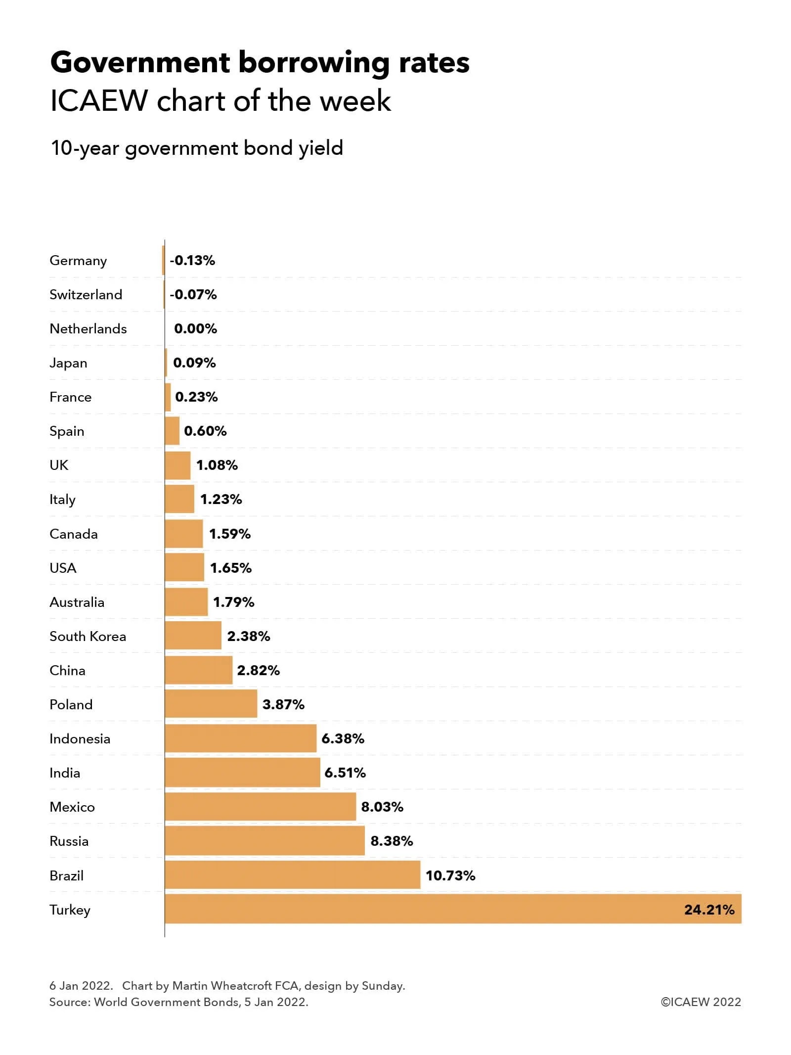
Our first chart of 2022 highlights how the cost of government borrowing remains extremely low for most of the 21 largest economies in the world, despite the huge expansion in public debt driven by the pandemic.
Our chart of the week illustrates how borrowing costs are still at historically low rates for most of the 21 largest national economies in the world, with negative yields on 10-year government bonds on 5 January 2022 for Germany (-0.13%) and Switzerland (-0.07%), approximately zero for the Netherlands, and yields of sub-2.5% for Japan (0.09%), France (0.23%), Spain (0.60%), the UK (1.08%), Italy (1.23%), Canada (1.59%), the USA (1.65%), Australia (1.79%) and South Korea (2.38%).
This is despite the trillions added to public debt burdens across the world over the past couple of years as a consequence of the pandemic, including the $5trn added to US government debt since March 2020 (up from $17.6trn to $22.6trn owed to external parties) and the more than £500bn borrowed by the UK government (public sector net debt up from £1.8trn to £2.3trn) for example.
Yields in developing economies are higher, although China (2.82%) and Poland (3.87%) can borrow at much lower rates than Indonesia (6.38%), India (6.51%), Mexico (8.03%), Russia (8.37%) and Brazil (10.73%). The outlier is Turkey (24.21%), which is experiencing some difficult economic conditions at the moment. Data was not available for Saudi Arabia, the 19th or 20th largest economy in the world, which has net cash reserves.
With inflation higher than it has been for several years, real borrowing rates are negative for most developed countries, meaning that in theory it would make sense for most countries to continue to borrow as much as they can while funding is so cheap. However, in practice fiscal discipline appears to be reasserting itself, with Germany, for example, planning on returning to a fully balanced budget by the start of next year and the UK targeting a current budget surplus within three years.
For many policymakers, the concern is not so much about how easy it is to borrow today, but the prospect of higher interest rates multiplied by much higher levels of debt eating into spending budgets just as they are looking to invest to grow their economies over the rest of the decade. Despite that, with the pandemic still raging and an emerging cost of living crisis, there may well be a temptation to borrow ‘just one more time’ to support struggling households over what is likely to be a difficult start to 2022.
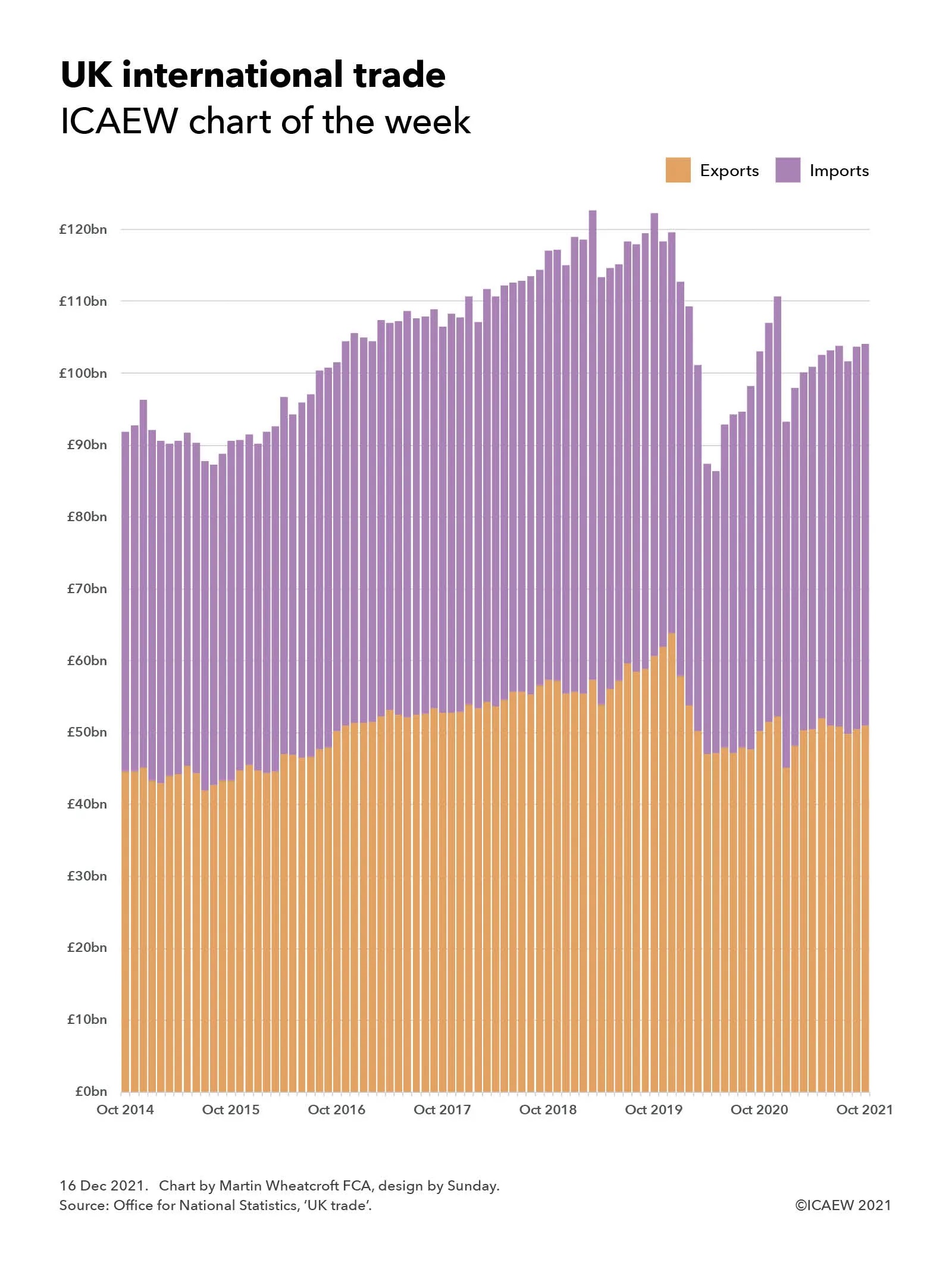
As 2021 draws to a close, our chart this week looks back on a rocky couple of years for UK international trade which has endured Brexit complications and the global COVID-19 pandemic.
Our chart of the week illustrates how Brexit and COVID-19 have combined to create a rocky couple of years for UK exports and imports of goods and services, reflecting the trials and tribulations of the Brexit process as well as the impact of the coronavirus pandemic on trade since the first lockdown last year.
The monthly trade total (exports + imports) increased from £92bn (£45bn + £47bn) in October 2014 to a peak of £123bn (£57bn + £65bn) in March 2019 at the height of Brexit ‘no deal’ preparations before falling back to £113bn (£54bn + £59bn) the following month before peaking again at £122bn (£61bn + £62bn) in October 2020 ahead of the end of the transition period. Following the introduction of new trading arrangements and the run-down of inventories, trade fell to a low of £86bn (£47bn + £39bn) in May 2020 during the first lockdown before recovering to £111bn (£52bn + £59bn) in December 2020. Trade fell back to £93bn (£45bn + £48bn) in January 2020 before growing back to £104bn (£51bn + £53bn) in July 2021 where it has appeared to stabilise with similar monthly totals in September and October 2021.
The chart provides only a hint of the challenges that have faced both importers and exporters over the past couple of years as they have had to navigate new trading arrangements with our European neighbours just as the pandemic has caused massive disruption across the planet. Imports and exports to EU countries have both fallen, but the EU still remains the UK’s principal trading partner, comprising almost half of the UK’s trade in goods for example.
The stabilisation in trade flows in the last few months for which statistics are available may be a hopeful sign, but with greater customs checks on the imports of goods from the UK coming into force in January, and the continuing evolution of the pandemic, the position is still very uncertain.
This is our last chart of the week for 2021 and so we would like to take this opportunity to wish you all the best for a safe and enjoyable Christmas break and for a healthy and prosperous 2022. We look forward to seeing you again in the new year.
My chart this week is on Bounce Back Loans, one of the principal sources of financial support for businesses during the first year of the pandemic and the subject of a recent investigation by the National Audit Office.
The recent publication of the Department for Business, Energy & Industrial Strategy (BEIS) accounts for 2020-21 contained an assessment of the losses expected on the financial provided to businesses through the Bounce Back Loan Scheme (BBLS), the Coronavirus Business Interruption Loan Scheme (CBILS), the Coronavirus Large Business Interruption Loan Scheme (CLBILS) and the Future Fund. This was followed by an updated report from the National Audit Office (NAO) on the administration of the scheme and the potential losses to the taxpayers.
The largest of these schemes was BBLS, with Bounce Back Loans of up to £50,000 provided to eligible businesses to help them weather the first lockdown in the second quarter of 2020, before being extended to the whole of the 2020-21 financial year. In the end, around a quarter of businesses took out a Bounce Back Loan, comprising 1.5m loans for a total of £47bn at an interest rate of 2.5% repayable over six years. The interest in the first year was covered by the government, with no repayments due in that period.
Businesses can extend the loans to ten years through the Pay As Your Grow option, as well as being allowed up to one six month payment holiday and three interest-only payments to provide flexibility without going into default.
The seven main UK banks provided around 90% of the loans by value, with the rest provided by other banks and non-bank lenders, such as peer-to-peer lenders. Each participating financial institution was provided with a 100% guarantee by the government to cover any amounts not repaid. Half a million or nearly 35% of the loans were for the maximum amount of £50,000 (adding up to £27bn) with £18bn lent out between £10,000 and £50,000 and £2bn lent for amounts between £2,000 (the minimum possible) and £10,000.
As the chart illustrates, the geographical distribution of loans was weighted towards the south and centre of England, with £11bn borrowed by businesses in London, £10bn in the South (£6.5bn South East and £3.6bn South West) and £11bn in the Midlands & East (£3.8bn West Midlands, £2.9bn East Midlands and £4.5bn East of England), a total of £32bn. The balance of £15bn was split between £9bn in the North (£3.2bn Yorkshire & the Humber, £4.8bn North West and £1.3bn North East) and £6bn in the other nations of the UK (£2.7bn Scotland, £1.6bn Wales and £1.3bn Northern Ireland).
More than 90% of the loans, amounting to £40bn, went to micro-businesses, ie businesses with turnover below £632,000.
BEIS have estimated in their 2020-21 financial statements that they do not expect 37% of the loans with a value of £17bn to be repaid, comprising £12bn in estimated bad debts and £5bn in estimated losses from fraud, although the NAO says that these numbers are highly uncertain at this stage. With £2bn already repaid, this leaves £28bn believed to be recoverable over the remainder of the six years of the loans (or 10 years for those that are extended).
The fraud estimate, for 11% of the loans with a value of £4.9bn, was based on a sample of 1,067 loans as at 31 March 2021, but a subsequent analysis in October 2021 suggests that the level of fraud may be lower at around 7.5% of loans and so there is some hope that BEIS and the British Business Bank will be able to reduce the amount they will have to reimburse to participating banks under the 100% guarantees.
However, as the NAO reports, these guarantees mean participating banks have no financial incentive to chase repayment and it has raised concerns that insufficient resources are being dedicated by BEIS and the British Business Bank to recovering outstanding amounts.
The challenge for government is that many businesses have not been able to get back to their pre-pandemic level of operation and so there is a need to be sensitive, whilst at the same time seeking to protect public money and tackle those who made fraudulent claims.
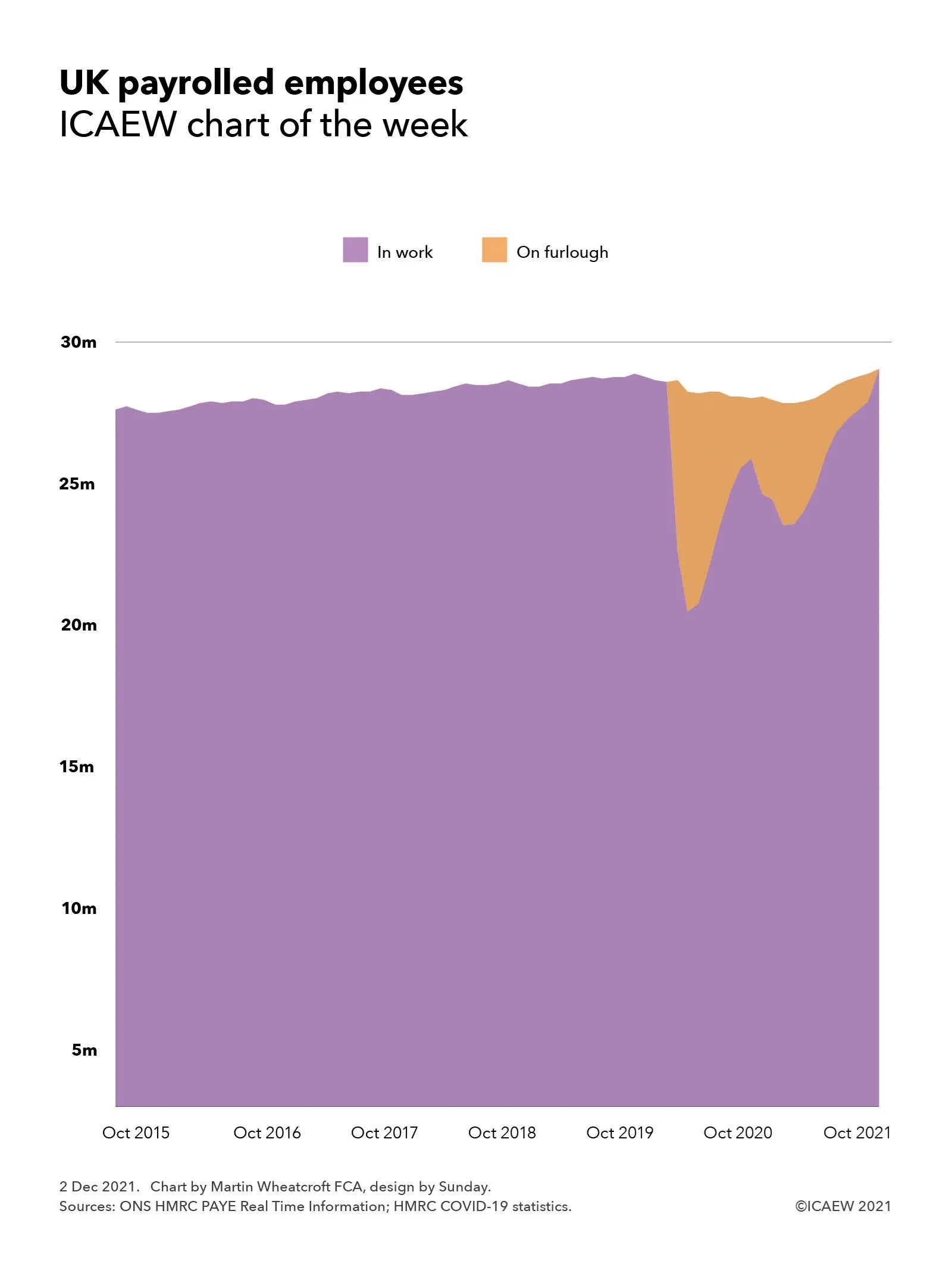
My chart this week looks at how the number of employees on UK payrolls has been supported by the furlough scheme, with more people employed in October 2021 than before the pandemic.
Concerns that the end of the furlough scheme in September 2021 would be followed by a sharp rise in unemployment proved to be unfounded, with the flash estimate of the number of people on UK payrolls increasing to 29.4m in October 2021, an increase of 166,000 from the previous month and greater than before the pandemic. This is positive news as it suggests that the majority of the 1.1m still on the furlough scheme when it ended on 30 September 2021 have been able to retain their jobs or have found work elsewhere.
The chart shows how payrolled employees increased gradually before the pandemic from 27.7m in October 2015 to 28.1m in October 2016, 28.5m in October 2017, 28.8m in October 2018 and 29.0m in October 2019, peaking in November 2019 at 29.1m. Numbers fell to 28.9m in February 2020 although on a seasonally adjusted basis the numbers increased slightly. Those in work fell significantly by the end of March 2020 to 22.0m when 6.8m were placed on furlough under the government’s Coronavirus Job Retention Scheme (CJRS) and to 19.7m at the end of April 2020 when 8.8m were on furlough.
Despite the furlough scheme overall payrolled numbers fell during the pandemic from 28.9m in March 2020 (including 6.8m on furlough) to 28.2m in October 2020 (when 2.4m were on furlough) to 28.0m at its lowest in January and February 2021 (when 4.9m and 4.7m were on furlough), before gradually rising to 29.2m in September 2021 (when 1.1m were on furlough) and 29.4m in October 2021 (when no one was on furlough).
Although the flash numbers for October 2021 are provisional and subject to change, they should be sufficiently reliable for policy makers to take some comfort that the furlough scheme has done its job in stabilising the economy and avoiding significant levels of unemployment. However, with the pandemic still not over, there will be concerns about whether growth in employment can be maintained over the coming months.
According to the ONS, the median monthly pay in October 2021 was £2,005, slightly down on the £2,010 reported for September 2021, but an increase of 4.9% compared with the £1,911 calculated for October 2020. The latter compares with consumer price inflation of 4.2% over the same period.
The idea that we might be emerging from the pandemic with higher levels of employment and wages than before it started might have seemed unlikely at the start of the first lockdown. But then at an estimated total cost of £370bn, of which £70bn was for the CJRS, the eye watering sums incurred by the government in getting to this position have been far from insubstantial.