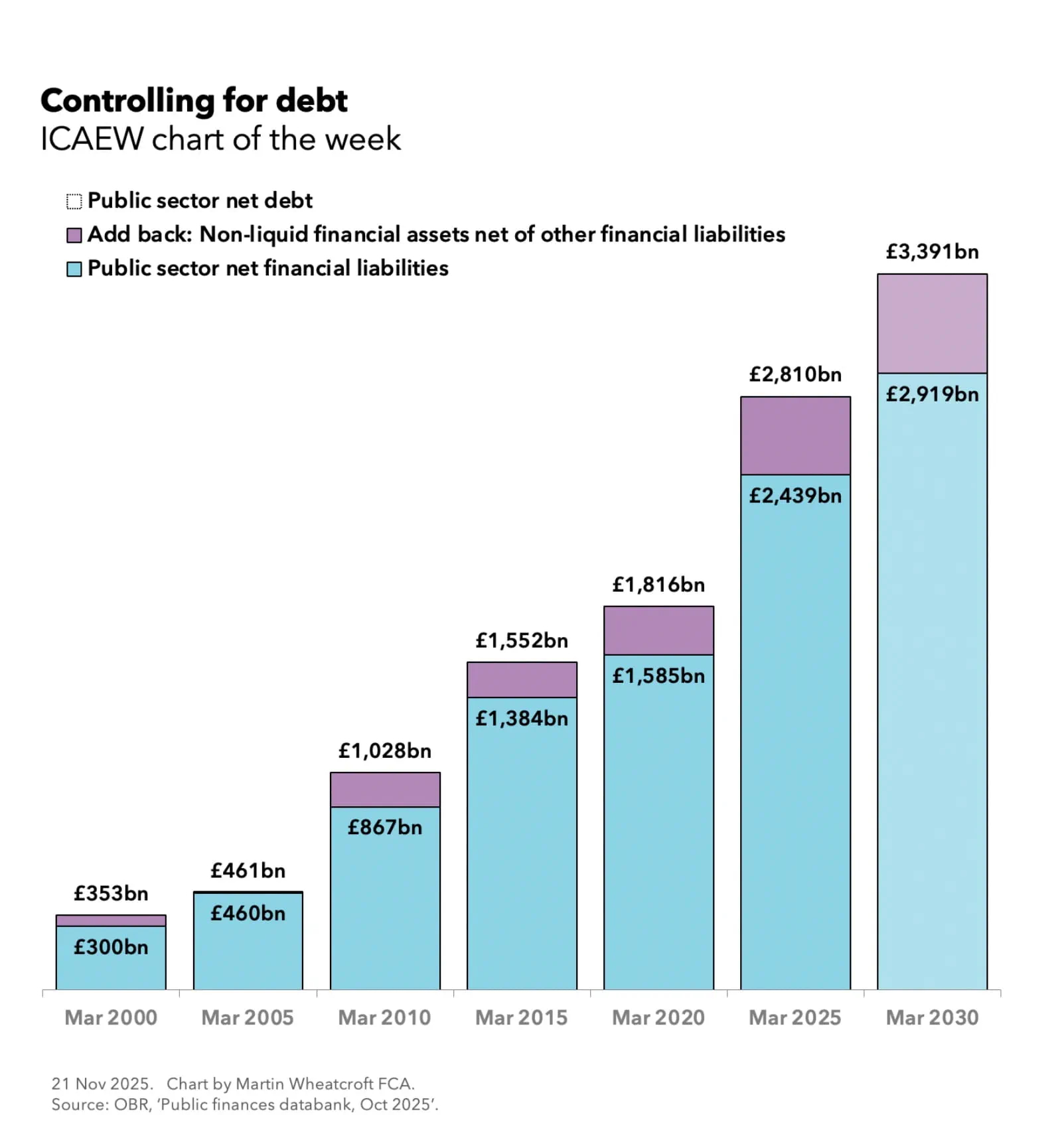
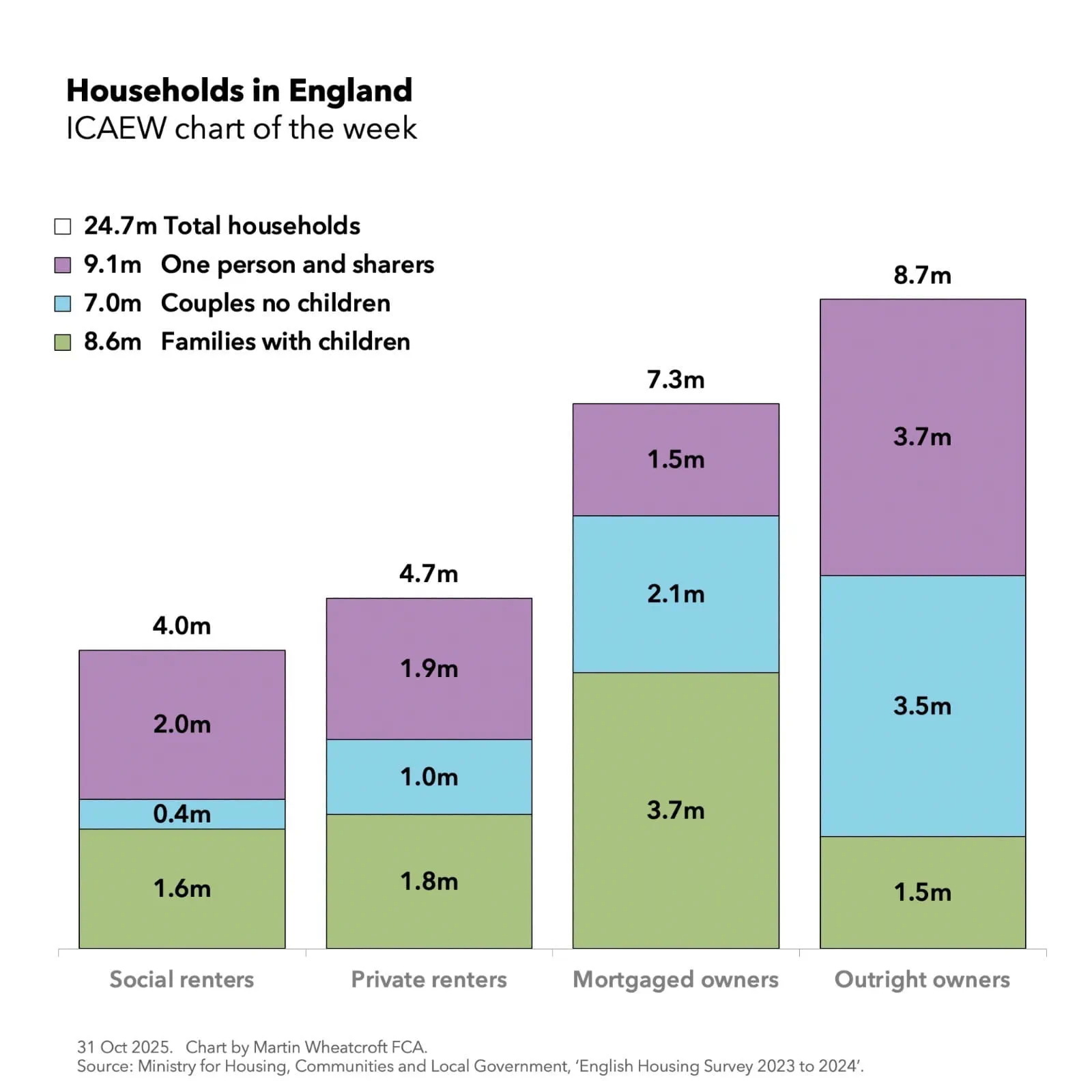
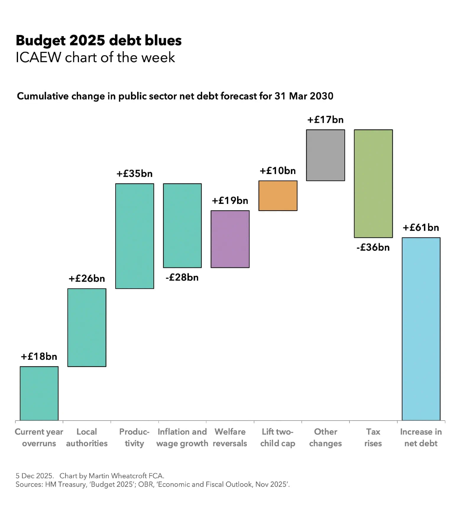
My chart for ICAEW this week illustrates how despite being a “tax-raising Budget”, the cumulative net effect of all the changes announced last week is to add £61bn to the public sector net debt forecast for 31 March 2030.
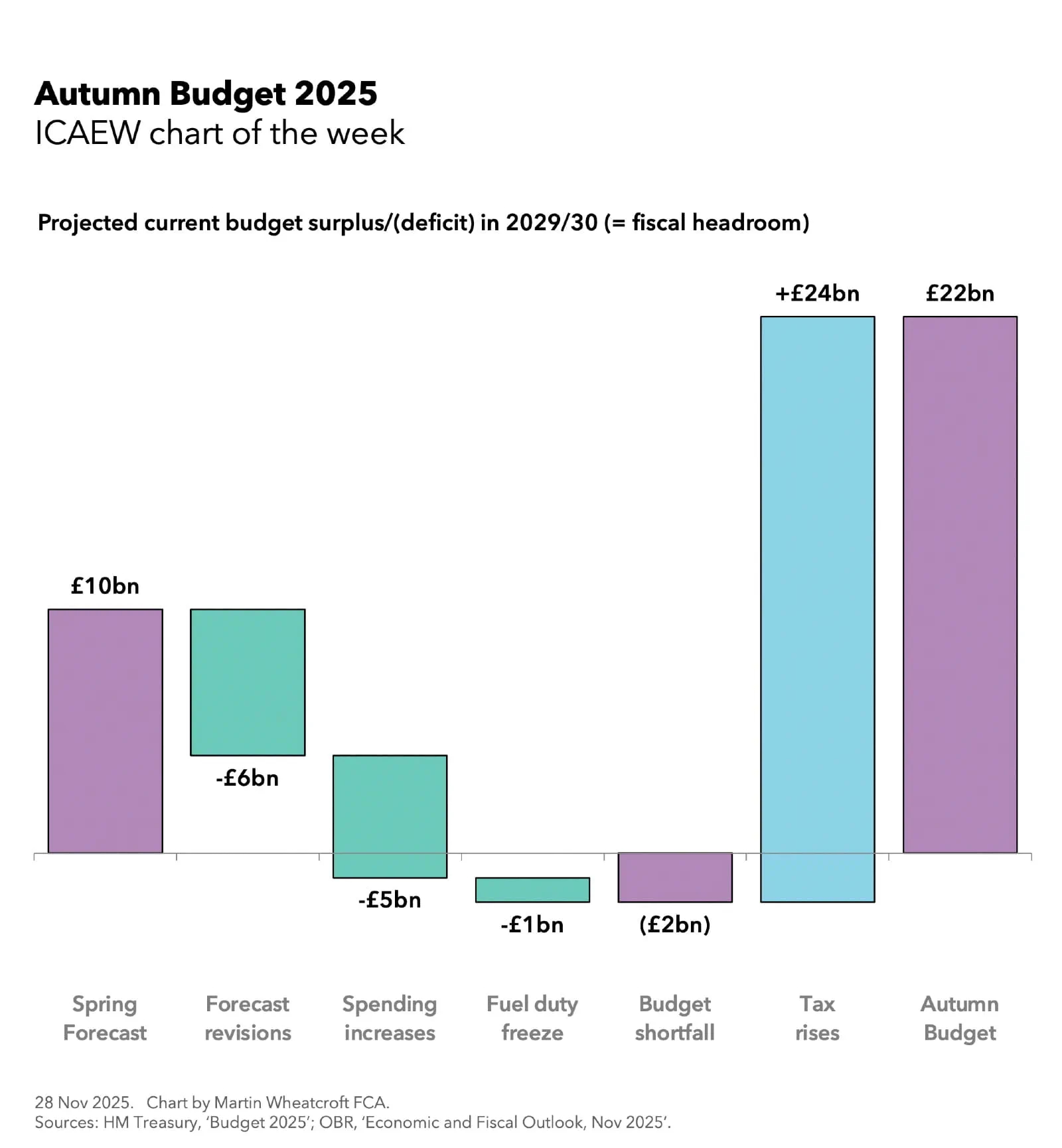
While my chart for ICAEW last week looked at the impact of Budget 2025 on 2029/30, the fourth year of the fiscal forecast used for the Chancellor’s fiscal rules, this week’s focus is on the cumulative effect of the changes made between now and 31 March 2030.
The first four bars of our step chart analyse the OBR’s forecast revisions, starting with extra borrowing to fund the expected budget overrun in the current financial year (2025/26) of £18bn (technically a £21bn higher deficit less a £3bn opening adjustment). This is followed by more borrowing to fund higher local authority spending of £26bn over four years (an average of £6.5bn a year) and to cover cumulative lower receipts of £35bn from downgrading the productivity growth assumption (£2bn a year rising to £16bn by 2029/30). This is then offset by £28bn over four years from the impact of inflation and wage growth on receipts exceeding the impact of inflation and other cost pressures on public spending.
Borrowing over the next four years is then increased by £19bn (just under £5bn a year on average) to cover the government’s welfare reversals over the summer – the restoration of the winter fuel allowance to many pensioners and the decision not to proceed with eligibility restrictions for disability benefits that were needed to make the Spring Statement add up.
The decision to lift the two-child benefit cap adds another £10bn (£2.5bn a year on average) to projected debt over the next four years, while other policy measures and working capital movements are expected to add £17bn (£11bn and £6bn respectively) on top of that.
A £36bn net reduction in debt from higher tax receipts net of indirect effects over the next four years (zero in 2026/27, £4bn in 2027/28, £10bn in 2028/29, and £22bn in 2029/30) reduces the cumulative impact to £61bn, with the £3,391bn forecast for 31 March 2030 at the time of the Spring Statement back in March 2025 being revised up to £3,452bn in the Autumn Budget 2025.
Perhaps the most surprising aspect of this analysis is the £26bn revision to the forecast for local government spending. While not as large as the well-publicised impact of productivity downgrades on the OBR’s fiscal forecast, it highlights some fundamental bookkeeping issues in how the government manages the public finances. A monthly financial consolidation process that excludes local government, schools and many other public bodies means the Office for National Statistics (ONS) and HM Treasury rely on forecasts and estimates instead of actual data when reporting the monthly public sector finances, exacerbated by the use of the four different accounting frameworks across the public sector and the local audit crisis in England that has created a large backlog in local authority audited financial statements.
The OBR states: “Recent substantial revisions to LA borrowing estimates and outturns, which reflect ongoing challenges in obtaining timely and high-quality estimates particularly for expenditure by local authorities. The ONS, the Ministry of Housing, Communities and Local Government, the Treasury and the OBR have formed a joint Local Government Financial Information Taskforce to investigate and address these concerns, with the overall objective of improving the flow of data to the ONS and the accuracy of our forecast.”
Meanwhile, the backloading of tax rises means that although the forecast is for a current budget surplus in 2029/30 and for a reduced overall deficit in that year, the summer welfare reversals, lifting of the two-child benefit cap, and other policy changes all require more borrowing before the tax rises kick in.
The 2025 Budget provides very mixed messages about the UK public finances’ prospects. There is more borrowing over the next three years before tax rises fully kick-in, while at the same time there are significant risks that mean the government could be back here again next year or the year after to ask for more money.
If ever a Chancellor could really do with some good economic news, it is probably in the coming year.