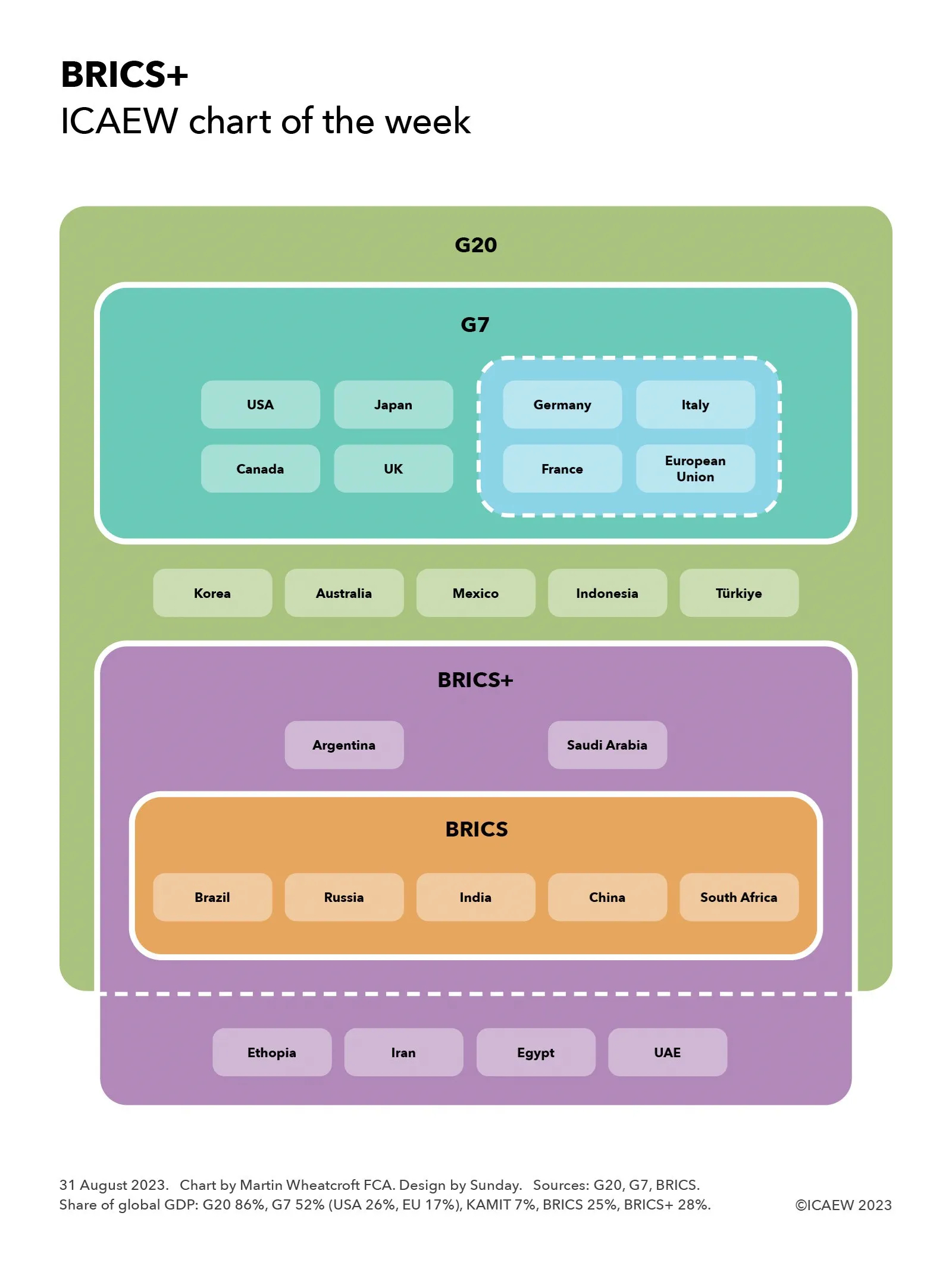
My chart this week looks at one of the big questions being looked at by the UK COVID-19 Inquiry: why did the UK experience one of the highest death rates in the developed world?
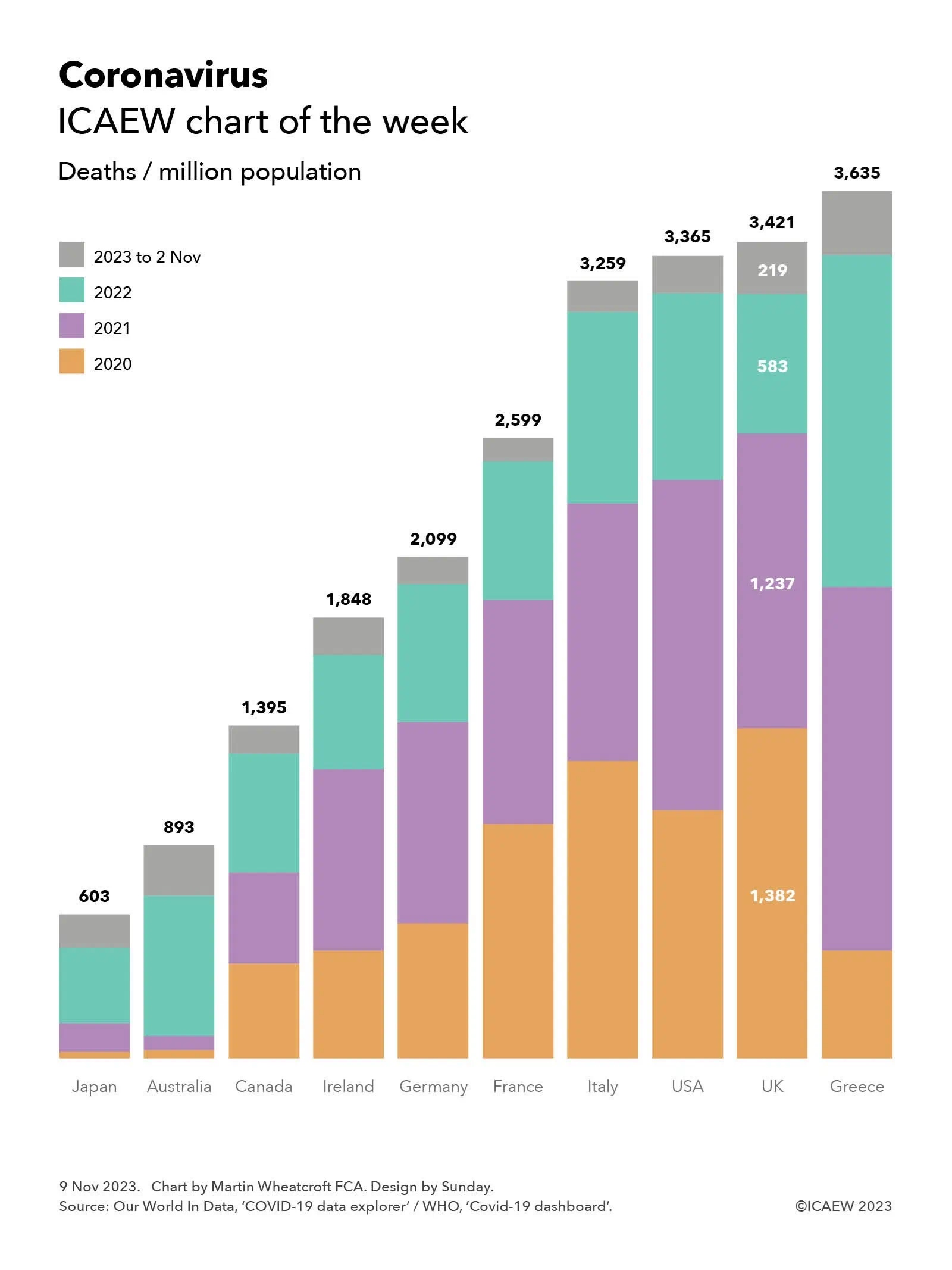
My chart for ICAEW this week is on the coronavirus pandemic and how, according to World Health Organisation (WHO) data as summarised by Our World in Data’s Covid-19 Data Explorer, the UK suffered one of the highest death rates in the developed world.
According to the official statistics, there were 3,421 deaths per million population attributed to COVID-19 in the UK between 1 January 2020 and 2 November 2023. This compares with 603 deaths per million in Japan, 893 in Australia, 1,395 in Canada, 1,848 in Ireland, 2,099 in Germany, 2,599 in France, 3,259 in Italy, 3,365 in the US and 3,635 in Greece.
Not shown in the chart are the total number of cumulative deaths attributed to COVID-19 (ie before dividing by the population) of 74,694 in Japan, 23,289 in Australia, 53,297 in Canada, 9,281 in Ireland, 174,979 in Germany, 167,985 in France, 192,406 in Italy, 1.14m in the USA, 230,974 in the UK, and 37,738 in Greece.
Both Our World In Data and the WHO give warnings about the data, especially given difficulties in identifying which deaths were caused by the coronavirus (especially in 2020 before testing was widely available), whether deaths are recorded when they happened or when they were reported, and differences in how countries attribute deaths to causes.
Despite those factors, these statistics give an overall impression of how badly the coronavirus affected different countries, especially when combined with other data, such as excess mortality (also not shown in the chart). According to Our World In Data, the cumulative difference between total deaths reported from all causes and projected deaths (based on an extrapolation from the years prior to the pandemic) changes the rankings for the countries in our chart, improving the UK’s position to an extent with the US has more excess deaths proportionately than the UK, and Italy more than Greece. Australia has the lowest level of excess deaths for these countries, below Japan, while France is between Canada and Ireland.
The chart also illustrates the deaths per million of population by year, highlighting how for the UK this was 1,382 in 2020, 1,237 in 2021, 583 in 2022, and 219 in 2023, up to 2 November 2023.
The UK COVID-19 Inquiry is looking at much more than the number of deaths as it considers how coronavirus affected all of us over the past few years, how people were affected, including short- and long-term impacts on health and how people died, as well as the impact on the economy and our lives more generally of COVID-19 – and the UK Government’s response to it.