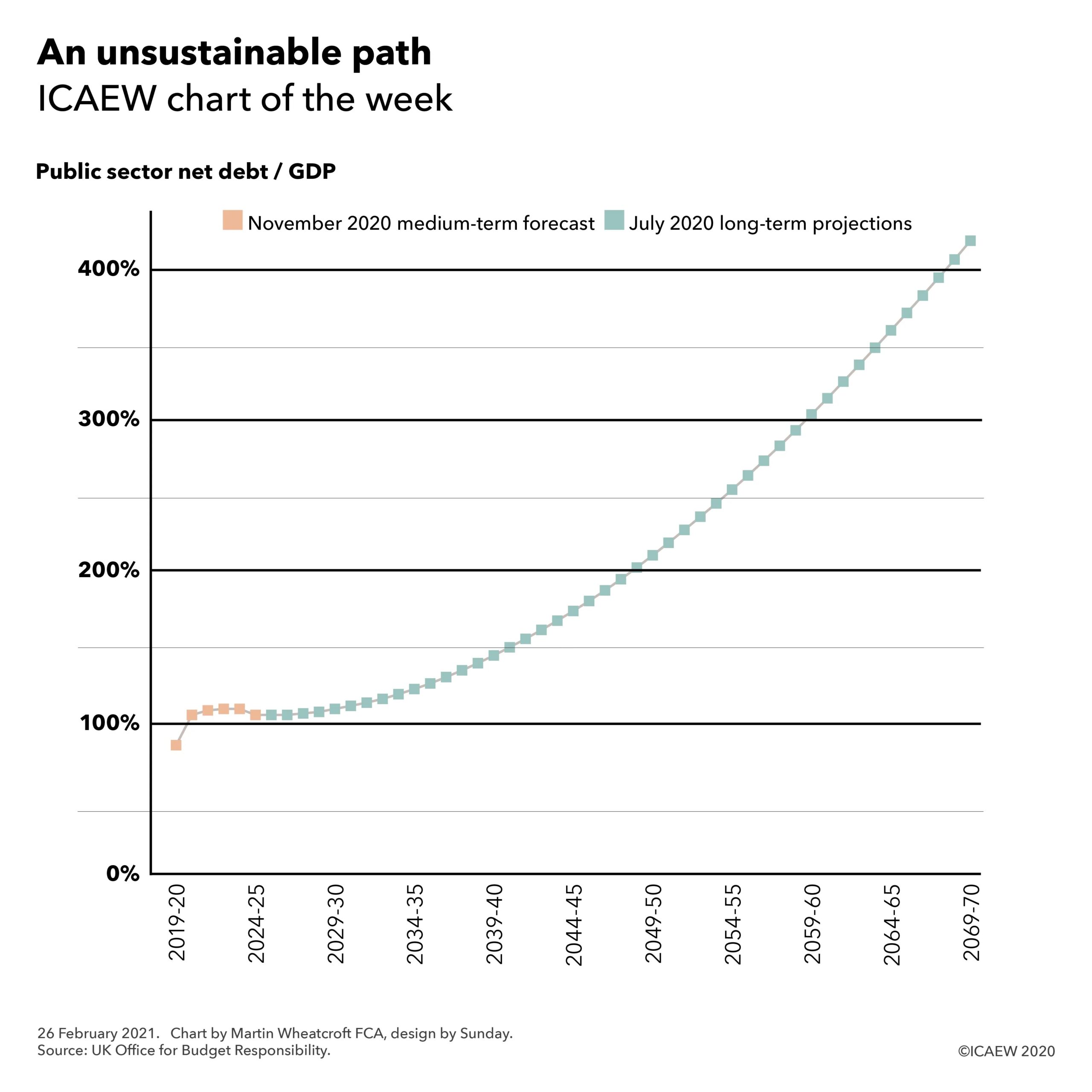
12 March 2021: This week’s chart illustrates how an expected increase of £1tn of additional public debt between 2020 and 2026 translates into the debt to GDP ratio.

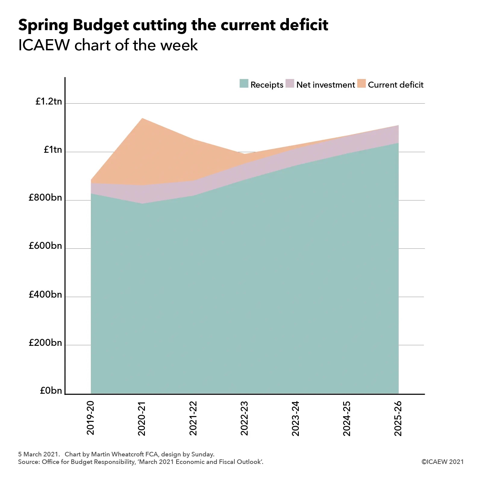
This week’s #icaewchartoftheweek illustrates how a trillion pounds of extra public debt translates into the debt to GDP ratio. This rises from 84.4% last March to a forecast peak of 109.7% in 2024 before falling to 103.8% in 2026, according to the medium-term economic and fiscal forecasts from the Office for Budget Responsibility (OBR) that accompanied the Spring Budget. These forecast a rise in public sector net debt from £1.8tn at 31 March 2020 to £2.8tn at 31 March 2026.
Most of the additional borrowing is expected to occur in the period to March 2024, with £781bn (equivalent to 35.2% of a year’s GDP) borrowed to fund four years of deficits – an estimated £355bn (16.9% of GDP) in the current financial year and forecast deficits of £234bn (10.3% of GDP), £107bn (4.5% of GDP) and £85bn (3.5% of GDP) in 2021-22 through 2023-24 respectively. A further £168bn (7.5% of GDP) is needed over that same period to fund lending and working capital requirements.
Despite borrowing the equivalent of 42.7% of GDP, the debt to GDP ratio is expected to increase by a smaller amount – 25.3% of GDP from 84.4% at 31 March 2020 to 109.7% of GDP at 31 March 2024. This reflects an increase in the denominator for GDP, as a combination of inflation and economic growth ‘inflate away’ the debt by the equivalent of 17.4% over four years. This effect appears quite large, given the annualised growth of 0.7% a year forecast over the four years (comprising a 12% fall during the current financial year followed by growth of 10% in the coming financial year, 5% in 2022-23 and 1.5% in 2023-24) and an average GDP deflator inflation rate of 1.8%, but the magic of compounding, combined with timing differences in the value for GDP used in the calculation all multiply up.
The following two years see the forecast debt to GDP ratio decline to 103.8%. Debt is only expected to increase by £57bn (or 2.2% of GDP) over these two years because lending to businesses during the pandemic is expected to be repaid, reducing the £148bn (5.7% of GDP) needed to fund deficits of £74bn (2.9% of GDP) in 2024-25 and £74bn (2.8% of GDP) in 2025-26 by a net cash inflow of £91bn (3.5% of GDP). As a consequence, the debt to GDP ratio is forecast to drop by 5.9% overall once 8.1% of ‘inflating away’ is taken into account.
As with all forecasts, the reality will be different. A stronger economic recovery would both reduce the need for borrowing and increase the size of GDP at the same time, accelerating the decline in the debt to GDP ratio. A weaker recovery combined with higher spending in response to pressures on public services and/or higher interest rates might do the reverse. Either way, the debt to GDP is likely to remain at a significantly higher level than the pre-financial crisis 34% seen in 2008 for many years, if not decades, to come.