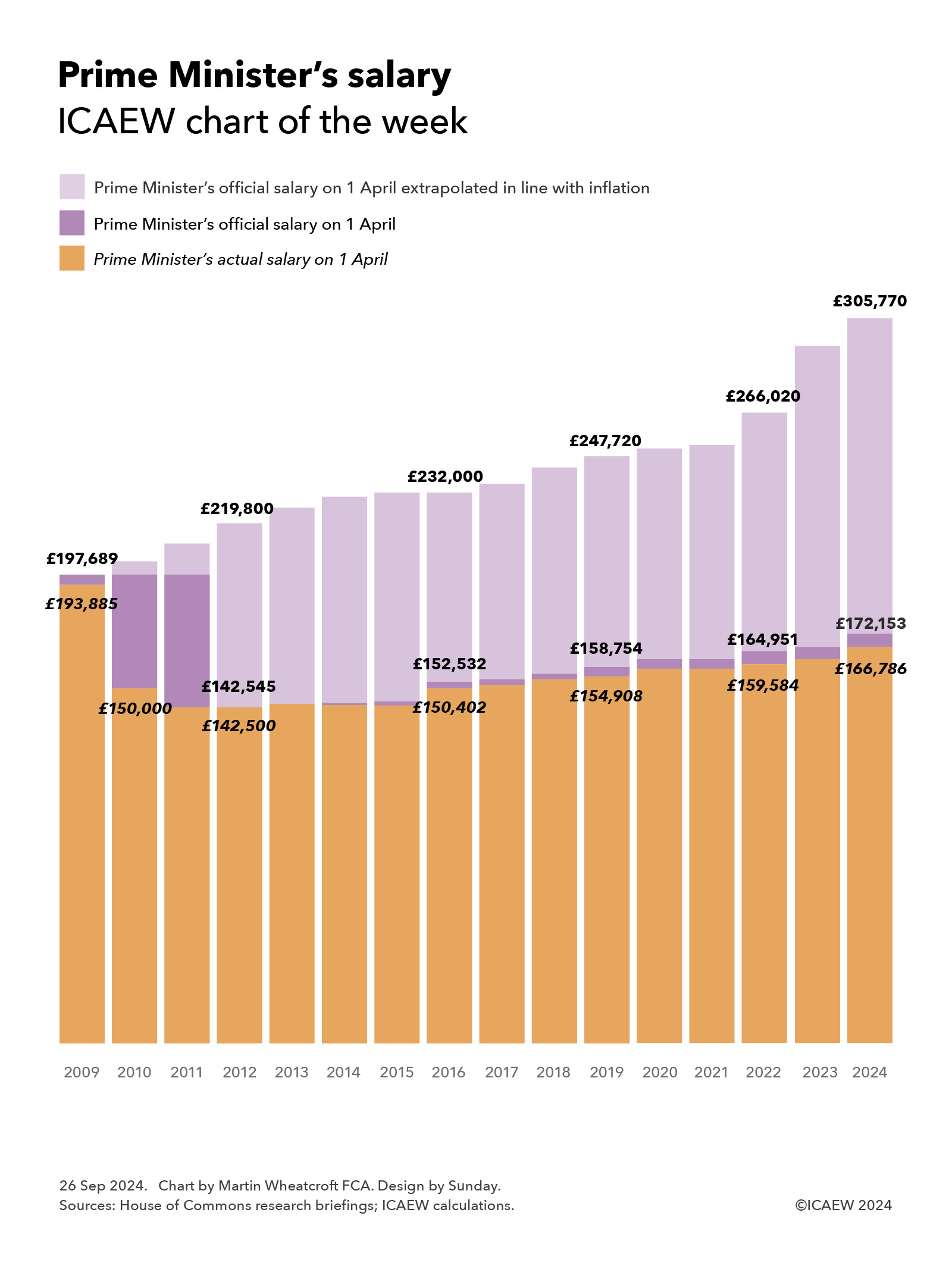
My chart for ICAEW this week illustrates how PM Keir Starmer’s £172,153 official salary entitlement would have been £305,770 if prime ministerial pay had kept pace with inflation since 2009.
Prime ministerial pay has been in the news quite a lot in recent weeks for a range of reasons, leading our chart of the week to look at how the prime minister’s salary has evolved over the last 15 years.
As the chart illustrates, former PM Gordon Brown was entitled to a salary of £197,689 and had an actual salary of £193,885 on 1 April 2009, significantly higher than today’s current official salary of £172,153 or the actual salary of £166,786 taken by current PM Keir Starmer. This is despite cumulative inflation of 55% (3.0% a year on average) or an increase in MP base pay of 41% (2.3% a year) over the past 15 years.
The reasons for these reductions in prime ministerial salary are primarily the result of a voluntary pay cut to £150,000 taken by Gordon Brown in the run up to the May 2010 election, and a further cut of 5% to £142,500 adopted by incoming PM David Cameron.
Cameron maintained his pay at this level for the duration of his first term in office, converting his voluntary decision into a permanent change in 2012 (backdated to 2011) in how much he and his successors have been entitled to receive. The chart shows how Cameron accepted a pay rise following the 2015 general election, taking him from a salary of £142,500 on 1 April 2012 out of an official entitlement of £142,545 to £150,402 on 1 April 2016 out of £152,532.
Subsequent prime ministers have also exercised pay restraint by restricting increases in ministerial pay, or in not taking all of the increases to which they were entitled. As a consequence, Theresa May concluded her period as prime minister in 2019 on a salary of £154,908 out of an official salary of £158,754, while Boris Johnson and Liz Truss were on annual salaries of £159,584 in 2022, short of their full entitlement of £164,951.
Rishi Sunak concluded his period as prime minister on an official salary of £172,153 from 1 April 2024 onwards, being the amount to which Sir Keir Starmer is entitled to claim if he wanted. However, the politics of accepting pay rises is difficult – perhaps now more than ever – and so Keir Starmer has stuck with the £166,786 actual salary that his predecessor was on before the 2024 general election.
Our chart illustrates how the prime minister’s official salary has eroded in value over the last 15 years by calculating how it would have risen to £219,800 on 1 April 2012, £232,000 on 1 April 2016, £247,720 on 1 April 2019, £266,020 on 1 April 2022 and £305,770 this year if it had increased in line consumer price inflation instead.
There are arguments for using other indexes for this comparison, such as public sector pay, which if used would have led to an official salary of £299,060 on 1 April 2024 ; average GDP per capita, perhaps a better measure of national economic performance, would have resulted in an official salary of £301,530. Linking to overall average pay would have led to an official salary of £311,990 today, while maintaining its value in comparison with pay in the private sector would have delivered a potential pay packet for the PM of £334,360.
The requirement for successive prime ministers to approve their own pay has led to the opposite of what you might think would happen. Instead of raising their salary ever higher because they have the power to do so, political choices and pressures have led them instead to cut or freeze their pay at different points over the last 15 years, resulting in a significant erosion in prime ministerial pay in that time.
These choices have led to the UK paying its head of government substantially less than comparable leaders such as Australian PM Anthony Albanese’s annual salary of A$607,500 (£311,500), German Chancellor Olaf Scholz’s €348,300 (£290,250) or Canadian PM Justin Trudeau’s C$408,200 (£226,800).
Ironically, it might be the prime minister (and his successors) who could benefit most of all of our public servants by taking the power to set his own pay away and giving it to an independent pay review body instead.
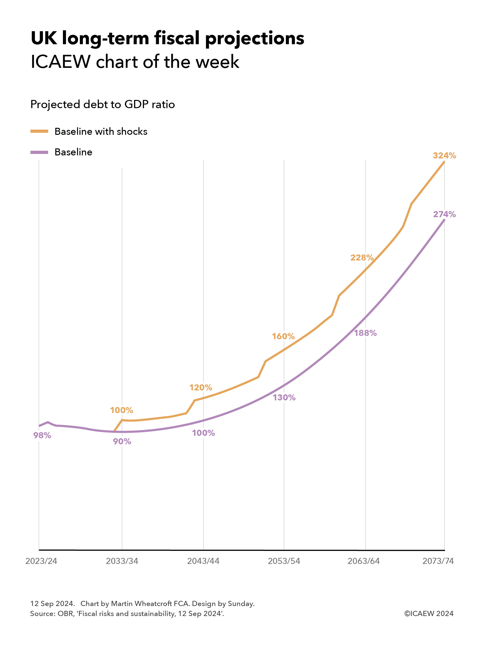
The OBR’s latest fiscal risks and sustainability report projects that public debt could reach 274% of GDP in 50 years’ time, or 324% if likely economic shocks are included.
Our chart this week is on the long-term fiscal projections included in the Office for Budget Responsibility’s (OBR) latest fiscal risk and sustainability report published on 12 September 2024.
The OBR suggests that – without action to improve productivity, increase taxes, cut spending, bring in more people or do more to tackle climate change – public sector net debt is projected to rise to 274%, or potentially 324% if likely economic shocks are included.
As the chart illustrates, debt to GDP was 98% at the end of 2023/24 and the baseline projection shows this falling over the coming decade to 90% by 2033/34, and then gradually increasing to 100% of GDP in 2043/44, 130% in 2053/54, 188% in 2063/64, and then 274% in 2073/74.
Experience tells us to expect an economic shock such as a recession every decade or so, and so the OBR also reports a ‘baseline with shocks’ scenario that sees the debt to GDP ratio reaching 100% of GDP in 2033/34, 120% in 2043/44, 160% in 2053/54, 228% in 2063/64, and then 324% in 2073/74.
The projections reflect long-term pressures on the public finances from the post-economic crisis slowdown in economic growth, an ageing population, the effects of climate change, and higher defence spending.
They are, of course, dependent on the assumptions used in their calculation, especially reproductivity growth, net inward migration, the health of the population, and the degree of rise in global temperatures. They also assume that the previous government’s plans to cut public spending significantly over the next five years are adopted by the incoming government, which is considered to be unlikely given that most economic commentators thought these plans were unrealistic even if there had not been a change in government.
Alternative scenarios prepared by the OBR include a better health scenario that results in a 44% lower debt to GDP ratio in 2073/74, a worse health scenario that increases debt by 49% of GDP, a higher rise in global temperatures to 2℃ that increases debt by 23% and to 3℃ that increases debt by 33%.
The good news is that all of these projections are completely unrealistic.
They are based on extrapolating from current tax and spending policies, without taking account of any actions that governments might take in the future to raise taxes, cut spending or develop the economy. It is extremely unlikely that future governments would be willing, or even able, to finance such large fiscal deficits over the next 50 years.
The bad news is that in consequence taxes are likely to go up.
While there are options to mitigate pressures on the public finances by cutting spending on public services or cutting the level of benefits such as the state pension, these are likely to be politically and practically difficult to achieve. Similarly, immigration remains a politically charged issue and encouraging higher levels of net inward migration significantly more than the 315,000 a year assumed from 2028/29 onwards might be challenging.
The OBR suggests a ‘fiscal tightening’ of 1.5% each decade would be necessary to return debt to its pre-pandemic level of approximately 80% of GDP. If accomplished through tax rises alone, this would see tax levels increase from a projected 37% of GDP in 2027/28 to around 43% of GDP in 2073/24.
Avoiding either of these outcomes – unsustainable debt or ever-increasing levels of taxation – will require productivity growth to increase significantly. So, if you have any good ideas on how to achieve higher productivity that no one else has thought of (preferably without increasing public spending too much), please write to the Chancellor at 11 Downing Street as she would probably be interested to hear them.
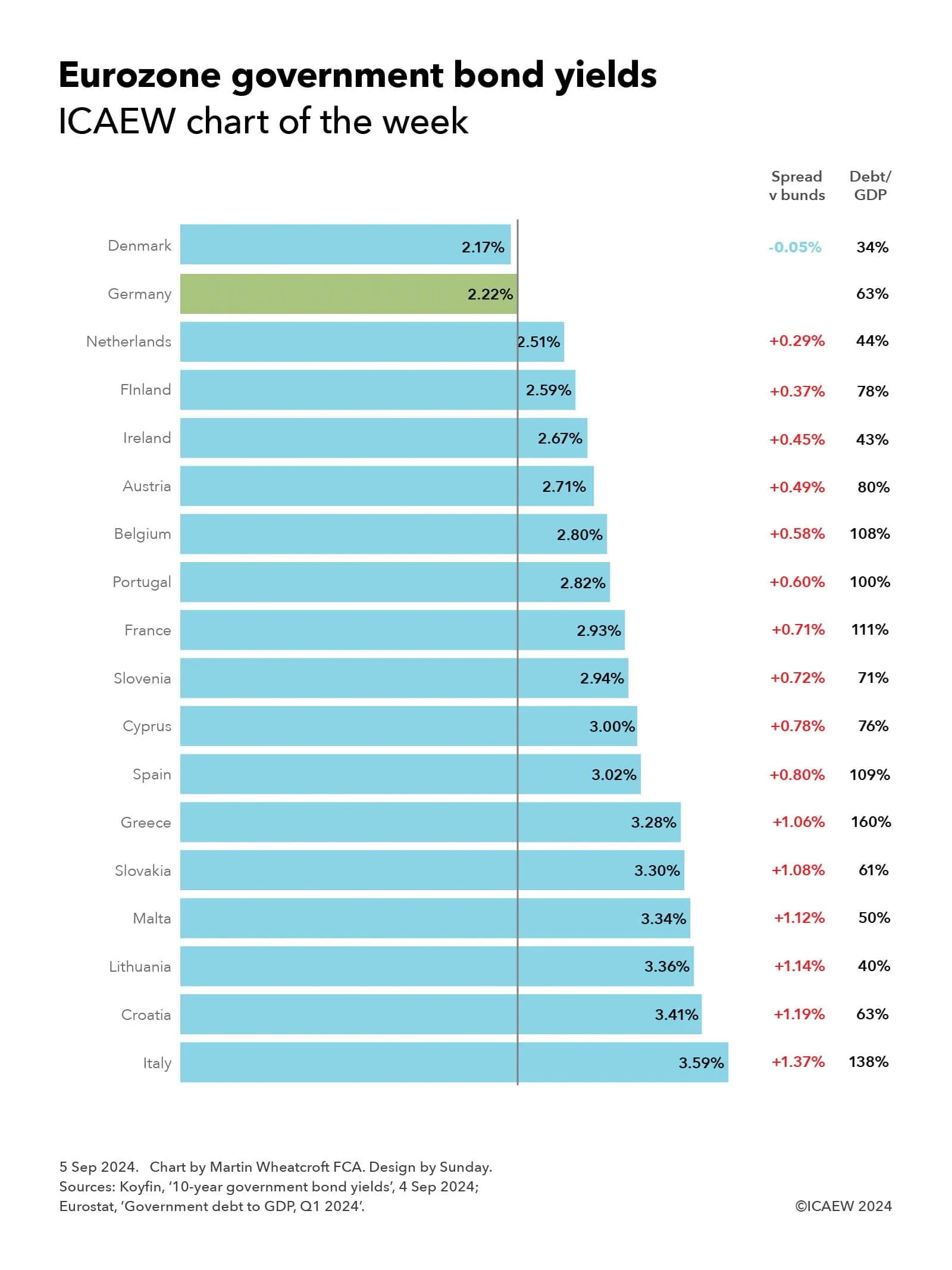
My chart for ICAEW this week is on the cost of government borrowing in the Eurozone, which on 4 September ranged from 2.17% for Danish 10-year bonds up to 3.59% for their Italian equivalents.
My chart this week is on the range of yields payable on 10-year government bonds by 18 out of the 20 countries in the Eurozone for which data is available.
The chart illustrates how investors in German 10-year government bonds (known as ‘bunds’) would have received a yield to maturity of 2.22% – or conversely the German government could have borrowed at an effective interest rate of 2.22% if issuing fresh debt at that point in time. Yields on German bunds are used as benchmark rates for government debt not just in the Eurozone, but globally.
Just one country in the Eurozone has a lower 10-year bond yield than Germany, which is Denmark at 2.17% on 4 September, which is a 0.05 percentage points or 5 basis points (bp) ‘spread’ below the benchmark bund rate.
While quoted yields move up and down all the time, sometimes by quite large amounts, spreads are much less volatile, providing an insight into how debt investors perceive the relative risks of investing in different countries’ sovereign debt.
The next lowest yields were the Netherlands at 2.51%, with a spread of 0.29 percentage points above bunds, and Finland at 2.59% (+0.37%). This is then followed by Ireland on 2.67% (+0.45%), Austria on 2.71% (+0.49%), Belgium on 2.80% (+0.58%), Portugal on 2.82% (+0.60%), France on 2.93% (+0.71%), Slovenia on 2.94% (+0.72%), Cyprus on 3.00% (0.78%) and Spain on 3.02% (+0.80%). There is then a small jump to Greece on 3.28% (+1.06%), Slovakia on 3.30% (+1.08%), Malta on 3.34% (+1.12%), Lithuania on 3.36% (+1.14%) and Croatia on 3.41% (+1.19%).
The highest yield for investors among Eurozone countries – and hence the highest borrowing cost for its government – is Italy with 3.59%, which is 1.37 percentage points above the effective interest rate at which Germany could in theory borrow.
Comparing the bond yields in the Eurozone provides an insight into the relative strengths and weaknesses of these countries’ public finances and economies given that they all share a currency, a central bank base interest rate (currently 3.75%), and are all in the EU Single Market and Customs Union. Comparing yields with other currencies, such as the UK’s 3.95% for example (not shown in the chart), needs to take other factors into account, such as the UK’s much higher central bank base rate of 5%.
The chart also reports the government debt to GDP levels of each country for the second quarter of 2024 according to Eurostat, which may help explain why Denmark (with debt/GDP of 34%) pays a significantly lower borrowing cost than Spain (109%).
However, debt/GDP doesn’t explain all of the differences, with the 10-year yield on Greek government debt (debt/GDP 160%) of 3.28% for example being significantly lower than the 10-year yield on Italian government debt (debt/GDP 138%) of 3.59%.
Not shown in the chart are Estonia (debt/GDP 24%) and Latvia (45%), both of which tend to borrow at shorter maturities.
The lack of a firm correlation between debt/GDP and bond spreads should not be surprising as debt/GDP is a relatively crude measure of public finance strength or weakness. It excludes most government assets and non-debt liabilities, the funded or unfunded nature of their social security systems, as well as a country’s medium- and longer-term economic prospects and the perceived stability of that country’s government. These are all factors debt investors take into account when deciding the level of risk that they are willing to accept when investing.
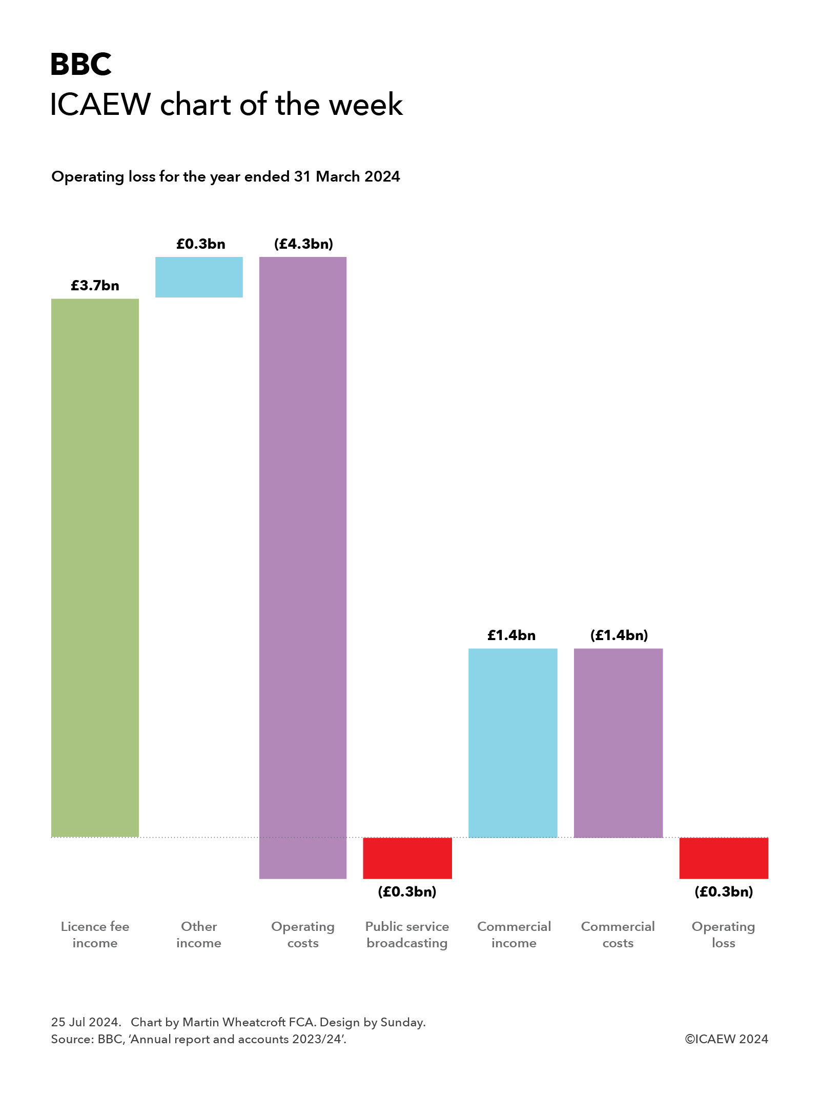
My chart for ICAEW this week highlights how the BBC is struggling financially after incurring an operating loss of £0.3bn on the provision of public service broadcasting and the failure of commercial activities to contribute to the bottom line.
The British Broadcasting Corporation (BBC) recently published its annual report and accounts for the year ended 31 March 2024 (2023/24) and my chart highlights how the BBC is struggling financially with a reported operating loss of £0.3bn and no operating profit contribution from commercial activities.
Licence fee income was £3.7bn in 2023/24, which combined with other income of £0.3bn resulted in public services broadcasting revenue of £4.0bn. After deducting operating costs of £4.3bn, this meant the BBC lost £0.3bn on its eight national and seven regional TV channels, 10 national and 46 regional and local radio stations, BBC World Service radio in 42 languages, BBC iPlayer, BBC Sounds, BBC Education, news, sport and weather internet sites, orchestras and other activities, including funding of the independent S4C TV channel in Wales.
External income generated by the BBC’s commercial operations amounted to £1.4bn but this was offset by £1.4bn in operating costs, leaving the overall group operating loss broadly unchanged from the public service broadcasting total.
Licence fee income of £3.7bn was just under £0.1bn or 2% lower than the year before as the number of households paying the full licence fee reduced from 23.2m to 22.7m at the end of March 2024 on a fee frozen at £159 per year (equivalent to £13.25 per month). There were approximately 4,000 households with monochrome licences and 0.2m households on concessionary fees, with a further 1.0m with free licences (principally given to those aged 75 or more receiving pension credit).
Other income includes £0.2bn from contract income and £0.1bn in grants from the Foreign Office towards the cost of the World Service.
Public services broadcasting expenditure of £4.3bn was £149m lower than the year before and can be analysed between spending on content of £3.0bn, distribution and support costs of £0.9bn, and other activities of £0.4bn. Content spending can be further broken down into £1.7bn on TV channels, £0.5bn on radio, £0.3bn on the World Service, £0.2bn on online services including BBC iPlayer, and £0.3bn on other content.
While external commercial income was broadly matched by costs once intra-group transactions are taken account of, the BBC’s commercial businesses contributed £325m in 2023/24 towards the BBC’s overheads, down from £368bn in the previous year. They principally comprise BBC Studioworks, which supplies studio time and post-production services to the major TV networks and most production companies in the UK, and BBC Studios, which produces TV shows and films on behalf of the BBC and other broadcasters, as well as distributing BBC content around the world. BBC Studios also operates the UKTV network of four ad-supported TV channels, four ad-supported streaming channels and three pay TV channels in the UK, several international TV channels (including BBC America and BBC News international services), and the BritBox International streaming service outside the UK (now 100% owned by the BBC).
Not shown in the chart is £0.5bn in non-operating gains, most of which were one-off items, including £0.2bn in gains on disposals in the year and £0.2bn from tax adjustments in respect of prior years. This resulted in an overall net surplus of £0.2bn for the year ended 31 March 2024.
Real-term cuts in the value of the licence fee and falling returns from commercial activities have put significant financial pressure on the BBC in recent years, causing it to cut back on content and some services, consolidate operations such as domestic and international news gathering, and undergo a series of restructurings to improve efficiency.
The 8.7% increase in the licence fee to £169.50 from 1 April 2024 (equivalent to £14.13 per month) and inflation-linked increases planned over the next three years should help ease some of the pressure in the current financial year, although returning to operating profitability is likely to still require the BBC to look for further savings in its public service broadcasting operations.
Unfortunately, the BBC has not been able to replicate its commercial success in the years before streaming when it was able to generate significant returns from the sale of DVDs and international content licensing. While there are plans to build up its international streaming services (from a relatively low base), the BBC’s commercial businesses are unlikely to generate enough money to affect the dilemma facing the new government on what to do with the licence fee when the BBC’s current financial settlement ends on 31 December 2027.
The temptation will be for the government to defer reform of how the BBC is funded yet again, just as its predecessors have done over the last couple of decades. However, the erosion of income from younger households choosing to not watch broadcast television to stop paying the licence fee, and the likely consolidation of streaming services into a handful of global online ‘broadcasters’ that will dominate the market, is likely to make avoiding this conundrum that much more difficult this time around.
My chart for ICAEW this week looks at how a declining fertility rate means the global population is now anticipated to reach a peak of ‘just’ 10.3bn in 2084, according to the UN.
The Population Division of the UN Department of Economic and Social Affairs (UN DESA) recently published its latest population projections for the 21st century. Its central projection is for the world’s population to increase from 8.2bn next year to a peak of 10.3bn in 2084 in 2084 before falling slightly to 10.2bn at the end of the century.
This means that the population will have increased by 2.0bn between 2000 and 2025 and is projected to increase by 1.5bn over the next 25 years to 9.7bn in 2050 and by 0.6bn to 10.3bn in 2075, before gradually starting to fall from 2084 onwards.
My chart illustrates how this change differs by region, with the population of Africa expected to grow throughout the century from 1.5bn in 2025 to 3.8bn in 2100. South and Central Asia, which has seen its population grow from 1.7bn in 2000 to an anticipated 2.3bn next year, is expected to see further growth to 2.9bn in 2075 before then falling to 2.8bn in 2100, while the population of the Asia-Pacific region is expected to increase from 2.1bn in 2000 to 2.4bn in 2025, is expected to fall gradually from 2030 onwards to 1.5bn in 2100.
The population of the Americas is expected to grow slightly from 1.1bn in 2025 (up from 0.8bn in 2000) to 1.2bn before falling back to 1.1bn by 2100, while Europe and Middle East’s population is expected to increase from 0.9bn in 2025 (up from 0.8bn in 2000) to close to 1.0bn in 2050 and for the rest of the century.
UN DESA says the main driver of global population increase over the next 60 years until it peaks is the momentum created by growth in the past, with increases in the number of women of reproductive age until the late 2050s offsetting a declining fertility rate – currently one child fewer on average than in the 1990s (2.25 live births per woman currently compared with 3.31 in 1990). They also project that the number of people aged 65 will reach 2.2bn in 2080, surpassing the number of children under 18 in that year.
The declining fertility rate is one reason that the UN are projecting that the world’s population in 2100 will be 700m or 6% smaller than they were anticipating a decade ago, despite life expectancy starting to increase again after falling during the COVID-19 pandemic.
For some countries and areas, the declines in population are expected to be quite significant over the remainder of the century, such as the populations of China and Japan, which are expected to reduce from 1,416m to 633m and from 123m to 77m between 2025 and 2100 respectively. Meanwhile India is expected to grow from a population of 1,464m in 2025 to a peak of 1,701m in 2061 before falling to 1,505m in 2100.
Many other countries and areas have already or will shortly see their populations start to decline, except for about 52 countries and areas up until 2054, and 62 up until 2100, where immigration will be the main driver of population growth. The latter includes the UK, where the population is expected to rise from 70m in 2025 to a peak of 76m in 2073 before falling to 74m in 2100, and the US, expected to grow from 347m in 2025 to 421m in 2100.
According to the analysis by the UN, there are around 100 countries and areas (out of the 237 included in their analysis) with relatively youthful populations over the next half century that have a window of opportunity to accelerate their economic development. This ‘demographic dividend’ occurs when the share of the population of working ages is increasing faster than the overall population and a substantial and sustained decline in fertility increases the numbers available to work, assuming the countries concerned can put in the investment needed to take advantage of this opportunity.
My chart for ICAEW this week looks at how negative economic growth per capita over the last five years may have contributed to the recent change in government.
My chart this week is on the change in quarterly GDP over the past five years, analysing the change between GDP as calculated by the Office for National Statistics (ONS) of £549bn in the first quarter of 2019 and £688bn in the first quarter of 2024, a net increase of £139bn.
Inflation, at 4% a year on average over the past five years, was the largest contributor to the change, being £120bn out of £139bn of the increase. An increase in population of more than 0.6% a year added a further £22bn, but this was offset by £3bn from negative economic growth per capita of 0.1% on average over the past five years.
Breaking down the £19bn change resulting from economic growth (0.5% a year on average), between population change and economic growth per capita in this way highlights how net inward migration has been one of the most significant drivers of the UK economy over the past five years.
While there are multiple reasons why the electorate decided to vote in a new government in the recent UK general election, the £41 reduction in quarterly GDP per capita over the past five years after adjusting for inflation – and the associated drop in living standards – to £9,994 per person in 2024 Q1 is likely to have been one of them.
The good news is that the next five years may be better, with monthly GDP up by 0.40% over the course of April and May 2024. This can be broken down between an estimated population growth of 0.16% and an increase in monthly GDP per capita over the two months of 0.24%, a positive sign, especially in the light of the latest ICAEW Business Confidence Monitor reporting that business confidence has risen to its highest level in over two years.
My chart for ICAEW this week ‘celebrates’ US Independence Day by setting out the latest congressional projections for federal debt.
Two hundred and forty-eight years ago, on 4 July 1776, the United States of America declared its independence from Great Britain, inheriting debts used to finance the revolutionary war but without any tax raising powers to fund repayment of the amounts owed. This was addressed by the adoption of the US Constitution in 1789, which enabled Secretary of the Treasury Alexander Hamilton to raise taxes, start repaying those initial debts, and issue new debt to finance a fledgling nation.
My chart this week illustrates how the US federal government has continued to borrow since then, with the Congressional Budget Office (CBO) reporting that US federal debt held by the public was $26.2tn or 97.3% of GDP in September 2023, on track to reach $28.2tn or 99.0% of GDP on 30 September 2024, before rising to a projected $50.7tn or 122.4% on 30 September 2034.
Debt on 4 July this year is estimated to be close to $27.8tn.
The projected rise in debt held by the public over the coming decade is based on extrapolating the gap between federal revenues and spending of around $160bn a month in the current financial year, based on tax and spending legislation enacted at 12 May 2024 together with the CBO’s own assessment of the administration’s financial plans (for example over student loan relief) and assumptions around factors such as interest rates and economic growth.
However, the CBO is keen to stress that these numbers are not a forecast. They say: “The baseline projections are meant to provide a benchmark that policymakers can use to assess the potential effects of changes in policy; they are not a forecast of future budgetary outcomes. Future legislative action could lead to markedly different outcomes. But even if federal laws remained unaltered for the next decade, actual budgetary outcomes would probably differ from CBO’s baseline projections, not only because of unanticipated economic conditions, but also because of the many other factors that affect federal revenues and outlays.”
The challenge for the US is that despite almost 250 years of taxation with representation, that representation finds it difficult to raise taxes to bring debt down, often choosing to cut taxes and increase borrowing instead.
Whether that will change, or whether debt markets force it to change, remains a big unknown in the experiment commenced by George Washington and Alexander Hamilton all those years ago.
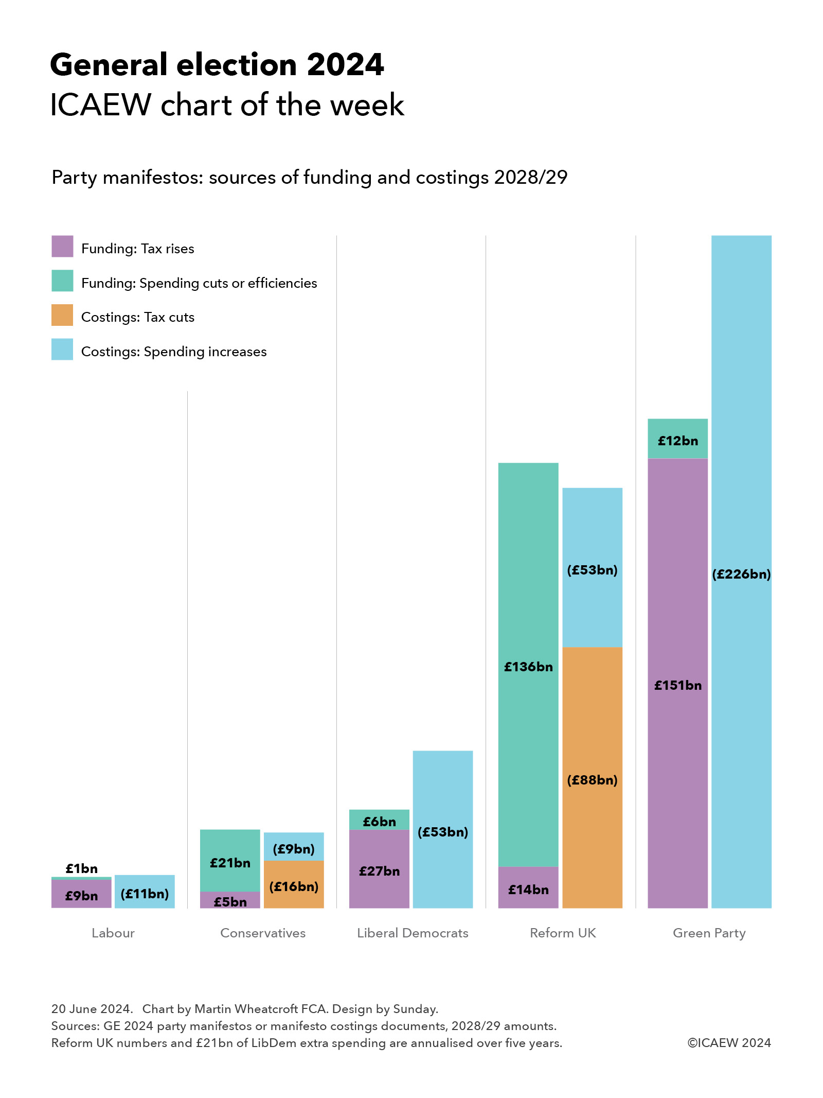
This week’s chart for ICAEW is on manifesto costings, illustrating the scale of each party’s promises and how they expect to fund them.
My chart for ICAEW this week summarises the financial commitments in the manifestos of the five UK-wide political parties, together with how they propose to fund their plans.
The Labour Party
The Labour Party manifesto costings are the most cautious financially, with plans to find £9bn in 2028/29 from a combination of tax rises and tackling tax avoidance and evasion and £1bn or so in spending reductions to provide most of the funding for its spending commitments of £11bn.
The additional tax revenue proposed by Labour includes £5.2bn from increasing taxes on non-doms and tackling tax avoidance and evasion, £1.5bn from VAT and business rates on private schools, £1.2bn from extending windfall tax on oil and gas, and £0.6bn from increasing the tax rate on private equity carried interest. Spending reductions include £0.7bn from cutting spending on consultants, £0.4bn from increased collaboration between police forces, and £0.2bn from scrapping the Rwanda plan and ending the use of hotels for asylum seekers.
Labour’s proposals for new spending comprise approximately £6bn for public services and £5bn a year in capital investment. The former includes £1.8bn for the NHS, £1.0bn for schools and young people (including £0.3bn for primary school breakfast clubs), £0.9bn for HMRC to tackle tax avoidance and evasion, £0.7bn for improving public service delivery and capability, £0.4bn for 13,000 neighbourhood and community PCSOs, and £0.2bn for asylum and border control. The latter includes £1.7bn for Great British Energy, £1.5bn for green investment programmes, £1.1bn for home insulation, and £0.3bn in incentives for green energy suppliers.
Labour’s proposals add up to £1bn in extra borrowing in 2028/29, although Labour suggest that they could add £3.5bn to borrowing in 2028/29, implying a further £2.5bn could be available for other priorities.
The Conservative Party
The Conservative Party’s plans are more ambitious, with plans to raise £5bn a year by 2028/29 from tackling tax avoidance and evasion and £21bn from spending cuts and efficiency savings, which they intend to use to fund tax cuts of £16bn and extra spending of £9bn.
Proposed spending cuts by the Tories comprise £11bn from cutting planned spending on welfare (principally disability benefits), £5bn from other cuts (£1.6bn R&D, £1.5bn regional development, £0.9bn from cutting ‘low value’ degrees, £0.4bn from visa changes, and £0.6bn in other measures), and £5bn from efficiency savings (£2.9bn civil service headcount, £1.1bn from quangos, £0.6bn consultancy and £0.4bn NHS managers).
Proposed tax cuts include £10bn per year by 2028/29 to halve employee national insurance, £1.7bn to abolish self-employed national insurance, £2.2bn to increase pensioner tax allowances, £1.2bn to reform the high-income child benefit charge, and £0.6bn to reduce stamp duty for first time buyers.
Unlike Labour, there is no additional investment in HMRC to help achieve the planned reduction in the tax gap, but there is £4.5bn in 2028/29 to increase defence spending to 2.44% of GDP (on its way to 2.5% by 2030/31), £2.0bn for national / community service, £1.4bn for the NHS, £0.8bn for 8,000 more police officers, and £0.7bn for apprenticeships.
The Liberal Democrats
The Liberal Democrats are more hopeful in that they believe they can find £7.2bn from tackling tax avoidance and evasion to supplement proposed tax rises of £19.7bn (£5.2bn capital gains tax, £4.3bn bank levies, £4.0bn aviation taxes, £2.1bn oil and gas, £2.1bn digital services tax, £1.4bn on share buybacks and £0.6bn other). The party also plans to find £5.8bn from spending cuts (£4.3bn asylum, £0.9bn free schools, and £0.6bn consultants).
The Lib Dems plan use this additional funding to spend an extra £32bn on public services in 2028/29 (£9.8bn NHS and social care, £6.7bn on defence, borders and international aid, £6.6bn on education and childcare, £4.1bn to tackle child poverty, £2.9bn for the devolved administrations, £1.0bn for farmers and the environment and £0.6bn for transport.
The balance of £20.7bn a year on average over five years for capital investment is expected to be funded mainly by additional borrowing, including £8.4bn to tackle climate change and protect the environment, £6.2bn for social housing, £1.9bn on school buildings, £1.9bn for the devolved administrations, £1.2bn on transport infrastructure, and £1.1bn for hospitals and other health facilities.
The Reform Party
The Reform UK costings in the ‘Our Contract with You’ are on a much bigger scale than everyone apart from the Green Party, with proposals to raise taxes by £14bn and cut spending by £136bn (10% of total public spending, or more once costs such as the state pensions are excluded) in order to fund an £88bn programme of tax cuts and £53bn a year in spending commitments.
The proposed spending cuts include a blanket £50bn a year in efficiency savings from cutting public service spending by 5% “without touching front line services”, £35bn from ceasing to pay interest to commercial banks on central bank deposits, £20bn from scrapping net zero, £15bn from cutting welfare benefits, £6bn from foreign aid, £5bn from reducing immigration and £5bn from stopping HS2 completely. The tax rises comprise a £10bn tax on renewable electricity generators and a £4bn immigration surcharge on employers, together with unquantified amounts from a 4% online delivery tax and a cut in entrepreneur’s relief to 5% that are netted off within the numbers below.
Reform UK plans to use these sums to cut personal taxes by £70bn (raise income tax threshold to £20,000, abolish VAT on energy bills, cut stamp duty, allow VAT reclaims for tourists, halve inheritance tax rate to 20% and raise threshold to £2m), cut business taxes by £18bn (reduce corporation tax to 15% and to zero for profits under £100,000, increase the VAT threshold to £150,000, abolish business rates for high street SMEs and create SME enterprise zones with zero tax when creating jobs).
Spending commitments include £17bn health and social care (a three-year basic rate tax holiday for NHS and social care staff, 20% tax relief on private healthcare and insurance, write-off medical student fees over 10 years and private treatment vouchers), £14bn for defence and veterans (2.5% of GDP with an aspiration to meet 3% after 2030), £8bn for children and families (including £5,000 transferrable marriage allowance and front loading of child benefit for ages 1-4), £5bn for police and courts (recruiting 40,000 new officers over five years), £5bn for education (including 20% tax relief on private school fees – and no VAT), and £4bn for agriculture, fishing and coastal communities
The Green Party
The Green Party has the most ambitious set of proposals, with tax rises of £151bn and cost savings of £12bn together with £63bn in additional borrowing to fund incremental spending of £226bn in 2028/29. It has an expansive agenda that involves nationalising water and the Big 5 energy companies, investing large sums in the green transition, and spending a significant amount more on health and welfare.
Its proposed tax increases comprise £72bn in higher personal and wealth taxes, £70bn from a carbon tax and around £9bn from business taxation, with £12bn in savings from cancelling the Trident replacement and roadbuilding programmes. Its proposals include aligning capital gain tax rates and investment income with income tax, increasing national insurance above the upper earnings limit from 2% to 10%, restricting pension tax relief to the basic rate, reforming inheritance tax, and introducing a 1% wealth tax on individuals with assets above £10m and 2% above £1bn. It also wants to replace council tax and business rates with land value taxes.
If achieved, this would allow it to pay for £145bn in additional current spending of £145bn in 2028/29 and £81bn in extra capital investment. The former includes £46.4bn for health and social care, £27.2bn welfare, £20.1bn overseas aid, £13.2bn education, £11.9bn transport, £4.5bn nature, food and farming, and £21.7bn for other priorities. The latter includes £56.7bn for green investment, £10.5bn for social housing, £6.6bn for health and education, and £6.8bn for other capital expenditures.
Upcoming Spending Review does not feature
None of the parties addresses the ‘elephant in the room’ represented by the upcoming three-year Spending Review for 2025/26 to 2027/28 that is expected by the Institute for Fiscal Studies and others to identify up to £20bn per year of additional funding requirements to maintain public services at their current level.
Overcoming the current weak state of the public finances is likely to be first order of business for whichever party wins the election.
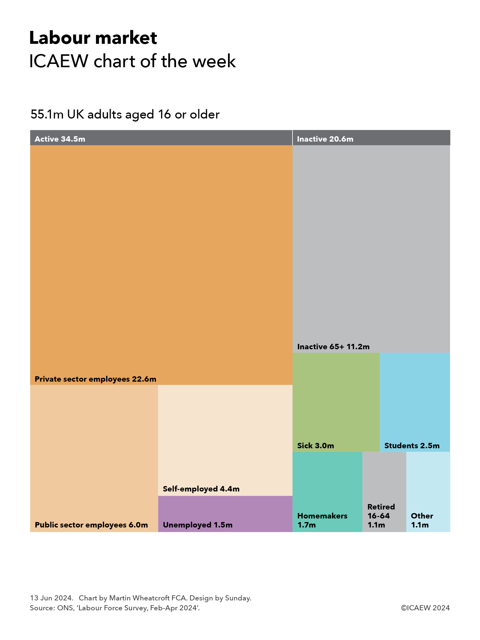
My chart for ICAEW this week is on the labour market, breaking down the employment status of the 55.1 million adults aged 16 or over in the UK.
Our chart illustrates the employment status of the 55.1m adults in the UK on the basis of the latest statistics reported by the Office for National Statistics (ONS), published on 11 June 2024 for the three months from February to April 2024. The ONS is well ahead of the Labour Party’s proposals to extend the franchise in that it has long classified individuals aged 16 or 17 as ‘adults’ for the purposes of its labour market statistics.
According to the latest numbers, there are 34.5m economically active individuals in the UK, comprising 22.6m private sector employees, 6.0m public sector employees, 4.4m self-employed and 1.5m unemployed.
A further 20.6m adults are not economically active, comprising 11.2m individuals aged 65 or more (most of whom are retired), 3.0m aged 16-64 who are sick, 2.5m students, 1.7m homemakers, 1.1m who have taken early retirement, and 1.1m others who are either not active for other reasons, or where the reason they are not active is not clear.
The 2.5m student number excludes 1.2m students and pupils with part-time jobs, who are included within the economically active category.
The inactive total includes 1.7m adults aged 16-64 who don’t meet the criteria to be officially classified as unemployed but say that they would like a job, comprising 0.3m or so students, 0.4m homemakers, 0.7m sick and 0.3m other.
The inactive numbers between age 16 and 64 have been broadly stable over the past few years (plus or minus 0.1m) with the exception of the number who are sick. This has increased from 2.3m (2.1m long-term sick and 0.2m temporarily sick) in the same period in 2020 – at the start of the pandemic – to 3.0m (2.8m long-term sick and 0.2m temporarily sick) today. This is a 32% increase in the number of long-term sick, a major issue both for the economy and the NHS.
The 33.0m people in work include 1.5m who are aged 65 or over, but unfortunately the ONS doesn’t provide a breakdown between those in work who are aged 65 (and therefore still shy of the state retirement age) and those who are aged 66 or more who could retire but have chosen or need to continue working.
Public sector employees comprise 2.0m in the NHS, 1.5m in education, 1.2m in public administration (including 0.5m in the civil service), 0.4m in the police and armed forces, 0.2m in other health and social work, and 0.7m in other areas.
According to the ONS, the employment rate is 74.3%, being the total of those in work between 16 and 64 (33.0m total – 1.5m over 65 = 31.5m) divided by the total number aged between 16 and 64 (31.5m in work + 1.5m unemployed + 9.4m inactive = 42.4m).
In contrast, the unemployment rate of 4.4% is calculated including those aged 65 or more but excluding those who are inactive, dividing the just over 1.5m who are officially unemployed (of whom 48,000 are 65 or more) by the just under 34.5m total number of economically active individuals
My chart for ICAEW this week celebrates the launch of King Charles III banknotes by looking at the number and value of Bank of England banknotes in circulation, highlighting the continued popularity of the £20 note.
My chart this week is in honour of the new King Charles III banknotes that have just started to enter circulation. These will match the design of the existing Sir Winston Churchill £5 notes, Jane Austen £10 notes, JMW Turner £20 notes, and Alan Turing £50 notes, but with the King’s image replacing that of the late Queen Elizabeth II.
As the chart illustrates, the Bank of England reports that there were £82.4bn of its banknotes in circulation on 29 February 2024, comprising 384m £5 notes worth £1.9bn, 1,277m £10 notes worth £12.8bn, 2,646m £20 notes worth £52.9bn, and 295m £50 notes worth £14.8bn.
The chart excludes £4.6bn in high value notes issued to Scottish and Northern Irish banks that in turn print their own banknotes.
The new King Charles III banknotes (or ‘Charlies’ as they may come to be called) were issued for the first time on 5 June 2024 in relatively small numbers. The Bank of England says that they are only going to put them into circulation as old banknotes wear out or to meet demand, which could take a long time given that polymer banknotes are much more hardwearing than old paper banknotes.
On average there are approximately 6 x £5, 20 x £10, 40 x £20 and 4 x £50 in circulation for each person living in the UK. Although many of these will be sitting in cash registers and bank vaults, there are still a large number sitting in drawers or down the back of sofas, or even – perhaps surprisingly in today’s ‘cashless’ world – in wallets and purses.
Of course, these are not the only currencies that will feature the King, with Canada recently announcing that Charles’ image will feature on the next Canadian $20, with New Zealand expected to follow in due course. However, Australia has decided to not to put the King on the next Australian $5, the last remaining Australian banknote to still retain an image of the late Queen.
Fortunately, Bank of England banknotes remain exchangeable forever, so if you damage any of your existing banknotes, you can always just pop down to Threadneedle Street to ask for a replacement. Although probably not immediately, as the queues for the new Charlies are likely to be quite long.