This week’s chart tracks railway usage, illustrating how passenger journeys in Great Britain dropped by 77.7% from 1,739m trips in 2019-20 to 388m in the year to 31 March 2021.
The current number of journeys is the lowest since records began in 1872, when 407m trips were taken at the start of the heyday of rail. Passenger numbers grew until 1920 and a peak of 2,186m journeys, before the advent of the motor car saw trips decline gradually over the following 60 or so years until the nadir of 630m journeys in 1982. Since then, passenger journeys have grown rapidly up to 2016-17 (1,727m journeys) before levelling off, followed by the huge decline in the most recent financial year.
Passenger numbers have started to rise again in the last few months but the big question is whether they will return to their pre-pandemic level or if there will be a permanent decline, with fewer commuters as working patterns change and fewer business and shopping trips as online retail takes over?
The cost of running empty trains has been significant for the now ‘nationalised’ railway, with train operators converted from franchise businesses into management-contract concessions alongside the already publicly owned rail infrastructure owner Network Rail. Emergency payments to train operators in 2020-21 amounted to just over £7bn, adding to the cost of an already taxpayer-subsidised railway system in Great Britain.
The difficulty for the new Great British Railways organisation that will take charge of the railways over the next couple of years will be in finding ways to bring passengers back so that neither subsidies nor prices have to go up permanently.
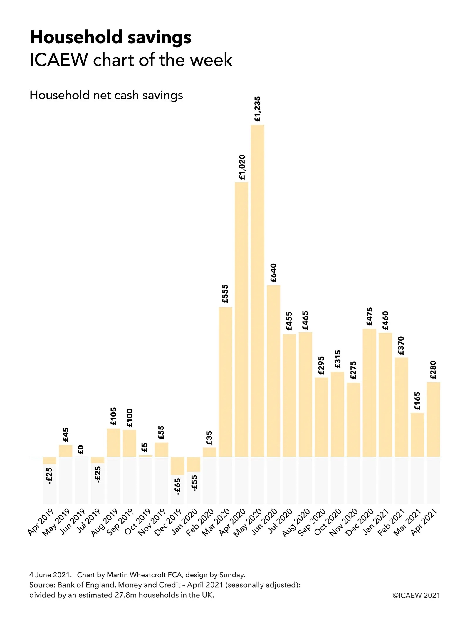
Will there be a rush to spend the £7,000 in household net cash savings built up over the course of the pandemic?
The #icaewchartoftheweek is on household savings built up over the course of the pandemic, illustrating how households have saved an average of £7,000 over the last fourteen months. A big question for the economic recovery is whether households will splash the cash once restrictions are lifted, providing a consumer-led boost to the economic recovery?
According to Bank of England statistics released on 2 June 2021, since the start of the pandemic in March 2020 up to April 2021 households have saved or repaid debts in the order of £195bn or an average of £14bn a month. This compares with £4.8bn or £0.4bn a month in the 11 months to February 2020, when cash savings were mostly offset by borrowing on consumer credit or mortgages.
With approximately 27.8m households in the UK according to the Office for National Statistics, this means that families have saved an average of just over £7,000 or £500 per month since the first lockdown in March 2020, compared with approximately £175 or £15 a month in the eleven months prior to the pandemic.
This reflects many lost opportunities for spending, with fewer holidays and nights out possible because of lockdown restrictions. Uncertainty about future economic prospects is likely to have also played a part, with many individuals cutting back on discretionary spending ‘just in case’.
Of course, there is no such thing as an average household. More prosperous families will have saved up a lot more than the £7,000 average and so are likely to have the capacity to spend a lot more if they want to, while many individuals will have run down savings or borrowed to survive through a difficult period.
For those fortunate families who are in a better financial situation, the big economic question is whether they will take the money they have saved from not going on holiday or going out over the course of the last year and put it into their pensions or other forms of investment – or will they choose to splurge on enjoying themselves once restrictions are fully lifted?
Household net cash savings = Seasonally adjusted changes in household M4 bank and building deposits plus changes in National Savings & Investments holdings (together ‘cash savings’), less seasonally adjusted changes in consumer credit and less seasonally adjusted changes in mortgage debt.
Total for 11 months to Feb 2020: cash savings £62.6bn less increases in consumer credit £11.5bn less increase in mortgage debt £46.3bn = £4.8bn or £175 per household.
Total for 14 months to April 2021: cash savings £235.2bn plus net repayments of consumer credit £23.1bn less increase in mortgage debt £63.5bn = £194.8bn or £7,005 per household.
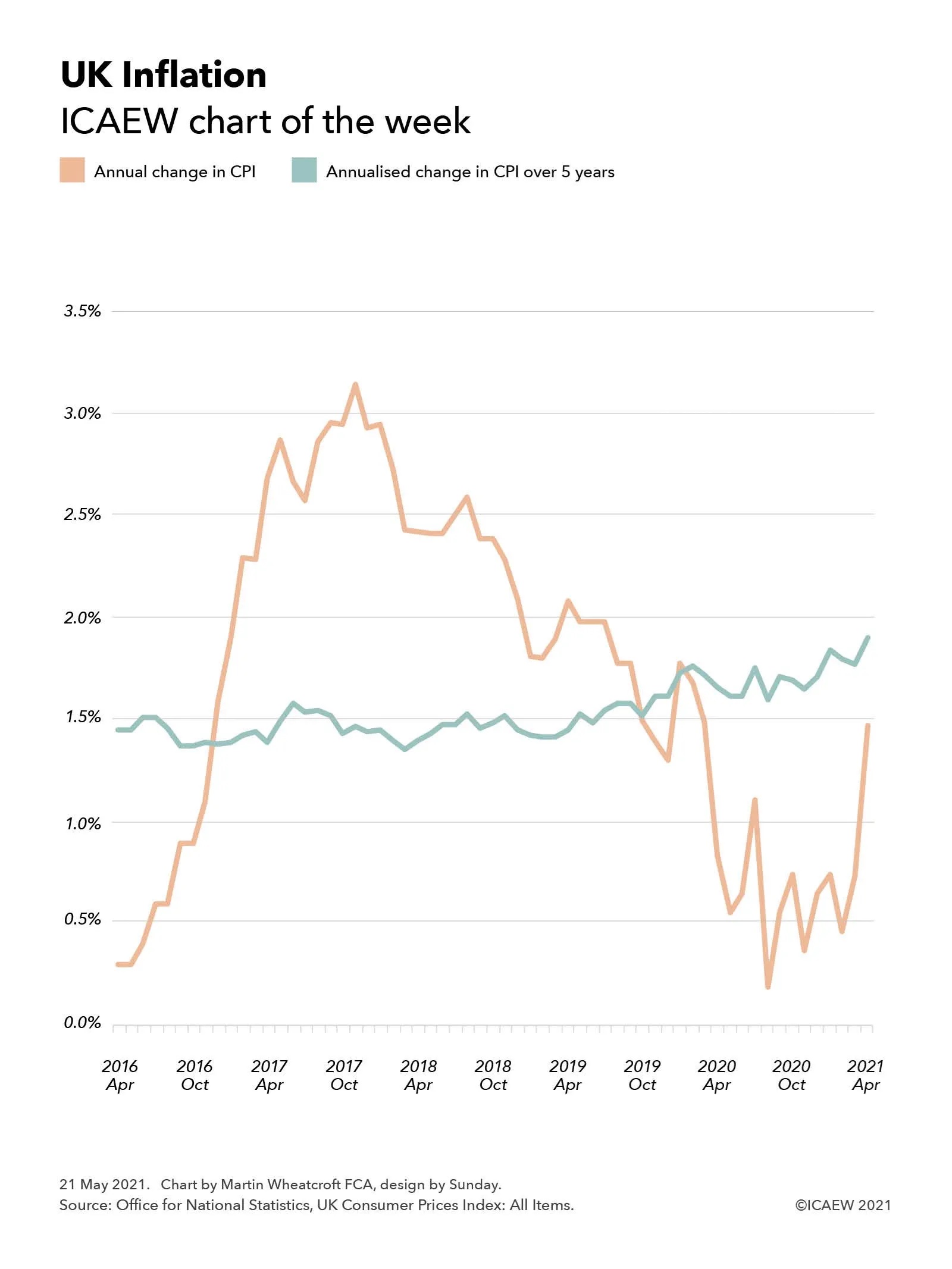
This week’s chart takes a look at UK inflation following news that the annual rate of inflation more than doubled in April to 1.5%, more than twice the 0.7% reported for the previous month.
The headline rate of inflation doubled this week from 0.7% to 1.5%, giving rise to concerns about the economic recovery. Economists aren’t getting worried just yet, but are they right to be so sanguine?
This scale of this jump partly reflects the timing of the first and current lockdowns, as inflation is typically measured by comparing prices with the same month a year previously, with significant changes both this year as the UK started to emerge from its third lockdown and a year ago as it was entering its first. Some commentators have pointed out that the temporary cut in VAT on restaurant food and leisure activities help prevent the jump from being even higher.
Our chart compares the annual rate of Consumer Price Index (CPI) inflation with a more stable measure, which is the annualised rate of CPI inflation over a five-year period. This is less susceptible to short-term swings in the economy, but as the chart shows, medium-term inflation has been gradually rising over the past five years even as headline rates on an annual basis fell over the last four years before the pandemic.
This perhaps explains some of the relaxed responses from economists about the sudden burst in inflation in the last month, given the annual rate of increase still remains below the medium-term trend, despite the current extraordinary economic circumstances.
Of course, that is not to say that inflation might not become a problem as the UK emerges further from lockdown. Many businesses have closed over the last year, particularly in the retail sector, while those that have survived will be looking to repair their balance sheets – a recipe for higher prices as constrained supply meets higher post-lockdown demand from consumers. Only time will tell whether this will feed into sustained higher levels of inflation or will jump be a temporary adjustment that falls out of the headline rate again in a year or so’s time.
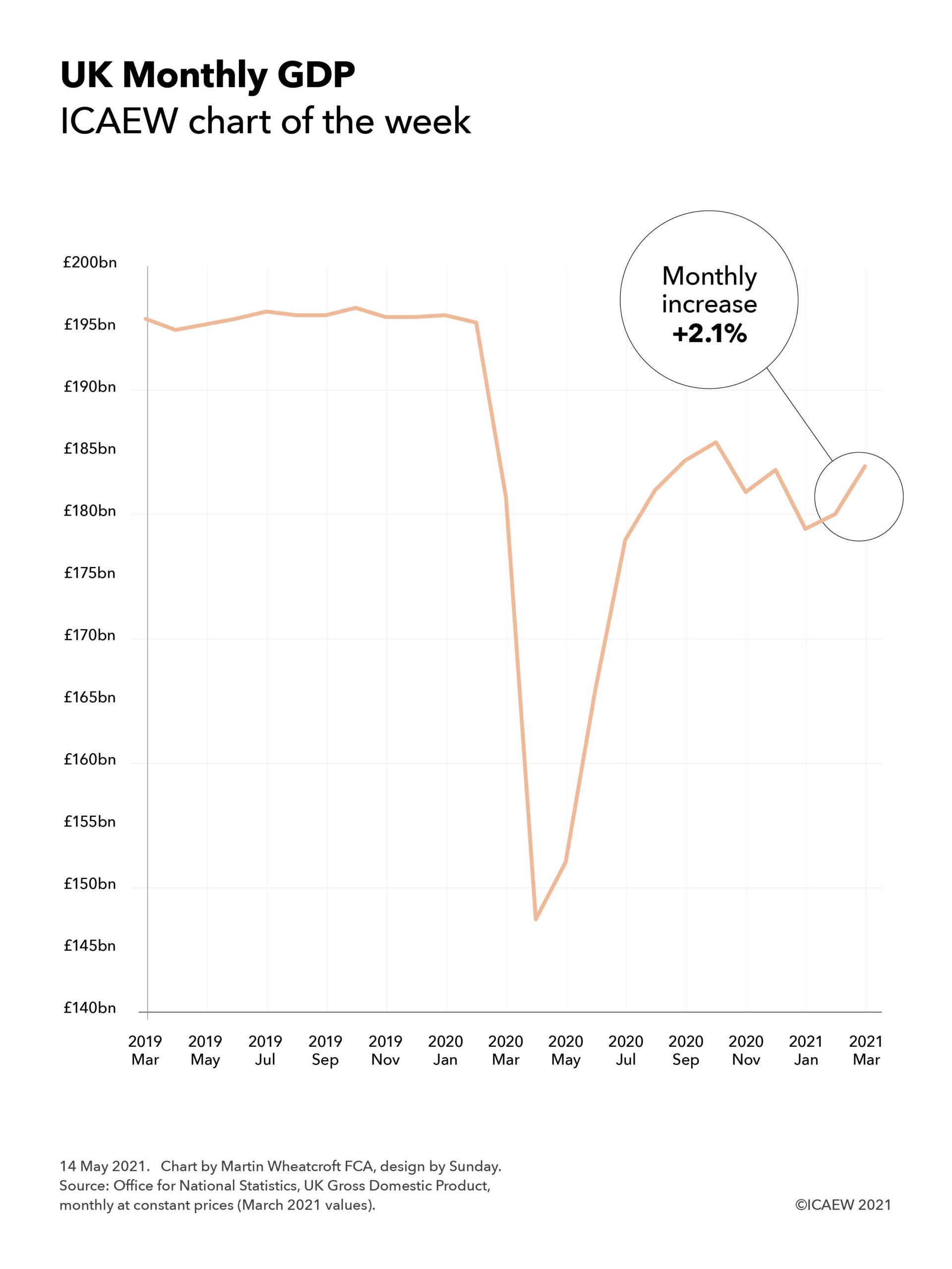
This week’s chart takes a look at the rebound in UK gross domestic product in March 2021, despite the country remaining in lockdown.
UK GDP jumped 2.1% in March 2021 according to the Office for National Statistics. A positive sign but, as our chart of the week illustrates, there is still a long way to go to get back to pre-pandemic levels of economic activity.
The #icaewchartoftheweek is on the economy this week, taking a look at how the latest economic statistics from the Office for National Statistics indicate a rebound in GDP in March 2021 even as the country remained in lockdown. This is a positive sign as the UK starts to emerge from the pandemic and people start to return to ‘normality’, albeit a new normal that is likely to be different to what came before.
However, the chart also makes clear how far the UK still has to go to return to pre-pandemic levels of economic activity, with the anticipated square-root shaped recovery stopped in its tracks in the last quarter of 2020 as COVID-19 resurged and restrictions on daily life were reimposed. The 2.1% real-terms growth in GDP in March follows a pattern of ups and downs in recent months with a fall of 2.2% in November, an increase of 1.0% in December, a fall of 2.5% in January, and an increase of 0.7% in February.
With the progress made in combating the virus over the last few months enabling lockdown restrictions to be progressively lifted across the UK, the hope is that March will be the second month on a more sustainable upward curve.
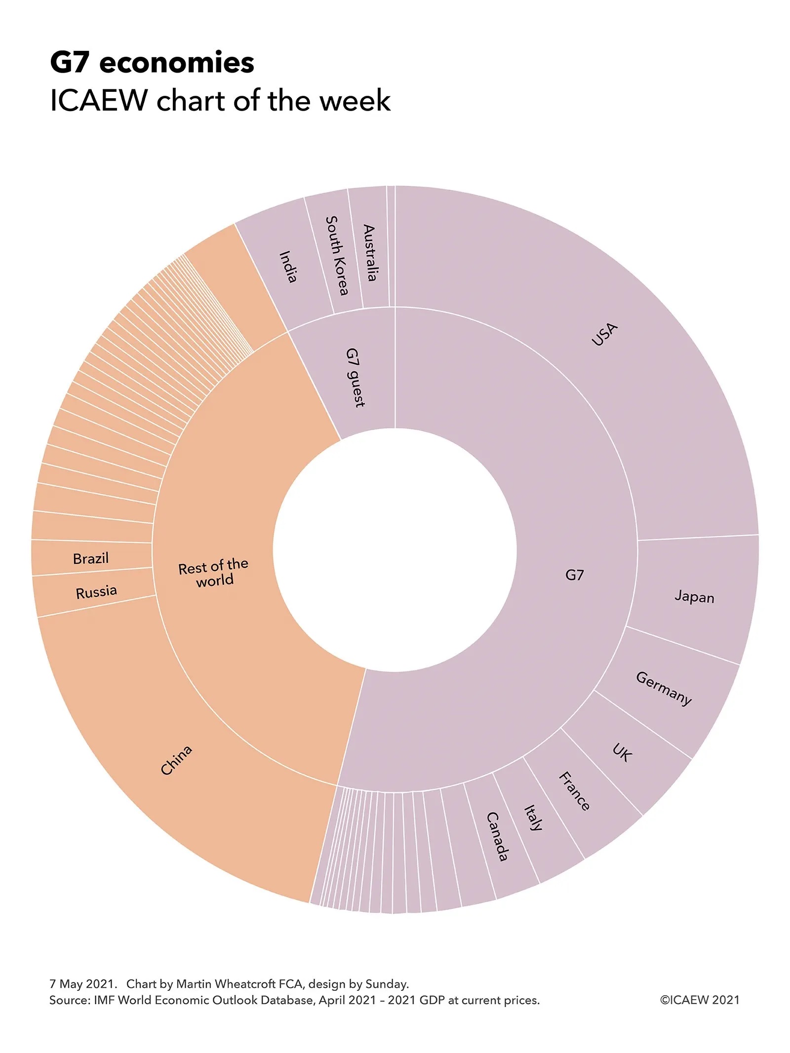
Our chart this week illustrates how in representing more than half of the world economy, decisions taken by the G7 can have a significant impact on the entire planet.
The G7 summit hasn’t formally started yet, but Group of Seven (G7) ministers and their guests have already started to meet ahead of the main event next month, albeit subject to quarantine restrictions.
The #icaewchartoftheweek illustrates how important this gathering is by highlighting how the seven major democratic nations and the European Union that together comprise the G7 represent more than half the global economy – and even more than that, once four invited guest nations are included.
Overall, the G7 economies are forecast by the IMF to generate £35.9tn of economic activity in 2021 at current prices, 54% of forecast global GDP of £66.8tn. This comprises the economies of seven individual member nations: the USA (£16.3tn), Japan (£3.8tn), Germany (£3.1tn), the UK (£2.2tn), France (£2.1tn), Italy (£1.5tn) and Canada (£1.3tn), together with the 24 other EU member states (£5.6tn).
The guests invited to the 47th G7 summit in Cornwall are expected to generate a further £4.9tn or 7% of global GDP in 2021, bringing the total economic activity represented at the summit to £40.8tn or 61% of the total. They are India (£2.2tn), South Korea (£1.3tn), Australia (£1.2tn) and South Africa (£0.2tn).
Not represented at the G7 are China (£12.2tn), Russia (£1.2tn) and Brazil (£1.1tn) and around 160 other nations across the globe (£11.5tn in total).
The G7 summit presents an opportunity for the 11 national leaders and 2 EU representatives involved to shape the direction for much of the world, with discussions expected to range from saving the planet through to transparency in financial and non-financial reporting.
This week’s chart looks at how the pandemic has driven government debt levels higher, a topic that will be on the agenda at the G7 summit in Cornwall in six weeks’ time.
The #icaewchartoftheweek is on the topic of government debt, looking at the indebtedness of the seven nations that comprise the G7 together with the EU.
The strength (or otherwise) of public finances will underlie many of the discussions at the upcoming G7 summit in Cornwall in June as countries decide how best to deal with the coronavirus pandemic, achieving net-zero carbon and the COP26 goals, strengthening defence and security, and economic recovery. All of these are likely to require significant public investment at a time when public finances have been hit hard from a combination of the financial crisis just over a decade ago and the coronavirus pandemic over the past year.
Perhaps best-placed amongst the G7 are Canada and Germany, with stronger public balance sheets than their peers putting them in a better position to fund public investment. Canada’s general government net debt to GDP ratio (the net debts of the federal government, provincial governments and local authorities combined compared with Canadian GDP) is forecast to increase from 23% at 31 December 2019 to 37% at 31 December 2021, while Germany’s general government net debt to GDP ratio is forecast to increase from 41% to 52% over the same period.
The UK is next with its general government net debt up from 75% of GDP to a forecast 97% of GDP, followed by France with its net debt increasing from 89% in December 2019 to a forecast 106% of GDP for the end of 2021. The USA is expected to overtake France with its major stimulus packages seeing debt rise from 83% as a proportion of GDP to 109% by the end of this year. The biggest ratios within the G7 are Italy, which is expected to increase from 122% to 144%, while Japan is expected to rise from 150% to 172% of GDP.
Not shown on the chart are G7 guest nations this year: Australia (up from 26% to a forecast 49% of GDP) and South Korea (12% to 23%) are both in relatively strong public finance positions, while India (74% to 99%) is in a more challenging fiscal situation.
Despite the differences in debt levels, there will be a commonality amongst all the nations present in needing to find money to deal with increased pressure on public services and social security systems as populations age, for public investment in achieving net zero and in infrastructure more generally, to fund defence in an increasingly unstable global security environment and in economic stimulus to restart economies as they reopen, not to mention the need to replace tax income on fossil fuels as they are eliminated over the coming decades.
The signs are that tax reform will play a larger part in discussions than it may have done previously, with the USA’s suggestion for a minimum corporation tax indicative of a move to limit tax competition between nations and work more collaboratively to capture tax receipts from increasingly mobile global corporations and individuals.
Hence while many of the headlines from the G7 summit are likely to be focused on the heads of government talking about the global response to the coronavirus pandemic, the global security situation and global plans to deliver net zero, the side room containing finance ministers discussing global taxation and global public investment may be just as consequential.
Monday 19 April 2021 saw Chrystia Freeland, the Canadian deputy prime minister and minister of finance, release her country’s 725-page Budget 2021, setting out the Government of Canada’s plan to “finish the fight against COVID-19 and ensure a robust economic recovery that brings all Canadians along”.
As the #icaewchartoftheweek illustrates, the forecast outturn for the fiscal year ended 31 March 2021 involved spending by the federal government of C$635bn (equivalent to £363bn at an exchange rate of C$1,75:£1), resulting in a budget shortfall of C$339bn after taking taxes and other income of C$296bn into account. Spending comprised C$363bn on ‘normal’ federal government activities – operational spending, welfare payments and transfers to provinces and territories and C$272bn on exceptional measures in response to covid-19.
COVID-19 spending is much lower in 2021-22 at C$76bn, even as other spending increases to C$422bn as the federal government seeks to generate economic growth following the pandemic – total spending of C$498bn (£285bn). Assuming taxes and other income recovers to C$355bn as expected, the budget shortfall should reduce to C$143bn – still much higher than the C$29bn seen before the pandemic in 2019-20.
The federal finances were in a fairly strong position coming into the pandemic compared with many other countries, with debt at 31 March 2020 of C$813bn (31% of GDP) rising to C$1,176bn (49% of GDP) at 31 March 2021 and a forecast C$1,334bn (51% of GDP) at 31 March 2022. This provides Canada with some room for manoeuvre as it navigates its way after the pandemic.
Fortunately for Canadians, one side-effect of the US government’s stimulus package is that it is expected to not only drive growth in the US economy, but in its Canadian neighbour too.
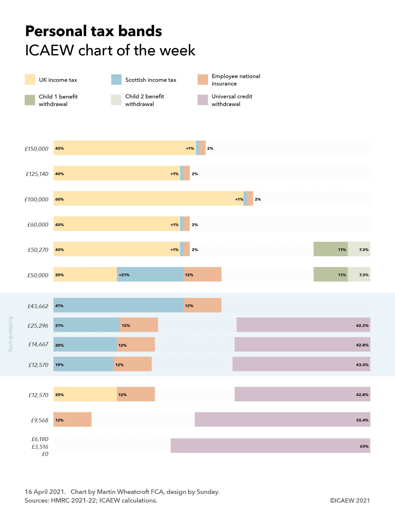
This week’s chart examines the complexity in the tax system and potential options for reform by looking at the number of tax bands for salaried employees across the UK.
The new tax year saw the introduction of an additional tax band to the UK system of personal taxation, bringing the total number to nine tax bands in England, Wales and Northern Ireland and twelve in Scotland.
The #icaewchartoftheweek continues on the theme of complexity in the tax system and potential options for tax reform by looking at the number of tax bands for salaried employees, with up to nine tax bands in England, Wales and Northern Ireland and up to twelve in Scotland.
Although the advertised personal tax allowance of £12,570 a year suggests that individuals only start to pay tax above that point, in practice ‘taxation’ in its wider sense can start from as little as £0, which is when some of those claiming universal credit start to have their benefits withdrawn at a rate of 63p in the pound. The threshold is £0 for those without dependent children, £3,516 for those on housing benefit and with dependent children or limited capability to work, or £6,180 for those with dependent children or limited capability to work who are not on housing benefit. The rate of withdrawal is even higher for those receiving council tax benefit, with an additional 20% or more levied on incomes above a certain level until it is fully clawed back – the details vary by council.
Tax in its more formal sense starts at £9,568 when employee national insurance of 12% starts to be levied. Although ‘constitutionally’ different in how the money collected is used and its role in entitlement to the state pension, in substance it operates as an income tax in all but name.
Income tax itself starts to be levied on earnings above £12,570 at a basic rate of 20%, adding to national insurance to give a marginal tax rate of 32% for those not on universal credit and 74.8% for those who are.
For those in England, Wales and Northern Ireland this tax band goes from £12,570 up to £50,000 but in Scotland, there are intermediate tax bands, with a lower rate of income tax of 19% between £12,570 and £14,667, 20% between £14,667 and £25,926, 21% between £25,926 and £43,662, and 41% above £43,662 when the higher rate of Scottish income tax kicks in.
The new tax band this year arises because the government failed to increase the £50,000 threshold at which child benefit is withdrawn from the higher-earning parent to align with the increase in the higher rate tax threshold to £50,270. This means the insertion of a new tax band between £50,000 and £50,270 as the government starts to withdraw entitlement to ‘universal’ child benefit of £21.15 a week for the eldest child and £14.00 a week for remaining children by collecting an additional tax of 11% for the eldest child and 7.3% for the second and each of any subsequent children.
Above £50,270, the higher rate of income tax of 40% starts to be levied in England, Wales and Northern Ireland, but the marginal rate of national insurance reduces to 2% meaning that this is a 10% increase from 32% to 42% in the combined marginal rate – at least assuming you don’t have children! This rate also applies to those with children from £60,000 up until £100,000 when the marginal rate jumps to 62% (63% in Scotland) as the personal income tax allowance is gradually withdrawn. The marginal rate reverts to 42% (43%) from £125,140 before increasing to 47% (48%) for those on the 45% top rate of income tax above £150,000.
While devolution has led to some of the complexity, this probably hasn’t been helped by the perennial tendency of governments to find ever more complicated approaches to extract additional money from taxpayers without touching the headline rates of tax – for example through the ‘withdrawal’ of the personal tax allowance, which in substance operates as an additional 20% tax payable by those earning between £100,000 and £125,140.
The consequence of this tinkering with the tax systems means there are now nine different tax bands in England, Wales and Northern Ireland with marginal tax rates of 0%, 12%, 32%, 32% + 11% (or more) for higher-earning parents, 42% + 11% (or more) for higher-earning parents, 42%, 62%, 42% and 47%. In Scotland there are twelve: 0%, 12%, 31%, 32%, 33%, 53%, 53% + 11% (or more) for higher earning parents, 43% + 11% (or more) for higher earnings parents, 43%, 63%, 43% and 48%.
Such a complex system invites the question of how it might be reformed, with the possibility of increasing the national insurance threshold to align with the income tax personal allowance being actively discussed in recent years to eliminate one of the bands. However, this now seems less likely than it once did since the pandemic caused such damage to the public finances. Other ideas have included aligning the 40% higher rate and 45% top rate of income tax (either up or down depending on political preference) or ‘folding’ in the personal tax allowance withdrawal into the tax system as part of the higher or top tax rates in conjunction with a reform to tax thresholds.
However, another option would be to add even more complexity, a real possibility now the Welsh government has obtained devolved powers to adjust its income tax rates and thresholds like Scotland, albeit powers that have thankfully not been used so far.
Either way, the nirvana that some tax reformers aspire to of a single flat rate of income tax applying to all earnings seems more remote than ever. One can but dream!
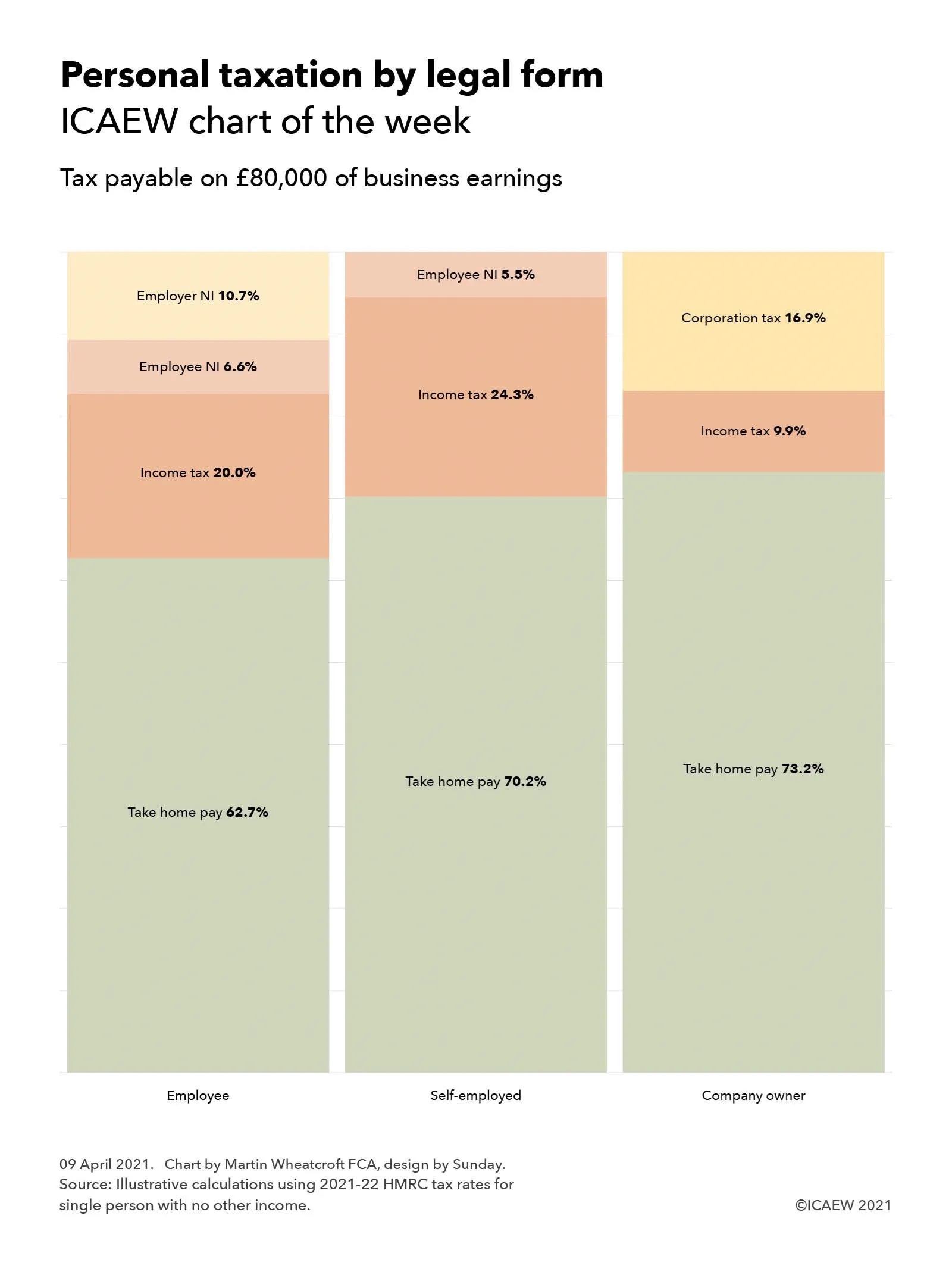
ICAEW’s chart this week compares the differences in the tax payable depending on legal form – an area ripe for reform in theory, but much more difficult in practice.
Comments by the Chancellor last year suggested he might tackle one of the thorniest challenges in the UK tax system – the differences in tax paid by individuals depending on the legal form through which they conduct their business activities. However, as the controversy over IR35 has demonstrated, a significant amount of political capital is likely to be needed if changes are to be made.
The #icaewchartoftheweek provides an illustrative example of just how significant the differences can be, with £80,000 in business earnings attracting an effective tax rate of 37.3% if paid to an employee on a salary of £71,460, 29.8% if paid to an individual who is self-employed or in a partnership, or 26.8% if earned through a company and distributed as dividends.
(It is important to note that this is a theoretical illustrative example for a single person with no other earnings and not paying any pension contributions, with the company owner in the example paying a salary equivalent to the secondary threshold for national insurance before paying the rest as dividends. Actual amounts of tax paid will of course depend on both business and individual circumstances, which can vary significantly.)
The last decade or so has seen a significant increase in the numbers of people becoming self-employed or conducting business through their own companies, and the tax authorities have been concerned about the loss in tax that has followed. One way they have sought to tackle this is by removing the tax benefits of being self-employed or operating through a company from some people, which is the approach adopted by IR35. Coming into force this month, IR35 in effect creates a new legal status of ‘deemed employee’ for tax purposes, reclassifying individuals back into the scope of employment taxes. This has proved highly controversial, accompanied as it is by extensive compliance requirements and general unhappiness by those determined to be subject to it.
Another potential approach would be to change the taxes and tax rates applying to three different forms – either by reducing the taxes on employees or by increasing them on the self-employed or those operating through companies. The former seems unlikely given the state of the public finances, but the challenge in increasing rates can be extremely politically difficult, as former Chancellor Philip Hammond found a few years ago when he proposed a relatively modest increase in the amount of national insurance to be paid by the self-employed.
Whether current Chancellor of the Exchequer Rishi Sunak will take forward a suggestion he made last year when he announced the self-employed income support scheme last year that taxes on the self-employed might rise is yet to be seen. However, what is likely is that this and future Chancellors will continue to look at this particular aspect of the tax system and wonder how they might collect a little more from the ranks of the self-employed and company owners.
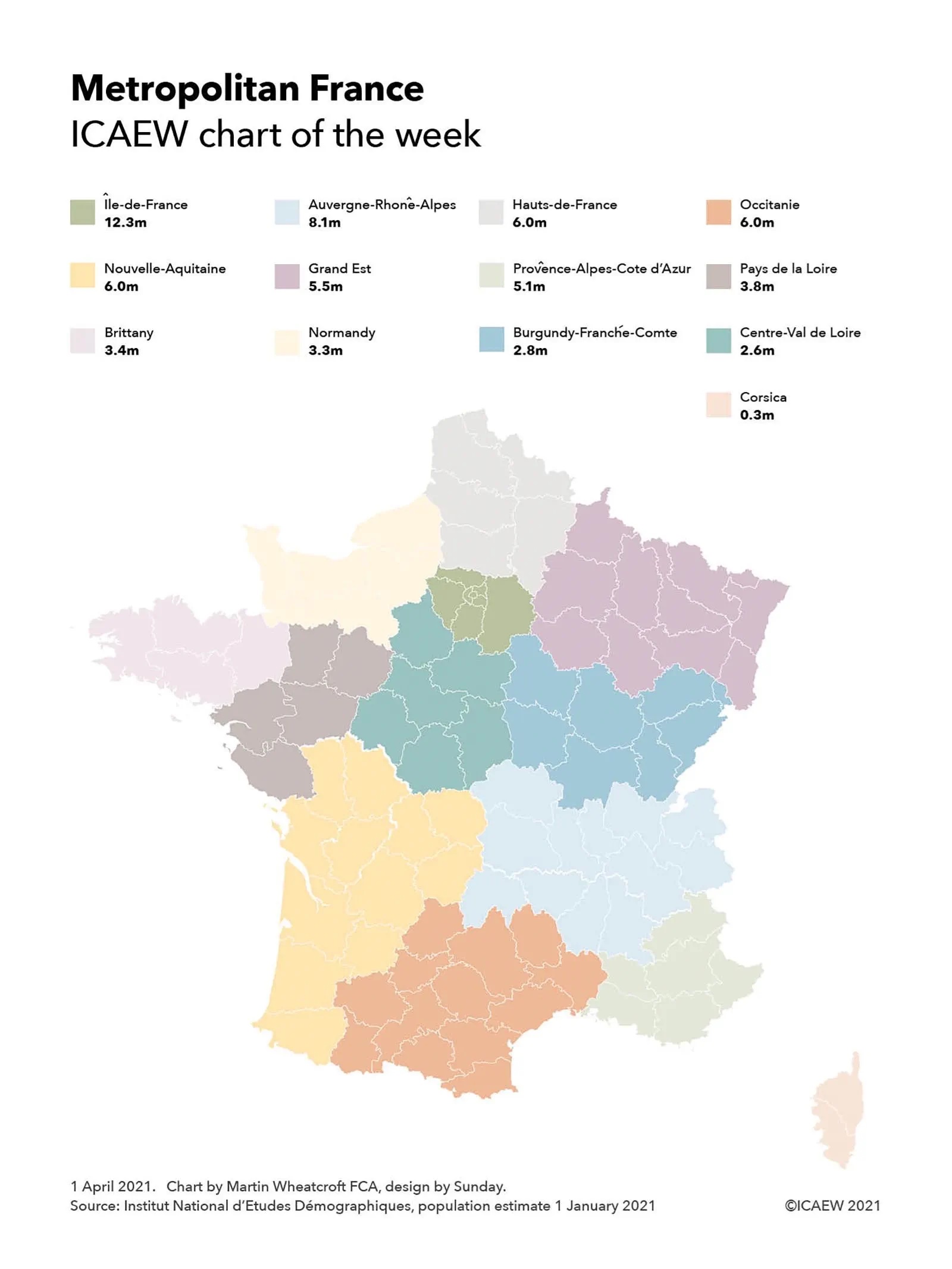
This week’s chart examines how France inserted a layer of regional administration between the national government in Paris and the 96 departments in mainland France and Corsica.
France’s regional tier of government was created in 1982 with 22 regions in Metropolitan France (ie mainland France and Corsica) and has generally seen to be a success. However, it was concluded that there were too many regions, resulting in a consolidation in 2015 into the current 13 regions, as illustrated by the #icaewchartoftheweek.
The regions range in size from the 12.3m population eight-department Île de France that includes Paris, to the 2.6m six-department Centre – Val de Loire region in mainland France and the 0.3m two-department Corsica region. This excludes the five overseas one-department regions of Guadeloupe, French Guiana, Réunion, Martinique and Mayotte.
Regional councils in mainland France and the assembly in Corsica can raise taxes and control substantial budgets, in particular over education and infrastructure investment, as well as having some regulatory powers (but not statutory law-making powers). Elections are on a proportional representation system, with regional presidents chosen by the elected councillors or assembly members.
The establishment of the regions has been part of a process of devolving power from the central government, moving away from the highly centralised control exercised since the French Revolution, which saw the establishment of departments, broadly equivalent to county councils in England. Although each of the 96 departments in Metropolitan France has an elected departmental council and president, many responsibilities for local administration (such as policing) still sit with departmental prefects and subprefects that are appointed by the central government. The lowest tier of local government comprises 36,552 communes, each with an elected council and mayor, with the exception of central Paris, Lyon and Marseille that are further divided into municipal arrondissements.
The comprehensive reforms adopted in France for regional government contrast with the patchwork approach in England, where regional authorities in the form of metropolitan councils were abolished in 1986, only to see a regional tier return in 2000 with the creation of the Greater London Authority. This has been followed over the last decade by the establishment of 10 regional combined authorities, comprising Greater Manchester (2011), Liverpool City Region (2014), Sheffield City Region (2014), North East (2014), West Yorkshire (2014), Tees Valley (2016), West Midlands (2016), West of England (2017), Cambridgeshire & Peterborough (2017) and North of Tyne (2018).
The stop-start approach in England has involved a process of negotiation between central and local government on whether to establish regional combined authorities in particular areas, with a number of proposals across the country under consideration. However, even if they are approved, this will still leave many parts of the country without a regional tier of government. The elections in May in England will therefore see elections for regional authorities only in some areas (including the first-ever elected mayor of West Yorkshire), for between one and three different tiers of local government, and for police & crime commissioners outside of Greater London and Greater Manchester. A rather complex picture!
Back in France, the regional elections scheduled for March have had to be postponed. Instead, a new set of regional administrations across the entirety of Metropolitan France are expected to be elected in June 2021.