My chart for ICAEW this week looks at official projections, published three days before President Trump was inaugurated for the second time, that predict federal debt is on track to return to and exceed levels last seen in the 1940s.
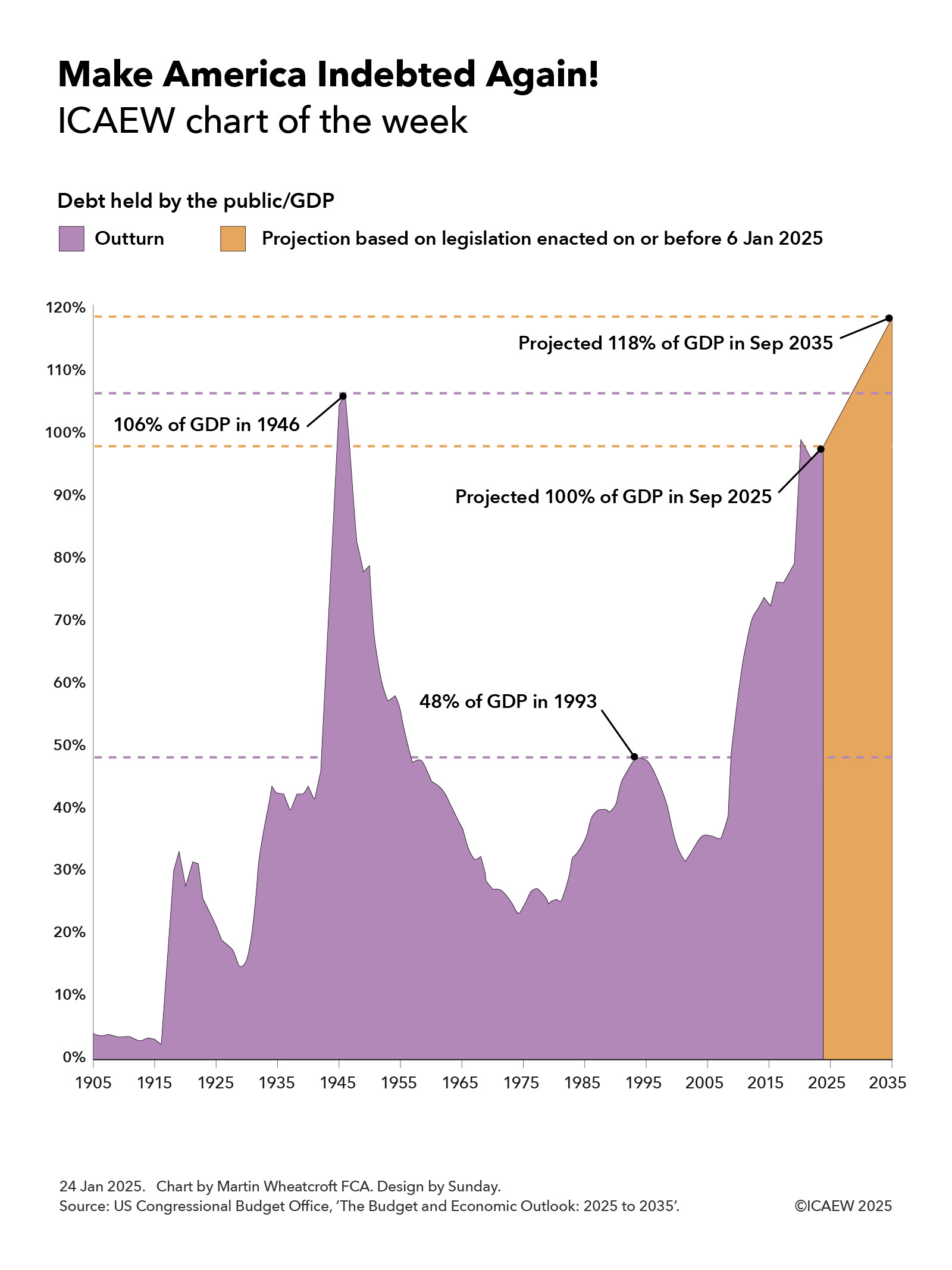
The US Congressional Budget Office (CBO) published its latest 10-year projections for the US federal government finances on 17 January 2025, covering the decade from 2025 to 2035. These projections are based on legislation enacted up to 6 January 2025, prior to the start of President Trump’s second term as President on 20 January 2025.
As the chart of the week illustrates, debt held by the public in relation to the size of the economy was 4% of GDP in 1905, falling to 3% in 1916 before rising to 33% of GDP as a result of the US entering the First World War. Debt/GDP fell over the subsequent decade to 15% of GDP in 1929 before rising again during the Great Depression to 42% of GDP in 1936. A drop to 40% in 1937 was then followed by a rise to 106% of GDP in 1946 following the end of the Second World War.
A rapidly growing economy over the next quarter of a century or so saw debt inflated away despite a major expansion in the size of the federal government over that period, with debt/GDP falling to 23% in 1974. More difficult economic times in the 1970s and 1980s and continued governmental expansion saw debt/GDP rise to 48% in 1993, before a growing economy again eroded debt as a share of GDP to down to 35% in 2007.
Debt rose rapidly during the financial crisis and subsequently, to reach 79% of GDP by 2019, before the pandemic drove it up further to 99% in September 2020. The post-pandemic economic recovery saw debt falling back to 95% of GDP in September 2022, but since then continued deficit spending since then has seen debt held by the public/GDP rise to 98% last year on its way to a projected 100% of GDP in September 2025.
The CBO predicts that debt held by the public will increase from $28.2tn at the end of September 2024 to $30.1bn in September 2025 and then to $52.1tn in September 2035, equivalent 118% of GDP. This assumes economic growth of 1.8% a year over the ten years to 2035 and is based on extrapolating from approved budgets and legislation in place as of 6 January 2025.
The big question is how that projected path will change as a result of the incoming Trump administration. His plan to cut taxes (pushing up the level of borrowing further) and to cut federal spending (offsetting some of that increase) will have a direct fiscal impact, but the indirect effects his policies have on the US economy will also be very important. Faster growth would have the effect of slowing the rise in the debt/GDP ratio or even bringing it down, while slower growth could shorten the time it takes to make America as indebted as it was back in 1946.
For further information, read the CBO’s ‘Budget and Economic Outlook: 2025 to 2035’.
This chart was originally published by ICAEW.