ICAEW chart of the week: OBR long-term fiscal projections

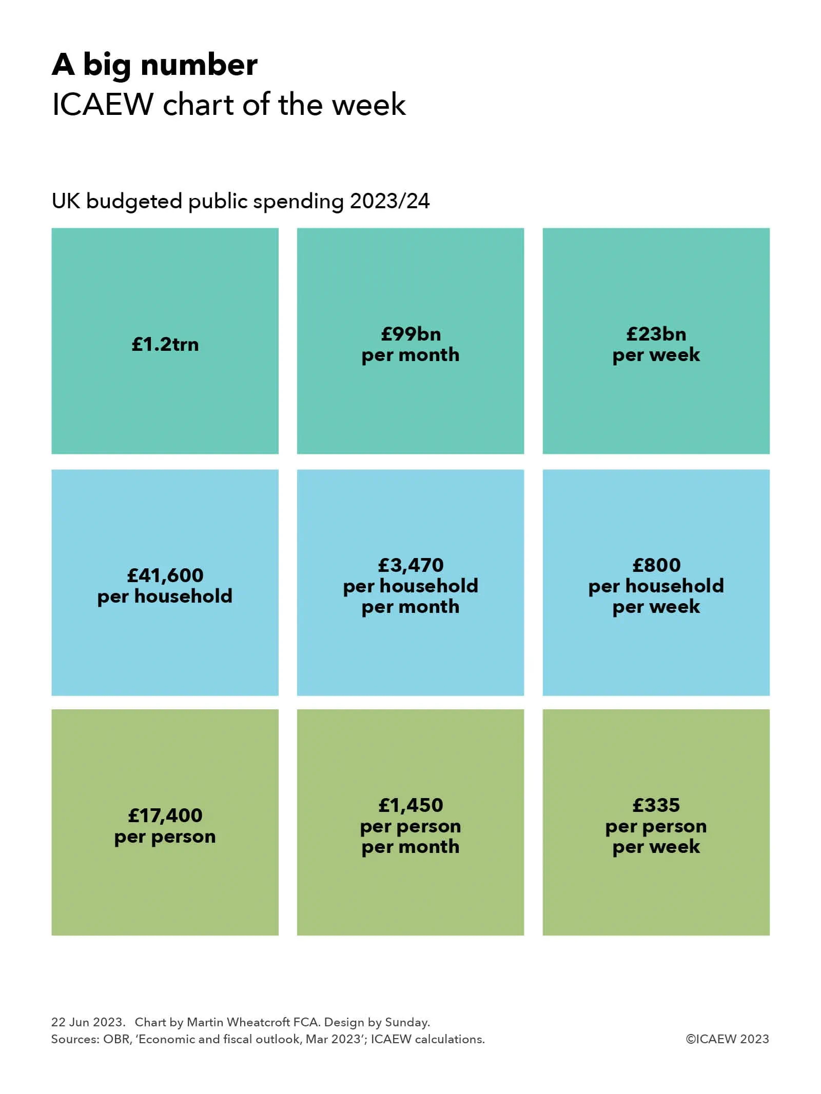
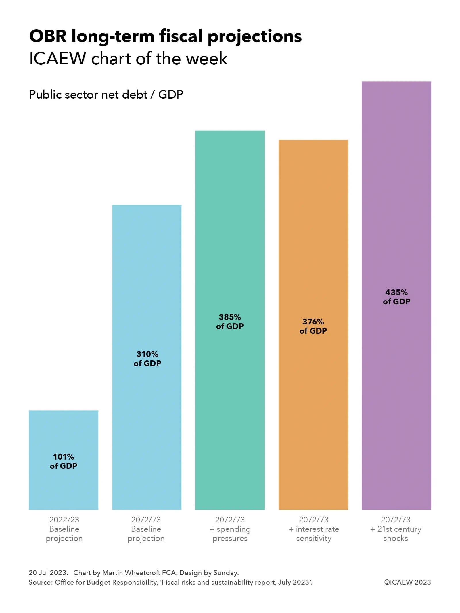
The OBR’s July 2023 fiscal risks and sustainability report indicates that, without higher taxes, public sector net debt as a share of GDP could triple or more over the next 50 years.

Column chart with bars equal to projected public sector net debt / GDP:

2022/23 Baseline projection: 101%
2072/73 Baseline projection: 310%
2072/73 + spending pressures: 385%
2072/73 + interest rate sensitivity: 376%
2072/73 + 21st century shocks: 435%

The Office for Budget Responsibility (OBR) published its latest fiscal risks and sustainability report on 13 July 2023, providing its analysis of the key risks confronting the UK public finances and long-term fiscal projections for the next 50 years.

This is a sobering report, suggesting that public sector net debt as a share of economic activity as measured by GDP could more than triple between March 2023 and March 2073 – and perhaps go even higher in certain circumstances. The OBR concludes that the public finances are on an unsustainable path.

As illustrated by this week’s chart, the OBR’s baseline projection suggests that the ratio of public sector net debt to GDP could rise from 101% of GDP in 2022/23 to 310% of GDP in 2072/73. The OBR also presented three alternate scenarios: the first is based on higher levels of spending, which could result in the ratio reaching 385% of GDP; one involves higher interest rates, where the ratio might reach 376% of GDP; and a further scenario assuming additional economic shocks, where the ratio might hit 435% of GDP.

The projections are based on the government’s current medium-term fiscal plans as set out in the March 2023 Spring Budget, extrapolated into the future based on existing trends. The starting point is the already high level of public debt that has built up over the past 15 years, together with the current government’s plan to cut spending on public services over the next five years.

The OBR has then overlayed its view of economic growth over the next half century and expected changes in patterns of public spending. This reflects a substantial rise in spending on pensions, health and social care as the proportion of the population in retirement rises, among other drivers that include the financial costs and benefits of delivering net zero. Other key assumptions relate to productivity, demographics (births, deaths and net migration), interest rates and inflation.

The one thing the OBR hasn’t been able to do is to include probable but not enacted tax changes in its projections, with increases in public spending assumed to be financed by higher levels of borrowing instead of the tax rises that future governments are in reality going to opt for. 

The projections therefore reflect borrowing that compounds over time to result in some very large headline debt numbers in March 2073, rather than the 1.5% of GDP rise in the tax burden each decade that would, according to the OBR, maintain the debt to GDP ratio at close to its current level.

The fiscal projections calculated by the OBR highlight just how difficult a position the UK’s public finances are in and the major fiscal challenges that will face the incoming government – whoever that may be – after the next general election.

This chart was originally published by ICAEW.

ICAEW chart of the week: A big number

Public spending is expected to approach £1.2trn this year, an extremely large and incomprehensible number to most of us. Our chart this week attempts to make that number more digestible.

Chart labelled 'A big number' comprising nine boxes in a grid each with the same number in nine difference versions:

First row of three boxes

- £1.2bn for UK budgeted public spending in 2023/24
- equivalent to £99bn per month
- or £23bn per week

Second row:

- £1.2bn is equivalent to £41,600 per household in 2023/24
- or £3,470 per household per month
- or £800 per household per week

Third row:

- £1.2bn is equivalent to £17,400 per person for 2023/24
- or £1,450 per person per month
- or £335 per person per week

Public spending in the current financial year is budgeted to amount to £1,189bn or just under £1.2trn. But what does such a large number really mean? 

It can be difficult to comprehend the sheer scale of public spending that a major economy such as the UK incurs each year. The 2023/24 budget of £1,189,000,000,000 is just a huge amount of money to think about.

One way to understand the number is to break it down a little; knowing that the UK public spending is expected to be an average of £99bn a month or £23bn a week during the current financial year helps a little. However, smaller but still exceptionally large amounts can be equally difficult to understand.

The traditional way to look at the public finances, not shown in the chart, is to relate it to the size of the UK economy. GDP is projected to amount to £2,573,000,000,000 in 2023/24, meaning that public spending should be equal to around 46% of the overall economy. However, while this is helpful in putting public spending into context, it is still just a ratio between two incredibly large numbers that very few of us really comprehend. Surely there must be a better way of getting to grips with the public finances.

Our chart this week attempts to do so. By dividing the total for public spending by the number of households in the UK (expected to reach around 28.6m in September, the middle of the financial year) and by the size of the UK population (anticipated to be approximately 68.2m) as well as by month and by week, we can hopefully get a better a feeling for what is going on.

As our chart this week illustrates, average public spending in 2023/24 is equivalent to £41,600 per household, which breaks down to £3,470 per household per month or £800 per household per week, and it may be helpful to think about public spending. Whether you prefer to think in annual, monthly or weekly time periods, they are pretty big numbers in the context of most people’s household budgets.

Alternatively, you may find it easier to identify with how public spending in 2023/24 is equivalent to an average of £17,400 per person living in the UK, breaking down to £1,450 per person per month or £335 per person per week. Again, a very large number, particularly when you realise the average covers children as well as the adult population.

In some ways these much smaller versions of a big number – such as public spending of £3,470 per household per month – feel a lot larger when brought into a more relatable context. The figure of £1.2trn is baffling, but when you know the UK public sector plans to spend £800 per week for each of its 28.6m households, you get a better sense of just how much the UK state spends.

Of course, in working out averages it is important to be clear that they are just that – averages. Many people will benefit more, or less, from public spending than others, while conversely different groups will pay more or less in the taxes needed to fund that spending. Pensioners and children generally pay much less in taxes than those of working age, while benefiting from a much greater proportion of public spending. Similarly, poorer households will receive more in benefits and other forms of support, while richer households pay more in taxes. 

Despite that, per household and per person averages give us an opportunity to compare public spending with reference points we can relate to, such as our own salary or household budget.

One of the reasons the numbers are so high, whichever way you look at them, is that the state does an awful lot. Average spending planned of £1,450 per person per month can be broken down further to approximately £420 on pensions and welfare, £350 on health and social care, £160 on education, £140 on defence, security, policing and justice, £140 on debt interest, £75 on transport, and £165 per person per month on everything else. Each of these in turn are made up of hundreds if not thousands of different central and local government programmes, many costing mere fractions of a penny per person per month, but that together add up to a lot of money.

No matter how you break it down, public spending will always be a huge number.

This chart was originally published by ICAEW.

ICAEW chart of the week: Public sector segments 2022/23

Our chart this week illustrates just how centralised the UK is by looking at the disparity between receipts and expenditure between central and local government.

Step chart for the financial year 2022/23, showing receipts of £1,018bn (first column) less expenditure £1,155bn (middle column) and deficit £137bn (last column).

Central government: £931bn receipts - £919bn expenditure = £12bn surplus before intra-government transfers. 

Local government: £59bn receipts - £204bn = £145bn shortfall before transfers.

Other public sector: £28bn receipts - £32bn expenditure = £4bn shortfall before transfers.

Most people living in the UK would be surprised to discover just how big a gap there is between the council taxes and other income received by local councils, police and fire authorities, and the amount that they spend on public services.

Our chart of the week illustrates this disparity by looking at public sector segments in 2022/23 and how receipts and expenditure match up, before taking account of intra-government transfers.

Fiscal reporting in the National Accounts is broken down into five segments, of which the two largest are central government and local government. The former includes UK government departments, the devolved administrations in Scotland, Wales and Northern Ireland, and several hundred government agencies and other public bodies. Local government principally consists of local authorities across the UK, the Greater London Authority and regional combined authorities in England, police and fire authorities in England and Wales, and local public transport bodies (the largest of which is Transport for London). The other three segments are public corporations (comprising publicly owned businesses plus social housing), funded pension schemes (mostly local authority schemes as central government schemes are generally unfunded), and the Bank of England.

The latest provisional numbers for the financial year ended 31 March 2023 reported that the UK public sector generated £1,018bn in receipts and incurred expenditure of £1,155bn, giving rise to a deficit of £137bn – a shortfall that has been funded by central government borrowing.

Central government raised £931bn in 2022/23 and spent £919bn, a net £12bn surplus before intra-government transfers. Local government received £59bn and spent £204bn, a shortfall of £145bn. And the three remaining fiscal segments together generated £28bn in receipts, and recorded £32bn in expenditure, a net shortfall of £4bn.

By excluding transfers in this way, the chart highlights just how centralised the UK state is, with local government dependent on central government largesse to pay for 69% of its spending in 2022/23. 

Local authorities received £41bn in council taxes and £18bn in non-tax receipts, with intra-government transfers amounting to £141bn, comprising £127bn in revenue grants and £14bn in capital grants. Transfers included a redistribution of £25bn in business rates, which although collected by local authorities are national taxes whose disposition is determined by central government. The rest came from a combination of block grants, subsidies, and specific grants (some of which councils need to bid for) as part of a complex and complicated web of funding arrangements for local authorities that makes them highly dependent on the decisions of government ministers.

After transfers there was a reported deficit of £137bn in central government and £4bn in local government, while £8bn in net transfers converted a £4bn shortfall between receipts and expenditure in the three other segments into a net £4bn surplus.

The big picture is of the most centralised state among medium and large economies in the developed world, with local authorities almost entirely dependent on the largesse of central government to fund the essential public services they deliver.

Distributing power to the devolved administrations in Scotland, Wales and Northern Ireland has started to see a share of national taxes dispersed (such as income tax in Scotland and Wales) and some limited tax-raising powers. This contrasts with the debate about devolution in England, which has primarily focused on structures with the partial creation of a regional tier of local government in the form of combined authorities, rather than on more fundamental questions of whether this very centralised system of funding for local authorities needs reform.

This chart was originally published by ICAEW.

ICAEW chart of the week: Japan demographics

We look at how Japan’s population is ageing and falling fast, presenting some major challenges for the public finances of the third largest national economy in the world.

Column chart showing Japan's population at twenty-year intervals from 1963 to 2063, analysed into five age groups: Ages 0-19, Ages 20-39, Ages 40-59, Ages 60-79, Ages 80+.

1963 – 36m, 32m, 19m, 8m and 1m – 96m total
1983 – 35m, 36m, 31m, 15m and 2m – 119m total
2003 – 25m, 35m, 35m, 27m and 5m – 127m total
2023 – 20m, 26m, 35m, 31m and 12m – 124m total
2043 – 15m, 22m, 26m, 31m and 16m – 110m total
2063 – 12m, 17m, 22m, 24m and 18m – 93m total

Our chart this week is on the demographics of Japan, looking at how its population grew rapidly from 96m in 1963 to 119m in 1983 and then 127m in 2003, before falling to 124m this year, to a projected 110m in 20 years’ time, and to 93m in 40 years’ time.

Our analysis starts with the 96m people who lived in Japan in 1963 and shows how increased longevity saw the population increase to 119m in 1983 (an increase of 24m from 36m births and 2m migrants less 14m deaths), before increasing to 127m in 2003 (a further 8m increase from 25m births less 17m deaths). 

The population has been relatively stable since then, peaking at 128m in 2010 (not shown in the chart), before dropping to 124m this year as the number of births (20m over the last 20 years) fell below the number of deaths (25m). This was offset by a small amount of net inward migration, with the non-Japanese component of the population amounting to 3m in 2023.

Fewer younger people means that the number of births is expected to be even smaller over the next 20 years to 2043 at around 15m, at the same time as deaths are expected to increase in line with an older population. According to the latest medium-variant projections of Japan’s National Institute of Population and Social Security Research, the population is projected to drop by 14m to 110m in 2043 (15m births + 3m migrants – 32m deaths) before falling by a further 17m to 93m in 2063 (12m births + 3m migrants – 32m deaths).

The primary purpose of the chart is to illustrate how the age profile has shifted and continues to change as Japan gets older. Grouped into five age segments: 0-19, 20-39, 40-59, 60-79 and 80+, the population was, is, and is projected to be as follows:

1963 – 36m, 32m, 19m, 8m and 1m – 96m total
1983 – 35m, 36m, 31m, 15m and 2m – 119m total
2003 – 25m, 35m, 35m, 27m and 5m – 127m total
2023 – 20m, 26m, 35m, 31m and 12m – 124m total
2043 – 15m, 22m, 26m, 31m and 16m – 110m total
2063 – 12m, 17m, 22m, 24m and 18m – 93m total

The contrast in the age profile in the 20th century compared with 21st century Japan is dramatic, with the proportion of population aged 60 or over increasing from 9% in 1963 to 35% today and to a projected 45% in 2063, at the same time as the share aged under 40 has fallen from 72% in 1963 to 37% in 2023 and to a projected 31% in 2063.

Also not shown in the chart is Japan’s median age, which was 26 in 1963, 33 in 1983, 42 in 2003 and 49 this year, before being projected to reach 53 in 2043 and 56 in 2063 – more than double that of a century earlier.

These demographic shifts have and will continue to present a major fiscal challenge for the Japanese government. The continued growth in size of older generations (who typically consume the most in public services and welfare), accompanied by a shrinking working-age population (the group that typically pays most of the taxes that fund public services and welfare), will not be an easy dynamic to manage. At the same time, Japan already has one of the largest national debts of any country at in excess of 250% of its GDP.

One action Japan could take is to increase the pace of net inward migration even more than it already has, given it is currently at a much lower level than in many other developed countries such as the UK. This would have the benefit of bringing in more tax-paying individuals of working age and potentially assist in driving up the birth rate, slowing the rate of fall in the size of the population. However, there would be significant political challenges to overcome for such a route to be successful.

The good news for Japan is that it can still borrow at very low interest rates, with the effective interest rate payable on 10-year government bonds currently at 0.4%, much lower than in many comparable countries with much lower levels of external debt. This is both a threat, in that interest rates could go up significantly in the future, but also an opportunity in that the Japanese government is able to invest in adapting itself for a very different future.

This chart was originally published by ICAEW.

ICAEW chart of the week: VAT threshold

The mystery of just why so many businesses sit just below the VAT registration threshold will be a big topic of debate at ICAEW’s VAT at 50 conference on Monday 22 May.

Line chart showing number of businesses plotted against £1,000 turnover intervals.

An orange line shows how the number of traders curves down as turnover increases, before increasing sharply before the VAT threshold (a vertical line in the chart at £85,000) and dropping almost vertically. 

A purple line shows a relatively straight decline to the right of the VAT threshold, with some bumps along the way.

A teal-coloured dotted trendline curves through the chart, with  businesses all above the trendline to the left of the VAT threshold, and below the trendline to the right up until £130,000.

Our chart this week celebrates the 50th anniversary of the introduction in the UK of Value Added Tax (VAT), the indirect tax on commercial transactions that now generates around 20% of tax receipts. 

One of the big mysteries in the tax system is why so many small businesses and sole traders cluster just below the VAT threshold of £85,000.

As illustrated by our chart, the number of businesses below the threshold gradually falls from almost 31,000 in the turnover band between £50,000 and £50,999 to just under 17,000 in the turnover band between £77,000 and £77,999, before diverging above the trendline to increase up to just over 20,000 in the £84,000 to £84,999 turnover band – immediately below the threshold for registering for VAT. This is almost twice as many as the just over 10,000 traders in the £85,000 to £85,999 turnover band, the first band legally required to register for VAT. 

One explanation may be that there is some gaming (or possibly even misreporting) going on, with business owners approaching the threshold for VAT deciding to spread their business activities across multiple legal entities or keeping ‘cash-in-hand’ transactions off the books to avoid, or evade, adding VAT of 20% in most cases onto their prices.

However, perhaps a more worrying concern is if these businesses are not getting around the rules, but instead deliberately choosing to keep their businesses small given the competitive disadvantage that goes with adding VAT to prices charged to consumers, and the hassles and hazards involved with becoming a tax collector on behalf of the government. 

This is a big issue for a UK economy experiencing weak economic growth. Not only is government income at stake, but also the wider benefits of more prosperous small businesses to the overall economy and what that means for the national economy.

Of course, many businesses do register despite being below the threshold, with around 1.1m traders in 2018/19 with turnover less than £85,000 signed up to VAT.

Other countries take a different approach, with much lower registration thresholds across most of Europe. Domestic thresholds range from nil in Spain, Italy and Greece, NOK40,000 (approximately £3,000) in Norway, €22,000 (£19,000) in Germany and €37,500 (£33,000) in Ireland, up to €50,000 (£43,000) in Slovenia. Switzerland is an exception with a higher registration threshold than the UK at CHF100,000 (£89,000). 

In general, this means that a much greater proportion of actively trading businesses across Europe are registered for VAT compared with the UK, where there are estimated to be more than 3m or so traders with annual revenue of between £10,000 and £84,999 who have not registered for VAT – more than £100bn in total revenue.

Some believe that raising the threshold would provide a boost to the economy, given that many businesses would be more willing to grow (or declare) more of their revenue, while others believe the better option would be to reduce the threshold to capture many more businesses. The former would likely result in lower tax receipts overall, by allowing businesses just above the existing threshold to stop collecting VAT. The latter should in theory generate much more in tax receipts, perhaps as much as £20bn a year, in addition to removing one of the distortions that the tax system creates in this part of the economy.

The irony is that a relatively high VAT threshold in the UK designed to encourage and support small businesses may be one of the factors holding back economic growth. And with an unchanged threshold combined with inflation of more than 10% over the past year, this may be an even bigger drag on the economy/incentive to cheat than it has been in the past.

Click here to find out more about VAT at 50, ICAEW’s celebration (if that is the right word) of the 50th anniversary of VAT, and what the future holds for our most beloved of indirect taxes.

This chart was originally published by ICAEW.

ICAEW chart of the week: Royal Household finances

His Majesty’s Coronation prompts us to peek into how the monarchy is funded and where the money goes.

Step chart showing components of £96.2m in income (first column) less £112.3m in expenditure (second column) = a net loss of £16.1m in 2021/22.

Top half of the chart is Core Sovereign Grant £51.8m + commercial income £9.9m less core operating costs (£41.5m) + property maintenance (£16.1m) with a surplus of £4.0m transferred to reserve.

Bottom half of the chart comprises Additional Sovereign Grant £34.5m less Buckingham Palace Refurbishment (£54.6m) with the shortfall covered by a transfer from reserve (£20.1m).

Our chart this week is on the finances of the Royal Household, based on its most recent financial statements for the financial year ended 31 March 2022 (2021/22), a period in which Her Majesty Queen Elizabeth II was in charge. 

Income during the year was £96.2m, comprising a core Sovereign Grant of £51.8m and an additional Sovereign Grant of £34.5m (a total of £86.3m), together with commercial income of £9.9m. Expenditure amounted to £112.3m, comprising core operating costs of £41.6m, core property maintenance of £16.1m, and Buckingham Palace refurbishment costs of £54.6m. 

The net loss was £16.1m, consisting of £20.1m transferred from reserves to cover amounts spent in the year refurbishing Buckingham Palace in excess of the additional Sovereign Grant for that year, less £4m transferred to reserves from the surplus by which the core Sovereign Grant and commercial income exceeded core operating costs and property maintenance.

The Sovereign Grant is funded out of the profits of the Crown Estate, a portfolio of property and other investments that were originally handed over to the state in 1760 by King George III in exchange for ending his responsibility to contribute towards the costs of running the civil government. This arrangement included a contribution from the Civil List to the Royal Household towards the costs of his official duties as head of state, separate from personal expenditure funded from his private resources as Duke of Lancaster (and as Duke of Cornwall, given there was no Prince of Wales at that point).

The Civil List continued through the reigns of George IV and William IV and was made permanent in 1837 when Queen Victoria took the throne, at least until 2012 when it was replaced by the Sovereign Grant. This consolidated into one budget the previously separate departmental grant-in-aid payments for royal travel, communications, and maintenance of official royal palaces in addition to the Civil List payments to cover official duties, although it excludes the costs of police and military security, armed forces ceremonial duties, and royal events such as the Coronation.

The Crown Estate’s contribution was initially set at 15% of its net income, with a cap on the level of reserves that the Royal Household can build up, as well as a floor that prevents the grant from falling if profits go down. This is being supplemented on a temporary basis by an additional 10% from 2017-18 onwards to fund a 10-year £369m refurbishment of Buckingham Palace.

The Royal Household generates commercial income from property rentals and from The Royal Collection Trust (a charity, which in turn generates income from visitors to Buckingham Palace and Windsor Castle), as well as from recharges to the King and other members of the Royal Family for their personal usage of the royal palaces, including their accommodation. Contributions from The Royal Collection Trust were waived during the pandemic, including most of 2021/22. 

Expenditure during 2021/22 of £112.3m comprised £54.6m on the refurbishment of Buckingham Palace, £41.6m in core operating costs and £16.1m on property maintenance. 

Core operating costs of £41.6m consisted of £23.4m in staff costs, £4.5m in official travel, £3.2m for utilities, £2.9m for digital services, £1.3m for housekeeping and hospitality, £2m in depreciation, and £4.3m in other spending.

Property maintenance expenditure relates to Buckingham Palace, St James’s Palace, Clarence House, Marlborough House Mews, Hampton Court Mews, Windsor Castle, Windsor Home Park, and parts of Kensington Palace, but does not include the Palace of Holyroodhouse (which is maintained by Historic Environment Scotland). 

Not shown in the chart is the balance sheet, with net assets of £63.6m comprising property improvements, plant and machinery and other fixed assets of £29.1m, cash of £45.1m and other current assets of £4.1m, less £16m in payables, plus £1.3m in net defined benefit pension scheme asset. Reserves comprise £15.7m in relation to the core Sovereign Grant, £15.1m to the Buckingham Palace refurbishment, £2.4m in retained surpluses, and £30.4m in other reserves. The balance sheet does not include the royal palaces and other royal properties themselves, which are held in trust for the nation by the King.

Lower net income from the Crown Estate over the course of the pandemic mean that the core and additional Sovereign Grants have been frozen at the same level in both 2022/23 and 2023/24, although they are expected to increase in 2024/25.

As the accounts illustrate, most of the cost of the monarchy goes towards the cost of maintaining and refurbishing the royal palaces, which are held in trust for the nation. It may be surprising to discover that the King pays to use the royal apartments, and so if the UK ever were to become a republic, it is likely that the net cost of a future ‘Presidential Household’ would likely be higher without those contributions. Unless we decided to give some of the palaces – and their associated maintenance costs – back to the Royal Family.

Either way, the amounts involved represent a tiny proportion of UK public spending, which exceeded £1trn in 2021/22 or £15,400 per person (£1,280 per month). 

On a per capita basis, the Royal Household received £1.27 per person in core and additional Sovereign Grant in 2021/22 and generated 15p in commercial income, a total of £1.42 in the year (or 12p a month). It spent £1.65 per person (14p per month), comprising core operating costs of 61p, property maintenance of 24p, and Buckingham Palace refurbishment expenditures of 80p.

To find out more, read the Sovereign Grant Report.

This chart was originally published by ICAEW.

ICAEW chart of the week: Public finances 2022/23

The public finances continue to be battered by economic shocks as this week’s chart on the past five years of red ink illustrates.

Column chart with five financial years illustrating tax and other receipts (top bar) less total managed expenditure (middle bar) = deficit (bottom bar).

2018/19 outturn: £813bn - £837bn = -£44bn
2019/20 outturn: £827bn - £888bn = -£61bn
2020/21 outturn: £793bn - £1,106bn = -£313bn
2021/22 outturn: £920bn - £1,041bn = -£121bn
2022/23 provisional: £1,016bn - £1,155bn = -£139bn

The monthly public sector finances for March 2023 released on Tuesday 25 April contained the first cut of the government’s financial result for 2022/23, with our chart this week illustrating trends over the past five years in receipts, expenditure and the deficit.

As our chart highlights, tax and other receipts increased from £813bn in 2018/19 to £827bn in 2019/20, before falling to £793bn during the first year of the pandemic. They recovered to £920bn in 2021/22 before rising with inflation to a provisional estimate of £1,016bn for the year ended 31 March 2023.

Total managed expenditure (TME) increased from £857bn in 2018/19 to £888bn in 2019/20, before exceeding £1trn for the first time in 2020/21 as the pandemic caused expenditure to rise significantly. TME fell in 2021/22 to £1,041bn as pandemic-released spending was scaled back, before rising this year to £1,155bn as inflation, higher interest rates and energy support packages more than offset the pandemic related spending that was not repeated in 2022/23.

The deficit of £44bn in 2018/19 was the lowest it had been since the financial crisis, following an extended period of spending restraint over a decade. The purse strings were loosened a little in 2019/20 as previous government plans to eliminate the deficit were abandoned, with the deficit rising to £61bn. The huge cost of the pandemic saw the deficit rise to £313bn in 2020/21 as the borrowing rose to meet the huge costs of dealing with the pandemic, before falling back to £121bn in 2021/22.

There were hopes that the situation would improve further, with the government in October 2021 budgeting for a deficit of £83bn. Unfortunately, rampant inflation and the energy crisis following Russia’s invasion of Ukraine mean that the government does not currently expect to reduce the deficit to below £50bn until 2027/28 at the earliest. And that is with what some commentators believe are unrealistic assumptions about the government’s ability to reduce spending on public services beyond the cuts already delivered.

Provisional receipts in 2022/23 were 25% higher than the outturn for 2018/19, which in the absence of economic growth has principally been driven by inflation of around 15% over that period combined with an increase in the level of taxation and other receipts from around 37% to approaching 41% of the economy. Total managed expenditure is provisionally 35% higher than in 2018/19, although this includes substantial amounts of one-off expenditures on the energy support packages and index-linked debt interest that should moderate, at least assuming inflation reduces in the coming financial year.

Not shown in the chart is what these numbers mean for public sector net debt, which has increased by £753bn over the past five years from £1,757bn at 1 April 2018 to a provisional £2,530bn at 31 March 2023. This comprises £678bn in borrowing to fund the deficits shown in the chart, and £75bn to fund lending by government and working capital requirements.

Our chart this week may be well presented, but it is not a pretty picture.

This chart was originally published by ICAEW.

ICAEW chart of the week: Silicon Valley Bank

My chart this week examines the late lamented Silicon Valley Bank and how its outsized investment in securities made it particularly vulnerable to a bank run.

Chart showing the consolidated balance sheet of SVB Financial Group (Silicon Valley Bank) at 31 Dec 2022.

Assets $212bn = Securities at amortised cost $91bn + securities at fair value $26bn + loans $74bn + cash $13bn + other $8bn.

Side column shows securities at fair value $102bn + underwater $15bn.

Liabilities $196bn = deposits $173bn + short-term debt $14bn + other $9bn.

Equity $16bn.

Silicon Valley Bank collapsed on 10 March 2023 after a bank run saw depositors rapidly withdraw funds as they lost confidence in the bank’s ability to survive. The bank’s collapse followed concerns that had been growing since 24 February 2023, when Silicon Valley Bank’s parent company, SVB Financial Group, published its annual consolidated financial statements for the year ended 31 December 2022.

As illustrated by this week’s chart, SVB’s consolidated balance sheet at 31 December 2022 comprised assets of $212bn, liabilities of $196bn and equity of $16bn. 

Assets consisted of investment securities recorded at amortised cost of $91bn, investment securities recorded at fair value of $26bn, loans of $74bn, cash of $13m, and other assets of $8bn. Liabilities comprised customer deposits of $173bn, short-term debt of $14bn, and other liabilities of $9bn (including long-term debt of $5bn). 

Not shown in the chart is the breakdown of equity of $16bn, which at 31 December 2022 primarily comprised preference stock of $4bn, additional paid-in capital of $5bn and $9bn of retained earnings, less $2bn in negative accumulated other comprehensive income.

As disclosed on the face of the balance sheet, the fair value of SVB’s $91bn portfolio of held-to-maturity investment securities was $15bn below its carrying value at amortised cost, reflecting how the main fixed-asset securities in this category – predominantly federally guaranteed mortgage-backed securities and collateralised-mortgage obligations – had fallen in value as interest rates climbed over the course of 2022. These unrealised losses of $15bn were not that far off the $16bn of equity reported by SVB, suggesting the bank would struggle if it ever had to sell these investments before they matured.

SVB’s intention had been to hold onto these investments, but circumstances changed on 9 March when depositors – concerned about further falls in the value of SVB’s assets as interest rates continued to rise during 2023, and an adverse reaction to a belated capital raising exercise launched by SVB on 8 March – withdrew $42bn in one day. This forced SVB to rapidly liquidate assets and borrow to find the cash required to repay depositors, but by then the first major digital bank run had gained too much momentum, with depositors attempting to withdraw a further $100bn on Friday 10 March. With insufficient cash to repay the amounts requested by SVB’s customers, the bank was closed by regulators that lunchtime.

A similar situation played out in the UK, where £3bn out of £10bn of deposits in SVB’s local subsidiary were withdrawn on Friday 10 March, causing the Bank of England to step in over the weekend to enforce a sale to HSBC for £1, a significant discount to previously reported equity of £1.4bn.

While banking regulators in the US, the UK and elsewhere will pour over the entrails of Silicon Valley Bank (and other recent bank failures such as Signature Bank of New York and Switzerland’s Credit Suisse) for some time to come, most commentators consider SVB to be unusual in how it had (or rather hadn’t) managed its exposure to changes in interest rates. At a minimum, closer regulatory supervision appears a likely consequence.

However, perhaps the biggest legacy of the failure of SVB is the decision of US regulators to protect the full amount of customer deposits and not just those covered by the $250,000 federal deposit insurance cap. For depositors in this mid-size banking institution that is of course good news, but the concern is that this might set a precedent for how to deal with potential bank failures in the future, where the price tag could be very much larger.

This chart was originally published by ICAEW.

ICAEW chart of the week: Public sector employment

My chart takes a look at how employment in the public sector has grown from 5.3m to 5.8m over the past five years.

Column chart in two sections showing FTEs in Dec 2017 and Dec 2022 and then headcount in Dec 2017 and Dec 2022.

Health and social care: FTEs 1,602,000 -- 1,864,000; headcount 1,870,000 -- 2,134,000.

Education: 1,099,000 -- 1,119,000; 1,494,000 -- 1,498,000.

Public administration: 859,000 -- 996,000; 1,018,000 -- 1,154,000.

Police and armed forces: 391,000 -- 421,000; 404,000 -- 431,000.

Other: 479,000 -- 511,000; 558,000 - 584,000.

Total: FTEs 4,430,000 -- 4,911,000; headcount 5,344,000 -- 5,801,000.

The size of the public sector workforce has grown significantly over the last five years between December 2017 and December 2022, with the number of full-time-equivalent employees (FTEs) increasing by 11% from 4,430,000 to 4,911,000 and headcount rising by 9% from 5,344,000 to 5,801,000.

This compares with a population increase of 2% over that time, but a 7% increase in those aged 65 or more (from 12.1m to 12.9m), which adds significantly to the demands placed on the National Health Service.

Our chart highlights how the number of FTEs working in health and social care increased by 16% from 1,602,000 to 1,864,000 between 2017 and 2022, while headcount went up by 14% from 1,870,000 to 2,134,000. This principally relates to the National Health Service, which saw FTEs go up 19% from 1,430,000 to 1,700,000 and headcount go up 17% from 1,640,000 to 1,916,000. Other health and social work staff fell slightly with FTEs down from 172,000 to 164,000 and headcount from 230,000 to 216,000. The latter excludes most social care staff, which are principally employed in the private sector.

The next biggest category is education, which saw FTEs increase by 2% from 1,099,000 to 1,119,000 at the same time as headcount was broadly flat, going from 1,494,000 to 1,498,000, implying more hours being worked by school staff and other state employees in the education sector. This represents an increase in efficiency given that pupil numbers have increased by around 4% over the same period.

Public administration FTEs increased by 16% from 859,000 to 996,000 and headcount by 13% from 1,018,000 to 1,154,000. This category includes the civil service (FTEs up 22% from 396,000 to 483,000 and headcount up 21% from 427,000 to 515,000) in addition to local authority and other office staff across the wider public sector. Much of this increase in public administration has been driven by Brexit, which has required more staff to perform duties previously outsourced to the EU as well as to administer more bureaucracy in the nation’s trading arrangements, although other factors such as pandemic have also had an impact.

Police and armed forces FTEs increased by 8% from 391,000 to 421,000 and headcount by 7% from 404,000 to 431,000. This can be analysed between the armed forces where FTEs were broadly the same at around 155,000 for both FTEs and headcount in both 2017 and 2022, and the police, including civilians, where both FTEs and headcount increased by around 12% (FTEs from 236,000 to 265,000 and headcount from 246,000 to 276,000). The latter principally reflects the government’s decision to reverse cuts in police numbers implemented in the early 2010s.

Other staff in the public sector have also increased over the last five years, with FTEs up 7% from 479,000 to 511,000 and headcount up 5% from 5,344,000 to 5,801,000.

Overall, the public sector in the UK has seen both employment headcount and hours worked per employee grow over the last five years as demands on public services have increased significantly. This is partly down to an ageing society, which puts pressure on the NHS, combined with the consequences of the pandemic, which exacerbated backlogs throughout the system. It is also a consequence of Brexit, which has added significantly to administrative and policy burdens placed on the civil service in particular.

These significant increases in FTEs and headcount perhaps explain the government’s moves to cut public sector pay in real-terms over the last few years. It remains to be seen if that Canute-like policy will be sufficient to hold back the tide of higher payroll costs that have been and are continuing to roll in to the shores of the public finances.

This chart was originally published by ICAEW.

Public sector finances return to red

February fiscal deficit hits £17bn, while the cumulative deficit for 11 months of £132bn doesn’t include backdated public sector pay awards.

The monthly public sector finances for February 2023 released on Tuesday 21 March 2023 reported a provisional deficit for the month of £17bn, which is a return to red after a surplus of £8bn last month in January 2023. 

The deficit was £10bn more than the £7bn deficit reported for the same month last year (February 2022), as higher interest costs, higher inflation on index-linked debt, and the cost of the energy price guarantee for households and businesses incurred during the month drove up the need to borrow. 

The cumulative deficit for the first 11 months of the financial year was £132bn, which is £15bn more than in the same period last year but £155bn lower than in 2020/21 during the first stages of the pandemic. It was £78bn more than the deficit of £54bn reported for the first 11 months of 2019/20, the most recent pre-pandemic pre-cost-of-living-crisis comparative period. 

The reported deficit does not reflect backdated public sector pay settlements that have been or are expected to be agreed in March 2023, although the numbers are broadly in line with the £152bn estimated deficit for the full year in the Office for Budget Responsibility (OBR)’s revised forecasts made at the time of the Spring Budget. This was lower than their previous forecast of £177bn in November, primarily because the energy price guarantee is costing less than anticipated.

Public sector net debt was £2,507bn or 99.2% of GDP at the end of February 2023. This is £692bn higher than net debt of £1,815bn on 31 March 2020, reflecting the huge sums borrowed since the start of the pandemic. The OBR’s latest forecast is for net debt to reach £2,546bn by March 2023 and to exceed £2.9trn by March 2028.

Tax and other receipts in the 11 months to 28 February 2023 amounted to £924bn, £91bn or 11% higher than a year previously. Higher income tax and national insurance receipts were driven by rising wages and the higher rate of national insurance for part of the year, while VAT receipts benefited from inflation in retail prices.

Expenditure excluding interest and investment for the 11 months of £888bn was £52bn or 6% higher than the same period in 2021/22, with Spending Review planned increases in spending, the effect of inflation, and the cost of energy support schemes partially offset by the furlough programmes and other pandemic spending in the comparative period not being repeated this year.

Interest charges of £120bn for the 11 months were £51bn or 73% higher than the £69bn reported for the equivalent period in 2021/22, through a combination of higher interest rates and higher inflation driving up the cost of RPI-linked debt. 

Cumulative net public sector investment to February was £48bn, £4bn more than this time last year. This is much less than might be expected given the Spending Review 2021 pencilled in significant increases in capital expenditure budgets in the current year.

The increase in net debt of £125bn since the start of the financial year comprised borrowing to fund the deficit for the 11 months of £132bn, less £7bn in net cash inflows from repayments of deferred taxes, and loans made to businesses during the pandemic, less funding for student, business and other loans together with working capital requirements.

Alison Ring OBE FCA, Public Sector and Taxation Director for ICAEW, said: “The public finances are back in the red this month as a deficit of £17bn brings the total for the 11 months to February to £132bn, with public sector net debt in excess of £2.5trn. Although broadly in line with the OBR’s improved estimate accompanying the Spring Budget, the numbers don’t reflect the cost of backdated public sector pay settlements to be recorded in the final month of the 2022/23 financial year.

“The chancellor still needs to top up departmental budgets for pay awards in the next financial year, reducing his capacity to address inflationary cost pressures in other areas. HS2 may not be the only capital programme at risk of being scaled back or delayed as he seeks to make savings.”

Table showing fiscal numbers for the last four 11 month periods to February.

Receipts - Expenditure - Interest - Net investment = Deficit - Other borrowing = Debt movement. 
Followed by Net debt and Net debt / GDP. All numbers in £bn, except for percentages.

Apr 2019 - Feb 2020: 755 - 720 - 53 - 36 = -54 + 22 = -32. 
Debt: 1,811, 84.2%.

Apr 2020 - Feb 2021: 721 - 906 - 40 - 62 = -287 - 56 = -343. 
Debt: 2,158, 98.0%.

Apr 2021 - Feb 2022: 832 - 836 - 69 - 44 = -56 - 85 = -202. 
Debt: 2,356, 97.0%.

Apr 2022 - Feb 2023: 924 - 888 - 120 - 48 =-132 + 7 = -125. 
Debt: 2,507, 99.2%.

Caution is needed with respect to the numbers published by the ONS, which are expected to be repeatedly revised as estimates are refined and gaps in the underlying data are filled.

The ONS made several revisions to prior period fiscal numbers to reflect revisions to estimates. These had the effect of reducing the reported fiscal deficit for the 10 months ended 31 January 2023 by £1bn to £116bn.

This article was originally published by ICAEW.