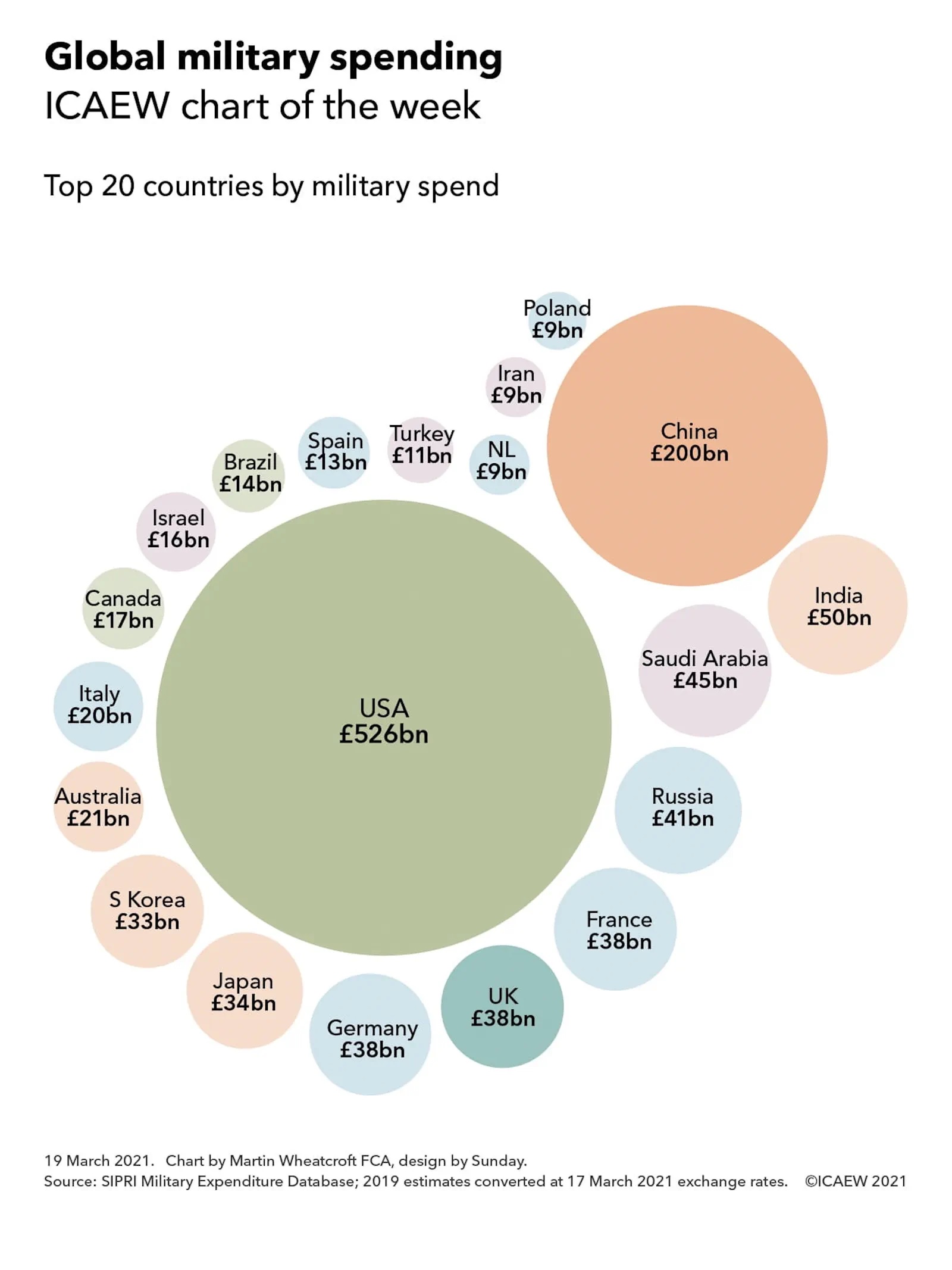
The ICAEW chart of the week returns from its summer holidays to look at the planned expansion of BRICS from five to 11 countries.
“The BRICs” was originally coined by Jim O’Neill in 2001 as an abbreviation for Brazil, Russia, India and China, four fast-growing economies that he predicted would come to dominate the world economy.
This investment shorthand evolved into something more substantive in 2006 when ministers from the four countries got together on the sidelines of a meeting at the UN. Leader summits started in 2009, followed by the addition of South Africa in 2011, which resulted in the capitalisation of the final ‘s’ to form BRICS.
BRICS has developed over time to become a counterweight to the G7, providing an alternative forum for leaders of these five major nations to discuss common concerns such as economic development, currency stability, climate change, and tackling drug trafficking and organised crime. BRICS has been increasingly important to Russia since its ejection from the G7 (then the G8) following its invasion of Crimea in 2014 and to China as relations with the G7 have deteriorated over the last decade.
The most recent summit (the 15th) was on 22-24 August 2023, at which it was announced that six additional countries would be joining on 1 January 2024 to bring the number of members to 11.
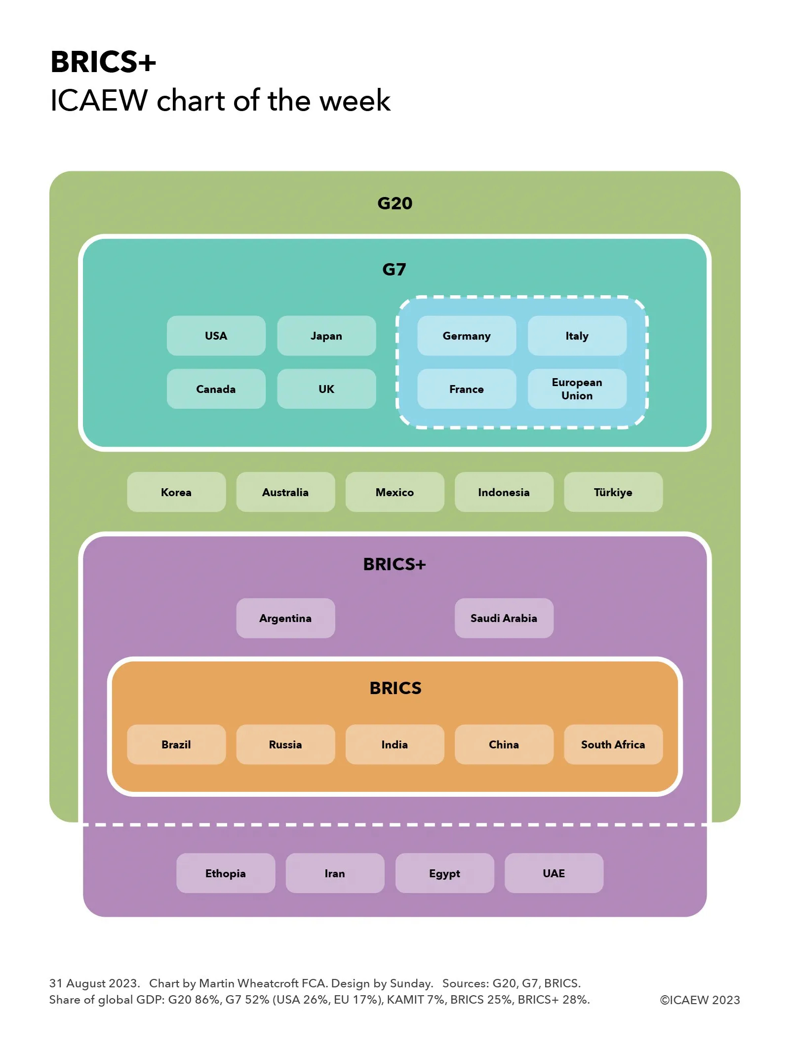
Our chart this week takes the form a Venn diagram to illustrate how BRICS, and the expanded “BRICS+” grouping (pending a new official name), fit with two other major intergovernmental organisations where leaders meet on a regular basis – the G7 and the G20.
It starts with the G20, a grouping of 19 nations and the European Union that together represent 86% of the global economy. Within this sit the eight members of the G7 group of advanced economies, representing 52% of the global economy: the USA (26%), Japan (4%), the UK (3%), Canada (2%), Germany (4%), France (3%), Italy (2%) and the European Union (17% including Germany, France and Italy). The five BRICS nations represent 25% of the global economy comprising: Brazil (2%), Russia (1.7%), India (4%), China (17%) and South Africa (0.4%).
The diagram is complicated by the expanded BRICS+ as although invitees Argentina (0.6%) and Saudi Arabia (1.0%) are also members of the G20, the other four new members – Ethiopia (0.2%), Iran (0.3%), Egypt (0.3%) and the United Arab Emirates (0.5%) – are outside the G20. These new members together represent 3% of the global economy, taking the expanded BRICS+ to 28%.
Squeezed between the G7 and BRICS+ are five G20 members that together make up around 7% of the global economy that are not in either grouping, being (South) Korea (1.6%), Australia (1.6%), Mexico (1.8%), Indonesia (1.4%) and Türkiye (0.8%). As yet there is no sign of an intergovernmental organisation for these “KAMIT” nations to complement the G7 and BRICS, although in practice they are often invited as guests to G7 summits in addition to their participation in meetings of the G20.
The attraction of intergovernmental forums such as the G7, BRICS and the G20 is that they enable national leaders to engage directly with their counterparts on a wide range of topics, in contrast to the often narrower focus and more formal diplomatic structures of treaty-based international organisations such as the Organisation for Economic and Co-operation Development (OECD), the World Bank or the Organisation of American States (OAS) for example.
Their informal nature gives national leaders more flexibility to (for example) change their memberships without lengthy treaty negotiations or to work together on pressing issues of mutual concern. However, that informality also makes it difficult to create binding resolutions, which is perhaps why the global alternative reserve currency proposed at the first BRICS summit in 2009 had still not been implemented by the time of the 15th summit this August.