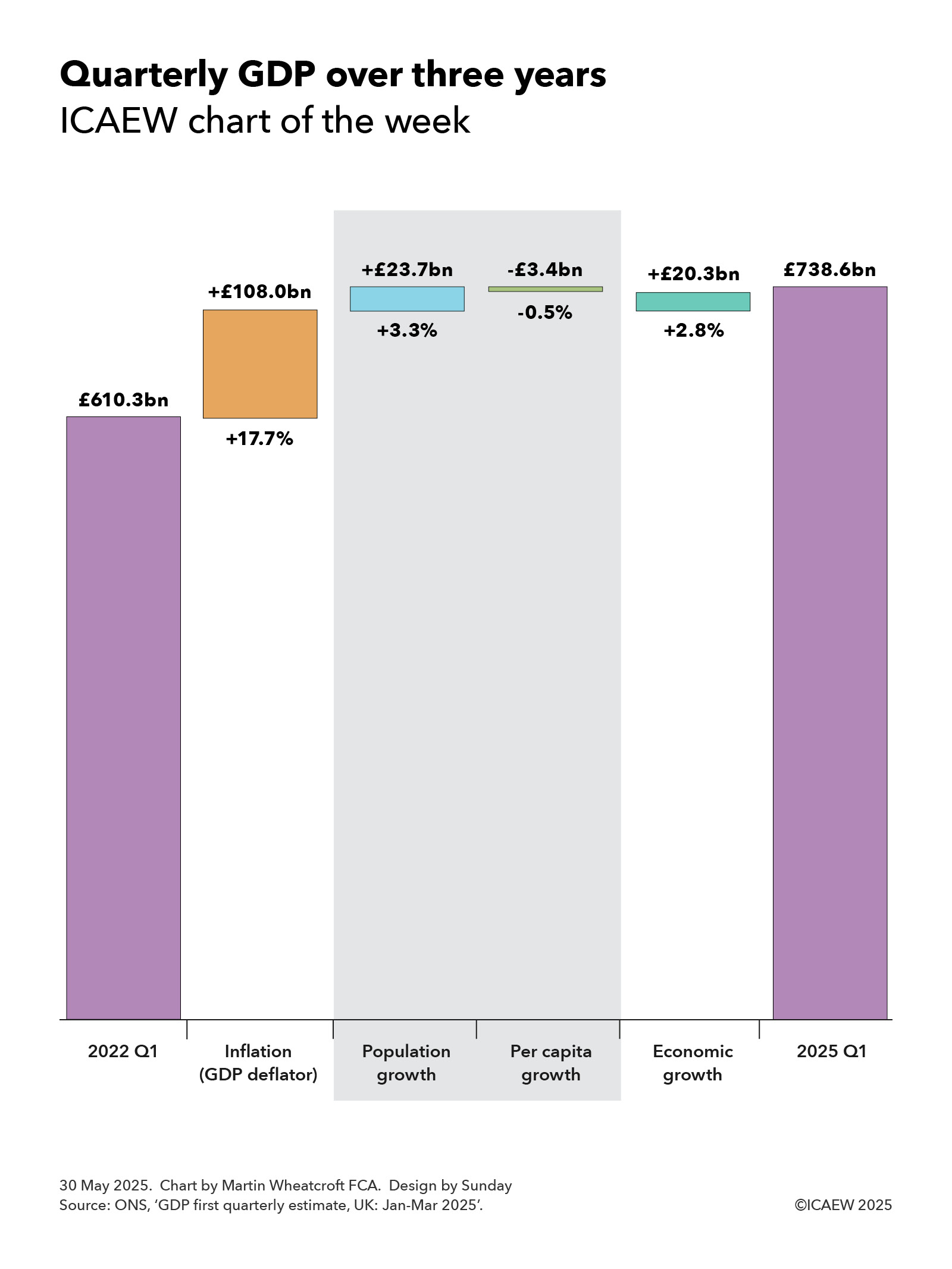
My chart for ICAEW this week looks at how a large upward revision in GDP for 2024/25 translates into a relatively modest 0.1 percentage point increase in economic growth per year since the pandemic.
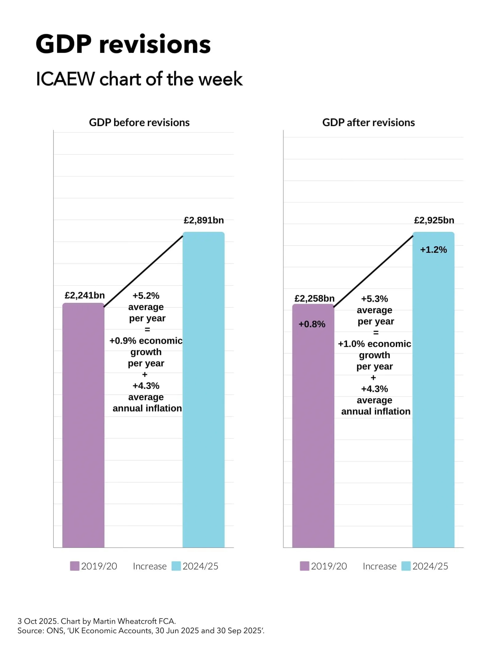
On 30 September, the Office for National Statistics (ONS) published its latest quarterly GDP statistics for April to June 2025. The headline pointed to a slowdown in quarterly economic growth to 0.3% over that period, down from 0.7% growth in the first quarter of the year. However, more significant was a large revision that increased reported GDP for the year to March 2025 (2024/25) by 1.2%, taking it from £2,891bn to £2,925bn.
The ONS also revised GDP for previous years, including a 0.8% upward revision in reported GDP for 2019/20 from £2,241bn to £2,258bn.
My chart for ICAEW this week illustrates how this resulted in the increase in GDP over the five years to 2024/25, going from an average of 5.2% a year in GDP before revisions, to 5.3% a year after revisions. As inflation is similar before and after the revisions (at an average of 4.3% per year), this means that average annual real economic growth over the past five years has been revised up by 0.1 percentage points from 0.9% a year to 1.0% a year.
While the effect on economic growth over the past five years has been relatively modest, it will knock off at least a percentage point from the public sector net debt to GDP ratio – all without the Chancellor needing to lift a finger.
The statistical revisions reflect the typical process of updating historical numbers for more recent data, such as corporation tax returns that reported higher corporate profits than originally estimated and higher estimates of educational output, business inflation and output of pharmaceutical companies. However, the largest revision was a methodology change that increased the estimate of investment in research and development by approximately 1 percentage point of GDP, bringing the UK more in line with comparable countries in the developed world.
Unfortunately, even with this statistical boost to research and development, the UK still underperforms compared with the US, where economic growth since before the pandemic has been more than twice as fast, as well as lagging (albeit slightly) behind the Eurozone.
ICAEW’s business growth campaign has identified how it has become increasingly too uncertain, too difficult and too expensive to do business in the UK and calls for fundamental reform of tax, regulation and economic policy to support stronger business growth going forward.
Read more in ICAEW’s recommendations on how we can tackle the barriers to improving productivity in our business growth campaign.
For more detail about GDP and the revisions the ONS has made, visit GDP quarterly national accounts: April to June 2025.