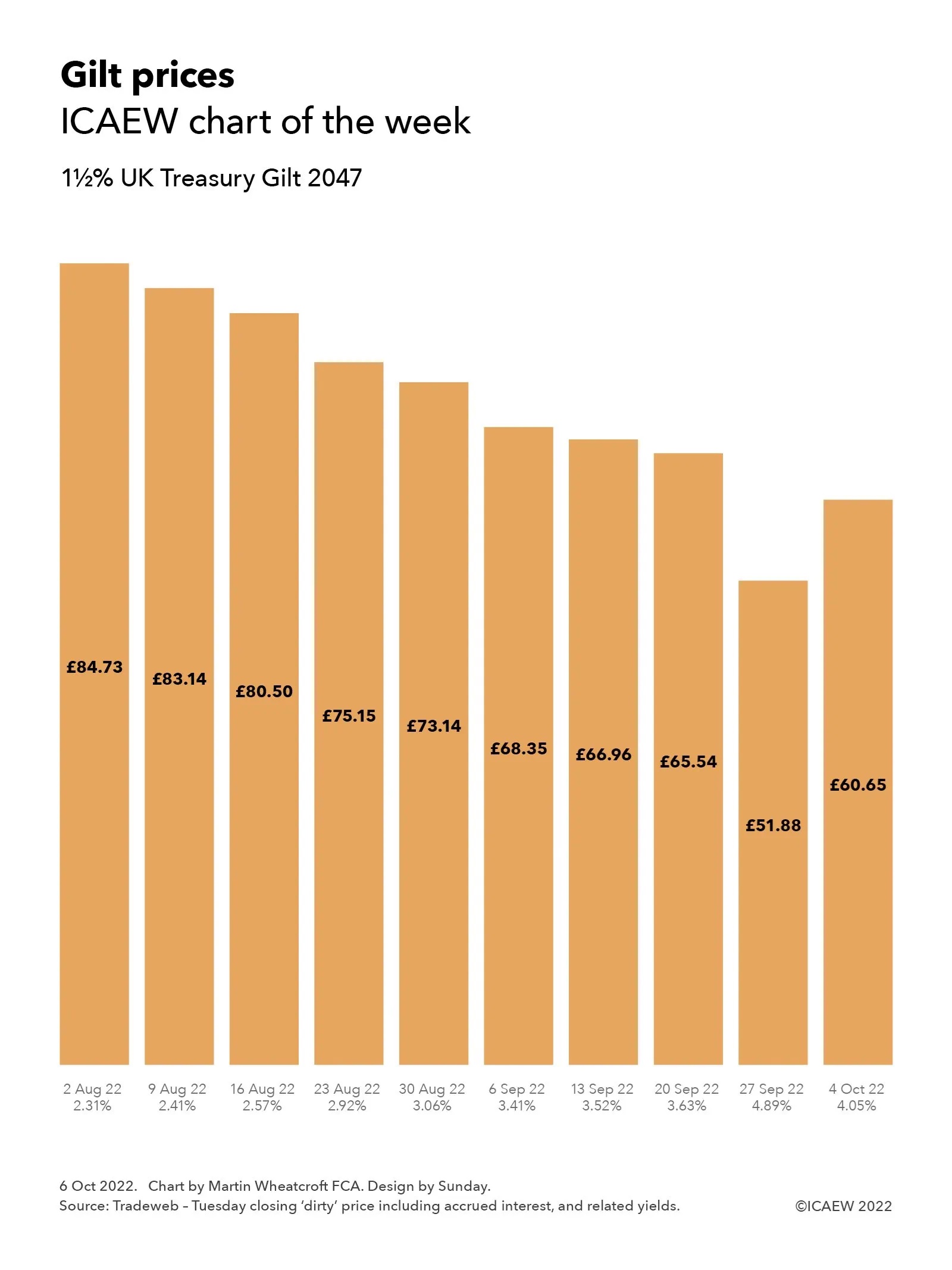
My chart this week illustrates how tax cuts, higher interest charges and energy support packages contribute to the Institute for Fiscal Studies forecast of big increases in the fiscal deficit over the next few years.
The Institute for Fiscal Studies (IFS) published its annual Green Budget pre-Budget report on Tuesday 11 October. My chart this week summarises how the government’s energy support packages, higher interest rates and planned tax cuts contribute to a big jump in the fiscal deficit for the next few years up until the financial year ending 31 March 2027 (2026/27).
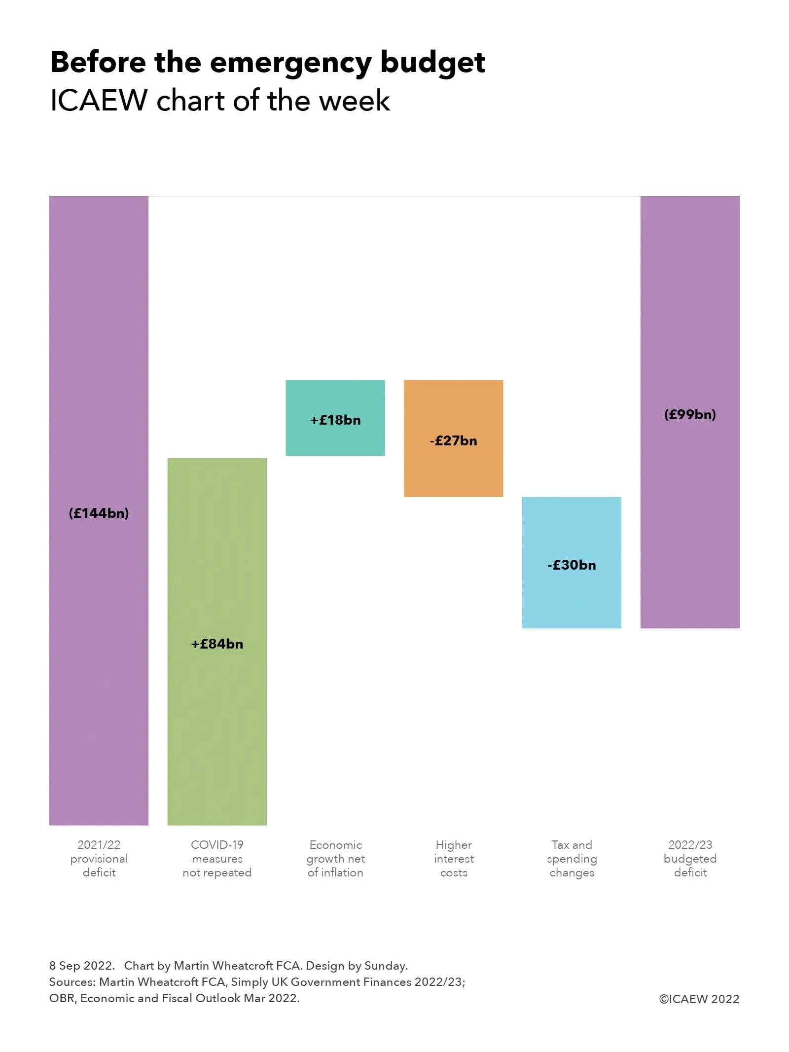
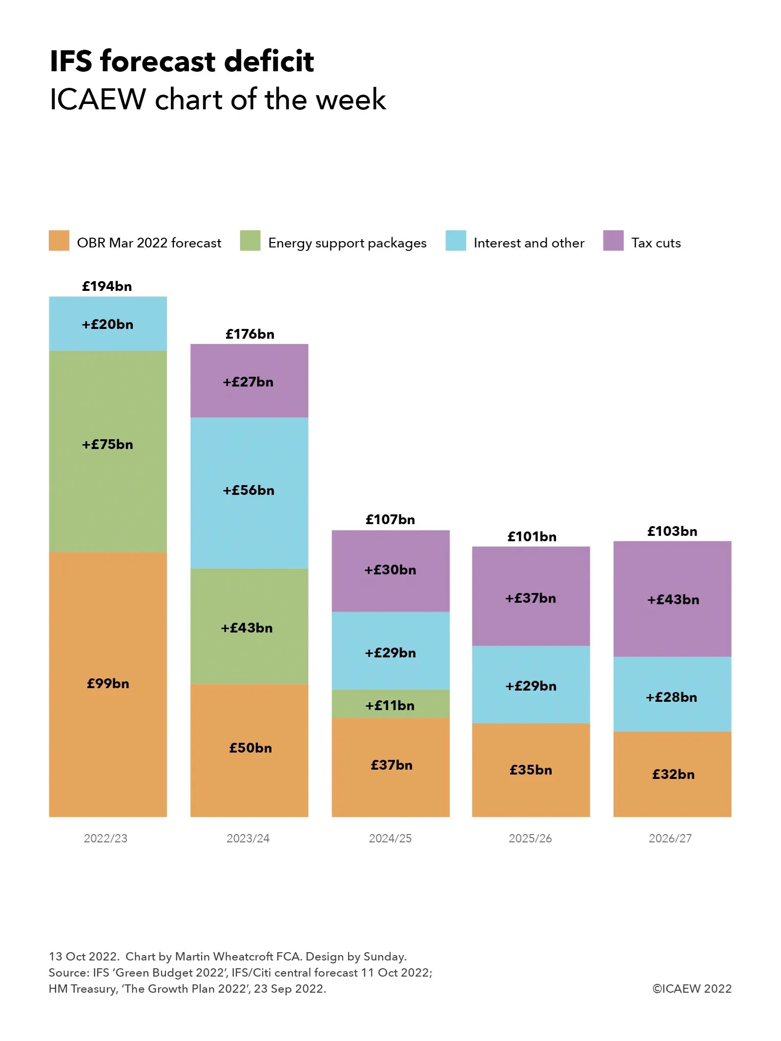
The chart starts with the Office for Budget Responsibility’s March 2022 Economic and Fiscal Outlook forecast for the deficit of £99bn in 2022/23, £50bn in 2023/24, £37bn in 2024/25, £35bn in 2025/26 and £32bn in 2026/27.
Forecasts from the IFS suggest that the deficit will almost double to £194bn in the current financial year, principally as a consequence of the £75bn cost-of-energy support packages announced by the government in May and September 2022, together with £20bn from higher interest and other forecast changes. The £7bn in lost tax revenue from cancelling the national insurance rise from November onwards and £1bn from cutting stamp duty is offset by £8bn in anticipated receipts from the energy windfall tax introduced by Rishi Sunak in May.
In the next financial year 2023/24, the IFS has forecast a £126bn increase in the forecast deficit from the OBR’s £50bn back in March to £176bn. This comprises an estimated £43bn cost of the domestic energy price guarantee, an extra £56bn from the effect of higher interest costs and other forecast changes, and £27bn in lower receipts as a consequence of the tax cuts announced by Chancellor of the Exchequer Kwasi Kwarteng on 23 September and partially reversed on 4 October.
The IFS emphasises that the forecast for the cost of domestic energy price guarantee is highly uncertain given how volatile energy prices are; it could vary up or down by tens of billions of pounds. There is also nothing in the forecast for an extension of the temporary energy support package for businesses that is due to expire on 31 March 2023, despite the potential that this may be required if energy prices remain elevated.
Higher interest charges are driven by a number of factors, including higher Bank of England base rates over the next few years, an increase in the yields on government borrowing when debt is refinanced, the effect of higher inflation on gilts linked to the retail prices index and the higher level of debt consequent on running bigger deficits. Other forecast changes principally relate to the effect of higher inflation on receipts and spending.
The effect of the tax cuts in 2023/24 has been estimated by HM Treasury to reduce receipts by £18bn from the cancellation of the national insurance rise, £11bn from cancelling the previously legislated increase in corporation tax from 19% to 25% from 1 April 2023, £5bn from implementing the cut in the income tax base rate from 20% to 19% a year early, £1bn from cutting stamp duty, £1bn from permanently setting the annual investment allowance for businesses to £1m and £1bn from rolling back IR35, net of £10bn generated by the energy profits levy.
In 2024/25, the forecast assumes energy prices continue to reduce, resulting in a cost for the final six months of the energy price guarantee to £8bn to add to the £37bn forecast by the OBR back in March. Higher interest and other forecast changes should add £29bn, while the government’s tax cuts should add a further £30bn, resulting in a new forecast for the deficit that year of £107bn. Similarly in 2025/26, the OBR’s spring forecast of £35bn has been revised up to £101bn, comprising £29bn from higher interest and other forecast changes and £37bn from tax cuts.
In 2026/27, the IFS forecasts the deficit to be £103bn, with the OBR March forecast of £32bn being increased by £28bn for higher interest charges and other forecast changes and £43bn from the effect of tax cuts. The latter comprises £19bn from the cancellation of the health and social care levy, £18bn from the cancellation of the corporation tax rise to 25%, £2bn from the cut in stamp duty, £2bn from a VAT-free shopping scheme for tourists, and £2bn in other tax measures.
While the huge cost of the government’s energy support packages is the largest contributor to the increase in the deficit in the first two years of the forecast, it is the persistent effect of higher interest rates combined with tax cuts that is the bigger concern for the IFS. Based on its calculation, it suggests that public spending cuts of £62bn a year might be necessary to achieve a falling ratio of debt to GDP by the fifth year of the forecast period – a not insignificant sum.