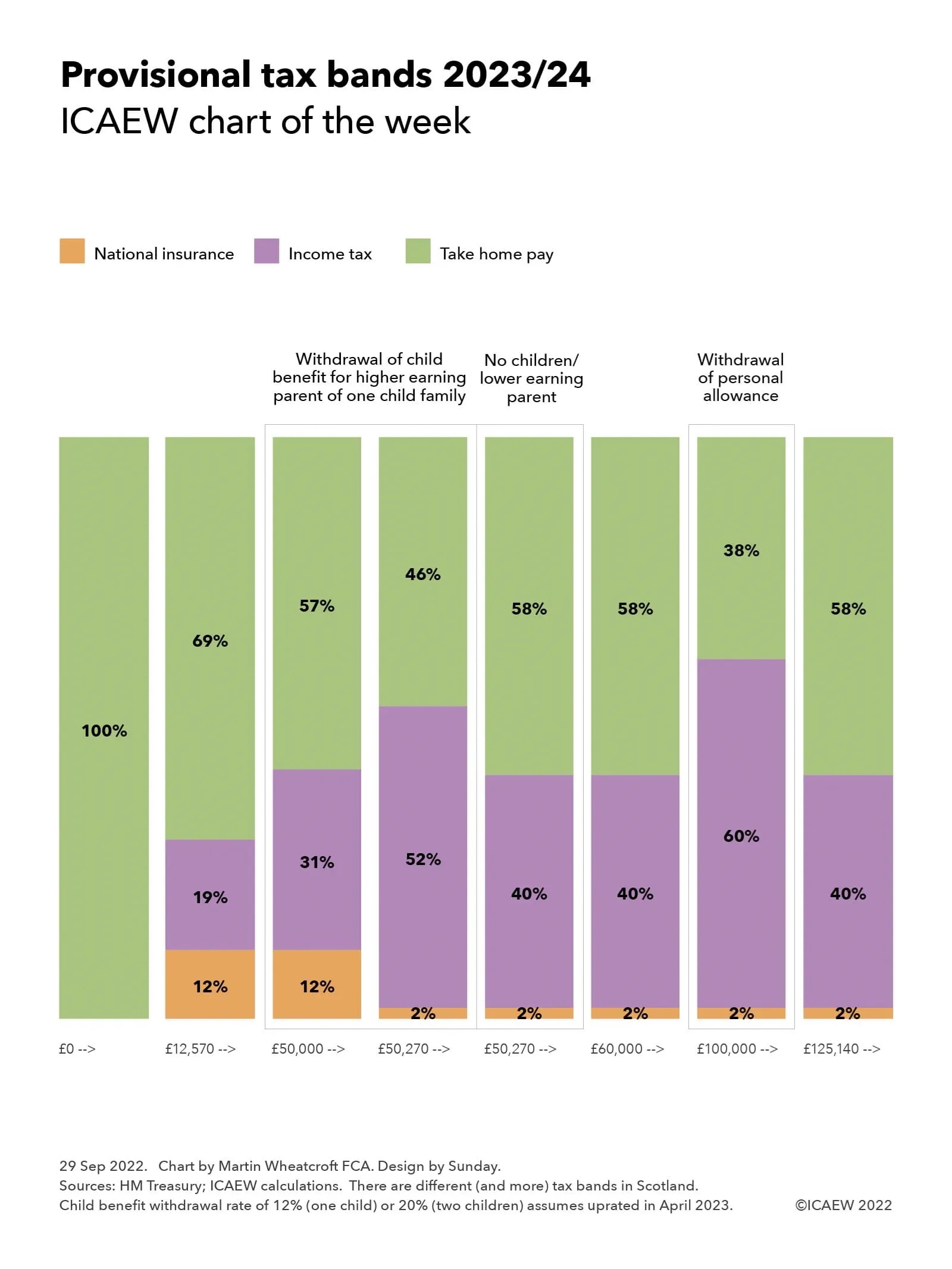
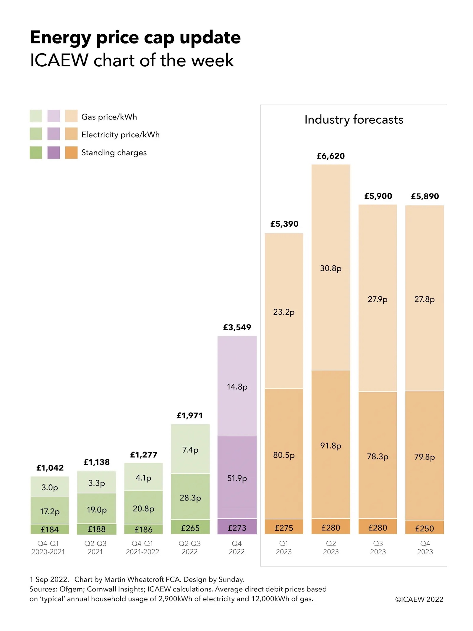
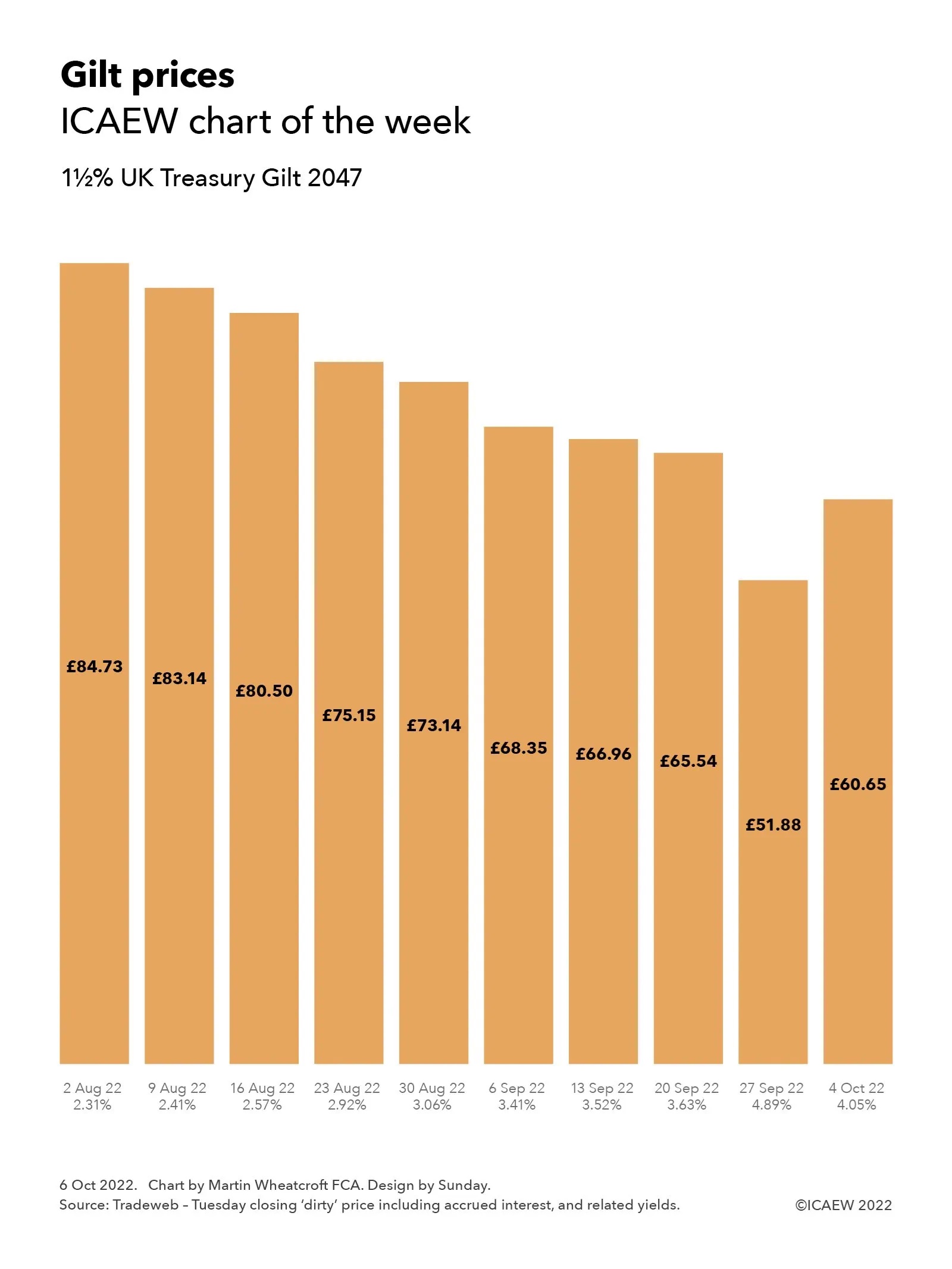
ICAEW chart of the week: hot weather

The chart this week is on the topic (or is that tropic?) of temperature, illustrating how hot weather has become hotter since the 1880s.

Column chart illustrating the maximum daily temperature by decade in ℃.

1880s: 29.3°C
1890s: 29.0°C
1900s: 31.2°C
1910s: 30.9°C
1920s: 31.0°C 
1930s: 30.5°C
1940s: 31.5°C
1950s: 29.9°C 
1960s: 29.6°C
1970s: 33.1°C
1980s: 29.9°C
1990s: 33.4°C
2000s: 33.0°C
2010s: 34.2°C
2020s: 37.3°C

Our chart this week is on hot weather, looking at how the maximum daily temperature in each decade has increased since the 1880s, according to the Met Office’s Hadley Centre Central England Temperature dataset. This is not from a single weather station, but averaged from several stations in order to be “representative of a roughly triangular area of the United Kingdom enclosed by Lancashire, London and Bristol”, according to the Met Office.

The Central England dataset reported a maximum temperature of 37.3% on 19 July, three degrees below the provisional highest temperature ever recorded in the UK of 40.3°C in Coningsby in Lincolnshire on the same day. However, as the chart illustrates, this was still substantially higher than the highest temperatures reported in each of the previous decades. 

Of course, the 2020s are far from over and there is a strong possibility that the peak in this decade will be even higher.

These were the maximum daily temperatures by decade in the Central England datasets:
1880s: 29.3°C (11 Aug 1884)
1890s: 29.0°C (18 Aug 1893)
1900s: 31.2°C (1 Sep 1906)
1910s: 30.9°C ( 9 Aug 1910)
1920s: 31.0°C (12 Jul 1923)
1930s: 30.5°C (27 Aug 1930)
1940s: 31.5°C (29 Jul 1948)
1950s: 29.9°C (6 Jun 1950)1
1960s: 29.6°C (29 Aug 1961)
1970s: 33.1°C (3 Jul 1976)
1980s: 29.9°C (28 Jul 1984)
1990s: 33.4°C (3 Aug 1990)
2000s: 33.0°C (19 Jul 2006)
2010s: 34.2°C (25 Jul 2019)
2020s: 37.3°C (19 Jul 2022)

This approach does not provide a full picture of climate change over the past 140 years, as we are just looking at the daily peaks of temperature in each decade. However, it does echo more scientifically-rigorous analysis of the climate that confirms that the planet is warming up, with even hotter temperatures expected in future decades if we don’t take action.

This chart was originally published on the ICAEW website.

ICAEW chart of the week: US dollar exchange rates

As the US dollar and euro approach parity, our chart illustrates how the US dollar has soared in value since the financial crisis compared with other major currencies apart from the Chinese yuan.

Step chart on US dollar exchange rates, showing the movements against sterling, the euro and the Chinese yuan between 9 Nov 2007 and 13 Jul 2022:

Sterling: £0.48:$1.00 +75% = £0.84:$1.00
Euro: €0.68:$1.00 +45% = €0.99:$1.00
Yuan: ¥7.41:$1.00 -9% = ¥6.72:$1.00

Source: Bank of England.

Our chart this week is on the topic of exchange rates, illustrating how the US dollar has appreciated by 75% and 45% against sterling and the euro respectively since the financial crisis, only to decline by 9% against the Chinese yuan over the same period.

On 9 November 2007, one US dollar was worth 48p as the pound peaked in value at an exchange rate of US$2.095:£1.00 according to the Bank of England’s exchange rate database. Since then the dollar has appreciated and sterling has fallen to an exchange rate of US$1.195:£1.00 at 13 July 2022, making one dollar worth 84p or 75% more today. This movement reflects a combination of much stronger economic growth in the USA over the last 15 years, higher interest rates, weaknesses in the UK economy, and the position of the US dollar as the world’s reserve currency that makes it an attractive safe haven for investors generally and even more in times of economic turmoil.

The dollar has also appreciated against the euro for similar reasons, albeit by only 45% over the same period. On 9 November 2007, one dollar was worth 68 euro cents when the exchange rate was US$1.468:€1.00, compared with the 99 euro cents it was worth on 13 July 2022 when the exchange rate was US$1.005:€1.00 – having briefly touched parity during the course of that day.

For the poor British traveller this means going to the US is substantially more expensive than it was 15 years ago, with a pound now worth just under a dollar and two dimes, compared with almost two dollars and a dime back then, a whole 90 cents less. The cost of travelling to the EU is also more expensive, with the pound worth €1.18 now compared with €1.43 in 2007, a fall of 17% in relative purchasing power.

All three currencies have depreciated against the Chinese yuan over the same period, as the Chinese economy has continued to grow to become the second largest in the world after the USA. The relative strength of the US economy has restricted the depreciation in the dollar to 9% from being worth ¥7.41 to ¥6.72 over 15 years. This contrasts with a fall of 38% in the value of the euro against the yuan from ¥10.88:€1.00 to ¥6.79:€1.00 and a 48% depreciation in sterling against the yuan from ¥15.52:£1.00 to ¥8.03:£1.00.

Exchange rates are volatile and can move significantly over the course of each minute, hour, day, week, month and year, so the numbers will keep changing. They also don’t reflect the full picture, as inflation, interest rates and economic conditions mean that the value of the dollar, pound, euro or yuan in your pocket will be worth more or less depending on what you want to use it for.

The strengthening of the US dollar over the last 15 years is one of the key elements of the global economic story that has seen the US economy come through the financial crisis and the pandemic in better shape than almost every other developed country. Many commentators believe that this is likely to continue in the near term, especially as Europe is much more directly affected by the Russian invasion of Ukraine.

However, as all professional financial advisers will tell you, past performance is no guide to the future – and your guess about how much one US dollar might be worth in the next fifteen years is likely to be as good as anyone’s.

This chart was originally published by ICAEW.

ICAEW chart of the week: Long-term fiscal forecast

The chart this week highlights the difficult fiscal background facing an incoming prime minister as the OBR reports how a “riskier world and ageing population ultimately leave the public finances on unsustainable path”.

Column chart showing public sector net debt as a percentage of GDP from 2021/22 to 2071/22 per the OBR long-term forecast. Starts at 96% in 2021/22, declining to 68% in the mid-2030s and then rising up to 267% by 2071/72.

The publication of the Office for Budget Responsibility (OBR) of its combined fiscal risks and sustainability report on Thursday 7 July 2022 was overshadowed by events in Westminster, which is unfortunate given just how important the state of the public finances is to the success of future government administrations and to the country as a whole.

Setting out long-term fiscal forecasts for the next 50 years, the OBR has analysed threats posed by rising geopolitical tensions, higher energy prices, the pressures of an ageing population and the loss of motoring taxes, as well as risks such as cyber attacks, future economic shocks, higher defence spending, and global protectionism adversely affecting international trade.

The chart illustrates the baseline projections prepared by the OBR, which show public sector net debt as a share of GDP rising from 96% of GDP to 267% in 50 years’ time in 2071/72. This primarily reflects more people living longer with the consequent effect that has on public spending, in particular pensions, health and social care, combined with a declining proportion of working age adults who pay the most in taxes. The report also highlights the fiscal gap created by the loss of fuel duty and vehicle excise duty as petrol and diesel cars are replaced with electric vehicles.

The OBR’s Chair, Richard Hughes, commented how 20 years ago, “Government debt stood at 28% of GDP, the deficit was about 0.5% of GDP, the economy was growing at an average rate of 2.75%, and inflation was running at 1.3% – and the Treasury’s pioneering 50-year fiscal projections predicted that government debt this year, 2022, would stay just below 40% of GDP – consistent with the fiscal rules in place at the time.

“As we now know, debt this year is expected to be more than twice that, at 96% of GDP,” Hughes continued, highlighting how over the past two decades the UK economy has been buffeted by an unprecedented series of global shocks including a financial crisis, a pandemic, a major war on the European continent, and an energy crisis. 

Hughes commented: “Working away in the background as this series of crises unfolded were a set of longer-term pressures on the public finances and the number of people aged 65 and over rose by 3.5 million from 9.5 to 13 million people; we learned that global temperatures had already risen by 1°C and were on track to rise by 4°C by the end of this century; and having fallen from over 5% in 2002 to less than 0.5% in 2020, interest rates on government debt are now back up to 2%.”

One of the key drivers of the projection is the old-age dependency ratio, the number of those aged 65 and over to those aged 16 to 64, which is expected to rise from 0.31 in 2022 to 0.52 in 2072, with a low birth rate and inward migration insufficient to offset the increasing number of people living longer in retirement.

The report has stress tested the projections with a range of potential events that could make the financial position much worse, with different unpalatable scenarios seeing the ratio of debt to GDP rising to 288%, 304%, 317% or 437% in 2071/72, depending on the assumptions made. In the other direction, the OBR notes that 76,000 additional net inward migrants a year over 50 years would reduce the baseline projection for debt to GDP of 267% to 217% in 2071/72.

The next prime minister will inevitably focus on the many short-term challenges facing the government and the country, but the OBR report makes clear just how much a long-term fiscal strategy is needed to put the public finances onto a sustainable path.

This chart was originally published by ICAEW.

ICAEW chart of the week: England and Wales Census 2021

The ICAEW chart of the week looks at the results of last year’s census, illustrating how the population of southern and central England has grown much faster than in the north of England and in Wales over the past decade.

Bubble chart overlayed on a map of England & Wales scaled to population in each region with inner bubbles showing the increase in the last decade. 

North East 2.6m (+1.9%)
North West 7.4m (+5.2%)
Yorkshire 5.5m (+3.7%)

West Midlands 6.0m (+6.2%)
East Midlands 4.9m (+7.7%)
East of England 6.3m (+8.3%)

South West 5.7m (+7.8%)
South East 9.3m (+7.5%)
London 8.8m (+7.7%)

Wales 3.1m (+1.4%)

The Office for National Statistics (ONS) released the first results from Census 2021 in England and Wales on Tuesday 28 June, providing an initial snapshot of who we are and where we live across two of the four nations of the UK. It follows on from the initial release earlier this year of the Northern Ireland Census 2021, but we won’t see a full picture for the UK for some time as the 2022 census in Scotland was delayed until this year.

The chart highlights how the East of England was the fastest growing region in England, with its population growing by 8.3% to 6.3m between 2011 and 2021. This was followed by the South West (up 7.8% to 5.7m), London (up 7.7% to 8.8m), East Midlands (up 7.7% to 4.9m) and the South East (up 7.5% to 9.3m). The West Midlands grew less quickly (up 6.2% to 6.0m), but still by more than the North West (up 5.2% to 7.4m), Yorkshire (up 3.7% to 5.5m) and the North East (up 1.9% to 2.6m). The population of Wales only increased by 1.4% over 10 years to remain at 3.1m.

In total the population of England and Wales amounted to 59.6m in 2021. This was 6.3% higher than the 56.1m people living in the UK in 2011 and 14.6% higher than the 52.0m reported by the 2001 census. This reflects a slowing rate of growth in the last decade at 0.6% a year on average compared with the average rate of 0.8% seen between 2001 and 2011 and is substantially lower than the compound growth of 1.6% a year experienced over 120 years since the first official census in 1801 reported a population of 8.9m in England & Wales.

The ONS has published a breakdown of the population by age and sex by local authority, highlighting how the number of people has changed significantly in some parts of the country, such as Tower Hamlets (up 22% in 10 years), Dartford (up 20%), Barking and Dagenham (up 18%), Bedford (up 18%), Peterborough (up 17.5%), Central Bedfordshire and Tewkesbury (each up 16%) and Salford, Milton Keynes, Uttlesford, Vale of White Horse and Wokingham (each up by around 15%). The biggest falls were in Kensington and Chelsea (down 10%) and Westminster (down 7%), although there is some speculation that this was because of the pandemic as family and second homes elsewhere proved to be more attractive places to work from home during lockdown. This is unlikely to be the driver of decreases in some rural areas such as the 6% fall in Ceredigion in Wales or the 5% fall in Copeland in Cumbria, where long-term trends of population decline have continued.

The census has also confirmed how we are getting older on average, with a 20% increase in those aged 65 and over from 9.2m in 2011 to 11.1m in 2021. This continues to be a big driver for public finances, as more funding is needed to pay for pensions, health and social care at the expense of other public services.

There is still a lot of data crunching to do as the statisticians work through the more in-depth questions on the census, ranging from employment status, education and housing to ethnicity, religion, sexual orientation and gender identity among other characteristics – demographics in action and the likely source of future charts of the week.

This chart was originally published by ICAEW.

ICAEW chart of the week: Railway journeys

This week’s chart illustrates how railway strikes are not the only problem facing Great British Railways, the new publicly owned body being established to run the rail network from next April.

Column chart showing railway journeys in Great Britain by quarter from Q1 of 2018/19 to Q4 of 2021/22 split between season tickets; peak, anytime and advance; and off-peak and other. See text below for numbers.

The ICAEW chart of the week is on railway journeys in Great Britain over the past four financial years, highlighting how the number of trips on the network have fallen from a peak of 1,753m in 2018/19 to 1,739m in 2019/20 and 388m in 2020/21, before increasing to 990m in the most recent financial year ended 31 March 2022. These numbers exclude London Underground and light rail and tram systems in London and elsewhere, but they include London Overground.

Passenger numbers are well below pre-pandemic levels – a challenge with a government increasingly reluctant to plug the gap in passenger revenues with additional subsidies on an ongoing basis.

The biggest fall has been in trips using Season tickets, which at 51m during January through March 2022 were 70% below the 170m reported for the fourth quarter of 2018/19. Trips using Peak, Anytime and Advance tickets and Off-peak and other tickets in Q4 of 2021/22 were 22% and 15% down on the quarter ended 31 March 2019. The chart illustrates how travel patterns have changed as many more people work from home on a regular basis, especially regular commuters who have traditionally formed the backbone of rail passenger traffic.

These falls in usage – and in the associated revenue from ticket sales and other income – are likely to present a huge challenge for Great British Railways, the new public body scheduled to take over the running of the railways in England, Wales and Scotland from 1 April 2023 (not including Transport for London and light rail and tram systems). 

Great British Railways is taking on responsibility for the track and stations currently owned by Network Rail and for the running of train services too – with the train operating companies engaged to run services on its behalf under concession arrangements that expose the taxpayer to revenue risk. A difficult enough task at the best of times, but one made even more challenging by the consequences of the pandemic and with a shareholder in the form of a government keen to cut subsidies that have ballooned since the start of the pandemic.

As the chart shows, trips using Season tickets by quarter were 149m, 142m, 160m and 170m in 2018/19; 141m, 139m, 154m and 153m in 2019/20; 10m, 21m, 36m and 26m in 2020/21; and 32m, 36m, 48m and 51m in 2021/22. Trips using Peak, Anytime and Advance tickets were 127m, 128m, 132m and 130m in 2018/19; 133m, 140m, 141m and 119m in 2019/20; 11m, 46m, 46m and 27m in 2020/21; and 63m, 89m, 103m and 102m during 2021/22. Trips using Off-peak and other tickets were 152m, 163m, 157m and 143m in 2018/19; 163m, 169m, 166m and 121m in 2019/20; 14m, 67m, 57m and 27m in 2020/21; and 87m, 123m, 134m and 122m in 2021/22.

The recent strikes won’t help, especially if they recur over the summer. However, whatever happens, getting people back to using the railways is going to be a big task for the new team at Great British Railways – whether by persuading workers to return to the office, encouraging people out of their cars or by just enticing us all to let the train take the strain more often than we do at the moment.

This chart was originally published by ICAEW.

ICAEW chart of the week: Foreign travel

This week’s chart looks at the number of trips abroad by UK residents before, during and after the pandemic. Will travel chaos, the cost-of-living crisis and climate concerns prevent a full return to pre-pandemic levels?

Column chart showing foreign travel by UK residents to the European Union, USA & Canada, and Rest of the World by quarter from 2018 Q1 to 2021 Q4. For numbers see text below.

The Office for National Statistics (ONS) issued detailed statistics on travel to and from the UK on 15 June 2022 highlighting how both inbound tourism and outbound foreign travel fell dramatically over the course of the pandemic.

As our chart illustrates, there were 90.6m visits abroad by UK residents in 2018 (16.6m, 24.7m, 29.9m and 19.4m in Q1: Jan-Mar, Q2: Apr-Jun, Q3: Jul-Sep and Q4: Oct-Dec respectively) and 93.1m in 2019 (18.1m, 25.8m, 30.0m and 19.2m), before dropping to 23.8m in 2020 (13.9m, 0.9m, 6.2m and 2.8m) and partially recovering to 19.1m in 2021 (0.9m, 1.2m, 8.0m and 9.0m).

Most journeys were, as you might expect, to our nearest neighbours in the European Union (led by Spain, France, Italy, and Ireland), with the USA and Canada being major destinations too. Other popular destinations visited included Turkey, India, Switzerland, the UAE, China, Mexico, Australia, Thailand and ‘cruises’.

For 2018 through 2020, around 63% of foreign trips were for holidays, 25% were to visit friends or relatives, 10% were for business and 2% were for other reasons. Unusually, in 2021 just 47% of visits were for holidays and proportionately a much higher 43% were to see friends or relatives, with 7% being business trips and 3% for other reasons.

The recent chaotic scenes at airports and flight cancellations may be one reason not to travel internationally at the moment, but there are big questions about whether our travel habits will return to the levels seen before the pandemic even when those problems are resolved. The fall in the value of the pound makes overseas trips even more expensive just as families are feeling a big squeeze in their incomes as inflation accelerates upwards. Virtual meetings are making business trips less necessary than before, while many individuals want to cut back on flying in order to do their bit to contribute to achieving net zero.

Despite that, substantial growth is expected in 2022 and 2023 in the number of visits abroad from the low base of 2020 and 2021 as – for many of us – the lure of distant (and not so distant) shores will just be too great to resist.

This chart was originally published by ICAEW.

ICAEW chart of the week: Whole of Government Accounts 2019/20

We take a look at the government balance sheet at 31 March 2020 this week, following publication by HM Treasury of the long-delayed 2019/20 audited financial statements for the UK public sector.

Step chart showing public assets £2,129bn, liabilities of (£4,973bn) and net liabilities of (£2,834bn).

Fixed assets £1,353bn, receivables & other £195bn, investments £323bn, financial assets £268bn.

Financial liabilities (£2,207bn), payables (£201bn), pensions (£2,190bn).

Taxpayer equity (£2,834bn).

HM Treasury was up in front of the Public Accounts Committee (PAC) this week to be grilled on the Whole of Government Accounts (WGA) for the year ended 31 March 2020. The first question posed by MPs was why it had taken more than 26 months to publish the audited financial statements for the UK public sector, unlocking a tale of woe regarding the pandemic, delays in central government reporting, even greater delays in local government, and problems in implementing a new consolidation system. 

For all that, the PAC expressed their appreciation for the contents of the WGA, which comprises a performance report, governance statements, financial statements prepared in accordance with International Financial Reporting Standards, an audit report and a reconciliation to the fiscal numbers reported by the Office for National Statistics. The UK is one of the leading governments around the world in preparing comprehensive financial reports similar to those seen in the private sector, and is the only one to attempt to incorporate local government as well as central government and public corporations.

Our chart summarises the balance sheet reported in the consolidated financial statements at 31 March 2020, when there were total assets of £2,139bn, total liabilities of £4.973bn and negative taxpayer equity of £2,834bn. These numbers do not reflect the more than half a trillion pounds borrowed since then which are likely to see the 2020/21 and 2021/22 WGA move even further into negative territory. 

On the positive side of the balance sheet were:

  • £195bn of receivable and other assets, comprising £160bn of trade and other receivables due within one year, £22bn of receivables due in more than year, £11bn of inventories and £2bn of assets held for sale;
  • £1,353bn of fixed assets, consisting of £676bn for infrastructure, £459bn of land and buildings, £77bn of assets under construction, £41bn of military equipment, £60bn of other tangible fixed assets, and £40bn of intangibles;
  • £323bn of investments, including £126bn of non-current loans and deposits, £77bn in student loans, £36bn in equity investments, £22bn invested in the IMF, £38bn in derivatives and other, and £24bn in investment property; and 
  • £268bn of current financial assets, of which £118bn were in debt securities, £74bn in loan balances due within one year, £38bn in cash and cash equivalents, £13bn in gold holdings, £13bn in IMF special drawing rights and £12bn in derivatives and other.

On the negative side, there were:

  • £2,207bn in financial liabilities, comprising £1,266bn in government securities (gilts and Treasury bills), £560bn of deposits owed to banks, £179bn owed to investors in National Savings & Investments, £78bn in bank and other borrowings, £74bn in banknotes and £50bn in derivatives and other financial liabilities;
  • £201bn of payables, including £66bn of accruals and deferred income, £55bn of trade and other payables, £42bn in lease obligations, £34bn in tax and duty refunds payable and £4bn in contract liabilities;
  • £2,190bn in net pension obligations, of which £2,062bn were for unfunded pension schemes (NHS £760bn, teachers £490bn, civil service £309bn, armed forces £233bn, police & fire £197bn, other £73bn) and £128bn for funded schemes (local government £359bn less £253bn = £106bn, and other funded schemes £106bn less £84bn = £22bn). This balance does not include the state pension, which is treated as a welfare benefit and not a liability for accounting purposes; and
  • £375bn in provisions for liabilities and charges, including £157bn for nuclear decommissioning, £86bn for clinical negligence, £39bn for EU liabilities, £31bn for the pension protection fund and £62bn in other provisions.

Net liabilities therefore amounted to £2,834bn, reflecting the general policy decision taken by successive governments not to fund liabilities in advance, but instead to rely on future tax revenues and borrowing to provide cash as needed to settle liabilities and other financial obligations and commitments. As Sir Tom Scholar, Permanent Secretary at HM Treasury, informed the PAC, this minimises the investment risks the government might otherwise be exposed to if it were to invest in (say) the stock market.

Cat Little, Head of the Government Finance Function, set out plans to bring down the time to prepare the WGA, to within 24 months for the 2020/21 WGA and to within 20 months for the 2021/22 WGA. This remains a long way off the long-term objective of producing the WGA within nine months of the balance sheet date.

While the numbers in these financial statements are now more than two years old, they are still extremely valuable in providing a baseline for the financial position of the UK public sector as the country headed into the pandemic. It is well worth a read if you have the time.

The Whole of Government Accounts 2019/20 is available online.

This chart was originally published by ICAEW.

ICAEW chart of the week: Public finances by region 2020/21

The ICAEW chart this week highlights how every single region and nation in the UK was in deficit in the first fiscal year of the pandemic.

Our chart this week highlights how every single region and nation in the UK was in deficit in the first fiscal year of the pandemic.

The Office for National Statistics (ONS) recently released an analysis of government revenue and expenditure by region and nation of the UK for the financial year ended 31 March 2021 – the first year of the pandemic. 

This was a year that saw public spending balloon to £1,112bn from £884bn in 2019/20 as the government splurged cash in response to the arrival of the coronavirus. At the same time, taxes and other income fell to £794bn in 2020/21 from £829bn the year before, while unprecedented levels of support to businesses and individuals prevented a much greater collapse in tax receipts. The resulting deficit of £318bn was the largest ever in peacetime.

The chart illustrates how every region incurred a deficit in 2020/21, with a deficit per head of approximately £800 in Greater London (revenue per head £18,440/expenditure per head £19,240), followed by £1,640 in the South East (£14,020/£15,660), £3,360 in the East of England (£11,940/£15,300), £5,000 in the South West (£10,940/£15,940), £5,140 in the East Midlands (£9,860/£15,000), £5,920 in Yorkshire and The Humber (£9,620/£15,540), £6,220 in the West Midlands Region (£9,380/£15,600), £6,580 in Scotland (£11,780/£18,360), £6,780 in the North West (£9,800/£16,580), £7,960 in the North East (£8,700/£16,660), £8,180 in Wales (£9,060/£17,240) and £9,500 in Northern Ireland (£8,740/£18,240). These numbers compare with an overall UK average deficit of approximately £4,740 per person, comprising per capita revenue of £11,840 less per capita spending of £16,580 based on a population of 67.1m.

The deficit in 2020/21 was so large that even London and the South East, which normally supply substantially more revenue to the government than they receive back in expenditure, saw the reverse this time. (In contrast, for example, with the surpluses of £4,520 and £2,180 per head respectively in 2019/20.)

Inclusive of pandemic spending, most regions ended up benefiting from government expenditure and welfare support of between £15,000 and £17,000 per person in the year, the outliers being Scotland and Northern Ireland, where spending exceeded £18,000 and London where it exceeded £19,000 per head. There is much wider range in the average for taxes and other income, from less than £9,000 per person in in the North East and Northern Ireland (more than 25% lower than the UK-wide average) up to more than £14,000 per head in the South East and more than £18,000 per head in London (more than 50% higher than the UK average).

For the public finances 2020/21 was a landmark year, in which exceptional levels of expenditure and an extraordinarily large deficit led to a significant increase in public debt. Despite that – as our chart illustrates – there continue to be significant economic and fiscal disparities across the regions and nations of the UK.

This chart was originally published by ICAEW.

ICAEW chart of the week: Inflation around the world

This week we look at how inflation is racing upwards across the world, with the UK reporting in April one of the highest rates of increase among developed countries.

Bar chart showing inflation rates by G20 country: Russia 17.8%, Nigeria 16.8%, Poland 12.4%, Brazil 12.1%, Netherlands 9.6%, UK 9.0%, Spain 8.3%, USA 8.3%, India 7.8%, Mexico 7.7%, German 7.4%, Canada 6.8%, Italy 6.0%, South Africa 5.9%, France 4.8%, South Korea 4.8%, Indonesia 3.5%, Switzerland 2.5%, Japan 2.4%, Saudia Arabia 2.3%, China 2.1%.

Inflation has increased rapidly over the last year as the world has emerged from the pandemic. A recovery in demand combined with constraints in supply and transportation has driven prices, with myriad factors at play. These include the effects of lockdowns in China (the world’s largest supplier of goods), the devastation caused by the Russian invasion in Ukraine (a major food exporter to Europe, the Middle East and Africa), and the economic sanctions imposed on Russia (one of the world’s largest suppliers of oil and gas).

As the chart shows, the UK currently has – at 9% – the highest reported rate of consumer price inflation in the G7, as measured by the annual change in the consumer prices index (CPI) between April 2021 and April 2022. This compares with 8.3% in the USA, 7.4% in Germany, 6.8% in Canada, 6.0% in Italy, 4.8% in France and 2.4% in Japan. 

The UK’s relatively higher rate partly reflects the big jump in energy prices in April from the rise in the domestic energy price cap, which contrasts with France, for example, where domestic energy price rises have been much lower (thanks in part to state subsidies). The UK inflation rate also hasn’t been helped by falls in the value of sterling, making imported goods and food more expensive.

Other countries shown in the chart include Russia at 17.8%, Nigeria at 16.8%, Poland at 12.4%, Brazil at 12.1%, Netherlands at 9.6%, Spain at 8.3%, India at 7.8%, Mexico at 7.7%, South Africa 5.9%, South Korea at 4.8%, Indonesia at 3.5%, Switzerland at 2.5%, Saudi Arabia at 2.3% and China at 2.1%. For most countries, the rate of inflation is substantially higher than it has been for many years, reflecting just how major a change there has been in a global economy that had become accustomed to relatively stable prices in recent years. 

This is not the case for every country, and the chart excludes three hyperinflationary countries that already had problems with inflation even before the pandemic, led by Venezuela with an inflation rate of 222.3% in April, Turkey with a rate of 70%, and Argentina at 58%.

Policymakers have been alarmed at the prospect of an inflationary cycle as higher prices start to drive higher wages, which in turn will drive even higher prices. For central banks that has meant increasing interest rates to try and dampen demand, while finance ministries have been looking to see how they can protect households from the effect of rising prices, particular on energy, whether that be by intervention to constrain prices, through temporary tax cuts, or through direct or indirect financial support to struggling households.

Here in the UK, both the Bank of England and HM Treasury have been calling for restraint in wage settlements as they seek to head off a further ramp-up in inflation. They hope that inflation will start to moderate later in the year as price rises in the last six months start to drop out of the year-on-year comparison and supply constraints start to ease, for example as oil and gas production is ramped up in the USA, the Middle East and elsewhere to replace Russia as an energy supplier, and as China emerges from its lockdowns.

Despite that, prices are likely to rise further, especially in October when the energy price cap is expected to increase by 40%, following a 54% rise in April. This is likely to force many to make difficult choices as household budgets come under increasing strain.

After all, inflation is much more than the rate of change in an arbitrary index; it has an impact in the real world of diminishing spending power and in eroding the value of savings. 

This chart was originally published by ICAEW.

ICAEW chart of the week: Global population

The ICAEW chart of the week looks at how the estimated global population of almost 8bn people is distributed around the world.

Bubble chart showing estimated global population of 7,995m in 2022: South Asia 1,894m, East Asia 1,671m, South East Asia 682m, Pacific 43m, Africa 1,419, Europe 592m, Middle East 357m, Eurasia 246m, North America 511m, South America 443m and Central America & Caribbean 97m.

UN projections show that the planetary population will reach approximately 7,955m in June this year, a 1.0% increase over the 7,875m estimate for June 2021.

The largest region on our chart is South Asia, which has 1,894m inhabitants, including 1,411m in India, 216m in Pakistan, 173m in Bangladesh, 40m in Afghanistan and 31m in Nepal. This is followed in size by the 1,671m people living in East Asia, including 1,432m in mainland China (currently the most populous country in the world), 126m in Japan, 52m in South Korea and 26m in North Korea.

Africa is the third largest region with 1,419m inhabitants, with 482m living in Eastern Africa (including Ethiopia 118m, Tanzania 67m, Kenya 56m, Uganda 50m, Mozambique 34m and Madagascar 29m), 424m in Western Africa (including Nigeria 217m, Ghana 32m, Côte d’Ivoire 27m and Niger 26m), 254m in Northern Africa (including Egypt 106m, Sudan 46m, Algeria 45m and Morocco 38m), 190m in Middle Africa (including the Democratic Republic of the Congo 95m, Angola 35m and Cameroon 27m), and 69m in Southern Africa (of which 60m are in South Africa).

Excluding Russia and Belarus, Europe has 592m people, including 444m in the 27 countries of the EU (including Germany 83m, France 66m, Italy 59m, Spain 46m and Poland 38m), 68m in the UK and 43m in Ukraine, although these numbers are all before taking account of the several million Ukrainians who have been forced to flee the war and are living temporarily in other countries. 

Eurasia, comprising the Commonwealth of Independent States of Russia, Belarus and the ‘stans’ of central Asia, has 246m inhabitants (including Russia 143m and Uzbekistan 34m), while the Middle East has an estimated 357m people (including Turkey 85m, Iran 85m, Iraq 44m, Saudi Arabia 36m and Yemen 32m.

North America has 511m inhabitants (USA 336m, Mexico 137m, Canada 38m), while 97m live in Central America (52m) and the Caribbean (45m), and 443m live in South America (including Brazil 217m, Colombia 51m, Argentina 46m, Peru 34m and Venezuela 34m).

South East Asia has 682m inhabitants, including 277m in Indonesia, 113m in the Philippines, 100m in Vietnam, 70m in Thailand, 56m in Myanmar and 34m in Malaysia. A further 43m people live in the Pacific region, of which 26m are in Australia. 

Although the rate of global population growth was projected to slow significantly in recent years, from 1.3% a year in 2000 when the population was 6.1bn, to 1.0% a year currently and to a forecast of around 0.7% in 20 years’ time, that still means that the number of people on the planet is expected to grow to around 9.8bn in 2050, placing even greater demands on natural resources than today. 

This highlights just how important achieving net zero and environmental sustainability is to the lives and wellbeing of future generations.

This chart was originally published by ICAEW.