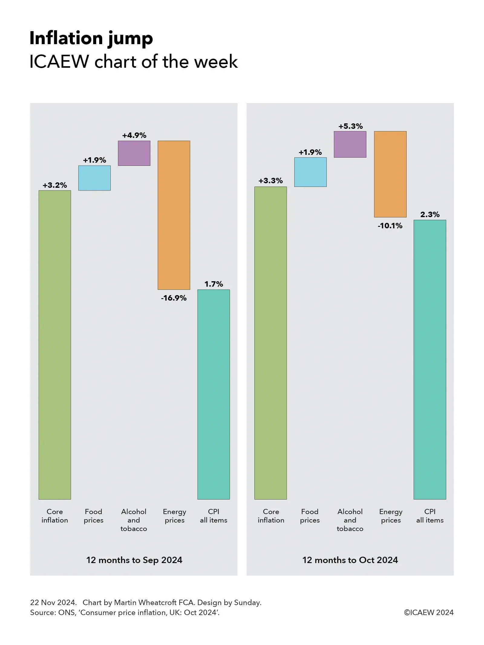
My chart for ICAEW this week takes a dive into the £53.9bn Ministry of Defence expenditure in 2023/24 ahead of what is likely to be a charged debate about defence spending in the coming year.
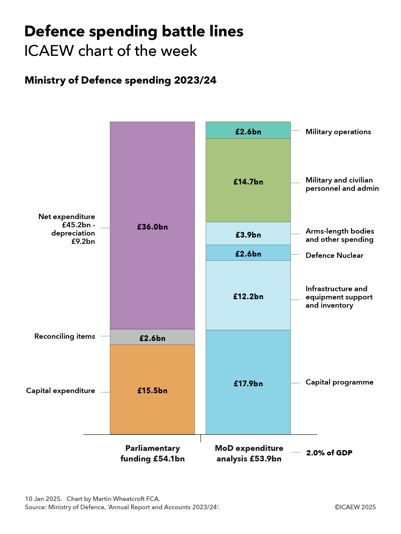
My chart of the week illustrates how parliamentary funding for the Ministry of Defence (MoD) amounted to £54.1bn for the year ended 31 March 2024 while summarising the MoD’s expenditure analysis of £53.9bn between £17.9bn for the capital programme, £12.2bn for infrastructure and equipment support and inventory, £2.6bn for Defence Nuclear, £3.9bn for arms-length bodies and other spending, £14.7bn for military and civilian personnel and admin, and £2.6bn for military operations.
The parliamentary funding of £54.1bn was used to pay for £36.0bn of day-to-day spending (being net expenditure reported in the accounts of £45.2bn less non-cash depreciation and impairments of £9.2bn) and £15.5bn in capital expenditure, after net reconciling items of £2.6bn (the largest being to exclude an exceptional £2.7bn gain from changes in discount rates).
The £17.9bn incurred on MoD’s capital programme during 2023/24 is higher than the total for capital expenditure because it includes research and development and capital grants that are expensed in the revenue and expenditure statement. Most of the amount spent relates to building or upgrading military equipment for the armed forces, ranging from Astute Class nuclear-powered and Dreadnought Class nuclear-powered ballistic missile submarines and Type 31 frigates for the Royal Navy, remotely piloted Protector surveillance and strike aircraft and radar upgrades to the Typhoon fighter for the Royal Air Force, through to Ajax armoured fighting vehicles and Chinook heavy-lift helicopters for the Army. It also includes investment in digital technology, back-office automation and investments in new military accommodation. (Existing military accommodation has been brought back in house since the end of the financial year).
The £12.2bn incurred in non-capital spending on infrastructure and equipment and inventory comprised £5.0bn to maintain and support infrastructure, £5.7bn to maintain and support equipment, and £1.5bn on inventory. A further £2.6bn was spent by the Defence Nuclear organisation to support the UK’s strategic nuclear deterrent capability, while £3.9bn went on arms-length bodies and other spending, including £1.3bn on the Defence Equipment and Support (DE&S) organisation that manages defence procurement, £0.2bn for the Defence Science and Technology Laboratory, the Submarine Delivery Agency and other arms-length bodies, £0.7bn for war pensions, and £1.7bn in other costs.
Personnel and admin costs of £14.7bn comprised £11.0bn for 151,905 full-time equivalent service personnel, £1.8bn for 70,881 full-time equivalent civilian and other staff, and £1.9bn in administration costs. This excludes £5.1bn in combined net expenditure for the Armed Forces Pension Scheme and Armed Forces Compensation Scheme that is reported separately from the MoD’s accounts.
Incremental spending on military operations amounted to £2.6bn in 2023/24, of which £2.2bn (£1.2bn capital and £1.0bn resource) went to support Ukraine and just under £0.2bn was spent on operations in the Middle East, while £0.2bn or so was incurred on other operations elsewhere in the world and on conflict prevention, stabilisation, security and peacekeeping activities.
The net expenditure of £53.9bn reported by MoD in 2023/24 was equivalent to just under 2.0% of GDP, being the majority of the approximately 2.3% of GDP the UK says it currently spends on defence and security for NATO purposes. The difference mainly relates to the cost of armed forces pensions not included in the MoD accounts, spending on the UK’s security services, and spending on counter-terrorism activities.
The UK government has already set out an ‘aspiration’ for UK defence and security spending to reach 2.5% of GDP by the end of the decade, but the return of President-elect Donald Trump to the White House is likely to result in pressure on NATO members to meet an even higher target.
During his first term, President Trump floated the idea of a 4% NATO target, which would have required the UK to spend the equivalent of an additional £47bn of spending based on GDP in 2023/24 and more than £50bn a year extra in future years. Even a more modest target of 3% of GDP would require an extra £19bn (or £20bn in future years) to be found.
Finding such large amounts of money would pose a huge challenge for any government at the best of times, but the current very fragile state of the public finances means the stretch is even greater now – adding to the headaches that are no doubt being inflicted on the Chancellor as she seeks to balance the books over the remainder of the decade.
Definitely time to watch this space.