ICAEW chart of the week: International migration 2022

As the ONS reports that just over 600,000 more people came to live in the UK in 2022 than left to live elsewhere, this week’s chart looks at the numbers behind the comings and goings.

Step chart showing immigration of +1,163,000 in 2022 (first column) less emigration of -557,000 (second column) = net migration +606,000 (third column).

The first column is broken down into +248,000 settlement and asylum, +316,000 workers and dependents, +404,000 students and dependents, +64,000 to join family and +131,000 other reasons.

Net inward migration of 606,000 in the year ended 31 December 2022 was boosted by a quarter of a million Ukrainians, Hong Kongers and asylum seekers according to ONS experimental statistics on international migration to and from the UK.

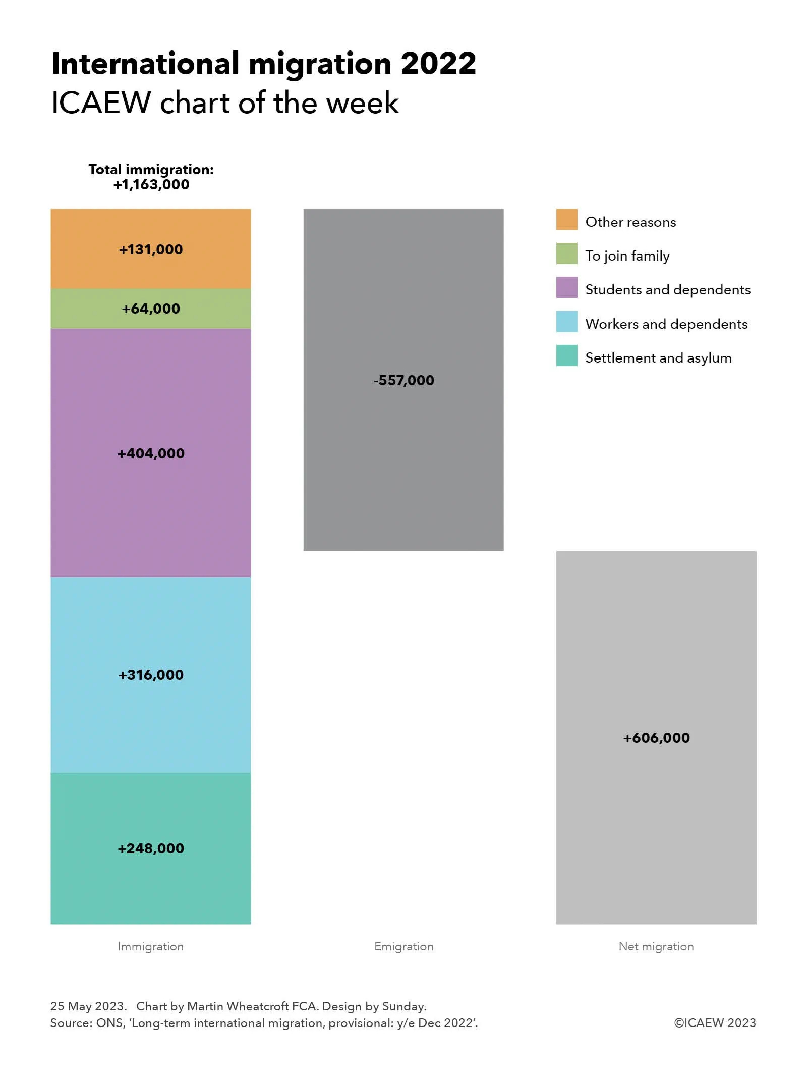
The Office for National Statistics (ONS) released provisional numbers for international migration on 25 May 2023, providing its estimate of long-term arrivals and departures from the UK for the 2022 calendar year, with 1,163,000 immigrants arriving in the UK and 557,000 emigrants, a net migration number of 606,000.

These numbers exclude tourists and other travellers planning to stay for less than a year, as well as UK residents going abroad on holiday or likewise planning to be away for less than a year. However, the numbers include students and others coming for more than a year who don’t plan to stay in the UK after they finish their courses or their work visas expire.

Traditionally these statistics have been prepared using arrival and departure surveys completed by a sample of travellers when they arrive or depart from UK airports and ports, but these have been found to be inaccurate in recent years. The ONS has started to address this by using other administrative sources to improve the quality of their analysis, in the meantime slapping this dataset with ‘experimental’ and ‘provisional’ labels to emphasise how less than definitive it is.

As our chart of the week illustrates, 248,000 immigrants arrived through settlement schemes or to claim asylum, 316,000 came for work reasons, 404,000 for study, 64,000 to join family, and 131,000 for other reasons. 

All of the 248,000 immigrants who arrived through settlement schemes or to claim asylum came from outside the EU. They comprised 114,000 Ukrainian refugees, 52,000 British Overseas Nationals from Hong Kong, 6,000 through other resettlement schemes (principally Afghanistan), and 76,000 asylum seekers. Some 3,000 asylum seekers were believed to have left the country in 2022, but the ONS does not have sufficient data to identify the number of Ukrainian refugees or other settlers who may have returned or moved elsewhere.

Of the 316,000 who came for work reasons, 235,000 were from outside the EU (of which 127,000 came to work and 108,000 were dependents), 62,000 came from EU countries, and 19,000 were UK citizens. Unfortunately, the ONS has not been able to analyse the number of EU or UK citizens who left for work reasons (either to start a new job elsewhere or because their UK-based job came to an end), but they have estimated that 56,000 non-EU non-UK workers and dependents left the UK in 2022 (29,000 workers and 27,000 dependents).

Study was the biggest immigration category in 2022, as the higher education sector continued to recruit international students as part of a big export drive. 404,000 people arriving during 2022. This comprised 361,000 from outside the EU (of which 276,000 came to study and 85,000 were dependents), 39,000 students from the EU and 4,000 being UK citizens who lived elsewhere before coming to the UK to study. The ONS reports that 153,000 non-EU citizens left the UK in 2022 after courses were completed (136,000 students and 17,000 dependents), but doesn’t report equivalent numbers for EU and UK citizens. 

The number of non-EU students and dependents arriving has risen quite significantly over the last couple of years (from 121,000 in 2019 and 113,000 in 2020 to 301,000 in 2021) and so the net impact should reduce significantly in 2024 and thereafter as courses complete. The net number could turn negative if the recently announced restrictions on masters students bringing dependents (masters courses often being the first step towards PhD study) causes incoming numbers to fall below the level of departures.

The majority of the 64,000 arriving to join family came from outside the EU, with 51,000 arriving from non-EU countries, 8,000 from the EU, and 5,000 being UK citizens. Again, the ONS does not have data on EU and UK citizens leaving to join family or returning after a long-term stay with family, but it does report 42,000 non-EU citizens in this category left the UK in 2022.

‘Other’ arrivals comprise a combination of genuine other reasons for people choosing to settle in the UK as well as data collection issues, with the ONS finding it difficult to identify the reasons why many EU and UK citizens arrive or leave the UK. Of the 131,000 immigrants classified as other, 29,000 came from outside the EU, 42,000 came from EU countries and around 60,000 were returning UK nationals.

While the headlines about the migration numbers have not necessarily been that favourable to the government, the Chancellor may be more cheerful than many of his colleagues given the recent improvement in the IMF’s short-term economic outlook for the UK, partly as a consequence of migrants arriving to fill domestic labour shortages, as well as the contribution to the economy of a growing number of fee-paying students.

This chart was originally published by ICAEW.

ICAEW chart of the week: VAT threshold

The mystery of just why so many businesses sit just below the VAT registration threshold will be a big topic of debate at ICAEW’s VAT at 50 conference on Monday 22 May.

Line chart showing number of businesses plotted against £1,000 turnover intervals.

An orange line shows how the number of traders curves down as turnover increases, before increasing sharply before the VAT threshold (a vertical line in the chart at £85,000) and dropping almost vertically. 

A purple line shows a relatively straight decline to the right of the VAT threshold, with some bumps along the way.

A teal-coloured dotted trendline curves through the chart, with  businesses all above the trendline to the left of the VAT threshold, and below the trendline to the right up until £130,000.

Our chart this week celebrates the 50th anniversary of the introduction in the UK of Value Added Tax (VAT), the indirect tax on commercial transactions that now generates around 20% of tax receipts. 

One of the big mysteries in the tax system is why so many small businesses and sole traders cluster just below the VAT threshold of £85,000.

As illustrated by our chart, the number of businesses below the threshold gradually falls from almost 31,000 in the turnover band between £50,000 and £50,999 to just under 17,000 in the turnover band between £77,000 and £77,999, before diverging above the trendline to increase up to just over 20,000 in the £84,000 to £84,999 turnover band – immediately below the threshold for registering for VAT. This is almost twice as many as the just over 10,000 traders in the £85,000 to £85,999 turnover band, the first band legally required to register for VAT. 

One explanation may be that there is some gaming (or possibly even misreporting) going on, with business owners approaching the threshold for VAT deciding to spread their business activities across multiple legal entities or keeping ‘cash-in-hand’ transactions off the books to avoid, or evade, adding VAT of 20% in most cases onto their prices.

However, perhaps a more worrying concern is if these businesses are not getting around the rules, but instead deliberately choosing to keep their businesses small given the competitive disadvantage that goes with adding VAT to prices charged to consumers, and the hassles and hazards involved with becoming a tax collector on behalf of the government. 

This is a big issue for a UK economy experiencing weak economic growth. Not only is government income at stake, but also the wider benefits of more prosperous small businesses to the overall economy and what that means for the national economy.

Of course, many businesses do register despite being below the threshold, with around 1.1m traders in 2018/19 with turnover less than £85,000 signed up to VAT.

Other countries take a different approach, with much lower registration thresholds across most of Europe. Domestic thresholds range from nil in Spain, Italy and Greece, NOK40,000 (approximately £3,000) in Norway, €22,000 (£19,000) in Germany and €37,500 (£33,000) in Ireland, up to €50,000 (£43,000) in Slovenia. Switzerland is an exception with a higher registration threshold than the UK at CHF100,000 (£89,000). 

In general, this means that a much greater proportion of actively trading businesses across Europe are registered for VAT compared with the UK, where there are estimated to be more than 3m or so traders with annual revenue of between £10,000 and £84,999 who have not registered for VAT – more than £100bn in total revenue.

Some believe that raising the threshold would provide a boost to the economy, given that many businesses would be more willing to grow (or declare) more of their revenue, while others believe the better option would be to reduce the threshold to capture many more businesses. The former would likely result in lower tax receipts overall, by allowing businesses just above the existing threshold to stop collecting VAT. The latter should in theory generate much more in tax receipts, perhaps as much as £20bn a year, in addition to removing one of the distortions that the tax system creates in this part of the economy.

The irony is that a relatively high VAT threshold in the UK designed to encourage and support small businesses may be one of the factors holding back economic growth. And with an unchanged threshold combined with inflation of more than 10% over the past year, this may be an even bigger drag on the economy/incentive to cheat than it has been in the past.

Click here to find out more about VAT at 50, ICAEW’s celebration (if that is the right word) of the 50th anniversary of VAT, and what the future holds for our most beloved of indirect taxes.

This chart was originally published by ICAEW.

ICAEW chart of the week: Food prices

An inflation rate of 10.1% in the year to March 2023 conceals a huge variation in individual price rises, as illustrated by this week’s chart on food prices.

Column chart showing annual inflation for a sample of individual food and non-alcoholic drink items across six different categories, according to the Office for National Statistics prices comparison tool for March 2023.

A horizontal line shows the average food price inflation over that period of +17%.

Each category is ordered from lowest price rise to highest, with only the highest labelled.

Snacks and sweets: 18 items (9 below line, 9 going above) the highest of which is plain biscuits +26%.

Meat and fish: 12 items (7 below, 5 going above), pork chops +28%.

Frozen: 10 items (3 below, 7 going above), chicken nuggets +35%.

Deli and dairy: 30 items (10 below, 1 going to the line, 19 going above), hard cheese +44%.

Store cupboard: 41 items (23 below, 18 going above), olive oil +49%.

Fruit and veg: 28 items (16 below, 12 going above), cucumber +52%.

One of the problems in measuring inflation is that a weighted average of thousands of different prices is very different from our individual experience of inflation. Not only are we unique in terms of the basket of goods and services that we buy, but we also tend to notice some price changes more than others – making our personal experience very different from everyone else’s.

Nowhere is this more pronounced than in our regular trips to the shops to buy groceries, where we can see higher prices both on the shelves and when we come to pay at the till. This can be much more visible to us than bills paid by direct debit, for example, where money just disappears from our bank account and we need to make an effort to work out what is going on.

The Office for National Statistics has recently launched a shopping prices comparison tool that allows you to choose a basket of goods and see how retail prices have increased across different types of purchases: food and drink, clothing and footwear, restaurants and bars, health, household items, recreation and culture, services, and transport. Even there, the prices they quote are averages from many different retail outlets, specific products, and brands – and so won’t exactly match what is happening to your individual basket.

For our chart this week, we have chosen to look at food prices, choosing a basket that in total has increased by 17% over the past year, rising from £422.40 if you had bought everything on the list in March 2022 to £495.43 in March 2023. We have allocated these into six different categories to give a bit more flavour (pun intended) to what is going on.

There is a huge amount of variation between different foodstuffs, with our chart illustrating how in the snacks and sweets category the average price of 200-300g of plain biscuits has increased by 26% (from 98p to £1.24), while in meat and fish, pork loin chops have gone up by 28% (from £6.35 per kg to £8.12 per kg). In the frozen category, chicken nuggets are up 35% (from £1.79 to £2.41), while in deli and dairy, hard cheese has gone up the most on average, by 44% (from £6.92 per kg to £9.98 per kg). Olive oil tops our store cupboard classification, up 49% (from £3.87 to £5.78 on average between 500ml and 1 litre), but the king of food price inflation is the humble cucumber, up a massive 52% over a one year period from 55p to 84p each.

Not highlighted in the chart are the smallest price rises in each category, with peanuts up 5% (from £1.23 to £1.29 for 150-300g), lamb loin chop/steaks up 4% (from £15.49 to £16.13 per kg), frozen vegetable burgers up 11% (£1.99 to £2.21), sliced ham up 9% (£2.41 to £2.64 for 100-200g), low-sugar/non-chocolate breakfast up 6% (£2.08 to £2.20), and sweet potato up a mere 2% (from £1.17 to £1.19 per kg).

The Bank of England continues to tighten the screws on inflation, raising its base rate to 4.5% on 11 May 2023, and the projections are that inflation overall should start to reduce quite rapidly over the next few months. 

However, as ICAEW Economies Director Suren Thiru recently said in a TV interview on BBC Breakfast, inflation is now becoming embedded into the everyday things that we buy. This makes the challenge for the Bank of England to bring inflation back down to its target range of 1% to 3% that much harder.

This chart was originally published by ICAEW.

ICAEW chart of the week: Royal Household finances

His Majesty’s Coronation prompts us to peek into how the monarchy is funded and where the money goes.

Step chart showing components of £96.2m in income (first column) less £112.3m in expenditure (second column) = a net loss of £16.1m in 2021/22.

Top half of the chart is Core Sovereign Grant £51.8m + commercial income £9.9m less core operating costs (£41.5m) + property maintenance (£16.1m) with a surplus of £4.0m transferred to reserve.

Bottom half of the chart comprises Additional Sovereign Grant £34.5m less Buckingham Palace Refurbishment (£54.6m) with the shortfall covered by a transfer from reserve (£20.1m).

Our chart this week is on the finances of the Royal Household, based on its most recent financial statements for the financial year ended 31 March 2022 (2021/22), a period in which Her Majesty Queen Elizabeth II was in charge. 

Income during the year was £96.2m, comprising a core Sovereign Grant of £51.8m and an additional Sovereign Grant of £34.5m (a total of £86.3m), together with commercial income of £9.9m. Expenditure amounted to £112.3m, comprising core operating costs of £41.6m, core property maintenance of £16.1m, and Buckingham Palace refurbishment costs of £54.6m. 

The net loss was £16.1m, consisting of £20.1m transferred from reserves to cover amounts spent in the year refurbishing Buckingham Palace in excess of the additional Sovereign Grant for that year, less £4m transferred to reserves from the surplus by which the core Sovereign Grant and commercial income exceeded core operating costs and property maintenance.

The Sovereign Grant is funded out of the profits of the Crown Estate, a portfolio of property and other investments that were originally handed over to the state in 1760 by King George III in exchange for ending his responsibility to contribute towards the costs of running the civil government. This arrangement included a contribution from the Civil List to the Royal Household towards the costs of his official duties as head of state, separate from personal expenditure funded from his private resources as Duke of Lancaster (and as Duke of Cornwall, given there was no Prince of Wales at that point).

The Civil List continued through the reigns of George IV and William IV and was made permanent in 1837 when Queen Victoria took the throne, at least until 2012 when it was replaced by the Sovereign Grant. This consolidated into one budget the previously separate departmental grant-in-aid payments for royal travel, communications, and maintenance of official royal palaces in addition to the Civil List payments to cover official duties, although it excludes the costs of police and military security, armed forces ceremonial duties, and royal events such as the Coronation.

The Crown Estate’s contribution was initially set at 15% of its net income, with a cap on the level of reserves that the Royal Household can build up, as well as a floor that prevents the grant from falling if profits go down. This is being supplemented on a temporary basis by an additional 10% from 2017-18 onwards to fund a 10-year £369m refurbishment of Buckingham Palace.

The Royal Household generates commercial income from property rentals and from The Royal Collection Trust (a charity, which in turn generates income from visitors to Buckingham Palace and Windsor Castle), as well as from recharges to the King and other members of the Royal Family for their personal usage of the royal palaces, including their accommodation. Contributions from The Royal Collection Trust were waived during the pandemic, including most of 2021/22. 

Expenditure during 2021/22 of £112.3m comprised £54.6m on the refurbishment of Buckingham Palace, £41.6m in core operating costs and £16.1m on property maintenance. 

Core operating costs of £41.6m consisted of £23.4m in staff costs, £4.5m in official travel, £3.2m for utilities, £2.9m for digital services, £1.3m for housekeeping and hospitality, £2m in depreciation, and £4.3m in other spending.

Property maintenance expenditure relates to Buckingham Palace, St James’s Palace, Clarence House, Marlborough House Mews, Hampton Court Mews, Windsor Castle, Windsor Home Park, and parts of Kensington Palace, but does not include the Palace of Holyroodhouse (which is maintained by Historic Environment Scotland). 

Not shown in the chart is the balance sheet, with net assets of £63.6m comprising property improvements, plant and machinery and other fixed assets of £29.1m, cash of £45.1m and other current assets of £4.1m, less £16m in payables, plus £1.3m in net defined benefit pension scheme asset. Reserves comprise £15.7m in relation to the core Sovereign Grant, £15.1m to the Buckingham Palace refurbishment, £2.4m in retained surpluses, and £30.4m in other reserves. The balance sheet does not include the royal palaces and other royal properties themselves, which are held in trust for the nation by the King.

Lower net income from the Crown Estate over the course of the pandemic mean that the core and additional Sovereign Grants have been frozen at the same level in both 2022/23 and 2023/24, although they are expected to increase in 2024/25.

As the accounts illustrate, most of the cost of the monarchy goes towards the cost of maintaining and refurbishing the royal palaces, which are held in trust for the nation. It may be surprising to discover that the King pays to use the royal apartments, and so if the UK ever were to become a republic, it is likely that the net cost of a future ‘Presidential Household’ would likely be higher without those contributions. Unless we decided to give some of the palaces – and their associated maintenance costs – back to the Royal Family.

Either way, the amounts involved represent a tiny proportion of UK public spending, which exceeded £1trn in 2021/22 or £15,400 per person (£1,280 per month). 

On a per capita basis, the Royal Household received £1.27 per person in core and additional Sovereign Grant in 2021/22 and generated 15p in commercial income, a total of £1.42 in the year (or 12p a month). It spent £1.65 per person (14p per month), comprising core operating costs of 61p, property maintenance of 24p, and Buckingham Palace refurbishment expenditures of 80p.

To find out more, read the Sovereign Grant Report.

This chart was originally published by ICAEW.

ICAEW chart of the week: Public finances 2022/23

The public finances continue to be battered by economic shocks as this week’s chart on the past five years of red ink illustrates.

Column chart with five financial years illustrating tax and other receipts (top bar) less total managed expenditure (middle bar) = deficit (bottom bar).

2018/19 outturn: £813bn - £837bn = -£44bn
2019/20 outturn: £827bn - £888bn = -£61bn
2020/21 outturn: £793bn - £1,106bn = -£313bn
2021/22 outturn: £920bn - £1,041bn = -£121bn
2022/23 provisional: £1,016bn - £1,155bn = -£139bn

The monthly public sector finances for March 2023 released on Tuesday 25 April contained the first cut of the government’s financial result for 2022/23, with our chart this week illustrating trends over the past five years in receipts, expenditure and the deficit.

As our chart highlights, tax and other receipts increased from £813bn in 2018/19 to £827bn in 2019/20, before falling to £793bn during the first year of the pandemic. They recovered to £920bn in 2021/22 before rising with inflation to a provisional estimate of £1,016bn for the year ended 31 March 2023.

Total managed expenditure (TME) increased from £857bn in 2018/19 to £888bn in 2019/20, before exceeding £1trn for the first time in 2020/21 as the pandemic caused expenditure to rise significantly. TME fell in 2021/22 to £1,041bn as pandemic-released spending was scaled back, before rising this year to £1,155bn as inflation, higher interest rates and energy support packages more than offset the pandemic related spending that was not repeated in 2022/23.

The deficit of £44bn in 2018/19 was the lowest it had been since the financial crisis, following an extended period of spending restraint over a decade. The purse strings were loosened a little in 2019/20 as previous government plans to eliminate the deficit were abandoned, with the deficit rising to £61bn. The huge cost of the pandemic saw the deficit rise to £313bn in 2020/21 as the borrowing rose to meet the huge costs of dealing with the pandemic, before falling back to £121bn in 2021/22.

There were hopes that the situation would improve further, with the government in October 2021 budgeting for a deficit of £83bn. Unfortunately, rampant inflation and the energy crisis following Russia’s invasion of Ukraine mean that the government does not currently expect to reduce the deficit to below £50bn until 2027/28 at the earliest. And that is with what some commentators believe are unrealistic assumptions about the government’s ability to reduce spending on public services beyond the cuts already delivered.

Provisional receipts in 2022/23 were 25% higher than the outturn for 2018/19, which in the absence of economic growth has principally been driven by inflation of around 15% over that period combined with an increase in the level of taxation and other receipts from around 37% to approaching 41% of the economy. Total managed expenditure is provisionally 35% higher than in 2018/19, although this includes substantial amounts of one-off expenditures on the energy support packages and index-linked debt interest that should moderate, at least assuming inflation reduces in the coming financial year.

Not shown in the chart is what these numbers mean for public sector net debt, which has increased by £753bn over the past five years from £1,757bn at 1 April 2018 to a provisional £2,530bn at 31 March 2023. This comprises £678bn in borrowing to fund the deficits shown in the chart, and £75bn to fund lending by government and working capital requirements.

Our chart this week may be well presented, but it is not a pretty picture.

This chart was originally published by ICAEW.

ICAEW chart of the week: debit and credit card transactions

Volumes have been the main driver of the increase in value of debit and credit card transactions since 2022, as average spend on debit cards fell and the average transaction on credit cards rose by less than inflation.

Step chart showing volume and value per transaction changed between £73.9bn in card transactions in January 2022 and £83.5bn in Jan 2023.

Debit card transactions: £57.7bn in Jan 2023 +£7.7bn volume (+13.4% to 1,971m) -£0.7bn (-1.1% to £32.82) = £64.7bn in Jan 2023.

Credit card transactions: £16.2bn in Jan 2023 +£1.6bn volume (+9.9% to 321m) +£1.0bn (+6.0% to £58.58) = £18.8bn in Jan 2023.

UK Finance, the industry body for the banking and finance industry, released its latest data on UK card transactions on 20 April 2023. This provides an insight into UK debit and credit card transactions between January 2022 and 2023, and our chart this week takes a look at the year-on-year change in transaction amounts.

The monthly total value of transactions on UK-issued debit and credit cards increased from £73.9m in January 2022 to £83.5bn in January 2023, putting card transactions on course to exceed £1trn over the course of 2023. This includes online and telephone purchases, as well as in-person retail transactions and spending overseas.

Our chart illustrates how the value of debit card transactions increased from £57.7bn in January 2022 to £64.7bn, analysed between £7.7bn from a 13.4% increase in the volume of transactions to 1,971m, less £0.7bn from a 1.1% fall in the average value of each debit card purchase to £32.82. 

In the context of inflation in excess of 10%, a decline in the average value of debit transactions may seem counterintuitive. This is partly because of the continued displacement of cash as a method of payment, especially for low value purchases – contributing to growth in the volume of transactions, but a decline in average purchase amounts. Consumers scaling back their spending in response to the cost-of-living crisis is also likely to be a factor.

The value of credit card transactions rose from £16.2bn to £18.8bn, reflecting £1.6bn from a 9.9% increase in the number of transactions to 321m plus £1.0bn from a 6.0% increase in the average value of each transaction to £58.58.

The largest component of credit card transactions were purchases, which increased from £14.6bn to £17.1bn, up £1.4bn from a 9.9% increase in the volume of purchases to 319m, and £1.1bn from a 6.7% increase in the average value of each purchase to £53.60. Cash advances increased from £187m to £207m (from a 6.6% increase in the number of cash advances to 1.5m and a 3.6% increase in average advance to £135), while balance transfers increased from £1.4bn to £1.5bn (from a 4.0% increase in the number of balance transfers to 0.7m and a 4.9% increase in average transfer to £2,133).

Similar to debit cards, the decline in the average value of each credit card purchase after inflation is likely to be affected by the ongoing switch from cards to cash, as well as a scaling back of purchases by some consumers. There may also have been a shift in purchasing patterns for some households, from fewer larger purchases to more frequent smaller ones.

Not shown in the chart is the amount owed by credit card holders, which was 9.1% higher at £60bn at the end of January 2023 compared with £55bn a year previously. This is lower than the £61.3bn owed at the end of December 2022 as the £20.1bn repaid (just under a third of the total) exceeded the £18.8bn added. According to UK Finance, 51.3% of credit card balances attract interest, with the remainder primarily comprising those who pay their balances in full each month and those on interest-free balance transfers.

Debit and card usage is expected to continue to rise, with UK Finance previously forecasting that cash usage will fall from around 15% of all retail purchases in 2021 to around 6% by 2030. Others have suggested that physical cash could be eliminated altogether, saving the exchequer and businesses from the costs of creating, handling and disposing of cash.

For many, transitioning to a cashless society will be welcome – heralding the end of the need of jingling coins and purses and wallets bulging with banknotes. For others, including the million or so consumers who prefer or are reliant on cash for most of their day-to-day shopping, this may not be so positive.

This chart was originally published by ICAEW.

ICAEW chart of the week: Africa

I take a look at Africa this week and how its current population of 1.5bn, 18% of the world’s total, is distributed across the continent.

Map of Africa's 1.5bn people with countries coloured into five regions, overlayed by semi-transparent scaled bubbles with the population of each region.

Teal: Western Africa 435m.
Orange: Northern Africa 221m.
Green: Central Africa 178m.
Purple: Southern Africa 198m.
Blue: Eastern Africa 428m.

My chart this week illustrates how Africa’s population of 1,460m can be divided into five regions. These comprise Western Africa with 435m people, Northern Africa with 221m, Central Africa with 178m, Southern Africa with 198m, and Eastern Africa with 428m. 

These regions are based on the African Union’s official regions for its 55 member states, which differ from the regions used by the United Nations. They include Réunion (1.0m) and Mayotte (0.3m), two French overseas territories in the Indian Ocean that are not members of the African Union, as well as St Helena (5,000), an overseas territory of the UK in the Atlantic. It also includes an estimated 5.8m people living in African Union applicant Somaliland that are included within the number for Somalia.

Excluded are 175,000 or so people living on the African continent in Ceuta and Melilla (Spain), around 2.2m and 250,000 respectively in the Atlantic Ocean on the Canary Islands (Spain) and Madeira (Portugal), and several hundred people in the Indian Ocean within France’s Southern Territories.

The table below breaks down the total by country within each region, highlighting how the four largest countries by population each have more than 100m people, led by Nigeria with 223.8m (15.3% of Africa’s total), Ethiopia with 126.5m (8.7%), Egypt with 112.7m (7.7%) and the Democratic Republic of the Congo with 102.3m (7.0%). 

The next largest are Tanzania with 67.4m (4.6%), South Africa with 60.4m (4.1%), Kenya with 55.1m (3.8%), Uganda with 48.6m (3.3%), Sudan with 48.1m (3.3%), Algeria with 45.6m (3.1%), Morocco with 37.8m (2.6%), Angola with 36.7m (2.5%), Ghana with 34.1m (2.3%), Mozambique with 33.9m (2.3%), Madagascar with 30.3m (2.1%) and Côte d’Ivoire with 28.9m (2.0%).

Table showing populations by each region:

Western Africa 435m: Nigeria 223.8m, Ghana 34.1m, Côte d'Ivoire 28.9m, Niger 27.2m, Mali 23.3m, Burkina Faso 23.3m, Senegal 17.7m, Guinea 14.2m, Benin 13.7m, Togo 9.1m, Sierra Leone 8.9m, Liberia 5.4m, Gambia 2.8m, Guinea-Bissau 2.2m, Cabo Verde 0.6m, St Helena (UK) 0.0m.

Northern Africa 221m: Egypt 112.7m, Algeria 45.6m, Morocco 37.8m, Tunisia 12.5m, Libya 6.9m, Mauritania 4.9m, Western Sahara 0.6m.

Central Africa 178m: DR Congo 102.3m, Cameroon 28.6m, Chad 13.2m, Congo 6.1m, Central African Republic 5.7m, Gabon 2.4m, Equatorial Guinea 1.7m, São Tomé and Principe 0.2m.

Southern Africa 198m: South Africa 60.4m, Angola 36.7m, Mozambique 33.9m, Malawi 20.9m, Zambia 20.6m, Zimbabwe 16.7m, Botswana 2.7m, Namibia 2.6m, Lesotho 2.3m, Eswatini 1.2m.

Eastern Africa 428m: Ethiopia 126.5m, Tanzania 67.4m, Kenya 55.1m, Uganda 48.6m, Sudan 48.1m, Madagascar 30.3m, Somalia 18.1m, Rwanda 14.1m, South Sudan 11.1m, Eritrea 3.7m, Mauritius 1.3m, Djibouti 1.1m, Réunion (FR) 1.0m, Comoros 0.9m, Mayotte (FR) 0.3m, Seychelles 0.1m.

The population of Africa is expected to grow significantly over the rest of the century, with the UN’s medium variant projecting a population of 1.7bn (20% of the projected global total) in 2030, 2.1bn in 2040 (23%), 2.5bn (26%) in 2050, 2.9bn (28%) in 2060, 3.2bn (31%) in 2070, 3.5bn (34%) in 2080, 3.7bn (36%) in 2090 and 3.9bn (38%) in 2100. This is despite a rapidly declining birth rate, with many more Africans living much longer lives than preceding generations.

Africa is currently relatively poor compared with advanced economies, with the total GDP for its 55 countries and 1.5bn people close in size to the UK’s single country GDP for 67.5m people of around £2.5trn a year at current exchange rates. This is around 3% of the global economy in each case. 

The UK’s share of the global economy is likely to decline over the rest of the century as Africa and other developing economies grow at a much faster pace. For Africa the combination of a rapidly growing population and economic development should see it become substantially more significant to the global economy than it is today.

This chart was originally published by ICAEW.

ICAEW chart of the week: English local government

Local government in England remains a complex patchwork despite a cut in the number of local authorities in England from 333 to 317 on 1 April 2023.

Sunburst chart showing regional level of government (inner wheel), plus one (middle wheel) or two tiers (middle and outer wheels) of local government.

56.5m people, 11 regional authorities and 317 local authorities

Teal - GLA and 10 combined authorities
Purple - 32 London boroughs and City of London
Orange - 36 metropolitan boroughs
Green - 21 county councils and 164 district councils
Blue - 62 unitary authorities and Isles of Scilly

Regions and boroughs, etc 24.2m:

GLA and 10 combined authorities in inner wheel.

32 London boroughs and City of London in the middle wheel attached to the first segment of the inner wheel, then 7, 10, 5, 5, 4 metropolitan boroughs for next five segments, then 1 unitary and 3 metropolitan boroughs for the seventh segment, 3 unitaries for the eighth segment, 1 county and 1 unitary for the ninth segment, 1 unitary and 2 metropolitan boroughs for the tenth segment and 5 unitaries for the eleventh segment. 

Outer wheel empty except for 5 district councils attached to the county council in middle wheel that is attached to the ninth segment of the inner wheel.

Counties and districts 18.6m:

Nothing in inner wheel, 20 county councils in middle wheel, and 159 district councils in outer wheel.

Unitary authorities 13.7m:

Nothing in inner wheel, 51 unitary authorities and Isles of Scilly in middle wheel, and nothing in the outer wheel.

Our chart this week takes a look at the structure of local government in England following the abolition of three county councils and seventeen district councils to form four new unitary authorities on 1 April 2023. This reduces the total number of local authorities in England from 333 to 317, while there was no change in the number of regional authorities at 11.

  • Cumbria county council and its six district councils were abolished and their functions were transferred to two newly formed unitary authorities. Cumberland, with 274,000 local residents, absorbed the now defunct Allerdale, Carlisle and Copeland district councils. Westmorland and Furness, serving a population of 227,000, took over Eden, South Lakeland and Barrow-in-Furness. 
  • Somerset county council and its four districts (Mendip, Sedgemoor, Somerset West and Taunton, and South Somerset) were merged into a new Somerset unitary authority serving 573,000 local residents.
  • North Yorkshire county council and its seven districts (Craven, Hambleton, Harrogate, Richmondshire, Ryedale, Scarborough and Selby) were merged into a single North Yorkshire unitary council, responsible for a local population of 619,000. 

As our chart illustrates, there is a complex patchwork quilt of regional and local authorities in England. Around 24.2m people, or 43% of the 56.5m population of England in mid-2021, live in areas with a regional level of government, while 18.6m (33%) people are served by a two-tier structure of county and district councils and 13.7m (24%) by single-tier unitary authorities.

Regional authorities comprise the Greater London Authority (with a population of 8.8m) and 10 combined authorities: West Midlands (2.9m), Greater Manchester (2.9m), West Yorkshire (2.3m), Liverpool City Region (1.4m), South Yorkshire (1.4m), North East (1.2m), West of England (0.9m), Cambridgeshire and Peterborough (0.9m), North of Tyne (0.8m) and Tees Valley (0.7m). 

Regional and local public services in London are provided by the GLA and 32 London boroughs and the City of London, and by the relevant combined authority and seven metropolitan boroughs in the West Midlands ‘Greater Birmingham’ combined authority area; 10 in Greater Manchester; five in South Yorkshire ‘Sheffield City Region’; five in Liverpool City Region; and four in the West Yorkshire ‘Leeds City Region’. There are three metropolitan boroughs plus one unitary authority in the North East ‘Sunderland and County Durham’ combined authority area; three unitary authorities in West of England ‘Greater Bristol’; one county council, five district councils and one unitary authority in Cambridgeshire and Peterborough; two metropolitan boroughs and one unitary authority in the North of Tyne ‘Newcastle and Northumberland’ combined authority area; and five unitary authorities in Tees Valley.

Local public services in two-tier areas without a combined authority above them comprise Kent county council (with 12 district councils), Essex (12), Hampshire (11), Lancashire (12), Surrey (11), Hertfordshire (10), Norfolk (7), West Sussex (7), Staffordshire (8), Nottinghamshire (7), Devon (8), Derbyshire (8), Lincolnshire (7), Suffolk (5), Oxfordshire (5), Leicestershire (7), Gloucestershire (6), Worcestershire (6), Warwickshire (5) and East Sussex (5). Many of these county councils do not cover the whole of their counties, with unitary authorities such as Southend-on-Sea and Thurrock carved out of Essex, Derby carved out of Derbyshire, and Plymouth and Torbay carved out of Devon, for example.

There are 51 unitary authorities plus the Isles of Scilly outside of combined authority areas, responsible for providing local services that traditionally county councils are responsible for, such as education, transport, fire and public safety, social care, libraries, waste management, and trading standards, as well as services typically provided by district councils such as rubbish collection, recycling, social housing, planning approvals and collecting council tax and business rates. 

North Yorkshire and Somerset are now the largest local authorities outside of metropolitan areas with populations of 619,000 and 573,000, followed by Cornwall (572,000), Buckinghamshire (555,000) and Wiltshire (513,000). Excluding these five authorities and tiny Rutland (41,000), the average population size served by unitary authorities outside of combined authority areas is 240,000. 

Overall the 317 local authorities in England comprise 32 London boroughs, the City of London, 36 metropolitan boroughs, 21 county and 164 district councils, 62 unitary authorities and the Isle of Scilly. This contrasts with the simpler one-tier approach of 32 local councils in Scotland, 16 in Wales and 11 in Northern Ireland.

The lack of a standard model for local government and an incomplete regional tier is a big challenge for the national government, unlike similar countries where the national government deals with a much smaller number of states, provinces or regional administrations and lets them deal with their localities. Trying to work with 11 regional authorities and 317 local authorities in a mixture of region + one-tier, region + two-tier, no region + one-tier, and no region + two-tier structures is difficult in practice, not helped by a very centralised approach that requires Whitehall to be involved very closely in what regional and local authorities are doing, and a lack of fiscal devolution that means local authorities are dependent on central funding and national government approvals for many of their activities.

A radical proposal to abolish district councils completely and move to a one-tier system of unitary authorities and boroughs, potentially with full regional coverage, was rumoured to be imminent when Boris Johnson was prime minister. Instead, the government has continued with its more glacial approach of providing financial and other encouragement to local authorities willing to form regional combined authorities with elected mayors, and to replace two-tier county and district councils with unitary authorities where some consensus can be reached, as in Cumbria, Somerset and North Yorkshire this year. 

While an unwieldy structure is not the main problem facing local government in England, it doesn’t make it easy for any government wanting to level up opportunity across the country to deliver, nor to find efficiency savings in central government departments that have to deal with that structure. 

Reform is likely, perhaps not now, but when?

This chart was originally published by ICAEW.

ICAEW chart of the week: Silicon Valley Bank

My chart this week examines the late lamented Silicon Valley Bank and how its outsized investment in securities made it particularly vulnerable to a bank run.

Chart showing the consolidated balance sheet of SVB Financial Group (Silicon Valley Bank) at 31 Dec 2022.

Assets $212bn = Securities at amortised cost $91bn + securities at fair value $26bn + loans $74bn + cash $13bn + other $8bn.

Side column shows securities at fair value $102bn + underwater $15bn.

Liabilities $196bn = deposits $173bn + short-term debt $14bn + other $9bn.

Equity $16bn.

Silicon Valley Bank collapsed on 10 March 2023 after a bank run saw depositors rapidly withdraw funds as they lost confidence in the bank’s ability to survive. The bank’s collapse followed concerns that had been growing since 24 February 2023, when Silicon Valley Bank’s parent company, SVB Financial Group, published its annual consolidated financial statements for the year ended 31 December 2022.

As illustrated by this week’s chart, SVB’s consolidated balance sheet at 31 December 2022 comprised assets of $212bn, liabilities of $196bn and equity of $16bn. 

Assets consisted of investment securities recorded at amortised cost of $91bn, investment securities recorded at fair value of $26bn, loans of $74bn, cash of $13m, and other assets of $8bn. Liabilities comprised customer deposits of $173bn, short-term debt of $14bn, and other liabilities of $9bn (including long-term debt of $5bn). 

Not shown in the chart is the breakdown of equity of $16bn, which at 31 December 2022 primarily comprised preference stock of $4bn, additional paid-in capital of $5bn and $9bn of retained earnings, less $2bn in negative accumulated other comprehensive income.

As disclosed on the face of the balance sheet, the fair value of SVB’s $91bn portfolio of held-to-maturity investment securities was $15bn below its carrying value at amortised cost, reflecting how the main fixed-asset securities in this category – predominantly federally guaranteed mortgage-backed securities and collateralised-mortgage obligations – had fallen in value as interest rates climbed over the course of 2022. These unrealised losses of $15bn were not that far off the $16bn of equity reported by SVB, suggesting the bank would struggle if it ever had to sell these investments before they matured.

SVB’s intention had been to hold onto these investments, but circumstances changed on 9 March when depositors – concerned about further falls in the value of SVB’s assets as interest rates continued to rise during 2023, and an adverse reaction to a belated capital raising exercise launched by SVB on 8 March – withdrew $42bn in one day. This forced SVB to rapidly liquidate assets and borrow to find the cash required to repay depositors, but by then the first major digital bank run had gained too much momentum, with depositors attempting to withdraw a further $100bn on Friday 10 March. With insufficient cash to repay the amounts requested by SVB’s customers, the bank was closed by regulators that lunchtime.

A similar situation played out in the UK, where £3bn out of £10bn of deposits in SVB’s local subsidiary were withdrawn on Friday 10 March, causing the Bank of England to step in over the weekend to enforce a sale to HSBC for £1, a significant discount to previously reported equity of £1.4bn.

While banking regulators in the US, the UK and elsewhere will pour over the entrails of Silicon Valley Bank (and other recent bank failures such as Signature Bank of New York and Switzerland’s Credit Suisse) for some time to come, most commentators consider SVB to be unusual in how it had (or rather hadn’t) managed its exposure to changes in interest rates. At a minimum, closer regulatory supervision appears a likely consequence.

However, perhaps the biggest legacy of the failure of SVB is the decision of US regulators to protect the full amount of customer deposits and not just those covered by the $250,000 federal deposit insurance cap. For depositors in this mid-size banking institution that is of course good news, but the concern is that this might set a precedent for how to deal with potential bank failures in the future, where the price tag could be very much larger.

This chart was originally published by ICAEW.

ICAEW chart of the week: Public sector employment

My chart takes a look at how employment in the public sector has grown from 5.3m to 5.8m over the past five years.

Column chart in two sections showing FTEs in Dec 2017 and Dec 2022 and then headcount in Dec 2017 and Dec 2022.

Health and social care: FTEs 1,602,000 -- 1,864,000; headcount 1,870,000 -- 2,134,000.

Education: 1,099,000 -- 1,119,000; 1,494,000 -- 1,498,000.

Public administration: 859,000 -- 996,000; 1,018,000 -- 1,154,000.

Police and armed forces: 391,000 -- 421,000; 404,000 -- 431,000.

Other: 479,000 -- 511,000; 558,000 - 584,000.

Total: FTEs 4,430,000 -- 4,911,000; headcount 5,344,000 -- 5,801,000.

The size of the public sector workforce has grown significantly over the last five years between December 2017 and December 2022, with the number of full-time-equivalent employees (FTEs) increasing by 11% from 4,430,000 to 4,911,000 and headcount rising by 9% from 5,344,000 to 5,801,000.

This compares with a population increase of 2% over that time, but a 7% increase in those aged 65 or more (from 12.1m to 12.9m), which adds significantly to the demands placed on the National Health Service.

Our chart highlights how the number of FTEs working in health and social care increased by 16% from 1,602,000 to 1,864,000 between 2017 and 2022, while headcount went up by 14% from 1,870,000 to 2,134,000. This principally relates to the National Health Service, which saw FTEs go up 19% from 1,430,000 to 1,700,000 and headcount go up 17% from 1,640,000 to 1,916,000. Other health and social work staff fell slightly with FTEs down from 172,000 to 164,000 and headcount from 230,000 to 216,000. The latter excludes most social care staff, which are principally employed in the private sector.

The next biggest category is education, which saw FTEs increase by 2% from 1,099,000 to 1,119,000 at the same time as headcount was broadly flat, going from 1,494,000 to 1,498,000, implying more hours being worked by school staff and other state employees in the education sector. This represents an increase in efficiency given that pupil numbers have increased by around 4% over the same period.

Public administration FTEs increased by 16% from 859,000 to 996,000 and headcount by 13% from 1,018,000 to 1,154,000. This category includes the civil service (FTEs up 22% from 396,000 to 483,000 and headcount up 21% from 427,000 to 515,000) in addition to local authority and other office staff across the wider public sector. Much of this increase in public administration has been driven by Brexit, which has required more staff to perform duties previously outsourced to the EU as well as to administer more bureaucracy in the nation’s trading arrangements, although other factors such as pandemic have also had an impact.

Police and armed forces FTEs increased by 8% from 391,000 to 421,000 and headcount by 7% from 404,000 to 431,000. This can be analysed between the armed forces where FTEs were broadly the same at around 155,000 for both FTEs and headcount in both 2017 and 2022, and the police, including civilians, where both FTEs and headcount increased by around 12% (FTEs from 236,000 to 265,000 and headcount from 246,000 to 276,000). The latter principally reflects the government’s decision to reverse cuts in police numbers implemented in the early 2010s.

Other staff in the public sector have also increased over the last five years, with FTEs up 7% from 479,000 to 511,000 and headcount up 5% from 5,344,000 to 5,801,000.

Overall, the public sector in the UK has seen both employment headcount and hours worked per employee grow over the last five years as demands on public services have increased significantly. This is partly down to an ageing society, which puts pressure on the NHS, combined with the consequences of the pandemic, which exacerbated backlogs throughout the system. It is also a consequence of Brexit, which has added significantly to administrative and policy burdens placed on the civil service in particular.

These significant increases in FTEs and headcount perhaps explain the government’s moves to cut public sector pay in real-terms over the last few years. It remains to be seen if that Canute-like policy will be sufficient to hold back the tide of higher payroll costs that have been and are continuing to roll in to the shores of the public finances.

This chart was originally published by ICAEW.