Major fiscal events can be confusing for those not familiar with the public finances – this brief explainer may help.
The primary purpose of the Spending Review announcement tomorrow by the Chancellor will be to set out the UK Government’s departmental spending plans for the 2020-21 financial year that starts on 1 April 2021, but there is a lot more going on than that.
Before going further, it is important to distinguish between the one-year Spending Review that will be presented and the three-year Comprehensive Spending Review (CSR) that was originally planned. The CSR has unfortunately been deferred until next year because of the uncertain economic outlook following the arrival of the coronavirus, with the Chancellor Rishi Sunak choosing to set department budgets for only the coming financial year. These budgets will have been based on bids submitted by each department that will have been pared back following extensive negotiations across Whitehall.
The process for establishing multi-year departmental budgets has now been deferred for the third year running, with the calling of the General Election last year resulting in Sajid Javid’s one-year Spending Round in 2019 and Brexit-related uncertainty resulting in one-year departmental spending allocations within Philip Hammond’s 2018 Budget. Although perhaps understandable on each individual occasion, the lack of medium-budget certainty for several years is far from ideal in terms of good financial management!
An important innovation last year was the setting of departmental capital budgets for two years rather than just one to provide greater certainty around capital programmes with long lead times. We are anticipating this will also be the case this time, although ICAEW has suggested extending capital budgets a further year in our letter to the Chief Secretary to the Treasury (the minister within HM Treasury with responsibility for public spending) in order to provide more certainty for long-term infrastructure projects.
Another exception to the shorter time horizon for this year’s Spending Review is the multi-year settlement for the Ministry of Defence announced last Thursday, which provides an additional £4bn a year over the next four years on top of the existing commitment to increase the defence budget by 0.5% in excess of inflation. This will underpin the Integrated Defence & Security Review expected to be published in early 2021.
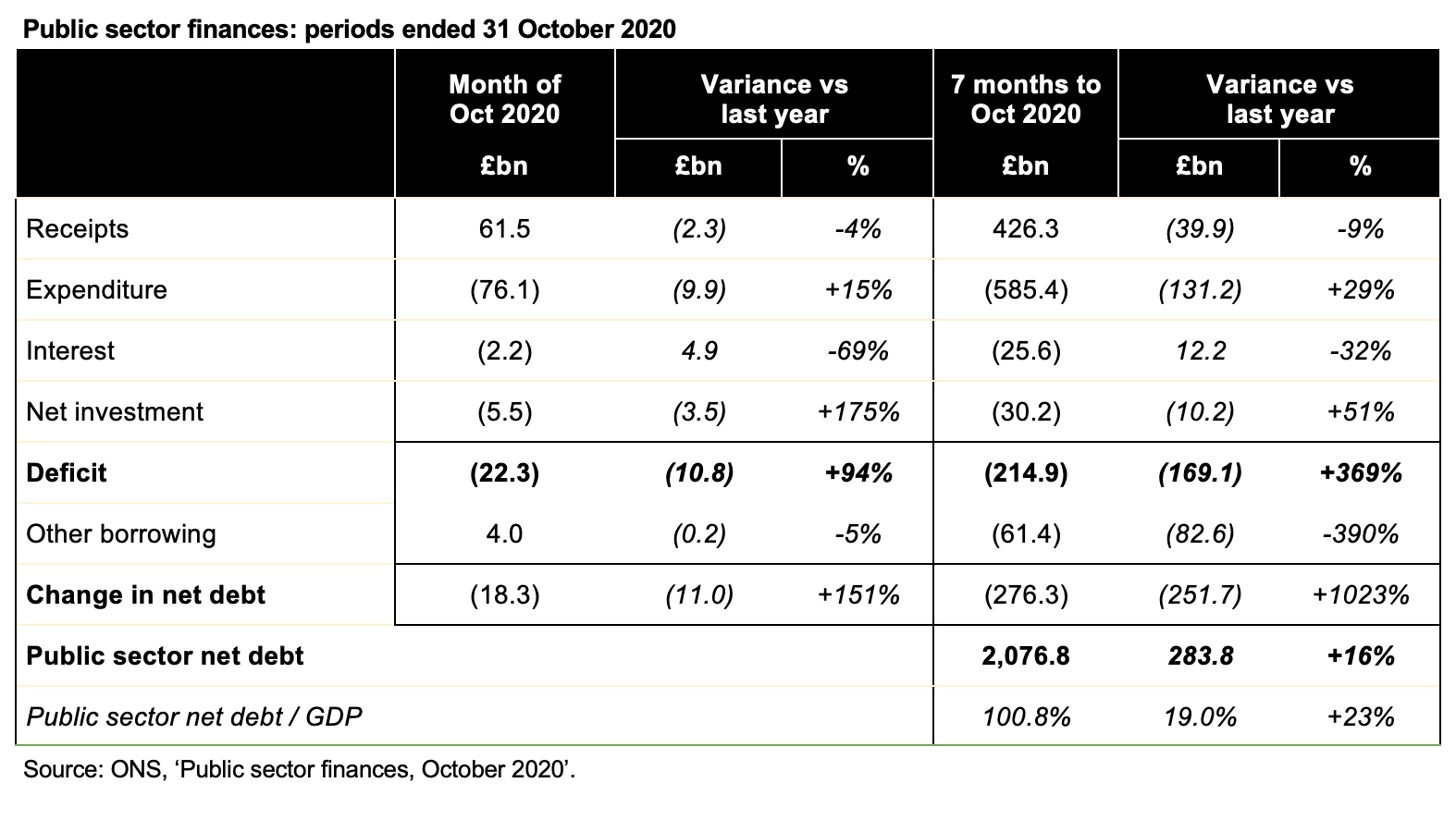
Although headlined as a spending announcement, tomorrow’s statement will also constitute one of the two annual fiscal events where the Office for Budget Responsibility (OBR) is required by law to publish its Economic and Fiscal Outlook (EFO) containing financial forecasts for the next five years. These are not expected to be very pretty, with the coronavirus pandemic spreading red ink across not only the public finances this year, but also dragging down expected revenues and increasing spending in future years. These forecasts will also be much more uncertain than is normal, which might be one reason the Chancellor has not chosen to describe this event as an Autumn Statement.
The EFO will cover not only planned spending by central government departments – known as departmental expenditure limits (DEL) – but also welfare, interest and other types of expenditure driven by economic conditions – known as annually managed expenditure (AME). Combined with expectations for tax and other receipts in 2020-21, it will roll these forecasts forward a further four years to 2024-25 to provide a five-year forecast for the fiscal deficit (the shortfall between receipts and spending) and public debt. There will be even greater caveats than normal not only in the forecasts but also in the estimate for the remainder of the current financial year.
This is not a full-blown Budget and so we do not expect to see many permanent tax changes beyond a few that were announced last week, although the Chancellor could take this opportunity to extend some temporary tax measures in addition to the extension of £1m Annual Investment Allowance temporary cap to the end of 2021. For example, he is likely to be considering whether or not to extend relief from business rates currently scheduled to end in March 2021 into the next financial year. There could also be an announcement about National Insurance thresholds for next year.
Fiscal events are often accompanied by other publications, with the long-delayed National Infrastructure Strategy anticipated to set out how the Government plans to deliver the ‘Ten Point Plan for a Green Industrial Revolution’ announced by the Prime Minister last week. Making the Government’s ambitious infrastructure investment plans a reality will take a lot more than just allocating money in a Spending Review spreadsheet; it will also be critical to have a clear strategy, faster decision making, strong delivery capabilities, and the right framework for attracting private sector investment. ICAEW’s response to the Infrastructure Finance Review last year addressed many of these issues.
Other updates are likely to include a revised remit for the Debt Management Office (DMO) to raise funds over the course of the rest of the financial year and progress reports on HM Treasury projects such as the Balance Sheet Review.
In summary, Wednesday’s announcement will still be very important despite the delay in the Budget until the spring and the deferral of the CSR to next year.
| Term | Description |
| Spending Review | On this occasion, the setting of budgets for central government departments for 2021-22 and capital budgets for 2021-22 and 2022-23. |
| 2020-21 | The current financial year – from 1 April 2020 to 31 March 2021. |
| 2021-22 | The next financial year – from 1 April 2021 to 31 March 2022. |
| Autumn or Spring Statement | The second major fiscal event each year after the Budget at which the Chancellor presents an update on the public finances. This can sometimes include new tax and spending measures but is not required to. Tomorrow’s announcement is technically an Autumn Statement in addition to the Spending Review. |
| Budget | The primary fiscal event each year in which the Chancellor of the Exchequer sets out plans for tax, spending and borrowing to finance government activities for the coming financial year and medium-term forecasts for the public finances. The Budget planned for this autumn was postponed until March 2021. |
| Chancellor of the Exchequer | Rishi Sunak MP, the cabinet minister and head of HM Treasury responsible for the economic matters and for the public finances. |
| Chief Secretary to the Treasury | Steve Barclay MP, the most senior minister at HM Treasury after the Chancellor, with primary responsibility for public spending and for negotiating the Spending Review with departments. |
| Comprehensive Spending Review (CSR) | A multi-year set of departmental operating and capital budgets, typically covering three years. A CSR was planned for 2020 but has been delayed until next year. |
| Debt | Public sector net debt (PSND) is the primary measure of financial position used by the Government within the National Accounts. It comprises debt owed to external parties less cash and other liquid financial assets and excludes some debt-like liabilities such as private-finance initiative embedded lease obligations and non-liquid loan receivables. The majority of public debt is raised by the Debt Management Office (DMO) selling government bonds (principally gilts) to professional investors. National Savings & Investments also raises money by taking retail deposits from the public. |
| Deficit | The fiscal deficit, officially known as public sector net borrowing (PSNB), is the primary measure of financial performance used by the Government. It is the shortfall between receipts and total managed expenditure calculated in accordance with statistics-based National Accounts rules. Despite its official name it does not equal the movement in public sector net debt as it excludes borrowing for other purposes (such as to fund lending to businesses) in addition to cash timing differences. The Government uses a modified form of the deficit that excludes the state-owned NatWest Group (formerly The Royal Bank of Scotland). |
| DEL and AME | Department expenditure limits and annually managed expenditure, being the two categories government spending is divided into. DEL comprises programme and administration costs incurred by central government departments, while AME consists of other types of expenditure such as welfare, interest, devolved administrations, local government and a number of other activities. DEL and AME are both net of ancillary income such as fees and charges and are measured in accordance with UK Government-specific ‘resource accounting’ rules that differ from both operating and capital expenditure reported in financial statements under International Financial Reporting Standards and the fiscal numbers reported in the National Accounts under international statistical standards. |
| Resource DEL and Resource AME | The government equivalent of expenditure, net of ancillary income. |
| Capital DEL and Capital AME | The government equivalent of capital expenditure, net of proceeds from the sale of assets. |
| Economic and Fiscal Outlook (EFO) | A set of economic and financial forecasts prepared by the independent Office for Budget Responsibility (OBR) that combines extrapolations of government spending plans from the most recent Spending Review with projections for tax and other receipts, welfare spending, interest and other costs. The fiscal forecast usually comprises a revised estimate for the current financial year and projections for the next five financial years based on the economic assumptions determined by the OBR. |
| Economic growth | An increase in GDP in excess of the GDP deflator. |
| GDP | Gross Domestic Product, an estimate of the total value of transactions within the UK economy. |
| GDP deflator | A measure of inflation across all sectors of the economy (including government) that is used in the economic and fiscal forecasts. It differs from other measures of inflation such as the consumer price index (CPI), the consumer-price index including housing (CPIH) and the retail prices index (RPI). |
| Public sector | The UK Government and the Scottish, Welsh and Northern Irish devolved administrations and bodies they directly control (central government), regional and local authorities, police & crime commissioners, fire services, Transport for London and bodies they control (local government), and the Bank of England and government-owned businesses (public corporations). |
| Supply Estimates | The formal process of obtaining Parliamentary approval for government spending each year. These convert the budgets agreed with the Treasury for both DEL and AME each year and convert them into a formal legal authorisation to incur expenditure. Supplementary Supply Estimates during the course of the financial year are sometimes needed if budgets need to be adjusted upwards. |
| Total managed expenditure (TME) | The combination of expenditure and net investment (capital expenditure less depreciation) measured in accordance with the statistics-based National Accounts rules. |
| Whole of Government Accounts (WGA) | Consolidated financial statements for the public sector prepared in accordance with International Financial Reporting Standards. The WGA recognises a wider range of assets and liabilities than are reported in the fiscal numbers and an accounting loss that includes long-term pension costs, nuclear decommissioning, clinical negligence and other costs that are excluded from the fiscal deficit. |