ICAEW chart of the week: NATO defence spending

Our chart this week looks at how much NATO members would need to spend to meet President Trump’s proposed new target of 5% of GDP for defence and defence-related expenditure.

A two column chart showing NATO defence spending. 

Left hand column - USA: £732bn defence spending in 2024, £67bn defence spending to 3.5% of GDP, and £342bn defence-related spending to 5.0% of GDP = £1,141bn total. 

Right hand column - Europe and Canada: £408bn defence spending in 2024, £36bn defence spending to 2.0% of GDP, £271bn defence spending to 3.5% of GDP, and £301bn defence-related spending to 5.0% of GDP. 

6 June 2025. Chart by Martin Wheatcroft FCA. Design by Sunday.  Sources: NATO, 'Annual Report 2024'; ICAEW calculations.

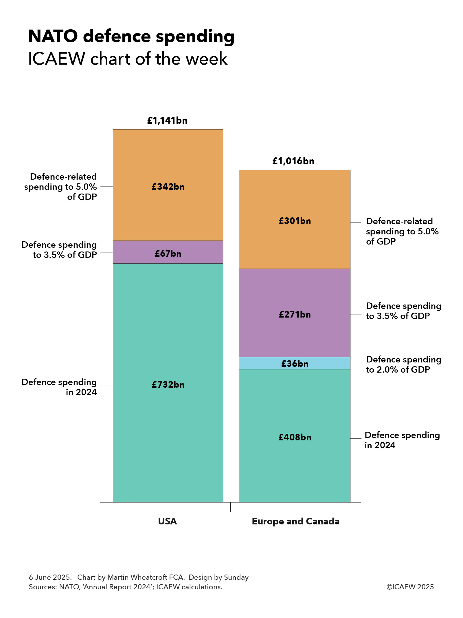
According to NATO, the US and other NATO members spent 3.2% and 2.0% of GDP respectively on defence and security in 2024, with 21 countries meeting NATO’s target of a minimum spend of 2.0%, 10 countries falling short and one (Iceland) for which the guideline does not apply.

Our chart this week illustrates how those 10 countries falling short would need to have spent an additional £36bn in 2024 to reach the 2% of GDP minimum, while the US and NATO Europe and Canada members (including Türkiye) would have needed to spend a further £67bn and £271bn respectively to reach President Trump’s proposed new minimum of 3.5% of GDP.

The chart also shows how the US and other NATO members would need to spend £342bn and £301bn respectively on defence-related expenditure to reach a headline percentage of 5% of GDP. The definition of this spending has yet to be clarified and so it is difficult to know how much of this will be incremental and how much will be met by existing expenditure on infrastructure, security, law enforcement and other public services.

The consequence of a 5% headline target would have been total defence and defence-related expenditure of £2,157bn in 2024 numbers, comprising £1,141bn of spending by the US and £1,016bn of spending by other NATO members.

The 10 countries that would need to have spent more to meet the existing 2% NATO minimum in 2024 are Spain (£10bn), Canada (£9bn), Italy (£9bn), Belgium (£4bn), Netherlands (£2bn), Portugal (£1bn), Slovenia (£0.4bn), Luxembourg (£0.3bn), Croatia (£0.1bn) and Montenegro (£18m).

To reach a 3.5% defence expenditure target would require a substantial expansion in defence budgets with defence expenditure in the US going up by £67bn, Germany by £51bn, France by £37bn, the UK by £33bn, Italy by a further £28bn, Canada by a further £26bn, Türkiye by £15bn, Netherlands by a further £14bn, and Belgium by a further £8bn, with most other countries needing to increase their defence budget, too. 

The sole exception is Poland, which already spends more than 3.5% of GDP on defence (4.1% in 2024), while Estonia (3.4%), Latvia (3.4%), Lithuania (3.1%) and Greece (3.0%) each have much less far to go to reach a 3.5% of GDP target than most other NATO members.

According to NATO, the UK spent £66bn or 2.3% of GDP on defence and security in 2024, but this includes expenditure on the security services, counter-terrorism policing and war pensions in addition to ‘pure’ defence expenditure of £57bn or 2.0% of GDP. Whether, and to what extent, these extra elements will end up being reclassified from defence to defence-related expenditure is unclear, but if all of it was then that would add £9bn to the £33bn a year that the UK would need to find to meet a 3.5% defence expenditure target.

The key question will be how long NATO members are given to meet their new targets. The 2.0% minimum guideline was set in 2014 and provided 10 years for members to reach their new targets. Even then, not all of them achieved it.

It is likely to take years to recruit and train significant numbers of new soldiers, sailors and aircrew and procure major items of equipment such as tanks, ships, submarines and aircraft that would be commensurate with such a new target, so even if the money was available immediately (which it won’t be in most cases) most NATO members are likely to resist calls by the US to adopt a new target with effect from 2026.

Whatever happens, it is clear that most NATO members, including the UK, are going to need to increase spending on defence significantly over the next few years – and at a much faster pace than most of them have budgeted for. 

Tax rises and more borrowing are therefore likely to be on the agenda in many more countries than the UK alone.

This chart was originally published by ICAEW.

ICAEW chart of the week: Canada’s trade with the US

Our chart this week takes a look at trade between the US and Canada, a major factor in Canada’s recent general election.

A step chart illustrating the differences between Canadian imports and exports in 2024.

Left hand column - US exports to Canada: C$601bn = C$36bn energy + C$442bn goods (excluding energy) + C$123bn services. 

Right hand column - Canada exports to the US: C$650bn = C$171bn energy + C$404bn goods (excluding energy) + C$75bn services. 

Step 1  - Trade surplus on energy +C$135bn. 
Step 2 - Trade deficit on goods -C£38bn. 
Step 3 - Trade deficit on services -C$48bn. 

2 May 2025. Chart by Martin Wheatcroft FCA. Design by Sunday. 

Sources: US Bureau of Economic Analysis; US International Trade Commission. C$1.37 = US$1:00.

Trade between Canada and the US has become a major political issue since the inauguration of President Trump, and is generally accepted to have had a significant influence on the outcome of Canada’s general election on 28 April 2025, with former Bank of England Governor Mark Carney elected as prime minister. 

Our chart this week looks at trade between the two countries in 2014, based on statistics from the US Bureau of Economic Statistics and the US International Trade Commission, translated into Canadian dollars at an average exchange rate in 2024 of C$1.37 = US$1.00.

According to these statistics, Canada had an annual trade surplus with the US of C$49bn, representing the difference between imports from the US of C$601bn and exports to the US of C$650bn. 

This can be analysed between a net trade surplus of C$135bn on energy and trade deficits of C$38bn on goods (excluding energy) and C$48bn on services. These represent the difference between US exports to Canada of C$36bn, C$442bn and C$123bn for energy, goods (excluding energy) and services respectively and Canadian exports to the US of C$171bn, C$404bn and C$75bn.

The picture presented by the chart is perhaps not entirely surprising given Canada’s abundant natural resources and the intertwining of its economy with that of its neighbour. Canadians collectively receive large amounts of US dollars for supplying energy that are then used to purchase goods and services from the US and to invest in the US.

President Trump’s on/off tariffs on Canada over the past couple of months, together with retaliatory actions by Canada, are believed to have already had a major impact on trade between the two countries, and this will become more visible as data becomes available over the next few months.

It is difficult to know where trade discussions between the two countries will end up, but Canada does have some cards to play, despite being highly dependent on trade with the world’s biggest economy. While import tariffs were part of their original response and remain an option, they also have the ability – used in past trade disputes – to put export tariffs on commodities such as crude oil and lumber that are essential to US industry and the daily lives of consumers. 

Doing so could add significantly to the inflationary pressures that the US is already experiencing from the tariffs it has placed on imports from China and the rest of the world.

O Canada.

ICAEW chart of the week: IMF Fiscal Monitor

Our chart this week finds that the UK is ranking highly in the IMF’s latest five-year forecasts for general government net debt.

Bar chart

General government net debt/GDP: 2029 forecast

Emerging and developing economies (green bars)
World (purple bar)
Advanced economies (blue bar)
UK (red bar)

Kazakhstan (green) 8%
Canada (blue) 13%
Saudi Arabia (green) 22%
Iran (green) 23%
Australia (blue) 24%
South Korea (blue) 29%
Türkiye (green) 30%
Indonesia (green) 37%
Germany (blue) 43%
Netherlands (blue) 43%
Nigeria (green) 47%
Mexico (green) 51%
Poland (green) 55%
Egypt (green) 56%
Pakistan (green) 61%
Brazil (green) 70%
World (purple) 79%
South Africa (green) 84%
Spain (blue) 92%
UK (red) 98%
France (blue) 107%
US (blue) 108%
Italy (blue) 136%
Japan (blue) 153%


18 Apr 2024.
Chart by Martin Wheatcroft FCA. Design by Sunday.
Source: IMF Fiscal Monitor: 17 Apr 2024.

©️ ICAEW 2024

The International Money Fund (IMF) released its latest IMF Fiscal Monitor on 17 April 2024, highlighting how public debts and deficits are higher than before the pandemic and public debts are expected to remain high. The IMF says: “Amid mounting debt, now is the time to bring back sustainable public finances”, commenting that as prospects for a global economic soft landing have improved, it is time for action to bring government finances back under control. 

Our chart this week illustrates how the UK is one of the ‘leading’ nations in government borrowing, with general government net debt projected by the IMF to reach 98% of GDP by 2029, compared with 92.5% in 2023. (Note: general government net debt is different to the public sector net debt measure used in the UK public finances – the latter includes the Bank of England and other public corporations.)

The chart illustrates how the major countries with the largest debt burdens tend to be advanced economies, with Spain (92% of GDP), the UK (98%), France (107%), US (108%), Italy (136%) and Japan (153%) having debt levels close to, or exceeding, the sizes of their economies.

Some countries are in much better fiscal positions, with Germany expected to bring its general government net debt down to 43% of GDP by 2029, while the Netherlands (43%), South Korea (29%), Australia (24%) and Canada (13%) also have relatively low levels of public debt compared with other advanced economies.

Emerging market ‘middle-income’ and ‘low-income’ developing countries often have much lower levels of public debt than advanced countries, often simply because it is more difficult for them to borrow to the same extent as well as not having the same scale of welfare provision as richer countries to finance. Examples include Kazakhstan (projected to have a general government debt of 8% of GDP in 2029), Saudi Arabia (22%), Iran (23%), Türkiye (30%) and Indonesia (37%). However, that does not stop some emerging and developing countries borrowing more, such as Nigeria (47%), Mexico (51%), Poland (55%), Egypt (56%), Pakistan (61%), Brazil (70%) and South Africa (84%).

Not shown in the chart are China and India for which no net debt numbers are available. The IMF projects them to have general government gross debt in 2029 of 110% and 78% of GDP respectively, indicating how their public debts have grown substantially in recent years. However, without knowing their levels of cash holdings it is less clear where they stand in the rankings.

Also not shown is Norway, the only country with negative general government net debt reported by the IMF. Norway’s general government net cash is projected to reach 139% of GDP in 2029, up from 99% in 2023.

As with all metrics, there are some issues in comparing the circumstances of individual countries. Many countries will also have investments, other public assets, or natural resource rights that are not netted off against debt, while many will also have other liabilities or financial commitments that aren’t counted within debt. For example, the UK has significant liabilities for unfunded public sector pensions as well as even larger financial commitments to the state pension, either of which, if included, would move the UK above the US in the rankings.

The IMF believes that as the world recovers from the pandemic and inflation is brought under control, it is important for countries to start tackling the deficits in the public finances and start bringing down the level of public debt. 

This may be difficult for countries such as the UK where significant pressures on the public finances mean public debt is expected to increase over the medium term rather than fall.

This chart was originally published by ICAEW.