Revisions and corrections help reduce the budget overrun to £7bn for the six months to September 2025, but the outlook remains bleak.
The UK government deficit hit £100bn in the six months to September 2025, according to the latest Office for National Statistics’ (ONS) monthly public sector finances release for September 2025, published on 21 October 2025.
The report also revealed a provisional shortfall between receipts and public spending of £20bn last month. The deficit for the month was £1bn higher than the previous year, in line with the budget. The cumulative deficit was £12bn higher than the first half of 2024/25, and £7bn more than budgeted.
Month of September 2025
Provisional receipts and total public spending for September – £95bn and £115bn respectively – were each 8% more than the previous year.
Current spending included depreciation of £108bn, comparable to the £108bn monthly average in the first five months of the financial year. Net investment was £7bn, higher than the £4bn monthly average investment between April and August 2025.
Excluding net investment, the current budget deficit for the month was £13bn – £2bn more than in the same month last year, £1bn more than budgeted. This was offset by a £1bn underspend on net investment.
Six months to September 2025
The provisional deficit for the six months to September 2025 was £12bn (14%) more than in the same six months last year. This was £7bn higher than budget, which can be analysed as a £13bn budget overrun on the current budget deficit (current receipts less current spending), less a £6bn underspend on net investment.
Table 1 highlights the changes in year-to-date receipts, up 7% overall on last year’s equivalents. These increases were mostly driven by factors such as inflation and fiscal drag from frozen tax allowances. The 20% increase in national insurance revenues reflects the increase in employers’ national insurance.
The 9% increase in current spending over the year has been driven by public sector pay rises, higher supplier costs, and the uprating of welfare benefits.
Net investment of £28bn in the first six months of 2025/26 was £1bn, or 4% higher than the same period last year. Capital expenditure of £46bn was up by £2bn and capital transfers (capital grants, research and development funding, and student loan write-offs) of £18bn were up by £1bn, offset by depreciation of £36bn, up by £2bn.
Table 1 Summary receipts and spending
| 6 months to Sep | 2025/26 £bn | 2024/25 £bn | Change % |
|---|---|---|---|
| Income VAT | 145 | 133 | +9% |
| VAT | 104 | 100 | +4% |
| National insurance | 98 | 82 | +20% |
| Corporation tax | 52 | 48 | +8% |
| Other taxes | 115 | 112 | +3% |
| Other receipts | 63 | 62 | +2% |
| Current receipts | 577 | 537 | +7% |
| Public services | (363) | (334) | +9% |
| Welfare | (155) | (146 | +6% |
| Subsidies | (18) | (17) | +6% |
| Debt interest | (77) | (67) | +15% |
| Depreciation | (36) | (34) | +6% |
| Current spending | (649) | (598) | +9% |
| Current deficit | (72) | (61) | +18% |
| Net investment | (28) | (27) | +4% |
| Deficit | (100) | (88) | +14% |
Budget for the rest of the financial year
The deficit is budgeted to be £118bn for the full year ending 31 March 2026, comprising £93bn in the first half of the year to September 2025 and £25bn in the second half of the year.
Borrowing and debt
Table 2 summarises government borrowing in the first six months of the financial year, taking public sector net debt to a provisional £2,916bn on 30 September 2025. This comprised £100bn in public sector net borrowing (PSNB) to fund the deficit and a further £6bn to fund government lending and working capital requirements.
The table also illustrates how the debt-to-GDP ratio increased by 1.6 percentage points, from a revised 93.7% of GDP at the start of the financial year to 95.3% on 30 September 2025, with incremental borrowing of £106bn, equivalent to 3.5% of GDP. It was partly offset by 1.9 percentage points due to inflation and economic growth adding to GDP.
Table 2 Public sector net debt and net debt/GDP
| 6 months to Sep | 2025/26 £bn | 2024/25 £bn |
|---|---|---|
| PSNB | 100 | 88 |
| Other borrowing | 6 | (14) |
| Net change | 106 | 74 |
| Opening net debt | 2,810 | 2,686 |
| Closing net debt | 2,916 | 2,760 |
| PSNB/GDP | 3.3% | 3.1% |
| Other/GDP | 0.2% | (0.5%) |
| Inflating away | (1.9%) | (2.7%) |
| Net change | 1.6% | (0.1%) |
| Opening net debt/GDP | 93.7% | 94.4% |
| Closing net debt/GDP | 95.3% | 94.3% |
Public sector net debt on 30 September 2025 of £2,916bn comprised gross debt of £3,368bn less cash and other liquid financial assets of £452bn.
Public sector net financial liabilities were £2,565bn, comprising the net debt plus other financial liabilities of £715bn, less illiquid financial assets of £1,066bn. Public sector negative net worth was £908bn – net financial liabilities of £2,565bn less non-financial assets of £1,657bn.
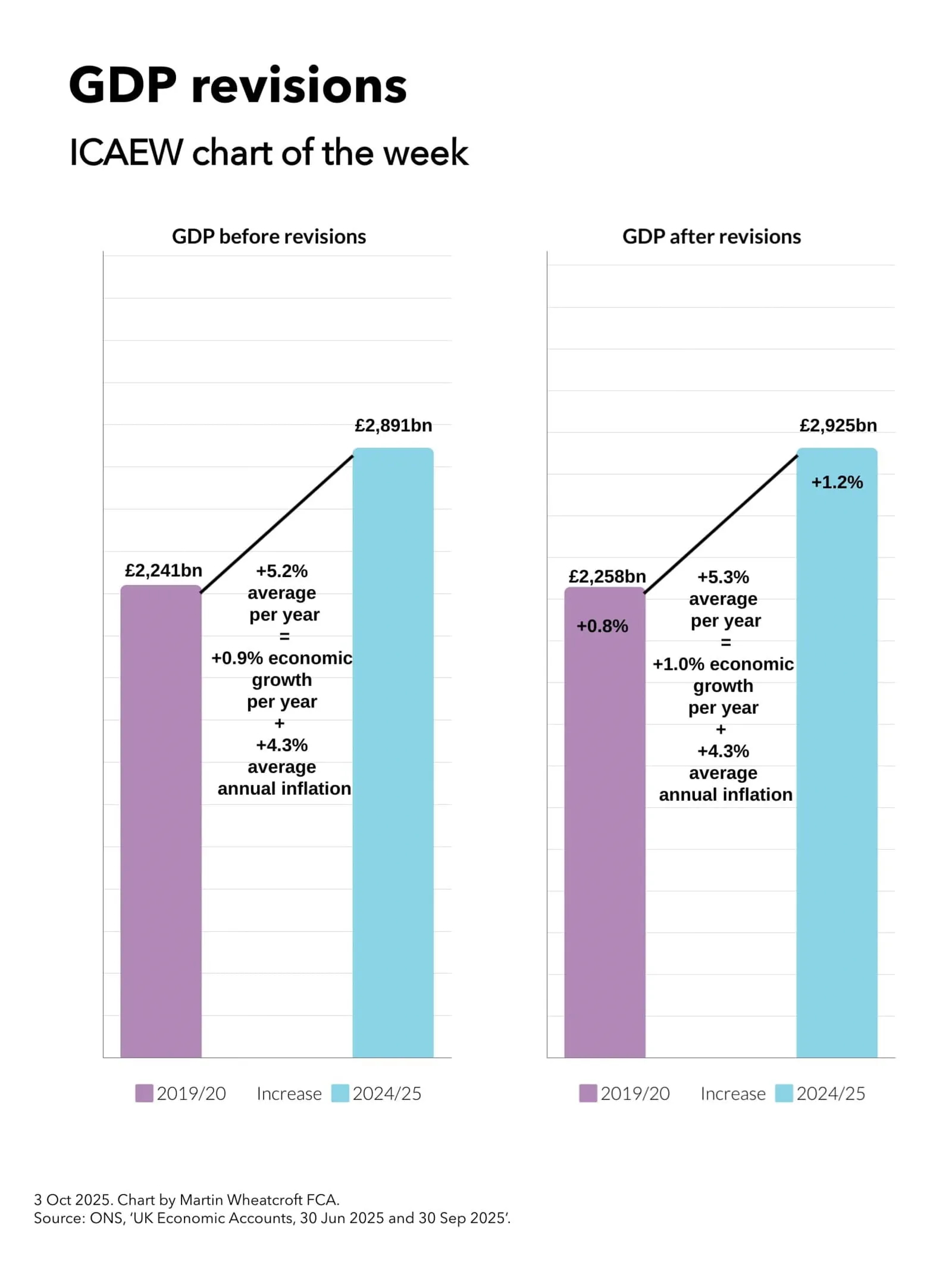
Revisions
Caution is needed with ONS figures, which are repeatedly revised as estimates are refined, and gaps in the underlying data are filled. This includes local government, where numbers are updated in arrears and are based on budget or high-level estimates in the absence of monthly data collection.
This month, the ONS revised down the previously reported deficit for the five months to August 2025 by £4bn, including a £2bn error correction for understated VAT receipts. The ONS also increased the reported deficit for the previous financial year (2024/25) by £4bn to £150bn to incorporate estimates of local government actual expenditure.
More significantly, the ONS revised its methodology for calculating economic activity, resulting in an increase in GDP of 1%. Doing so causes historical percentages for deficit and debt as a proportion of GDP to be revised downwards. This includes a 1.1 percentage reduction in public sector net debt/GDP at the start of the financial year on 1 April 2025, from the previously reported 94.8% to the 93.7% shown in Table 2.
Martin Wheatcroft, external advisor on public finances to ICAEW, said that public finances were broadly as expected, with the £20bn deficit for the month in line with budget.
“Borrowing to fund the deficit was a fraction under £100bn in the six months to September, the second-highest half-year deficit on record after the pandemic year. This was despite a narrowing of the year-to-date budget overrun to £7bn, as a consequence of error corrections and other revisions to previous months. In addition, statistical revisions to the size of the economy resulted in around a percentage point fall in the ratio of public sector net debt to GDP.”
Tepid economic growth and high debt interest costs will continue to weigh on prospects for the rest of the financial year, he added. “The revisions do very little to alter the bleak outlook for the public finances that is driving the need for a significant fiscal correction in the Autumn Budget 2025.”
This article was written by Martin Wheatcroft for ICAEW and was originally published by ICAEW.