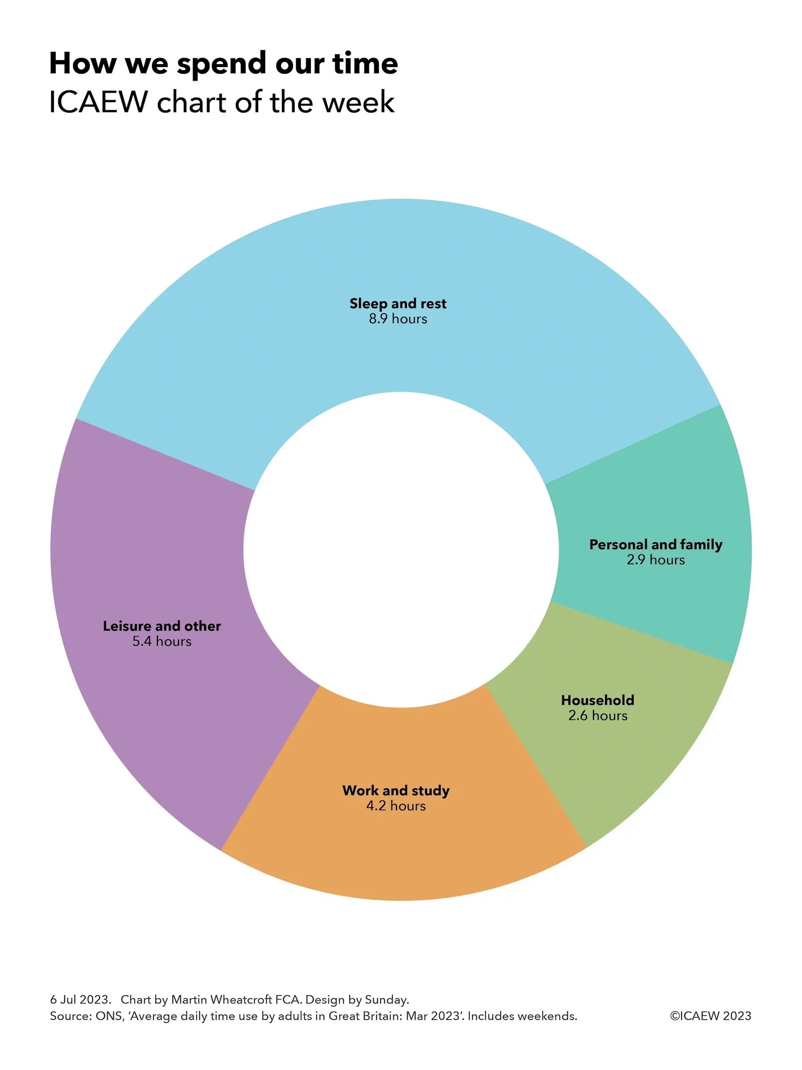
My chart this week is on the £218bn balance sheet of the state-owned retail financial institution that borrows from the public to help fund the UK government.
While the bulk of the UK national debt is financed through the sale of government bonds primarily purchased by institutional investors, the UK government also borrows money directly from the public through its in-house ‘bank’, National Savings & Investments (NS&I).
Originally established as the Post Office Savings Bank in 1861, NS&I has a long history of funding the UK government, for example through the sale of war bonds direct to the public in the twentieth century. Today it is a non-ministerial department for its banking or ‘product’ activities, managed by an executive agency of HM Treasury of the same name.
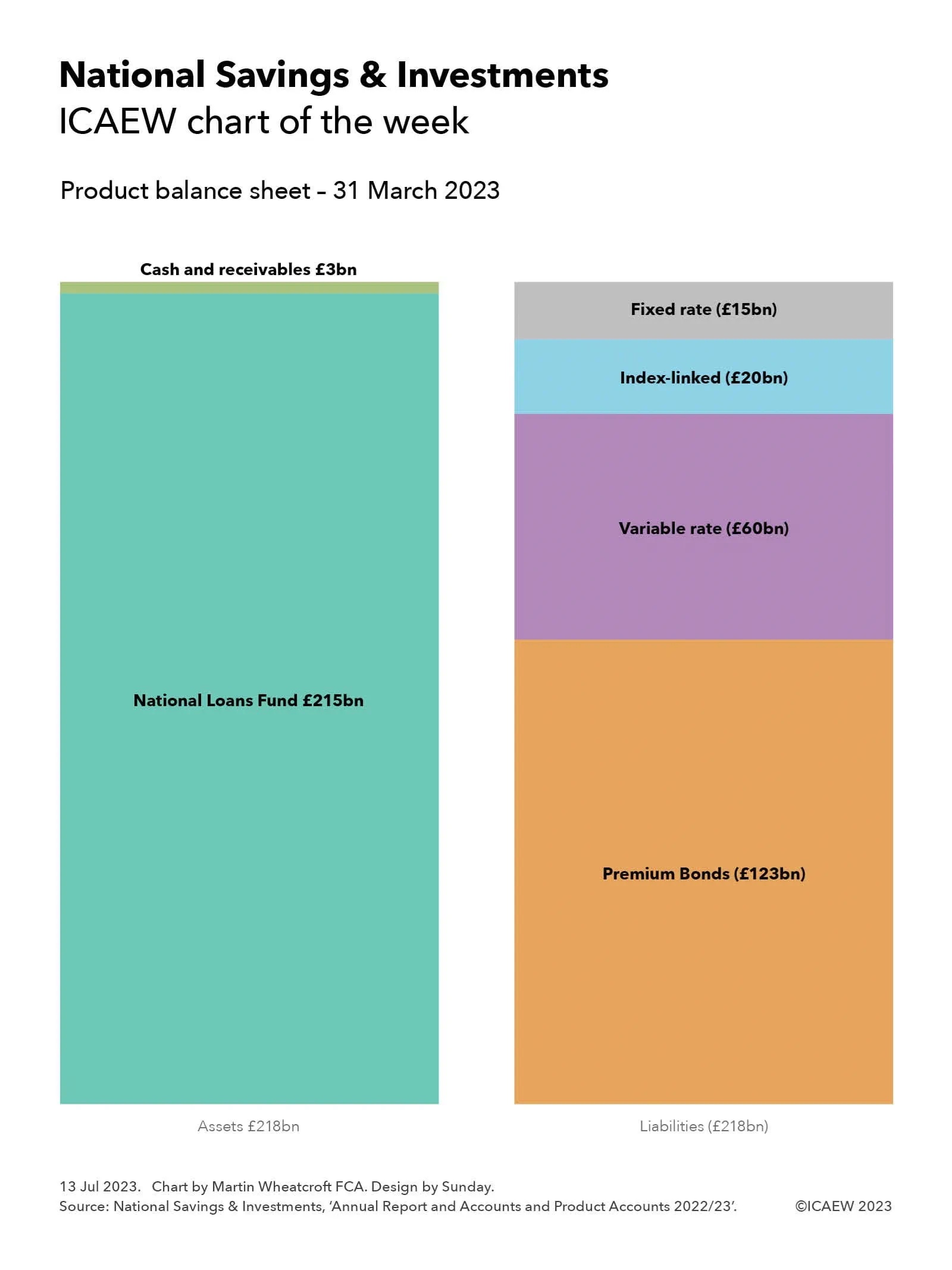
As my chart this week illustrates, NS&I’s product assets as of 31 March 2023 of £218bn were balanced by its liabilities. As a government-backed financial institution, it is not technically a bank and so does not need to maintain equity reserves, unlike commercial banks.
The primary job of NS&I is to attract money from the public to help finance the government’s operations, with a total of £215bn lent to the National Loans Fund as of 31 March 2023. This lending formed the bulk of the NS&I’s product assets, with the balance of assets of £3bn comprising mostly cash together with some receivables.
Liabilities of £218bn on 31 March 2023 were owed to depositors, comprising £123bn in Premium Bonds, £60bn in other variable rate savings products, an estimated £20bn in Index-Linked Savings Certificates, and £15bn in fixed-interest certificates and bonds.
Premium Bonds were introduced in 1956 and (from the NS&I’s perspective) pay a variable rate of interest (currently 4.00%). From a savers’ perspective, however, bonds do not attract any interest at all and instead represent a refundable ticket to a regular tax-free prize draw, with a 22,000 to 1 chance of winning a prize each month, ranging from £25 up to £1m.
Other variable rate savings products include £32bn in on demand Direct Saver accounts that pay interest monthly (currently 3.40% gross/3.45% AER), £20bn on demand Income Bonds paid annually (currently 3.40%), £5bn in ISAs (paying 2.40%) and Junior ISAs (paying 3.65%), and £3bn in Investment Account (paying 0.85%) and legacy savings products that pay either 0.25% or 0%.
Index-Linked Savings Certificates of approximately £20bn (the exact number is not disclosed) are no longer on sale. They are of three years’ duration and can be rolled over by existing holders. These typically attract interest equivalent to Consumer Price Inflation + 0.01% AER, a very low amount in the last decade, but of course much more recently.
Fixed rate liabilities of £15bn principally comprise £12bn in Guaranteed Bonds, £2bn in Fixed Interest Savings Certificates and £1bn in Green Savings Bonds. Guaranteed Bonds are one-year fixed-term fixed interest accounts, with Guaranteed Income Bonds that today pay 3.90% gross/3.97% AER in monthly instalments and Guaranteed Growth Bonds that pay 4.00% on maturity, higher than previous issues. Three-year Fixed Interest Savings Certificates are no longer on sale but can be rolled over by existing holders, however savers can opt instead for three-year Green Savings Bonds, with issue 4 on sale at a fixed interest rate of 4.20% credited annually.
The above numbers do not include NS&I’s separate executive agency operational balance sheet that comprised £0.18bn in assets, £0.15bn in liabilities and equity of £0.03bn on 31 March 2023.
The £218bn lent by the public to NS&I is equivalent to 7.7% of public sector gross debt of £2,836bn on 31 March 2023. While this may seem relatively small in comparison to the £1,320bn in British government securities (gilts) and other debt securities and loans that have been raised from institutional debt investors, or the £1,298bn in currency and central bank deposit liabilities, NS&I provides both a useful public service and a useful alternative source of funding.
Prime Minister Henry Temple (Viscount Palmerston) and Chancellor of the Exchequer William Gladstone would no doubt be extremely pleased to see that their creation was still funding the nation 162 years on. Even if, with £10bn in net new deposits received during the year ended 31 March 2023, it is an increasing liability.