ICAEW chart of the week: UK public debt

We take a look at what makes up UK public debt and who it is owed to, before the Chancellor borrows hundreds of billions more in his emergency fiscal event.

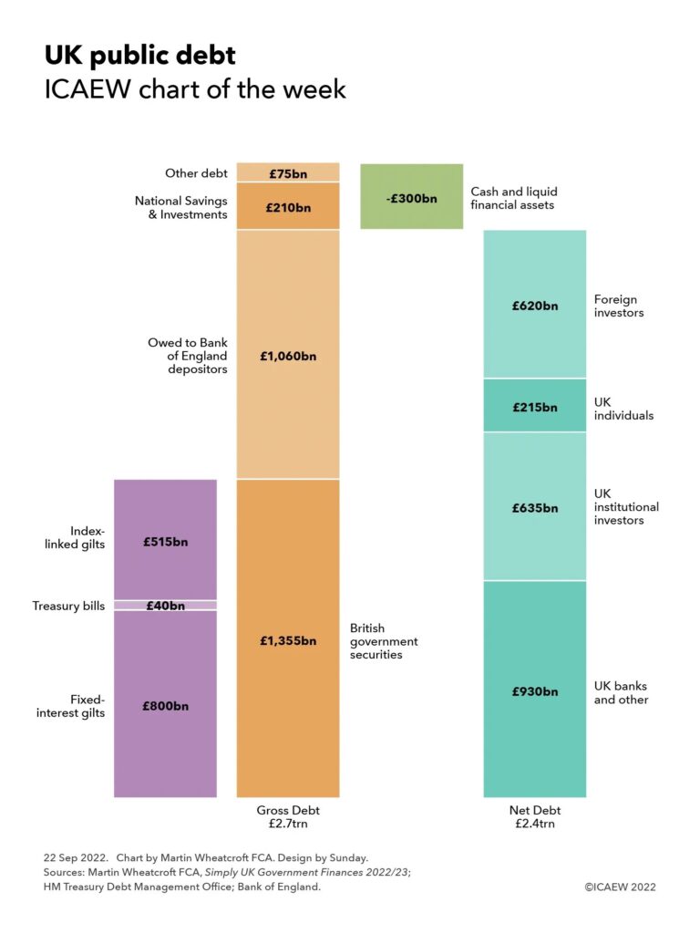
Hybrid step chart showing gross debt of £2.7trn comprising £1,355bn of British government securities (of which £800bn is fixed-interest gilts, £40bn is treasury bills and £515bn is index-links gilts), £1,060bn owed to Bank of England depositors, £210bn for National Savings & Investments and £75bn in other debt. 

After deducting £300bn of cash and liquid financial assets, net debt is £2.4trn, which can be analysed as £930bn owed to UK banks and other, £635bn to UK institutional investors, £215bn to UK individuals, and £620bn to foreign investors.

We take a look at what makes up UK public debt and who it is owed to, before the Chancellor borrows hundreds of billions more in his emergency fiscal event.

Our chart this week is on public debt, illustrating how public sector gross debt is currently in the region of £2.7tn and public sector net debt is in the order of £2.4trn.

HM Treasury owes £2.1trn to holders of British government securities, of which approximately £745bn is owed to the Bank of England and £1,355bn to external investors. These securities are tradable on the London Stock Exchange, comprising fixed-interest bonds (‘gilts’) with an average maturity of 14 years, retail price index-linked gilts with an average maturity of 18 years and treasury bills that mature and roll over within six months or less.

The next largest public sector borrower is the Bank of England, which owes around £1,060bn to its depositors. This mostly comprises deposits created under its quantitative easing programme to support the economy, in the order of £850bn to finance fixed-interest gilt purchases, £20bn to finance corporate bond purchases and around £190bn to finance Term Funding Scheme loans.

The public is directly owed £210bn in the form of National Savings & Investments premium bonds and savings certificates.

The balance of £75bn comprises £25bn in Network Rail loans, £15bn in local authority external debt (local authorities owe £120bn in total, but £105bn is owed to central government) and £35bn in other sterling and foreign currency debt. These numbers do not include £21bn in central government leases and £10bn in other debts that have recently been added to the official measure for government debt following changes in methodology.

After deducting £300bn in cash and other liquid assets, this means public sector net debt stands at around £2.4trn, of which in the order of £930bn is owed to UK banks and other financial institutions, £635bn to UK institutional investors (pension funds and insurance companies), £215bn to UK individual investors, and £620bn to foreign investors, including foreign central banks and governments as well as private sector investors.

The chart illustrates how, despite the efforts of HM Treasury’s Debt Management Office to lock in fixed interest rates for long periods, the government is exposed to significant interest rate and inflation exposure, with the Bank of England having – in effect – swapped a significant proportion of government debt from fixed-rate gilts into variable rate central bank deposits through its quantitative easing programmes.

The consequence is that the majority of public debt is exposed to changes in interest rates or, in the case of index-linked gilts, to changes in retail price inflation, driving interest costs higher and higher each time the Bank of England raises its benchmark central bank deposit rate.

This provides a difficult backdrop for the Chancellor’s plans to borrow substantial sums to cut taxes, cap energy prices for households and businesses and increase defence spending. Most of the extra borrowing will be financed by issuing new British government securities at a time when the Bank of England is starting to put its quantitative easing programme into reverse and so selling some of its stock of fixed-interest gilts back into the market. 

There is no need for an official forecast to be confident of two things: public debt, and the cost of public debt, are both going up.

This chart was originally published by ICAEW.

ICAEW chart of the week: Receipts and spending by age

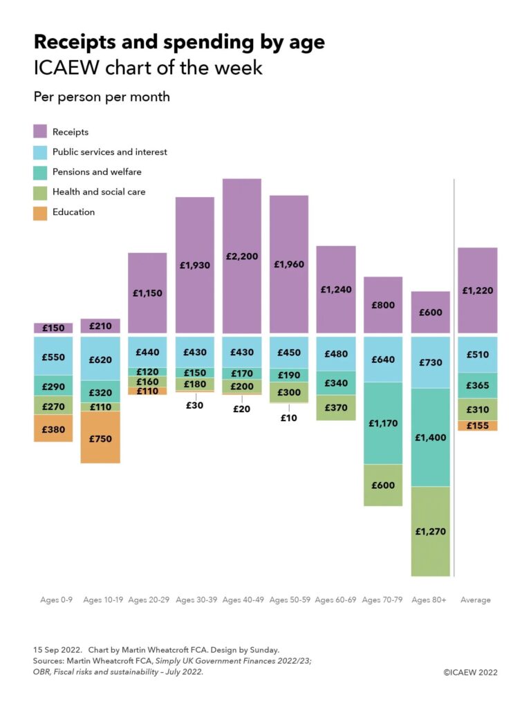
My chart this week looks at how receipts and spending vary by age, a key driver for public finances that new Chancellor Kwasi Kwarteng will need to factor into his fiscal plans.

Column chart - showing receipts by age group per person per month above the line and spending below the line.

0-9: £150 (receipts) - £550 (public services and interest), £290, (pensions and welfare), £270 (health and social care), £380 (education)

10-19: £210 - £620, £320, £110, £750

20-29: £1,150 - £440, £120, £160, £110

30-39: £1,930 - £430, £150, £180, £30

40-49: £2,200 - £430, £170, £200, £20

50-59: £1,960 - £450, £190, £300, £10

60-69: £1,240 - £480, £340, £370, -

70-79: £800 - £640, £1,170, £600, -

80+: £600 - £730, £1,400 - £1,270

Average: £1,220 - £510, £365, £310, £155

Kwasi Kwarteng’s first Budget will be an emergency one, not only setting out his plans for the financial year commencing on 1 April 2023, but also re-opening the budget for the current financial year. It will be dominated by the emergency support package for individuals and businesses already announced, alongside starting to deliver on Prime Minister Liz Truss’s commitments to cut taxes and ‘shrink the state’.

The new Chancellor is likely to find that cutting public spending is not going to be easy given the increasing financial commitments made by successive governments since the Second World War on education, pensions, health and social care, the areas that now dominate public spending. He supported adding to those commitments only a couple of years ago when then Prime Minister Boris Johnson decided to expand eligibility for social care, and former Chancellor Rishi Sunak re-committed to the ‘triple-lock’ that guarantees increases in the state pension every year.

As our chart this week illustrates, receipts and spending vary significantly across age groups, with spending on education higher on the young, who pay very little in taxes, and spending on pensions, health and social care much higher for older generations who contribute less than the average, especially after reaching retirement age. This contrasts with the profile for those of working age who pay the most into the system while on average taking the least out.

Derived from an analysis from the Office for Budget Responsibility’s fiscal risks and sustainability report published in July, the chart shows how – before the emergency Budget scheduled for 21 September – budgeted tax and other receipts for the current financial year 2022/23 are equivalent to £1,220 per person per month, based on forecast receipts of £988bn and a population of 67.5m. This is below budgeted public spending of £1,340 per person per month (£1,087bn/67.5m people/12 months), with the deficit of £120 per person per month (£99bn in total) funded by borrowing.

Average receipts per person per month by age group are estimated to be in the order of £150, £210, £1,150, £1,930, £2,200, £1,960, £1,240, £800 respectively for those aged 0-9, 10-19, 20-29, 30-39, 40-49, 50-59, 60-69, 70-79 and 80+ respectively. These numbers include £115 per person per month of non-tax receipts spread evenly across everyone. 

Spending on public services and interest in the order of £510 per person per month, or £550, £620, £440, £430, £430, £450, £480, £640, £730 by age group, is less variable across age groups because it much of this spending is incurred on behalf of everyone, including £125 in interest, £73 on defence and security and £53 on policing, justice and safety for example.

Spending on pensions and welfare of £365 per person per month is less evenly spread, with £290 and £320 per month spent on those in their first two decades and £440, £430, £430 and £450 on those in their twenties, thirties, forties and fifties respectively. This increases to average spending per person per month of £480, £640 and £730 on those in their sixties, seventies and eighties or over. 

Health and social care spending of £310 is biased towards older generations, with per person per month spending of £270, £110, £160, £180 and £200 for the first five decades of life contrasting with the £300, £370, £600 and £1,270 spent on average on those in their fifties, sixties, seventies and eighties or over. 

As you would expect, education spending of £155 per person per month on average is mostly spent on the young, with around £380 per person per month spent on the under-10s, £750 spent on those between 10 and 19, £110 spent on those in their twenties, and £30, £20 and £10 respectively spent on those in their thirties, forties and fifties.

The reason this chart is so critical is because demographics are not in a steady state, with the ONS projecting that there will be an additional 3.3m pensioners in 20 years’ time, a 27% increase. This will have significant cost implications for this and future governments over a period when the working-age population – who pay most of the taxes to fund public spending – is projected to grow by just 4% in total. 

While a declining birth rate might relieve some of the pressure on education spending over the next 20 years, spending on the state pension, the NHS and on social care will grow significantly if the commitments made by the current and previous governments to provide for income in retirement, universal free health care and an increasing level of social care provision are to be met, at the same time as running public services to the standard required.

Kwasi Kwarteng’s predecessors have been able to cover the expanding share of public spending going on pensions and health and social care without raising taxes above 40% of the economy by cutting spending on public services, in particular the defence budget, which has declined from in the order of 10% of GDP to around 2% over the last half century. However, with defence already at the NATO minimum, and many public services under significant pressure to improve delivery, there is much less scope to find savings than there has been in the past.

This poses a very big challenge for the Chancellor as he puts together his medium-term fiscal plans. Economic growth needs to be much higher than it has been in recent years, not only to cover the cost of tax cuts that he hopes will generate that growth, but also to generate the extra tax receipts needed to fund pensions and health and social care as more people live longer lives.

This chart was originally published by ICAEW.

ICAEW chart of the week: before the emergency fiscal event

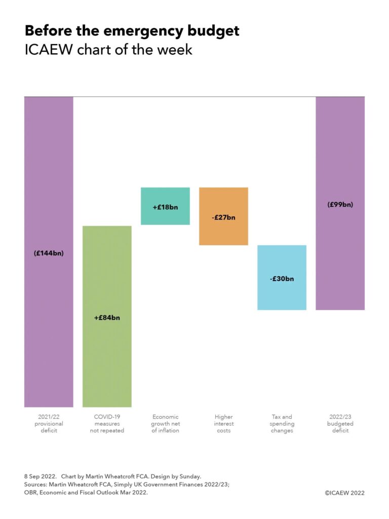
My chart this week looks at how the budgeted deficit was supposed to play out according to the Spring Statement back in March, ahead of an emergency fiscal event expected within the next few weeks.

Step chart:

(£144bn) 2021/22 provisional deficit

+£84bn COVID-19 measures not repeated

+£18bn Economic growth net of inflation

-£27bn Higher interest costs

-£30bn Tax and spending changes

=

(£99bn) 2022/23 budgeted deficit

The new Chancellor will be looking at a range of possible large scale interventions to support individuals and businesses as they face unprecedented cost-of-living and cost-of-doing-business crises this winter. Several commentators have suggested that the combination of tax cuts trailed by new Prime Minister Liz Truss and a massive emergency support package could add more than £100bn to the deficit, more than doubling the budgeted deficit of £99bn established back in March 2022 just before the start of the financial year.

My chart illustrates how the deficit was expected to change from a provisional outturn of £144bn for the deficit in the year ended 31 March 2022, when taxes and other receipts were £914bn and total managed expenditure amounted to £1,058bn.

Last year’s totals included £84bn in COVID-19 related measures (£14bn of tax cuts and £70bn of spending measures) that are not repeated this year, with further spending this year – including continuing to treat COVID-19 patients and tackling NHS backlogs that stem from the pandemic – folded into departmental budgets set during the three-year Spending Review back in October 2021.

Economic growth net of inflation was expected to reduce the deficit by a further £18bn, comprising £21bn in extra receipts from forecast economic growth of 2.2% less £3bn (£41bn on spending, £38bn on receipts) from forecast inflation of 4.1%. The latter uses the GDP deflator measure for the ‘whole economy’ and was estimated at a point when consumer price inflation was expected to reach 8.0% this year.

Inflation also drove much of the jump in interest costs of £27bn in comparison with the previous year, principally because of interest accrued on inflation-linked gilts, but also as a consequence of higher interest rates.

Tax and spending changes amounted to £30bn, comprising £31bn in additional spending less a net £1bn in tax changes. The former comprises a £21bn or 2.0% increase in public spending principally stemming from the 2021 Spending Review, together with £10bn of support for household energy bills announced by former chancellor Rishi Sunak back in February and March 2022. Tax rises were expected to add £20bn to the top line, of which £18bn stems from the rise in national insurance rates from April pending the introduction of the health and social care levy next year. However, this was offset by £19bn in tax cuts and other movements, including a £6bn tax cut from increasing national insurance thresholds, £2bn from cutting fuel duty by 5p, and £1bn from freezing the business rates multiplier.

These changes result in a budgeted deficit of £99bn, being forecast tax and other receipts of £988bn less public spending of £1,087bn.

These amounts exclude £15bn in additional help for energy bills since the budget was finalised in March 2022, partially offset by £5bn from the windfall tax on energy companies announced at the same time. Adjusting for these two items, however, is relatively small beer compared with the large-scale fiscal announcements made by new Chancellor Kwasi Kwarteng. This is before the Office for Budget Responsibility works its magic in updating the fiscal forecasts for changes in the economic situation, taking account of higher inflation and interest rates, and lower economic growth or even an economic contraction.

The worsening economic outlook continues to overshadow the public finances, providing perhaps one of the worst foundations for any incoming Chancellor since the Second World War.

This chart was originally published by ICAEW.

ICAEW chart of the week: Energy price cap update

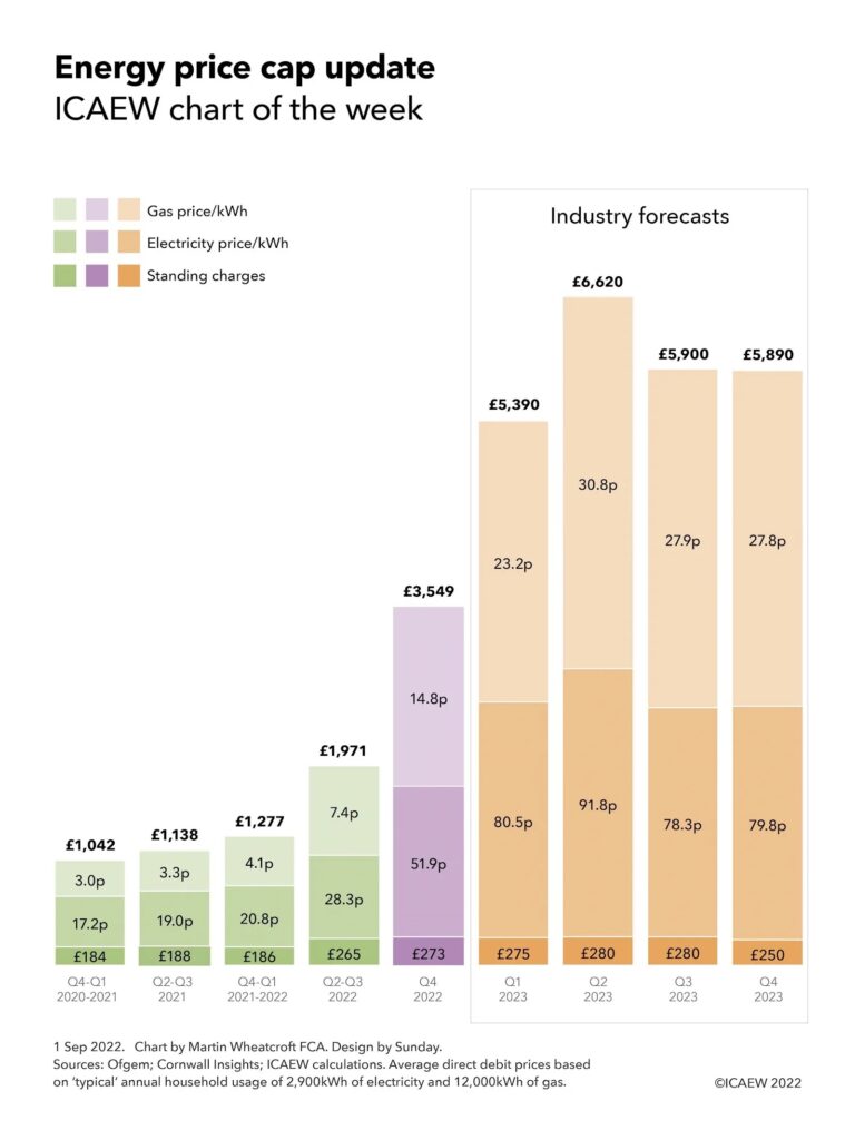
My weekly chart for ICAEW returns for a less than cheerful update on the energy price cap, highlighting how the massive 54% price rise back in April pales into insignificance in comparison with the recently announced 80% rise in October and the prospect of further big rises in the first half of 2023.

Column chart showing historical price caps for Q4 2020-Q1 2021, Q2-Q3 2021, Q4 2021-Q1 2022, Q2-Q3 2022, the recently announced price cap for Q4 2022, and industry forecasts for Q1, Q2, Q3 and Q4 2023.

Average typical price cap: £1,042, £1,138, £1,277, £1,971, £3,549 (Q4 2022), £5,390, £6,620, £5,590, £5,890.

Gas price/kWh: 3.0p, 3.3p, 4.1p, 7.4p, 14.8p (Q4 2022), 23.2p, 30.8p. 27.9p, £27.8p.

Electricity price/kWh: 17.2p, 19.0p, 20.8p, 28.3p, 51.9pm (Q4 2022), 80.5p, 91.8p, 78.3p, 79.8p.

Standing charge: £184, £188, £186, £265, £273 (Q4 2022), £275, £280, £280, £259.

Sources: Ofgem, Cornwall Insights, ICAEW calculations. Average direct debit prices based on 'typical' annual household usage of 2,900 kWh of electricity and 12,000kWh of gas.

My chart this week is on Ofgem’s cap on domestic electricity and gas prices, which increased from an annual average of £1,042 back in October 2020 for a ‘typical’ household using 2,900kWh of electricity and 12,000kWh of gas paying by direct debit, to £1,138 in April 2021, £1,277 in October 2021 and £1,971 in April this year.

Unless the new prime minister intervenes, the energy price cap will rise to £3,549 on 1 October, significantly more than was anticipated in our chart back in January on this topic . Divided by 12, this gives a monthly average bill of £296 (compared with £164 currently and £106 last winter), although as energy usage in winter is higher for most households the £400 or £66 per month rebate between October 2022 and April 2023 announced by the government earlier this year will not go very far.

The change to quarterly price caps from 2023 onwards means that households face a further rise in January, making the winter even more expensive given that research from Cornwall Insight suggests energy prices will continue to rise, to a likely cap of in the region of £5,390 on 1 January 2023 and potentially to as much as £6,620 on 1 April 2023, before falling to £5,900 on 1 July and £5,890 on 1 October 2023.

The energy price cap is technically a series of regional caps on the price per kilowatt-hour (kWh) for electricity and gas, and on the daily standing charge payable by domestic users. Larger or less energy-efficient households using more electricity or gas will pay a lot more than the amounts shown here, while smaller and more energy-efficient households will pay less. There are higher prices for those using prepayment meters (£3,608 from 1 October) and those paying by cash or cheque (£3,764 from 1 October).

The chart illustrates how the average annual standing charge was £184 in Q4 2020 and Q1 2021, £188 in Q2 and Q3 2021, £186 in Q4 2021 and Q1 2022 and £265 in the current price cap, the large increase principally to cover the costs of dealing with the 40 or so energy suppliers that went bust over the past year. The average standing charge will increase to £273 in October and then is expected to stabilise at around that level, potentially at £275, £280, £280, and £250 respectively for the four quarters in 2023, although this depends on how Ofgem chooses to allocate the costs that make up the cap between fixed and variable elements in the pricing structure.

The average per kWh price for electricity has increased from 17.2p (Oct 2020-Mar 2021) to 19.0p (Apr-Sep 2021) to 20.8p (Oct 2021-Mar 2020) to 28.3p currently and will rise to 51.9p in October. If Cornwall Insight’s predictions come to fruition, the price is likely to rise to somewhere around 80.5p per kWh in January and potentially to 91.8p in April, before falling to 78.3p in July and rising slightly to 79.8p in October 2023. The potential peak of 91.8p is more than five times the level back in October 2020 and is likely to be an even higher multiple for the many households who were on fixed price deals that were often significantly below the level of the price cap.

The average per kWh price for gas has increased from 3.0p (Oct 2020-Mar 2021) to 3.3p (Apr-Sep 2021) to 4.1p (Oct 2021-Mar 2020) to 7.4p currently and will rise to 14.8p in October. The gas price is likely to rise to 23.2p per kWh in January and potentially to 30.8p in April, followed by 27.9p and 27.8p in the final two quarters of 2023. The possible peak of 30.8p would be more than 10 times the level of 3.0p back in October 2020.

The price cap about to come into force of £3,549 is based on annually equivalent wholesale energy costs of £2,491, network costs of £372, operating costs of £214, social and environmental contributions of £152, other costs of £88 and a profit margin of £63, before adding on £169 of VAT at a rate of 5%. These are equivalent to £208, £31, £18, £13, £7, £5, and £14 in a ‘typical’ bill of £296 per month.

The sheer scale of these price rises will make energy unaffordable for millions of families across the UK at the same time as many other prices are rising sharply. This will mean real hardship for those on low and middle incomes without significant additional financial support from government, whether in the form of extra rebates on energy price rises or support through the benefit system. Other options include reforming the pricing mechanism for electricity generated by non-gas sources such as renewables or providing the energy suppliers with a long-term borrowing facility to enable the expected price rises to be spread out over a number of years.

Either way, the incoming prime minister faces some very difficult choices in how to respond, not only to the cost-of-living crisis but also to an emerging cost-of-doing-business crisis that could see many businesses forced to close as their energy prices (not covered by the domestic price cap) become unsustainable.

In January, I said: “There may be trouble ahead.” Unfortunately for all of us, trouble has arrived.

This chart was originally published by ICAEW.

Why good governance is more than words on a page

Governance failures are all too common in local government, but what can you do to make sure they don’t happen on your watch? Alison Ring, director of public sector and taxation at ICAEW, explains why good governance must be ‘lived and breathed’.

Recent headlines have highlighted the importance of good governance in ensuring the financial and reputational health of local authorities.

At one council, there were “serious failings in governance” arising from a control failure involving the signing of blank cheques, leading to a loss of £238,0000. Meanwhile, at one city council, inspectors questioned the composition of its boards stating: “Where it continues to use councillors on the boards of its subsidiary companies, it should ensure that the non-executives (including councillors) on the relevant board have, in aggregate, the required knowledge and experience to challenge management.”

An inspection report at another city council discovered “serious failings … in both governance and practice” and criticised the “corporate blindness that failed to pick this up and remedy the position”.

Seven principles of good governance

Failures such as these have led to reminders from CIPFA and others about the importance of ensuring that a local code of governance is in place. As recommended by the 2016 Governance Framework, your code should set out how the authority’s arrangements work towards meeting the seven principles of good governance set out in the framework.

Unfortunately, as CIPFA has commented, “… many authorities do not have a local code and instead rely on their annual governance statement to describe their governance arrangements. Some local codes that CIPFA has seen are not fit for purpose”.

Governance failures are all too common, so what can you do to make sure they don’t happen on your watch?

Putting a code in place is only the start. After all, some of the most egregious governance failures in recent times have occurred in local authorities with a local code that was full of structures, processes and procedures designed to ensure that risks were being managed, and public money protected.

Designing a delegated authority framework, financial controls to prevent fraud or error, or setting up an audit committee to scrutinise your finances are only the table stakes. In practice, governance only works if you live and breathe it every day.

Putting a code in place is only the start. Some of the most egregious governance failures have occurred in authorities with a local code  full of structures, processes and procedures designed to ensure that risks were managed and public money protected.

Structures and processes are there for a reason

There are many different ways to describe effective governance, but one of my favourites is from a colleague, who says that good governance is about ensuring the right people are in the right place at the right time, with the right information, asking the right questions to make the best possible decisions. This is a good rule of thumb to use in thinking about whether governance arrangements are working and how they can be improved.

Right people: do the people making the decisions have the right subject matter and financial expertise? Is there a diversity of perspectives to prevent group think? Are they able and confident enough to ask the right questions? Do you have a suitable number of people for the big decisions?

For example, are there independent lay members on your audit committee with external perspectives, financial expertise and the willingness to ask questions? Do you have a diversity of team members and perspectives in your executive team meetings? Are you inviting the most appropriate members of staff to present proposals? Have you received input from the team on the ground?

Right place: the meeting room (actual or virtual) is important because it can make a real difference to how decisions are made. The foundations should be in place to ensure meetings are productive and that information flows work well and support doing the right thing.

Right time: you need to make sure discussions to formulate, refine, recommend or approve decisions are held at the best point in time. Too late in the decision-making process, and there will be a reluctance to turn down sub-optimal proposals because of the time and effort already incurred. Too early, and proposals may not be fully developed and risks not properly assessed, letting though impractical ideas or resulting in you having to come back to the same decision again and again.

You also need to make sure there is sufficient time to properly consider a proposal, both in the time available in meetings to discuss it, but also in the time provided to decision-proposers and decision-makers to evaluate and respond. Deadlines should be set so people have sufficient time to think.

Just as importantly, time needs to be valued. Are you using people’s time effectively, making sure that decisions are being made or approved at the right level so that they have enough time for the most important decisions? Use the 80:20 rule to focus on the 20% of decisions with the most impact, and minimise the time spent on the 80% that are not so critical.

You need to foster a culture where it is acceptable to ask questions, sometimes even the stupid ones. You may not have thought of the right question to ask, but someone else may have if only they felt confident enough to ask it.

Quality of information

Right information: good governance lives or dies by the quality of information that forms the basis on which decisions are made. This is where finance has the biggest role to play, not only because you are often the gatekeeper through which key financial and strategic decisions are made, but also in your role in supporting operational decisions at all levels throughout the organisation.

Information must be of high quality and transparent. It should set out the downsides as well as the upsides, and – most importantly – must be understandable and focused. Too often we see budgets supported by extensive commentary on operational level detail best left to line management to decide, while providing scant explanation of the benefits and risks of multimillion pound capital programmes.

Right questions: asking the right questions is the most important element of any governance framework. Do decision-makers really understand what is going on? What is important to know? Who should I be talking with to get the answers? If you don’t ask the right questions, you are not going to get the right answers, or you might be satisfied with superficial information that doesn’t tell you what you really need to know. Ask questions that establish the facts, enable you to challenge and scrutinise, identify risks, prompt a thorough discussion and aid decision making.

Most importantly, you need to foster a culture where it is acceptable to ask questions, sometimes even the stupid ones. You may not have thought of the right question to ask, but someone else may have if only they felt confident enough to ask it.

Reappraising decisions

Making the best decisions involves rigorously evaluating what has been done before so that you can do better in the future. Are you continually appraising previous decisions, not only to learn from mistakes but also to learn from successes? Are you getting the right answers from the process that is your system of governance?

This is where the quality of oversight comes into its own. Are your formal structures playing their full role in challenging management to be the best you can be, both at the top level (for example, audit, finance and scrutiny), but also down through the organisation?

Is your finance committee challenging you about the accuracy of financial forecasts and projections? Is your audit committee asking what is being done to reduce errors in financial processes? Are your external auditors reporting to you and the audit committee on the quality of year-end working papers and providing feedback on required improvements?

Independent audit committee members with technical expertise can help by challenging decisions, acting as a critical friend to the council leader, their cabinet and the management team, and can provide financial education for councillors.

Your internal audit team can really help with evaluation, not only in their formal role examining the effectiveness of processes each year, but also by being a critical friend within the organisation as they kick the tyres across a whole range of different assignments.

Continuous improvement is key, as processes are never perfect. Are you actively seeking to improve the quality of decision-making? If key meetings are rushed, curtailing the opportunity for proper discussion of the merits of important decisions, can they be extended, or less important items moved to a different forum or dealt with much better by those close to the coal face? Are your budget documents up to scratch, providing the information management that cabinet and councillors need to make the best choices?

Good governance must be lived and breathed

Making sure you have a code of governance in place is important, but it is not enough on its own.

You and your colleagues need to live and breathe governance for it to be effective. Otherwise, your code will be just another document gathering electronic dust in the far reaches of your website. Enough to tick a box to say you have one, but not nearly enough to help you steer clear of avoidable disasters.

Martin Wheatcroft contributed to the writing of this article at the request of ICAEW. It was originally published in Room 151.
July boost to public finances doesn’t stop red ink

Fiscal outlook worsens as mid-year self assessment receipts fail to outweigh higher debt interest and the cost of energy support packages.

The monthly public sector finances for July 2022 released on Friday 19 August 2022 reported a provisional deficit for the month of £5bn, compared with a deficit of £21bn in the previous month as self assessment receipts boosted the cash position, supplemented by growing VAT and PAYE receipts. The latter helped add £7bn to the top line compared with this time last year, bringing total receipts for the month to £84bn, while current expenditure excluding interest of £79bn and interest of £7bn were each £3bn higher. With net investment unchanged at £3bn, the net improvement in the deficit for July compared with the same month last year was £1bn.

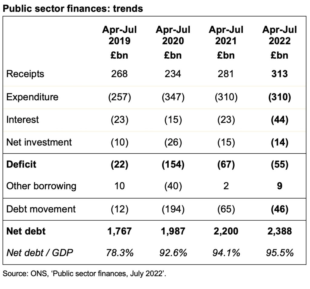
The total deficit for the first four months of the 2022/23 financial year was £55bn following revisions to previous months. This was £12bn lower than this time last year and £99bn lower than the previous year during the first pandemic lockdown, but £33bn more than the deficit of £22bn for the first four months of 2019/20, the most recent pre-pandemic comparative period.

Public sector net debt was £2,388bn or 95.5% of GDP at the end of July, up £46bn from £2,342bn at the end of March 2022. This is £621bn higher than the £1,767bn equivalent on 31 March 2020, reflecting the huge sums borrowed over the course of the pandemic, although the increase in the debt-to-GDP ratio from 74.4% on 31 March 2020 is less than that reported in previous months as inflation has added to nominal GDP.

Tax and other receipts in the first four months to 31 July amounted to £313bn – £31bn, or 11%, higher than a year previously. This included higher income tax receipts from wage increases and bonuses as well as the new higher rate of national insurance, together with additional VAT receipts from inflation in retail prices.

Expenditure excluding interest and investment for these four months of £311bn was level with the same period last year, as reduced spending on the pandemic (including furlough programmes) was offset by the spending increases announced in last year’s Spending Review, together with support for households to help with energy bills.

Interest charges of £44bn were recorded for the four months – £21bn or 92% higher than the £23bn in the equivalent period in 2021 – with inflation driving up the cost of RPI-linked debt in addition to the effect of higher interest rates.

Cumulative net public sector investment was £14bn. This is £1bn or 9% lower than a year previously, potentially indicating a slowdown in capital programmes given that the Spending Review 2021 had pencilled in significant increases in capital expenditure budgets for the current year.

The increase in net debt of £46bn since the start of the financial year comprises the deficit for the four months of £55bn less £9bn in net cash inflows, as inflows from repayments of taxes owed and loans made to businesses during the pandemic exceeded outflows to fund student loans, other lending and working capital movements.

Alison Ring OBE FCA, Public Sector and Taxation Director at ICAEW, said: “The latest numbers highlight the extent to which the fiscal outlook is worsening as the cost of borrowing rises, with record high energy costs, rapidly increasing prices and an economy close to recession expected to further drive up public spending in this and the next financial year.

“The UK’s deteriorating fiscal situation will make it hard for the new prime minister to deliver on promised tax cuts, invest in energy resilience and support struggling families and businesses over the winter, without breaching fiscal rules intended to ensure the long-term health of the public finances.”

Table with cumulative receipts - expenditure - interest - net investment = deficit - other borrowing = debt movement for the first four months of the financial year, together with net debt and net debt / GDP.

Apr-Jul 2019 £bn: 268 - 257 - 23 - 10 = -22 deficit + 10 = -12 debt movement; 1,767 net debt, 78.3% net debt / GDP.

Apr-Jul 2020 £bn: 234 - 347 - 15 - 26 = -154 deficit - 40 = -194 debt movement; 1,987 net debt, 92.6% net debt / GDP.

Apr-Jul 2021 £bn: 281 - 310 - 23 - 15 = -67 deficit + 2 = -65 debt movement; 2,200 net debt, 94.1% net debt / GDP.

Apr-Jul 2022 £bn: 313 receipts - 310 expenditure - 44 interest - 14 net investment = -55 deficit + 9 = -46 debt movement; 2,388 net debt, 95.5% net debt / GDP.

Caution is needed with respect to the numbers published by the ONS, which are expected to be repeatedly revised as estimates are refined and gaps in the underlying data are filled.

The ONS made several revisions to prior period fiscal numbers to reflect revisions to estimates. These had the effect of reducing the reported fiscal deficit for the three months ended 30 June 2022 by £5bn from £55bn to £50bn and increasing the reported fiscal deficit for the 12 months to March 2022 by £2bn from £142bn to £144bn.

This article was originally published by ICAEW.

ICAEW chart of the week: Commonwealth Games

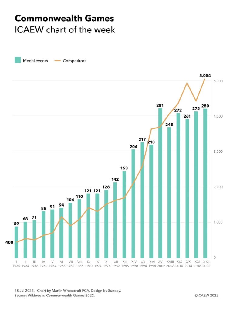
Our chart this week marks the start of the XXII Commonwealth Games in Birmingham, illustrating how the numbers of events and competitors have grown since the first games in 1930 to reach 280 events featuring 5,054 competitors in 2022.

Combined line and column chart showing medal events for each games (columns) and number of competitors (line).

Games: I-III every four years from 1930 to 1938, IV-XII every four years from 1950 to 2022.

Medal events I-X: 50, 68, 71, 88, 91, 94, 104, 110, 121, 121; XI-XX: 128, 142, 163, 204, 217, 213, 281, 245, 272, 261; XXI-XXII: 275, 280.

Competitors: 400 in 1930 through to 5,054 in 2022.

The XXII Commonwealth Games in Birmingham, from 28 July to 8 August, involves a record 5,054 competitors from 72 teams participating in 280 events in 20 sports. This is many times the 400 or so competitors from 11 teams that competed in 59 events in six sports at the inaugural British Empire Games in Hamilton, Canada, in 1930.

Although much smaller than the Olympic Games, the Commonwealth Games is still a major undertaking with a budget for Birmingham 2022 approaching a billion pounds, including £778m of public funding, of which £594m is from central government and £184m is from Birmingham City Council, West Midlands city region and other local sources.

The main focus will be on sporting performance, with events in aquatics (12 diving, 52 swimming), athletics (58), badminton (6), 3×3 basketball (4), beach volleyball (2), boxing (16), cricket T20 (1), cycling (20 track, 4 road, 2 mountain biking), gymnastics (14 artistic, 6 rhythmic), hockey (2), judo (14), lawn bowls (11), netball (1), para powerlifting (4), rugby sevens (2), squash (5), table tennis (11), triathlon (5), weightlifting (16) and wrestling (12).

Birmingham 2022 is the first games to have more than 5,000 competitors, although with 280 medal events there is one less than the 281 that featured in Manchester 2002.

England, as the host nation, will be hoping to improve on its performance at the Gold Coast 2018 games, when it came second in the medal table with 136 medals (45 gold, 45 silver, 46 bronze) to Australia, who won 198 medals (80, 59, 59) on their home turf. India with 66 medals in 2018 (26, 20, 20), Canada with 82 (15, 40, 27), New Zealand with 46 (15, 16, 15), South Africa with 37 (13, 11, 13), Wales with 36 (10, 12, 14) and Scotland with 44 (9, 13, 22) will also be looking to do well.

For the participants, the efforts will be intense, while for spectators in the stadium and the audience at home, the nail-biting tension of the lawn bowls competition will be just one of many gripping sporting events to be enjoyed this summer.

This chart was originally published by ICAEW.

Inflation adds fuel to the deficit as cost of borrowing soars

Economic pressures mount as the public sector deficit reaches £55bn in the first three months of the fiscal year.

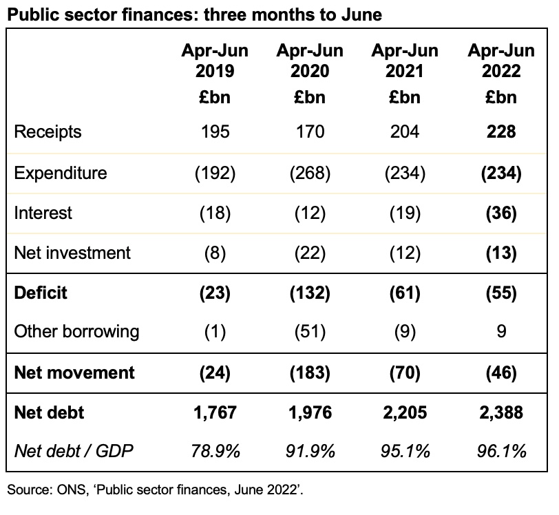
The monthly public sector finances for June 2022, released on Thursday 21 July 2022, reported a provisional deficit for the month of £23bn, bringing the total for the first quarter of the 2022/23 financial year to £55bn.

The first quarter deficit was £6bn below this time last year, but £32bn higher than the £23bn reported for the first three months of 2019/20, before the pandemic.

Public sector net debt increased to £2,388bn or 96.1% of GDP at the end of June, up £46bn from £2,342bn at the end of March 2022. This is £595bn higher than 31 March 2020, reflecting the huge sums borrowed over the course of the pandemic.

Tax and other receipts in the first quarter to 30 June amounted to £228bn, £24bn or 11% higher than a year previously. This included higher income tax receipts from wage increases and bonuses as well as the new higher rate of national insurance, plus higher VAT receipts driven by higher retail prices.

Expenditure excluding interest and investment for the quarter of £234bn was £1bn higher than the same period last year, as reduced spending on the pandemic (including furlough programmes) was offset by planned increases in spending announced in last year’s Spending Review and by additional support to households to help with their energy bills.

Interest charges of £36bn were recorded for the three months, £17bn or 39% higher than the £19bn in the equivalent period in 2021, driven by rising inflation increasing the cost of RPI-linked debt in addition to higher interest rates. This reflects how the government’s hedge against low inflation – which saw interest charges fall even as debt quadrupled over the last 15 years – went into reverse, with the benefit (to the government) of debt inflating away more quickly offset by a higher cost of borrowing.

Net public sector investment in the quarter was reported to be £13bn, which is £1bn or 7% higher than a year previously.

The increase in net debt of £46bn since the start of the financial year comprises the deficit for the quarter of £55bn less £9bn in net repayments. This reflects the recovery of loans to banks through the Bank of England’s Term Funding Scheme and of loans to businesses via the British Business Bank (including bounce-back and other coronavirus loans), offset by outflows to fund student loans and other government cash requirements.

Alison Ring OBE FCA, Public Sector and Taxation Director for ICAEW, said: “The latest inflation-fuelled numbers will provide little comfort for the new Prime Minister, as at £55bn for the quarter to June, the deficit is more than double what it was before the pandemic.

“With inflation at a 40-year high and record energy prices this winter, the question facing the next Prime Minister and Chancellor will not be about whether or not to write another cheque to struggling families, but how big it will be.

Meanwhile, rising supplier cost inflation and public sector pay demands that are unlikely to be satisfied by a proposed 5% increase will put severe pressure on both operating and capital budgets. Combined with long-term demographic trends that continue to drive public spending higher, the likelihood is that any tax cuts promised during the Conservative party leadership campaign will end up being reversed in the years ahead.”

Table with public sector finance numbers for receipts, expenditure, interest, net investment, the deficit, other borrowing, the net movement in debt and net debt at the end of the period.

Apr-Jun 2019: receipts £195bn - expenditure £192bn - interest £18bn - net investment £8bn = deficit -£23bn - other movements £1bn = net movement -£24bn; net debt £1,767bn or 78.9% of GDP.

Apr-Jun 2020: £170bn - £268bn - £12bn - £22bn = deficit -£132bn - £51bn = net movement -£183bn; net debt £1,976bn or 91.9% of GDP.

Apr-Jun 2021: £204bn - £234bn - £19bn - £12bn = deficit -£61bn - £9bn = net movement -£70bn; net debt £2,205bn pr 95.1%.

Apr-Jun 2022: £228bn - £234bn - £36bn - £13bn = deficit £55bn + £9bn = net movement -£46bn; net debt £2,388bn or 96.1% of GDP.

Caution is needed with respect to the numbers published by the ONS, which are expected to be repeatedly revised as estimates are refined and gaps in the underlying data are filled.

The ONS made several revisions to prior period fiscal numbers to reflect revisions to estimates. These had the effect of reducing the reported fiscal deficit for the two months ended 31 May 2022 by £3bn from £36bn to £33bn and the reported fiscal deficit for the twelve months to March 2022 by £2bn from £144bn to £142bn.

This article was originally published by ICAEW.

ICAEW chart of the week: hot weather

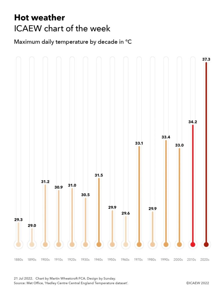
The chart this week is on the topic (or is that tropic?) of temperature, illustrating how hot weather has become hotter since the 1880s.

Column chart illustrating the maximum daily temperature by decade in ℃.

1880s: 29.3°C
1890s: 29.0°C
1900s: 31.2°C
1910s: 30.9°C
1920s: 31.0°C 
1930s: 30.5°C
1940s: 31.5°C
1950s: 29.9°C 
1960s: 29.6°C
1970s: 33.1°C
1980s: 29.9°C
1990s: 33.4°C
2000s: 33.0°C
2010s: 34.2°C
2020s: 37.3°C

Our chart this week is on hot weather, looking at how the maximum daily temperature in each decade has increased since the 1880s, according to the Met Office’s Hadley Centre Central England Temperature dataset. This is not from a single weather station, but averaged from several stations in order to be “representative of a roughly triangular area of the United Kingdom enclosed by Lancashire, London and Bristol”, according to the Met Office.

The Central England dataset reported a maximum temperature of 37.3% on 19 July, three degrees below the provisional highest temperature ever recorded in the UK of 40.3°C in Coningsby in Lincolnshire on the same day. However, as the chart illustrates, this was still substantially higher than the highest temperatures reported in each of the previous decades. 

Of course, the 2020s are far from over and there is a strong possibility that the peak in this decade will be even higher.

These were the maximum daily temperatures by decade in the Central England datasets:
1880s: 29.3°C (11 Aug 1884)
1890s: 29.0°C (18 Aug 1893)
1900s: 31.2°C (1 Sep 1906)
1910s: 30.9°C ( 9 Aug 1910)
1920s: 31.0°C (12 Jul 1923)
1930s: 30.5°C (27 Aug 1930)
1940s: 31.5°C (29 Jul 1948)
1950s: 29.9°C (6 Jun 1950)1
1960s: 29.6°C (29 Aug 1961)
1970s: 33.1°C (3 Jul 1976)
1980s: 29.9°C (28 Jul 1984)
1990s: 33.4°C (3 Aug 1990)
2000s: 33.0°C (19 Jul 2006)
2010s: 34.2°C (25 Jul 2019)
2020s: 37.3°C (19 Jul 2022)

This approach does not provide a full picture of climate change over the past 140 years, as we are just looking at the daily peaks of temperature in each decade. However, it does echo more scientifically-rigorous analysis of the climate that confirms that the planet is warming up, with even hotter temperatures expected in future decades if we don’t take action.

This chart was originally published on the ICAEW website.

ICAEW chart of the week: US dollar exchange rates

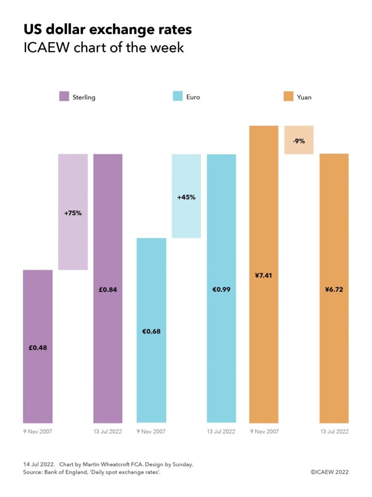
As the US dollar and euro approach parity, our chart illustrates how the US dollar has soared in value since the financial crisis compared with other major currencies apart from the Chinese yuan.

Step chart on US dollar exchange rates, showing the movements against sterling, the euro and the Chinese yuan between 9 Nov 2007 and 13 Jul 2022:

Sterling: £0.48:$1.00 +75% = £0.84:$1.00
Euro: €0.68:$1.00 +45% = €0.99:$1.00
Yuan: ¥7.41:$1.00 -9% = ¥6.72:$1.00

Source: Bank of England.

Our chart this week is on the topic of exchange rates, illustrating how the US dollar has appreciated by 75% and 45% against sterling and the euro respectively since the financial crisis, only to decline by 9% against the Chinese yuan over the same period.

On 9 November 2007, one US dollar was worth 48p as the pound peaked in value at an exchange rate of US$2.095:£1.00 according to the Bank of England’s exchange rate database. Since then the dollar has appreciated and sterling has fallen to an exchange rate of US$1.195:£1.00 at 13 July 2022, making one dollar worth 84p or 75% more today. This movement reflects a combination of much stronger economic growth in the USA over the last 15 years, higher interest rates, weaknesses in the UK economy, and the position of the US dollar as the world’s reserve currency that makes it an attractive safe haven for investors generally and even more in times of economic turmoil.

The dollar has also appreciated against the euro for similar reasons, albeit by only 45% over the same period. On 9 November 2007, one dollar was worth 68 euro cents when the exchange rate was US$1.468:€1.00, compared with the 99 euro cents it was worth on 13 July 2022 when the exchange rate was US$1.005:€1.00 – having briefly touched parity during the course of that day.

For the poor British traveller this means going to the US is substantially more expensive than it was 15 years ago, with a pound now worth just under a dollar and two dimes, compared with almost two dollars and a dime back then, a whole 90 cents less. The cost of travelling to the EU is also more expensive, with the pound worth €1.18 now compared with €1.43 in 2007, a fall of 17% in relative purchasing power.

All three currencies have depreciated against the Chinese yuan over the same period, as the Chinese economy has continued to grow to become the second largest in the world after the USA. The relative strength of the US economy has restricted the depreciation in the dollar to 9% from being worth ¥7.41 to ¥6.72 over 15 years. This contrasts with a fall of 38% in the value of the euro against the yuan from ¥10.88:€1.00 to ¥6.79:€1.00 and a 48% depreciation in sterling against the yuan from ¥15.52:£1.00 to ¥8.03:£1.00.

Exchange rates are volatile and can move significantly over the course of each minute, hour, day, week, month and year, so the numbers will keep changing. They also don’t reflect the full picture, as inflation, interest rates and economic conditions mean that the value of the dollar, pound, euro or yuan in your pocket will be worth more or less depending on what you want to use it for.

The strengthening of the US dollar over the last 15 years is one of the key elements of the global economic story that has seen the US economy come through the financial crisis and the pandemic in better shape than almost every other developed country. Many commentators believe that this is likely to continue in the near term, especially as Europe is much more directly affected by the Russian invasion of Ukraine.

However, as all professional financial advisers will tell you, past performance is no guide to the future – and your guess about how much one US dollar might be worth in the next fifteen years is likely to be as good as anyone’s.

This chart was originally published by ICAEW.