My chart this week looks at how receipts and spending vary by age, a key driver for public finances that new Chancellor Kwasi Kwarteng will need to factor into his fiscal plans.
Kwasi Kwarteng’s first Budget will be an emergency one, not only setting out his plans for the financial year commencing on 1 April 2023, but also re-opening the budget for the current financial year. It will be dominated by the emergency support package for individuals and businesses already announced, alongside starting to deliver on Prime Minister Liz Truss’s commitments to cut taxes and ‘shrink the state’.
The new Chancellor is likely to find that cutting public spending is not going to be easy given the increasing financial commitments made by successive governments since the Second World War on education, pensions, health and social care, the areas that now dominate public spending. He supported adding to those commitments only a couple of years ago when then Prime Minister Boris Johnson decided to expand eligibility for social care, and former Chancellor Rishi Sunak re-committed to the ‘triple-lock’ that guarantees increases in the state pension every year.
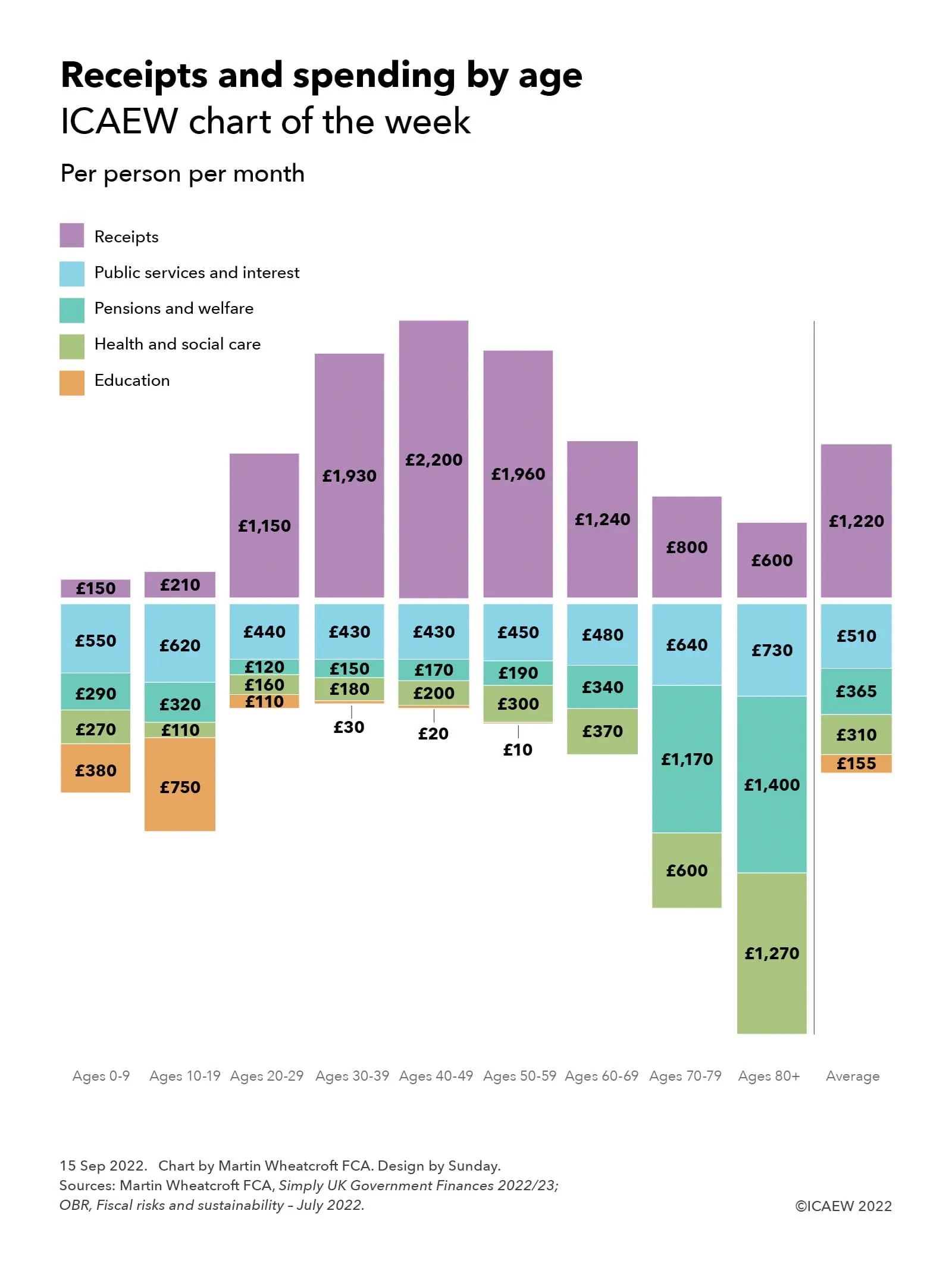
As our chart this week illustrates, receipts and spending vary significantly across age groups, with spending on education higher on the young, who pay very little in taxes, and spending on pensions, health and social care much higher for older generations who contribute less than the average, especially after reaching retirement age. This contrasts with the profile for those of working age who pay the most into the system while on average taking the least out.
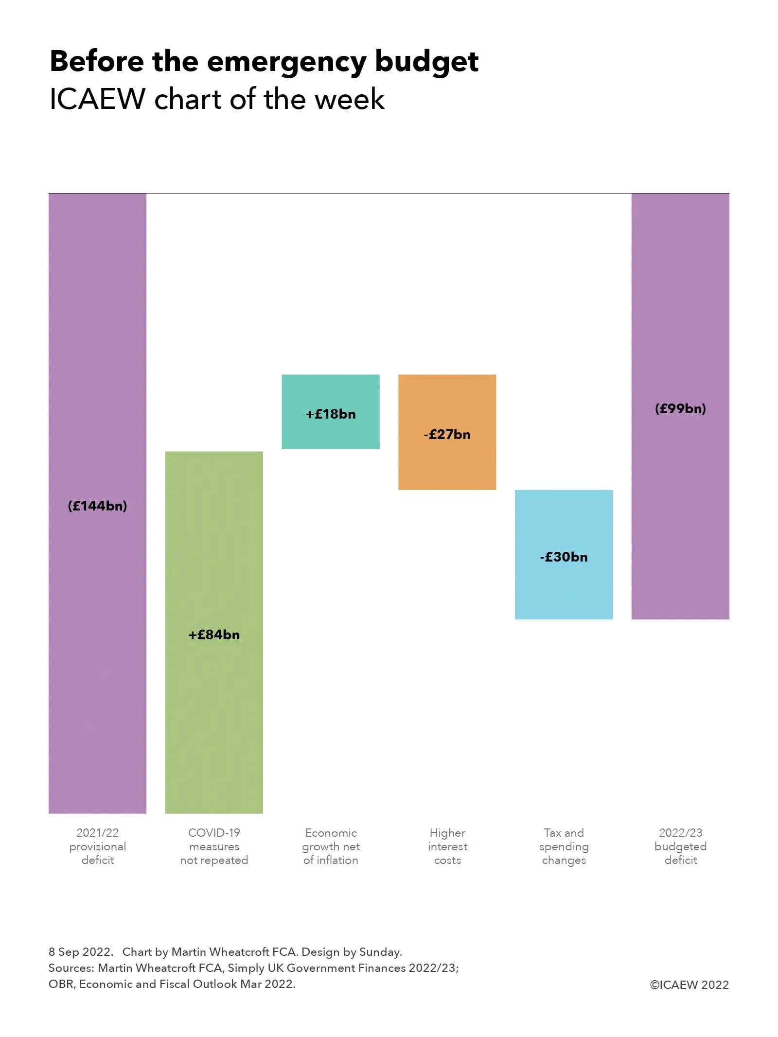
Derived from an analysis from the Office for Budget Responsibility’s fiscal risks and sustainability report published in July, the chart shows how – before the emergency Budget scheduled for 21 September – budgeted tax and other receipts for the current financial year 2022/23 are equivalent to £1,220 per person per month, based on forecast receipts of £988bn and a population of 67.5m. This is below budgeted public spending of £1,340 per person per month (£1,087bn/67.5m people/12 months), with the deficit of £120 per person per month (£99bn in total) funded by borrowing.
Average receipts per person per month by age group are estimated to be in the order of £150, £210, £1,150, £1,930, £2,200, £1,960, £1,240, £800 respectively for those aged 0-9, 10-19, 20-29, 30-39, 40-49, 50-59, 60-69, 70-79 and 80+ respectively. These numbers include £115 per person per month of non-tax receipts spread evenly across everyone.
Spending on public services and interest in the order of £510 per person per month, or £550, £620, £440, £430, £430, £450, £480, £640, £730 by age group, is less variable across age groups because it much of this spending is incurred on behalf of everyone, including £125 in interest, £73 on defence and security and £53 on policing, justice and safety for example.
Spending on pensions and welfare of £365 per person per month is less evenly spread, with £290 and £320 per month spent on those in their first two decades and £440, £430, £430 and £450 on those in their twenties, thirties, forties and fifties respectively. This increases to average spending per person per month of £480, £640 and £730 on those in their sixties, seventies and eighties or over.
Health and social care spending of £310 is biased towards older generations, with per person per month spending of £270, £110, £160, £180 and £200 for the first five decades of life contrasting with the £300, £370, £600 and £1,270 spent on average on those in their fifties, sixties, seventies and eighties or over.
As you would expect, education spending of £155 per person per month on average is mostly spent on the young, with around £380 per person per month spent on the under-10s, £750 spent on those between 10 and 19, £110 spent on those in their twenties, and £30, £20 and £10 respectively spent on those in their thirties, forties and fifties.
The reason this chart is so critical is because demographics are not in a steady state, with the ONS projecting that there will be an additional 3.3m pensioners in 20 years’ time, a 27% increase. This will have significant cost implications for this and future governments over a period when the working-age population – who pay most of the taxes to fund public spending – is projected to grow by just 4% in total.
While a declining birth rate might relieve some of the pressure on education spending over the next 20 years, spending on the state pension, the NHS and on social care will grow significantly if the commitments made by the current and previous governments to provide for income in retirement, universal free health care and an increasing level of social care provision are to be met, at the same time as running public services to the standard required.
Kwasi Kwarteng’s predecessors have been able to cover the expanding share of public spending going on pensions and health and social care without raising taxes above 40% of the economy by cutting spending on public services, in particular the defence budget, which has declined from in the order of 10% of GDP to around 2% over the last half century. However, with defence already at the NATO minimum, and many public services under significant pressure to improve delivery, there is much less scope to find savings than there has been in the past.
This poses a very big challenge for the Chancellor as he puts together his medium-term fiscal plans. Economic growth needs to be much higher than it has been in recent years, not only to cover the cost of tax cuts that he hopes will generate that growth, but also to generate the extra tax receipts needed to fund pensions and health and social care as more people live longer lives.