My chart this week is on the Chancellor’s tax and spending plans for the coming financial year commencing on 1 April 2023.

Chancellor Jeremy Hunt presented his first Budget to Parliament on Wednesday 15 March 2023, setting out his formal Budget estimate for the financial year ended 31 March 2024 (2023/24) accompanied by fiscal forecasts from the Office for Budget Responsibility (OBR) for the period up to 2027/28 and the OBR’s final estimate for the current financial year ending on 31 March 2023.
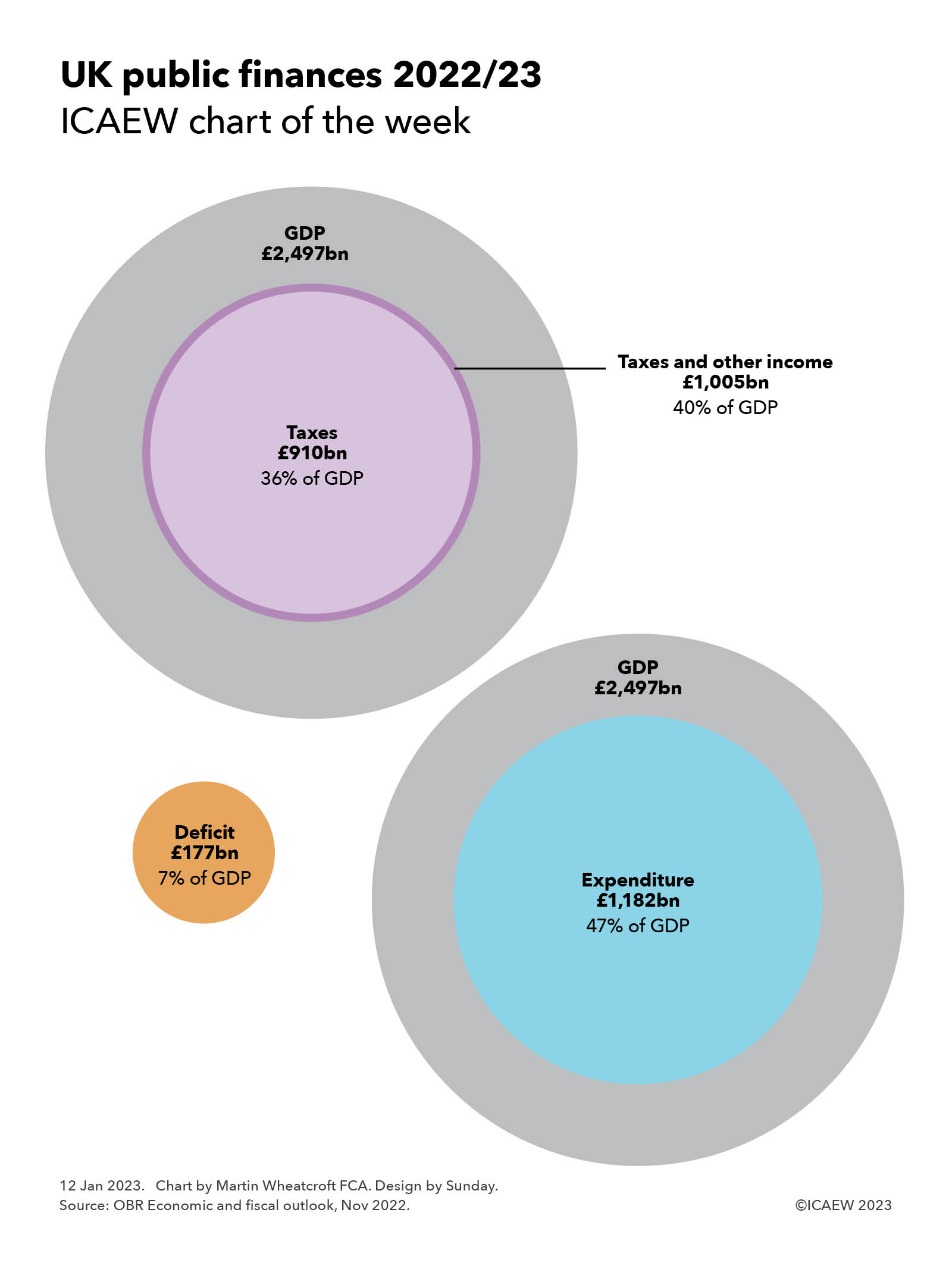
Our chart this week starts by summarising the final estimate for 2022/23, highlighting an expected shortfall of £152bn between anticipated receipts of £1,020bn and spending of £1,172bn. This is followed by a similar analysis for the budget year of 2023/24, with a deficit of £132bn resulting from a shortfall between estimated taxes and other receipts of £1,057bn and spending of £1,189bn.
Receipts in 2022/23 and 2023/34 respectively comprise £922bn and £950bn in tax and £98bn and £107bn in other receipts. The increase in tax of 3.0% is perhaps lower than might be expected given the level of inflation and the new higher rate of corporation tax from 1 April 2023, with an anticipated 10% growth in corporation tax receipts (net of full expensing of business investment) offset by flat or relatively small growth in other taxes. Other receipts are expected to increase by 9%, primarily the effect of higher interest rates on investments.
Total managed expenditure in 2022/23 and 2023/24 respectively comprise £968bn and £1,015bn in current expenditure excluding energy support costs and debt interest, £30bn and £5bn in energy support packages, £115bn and £95bn in debt interest, and £59bn and £74bn in net investment.
Current expenditure excluding energy support costs and debt interest is expected to increase by 4.9% in 2023/24 compared with 2022/23, more than the 2.5% ‘whole economy’ measure of inflation used by the government and the 4.1% forecast for consumer price inflation. This partly relates to inflation in the current financial year feeding through into next year’s budgets, as well as spending measures announced by the Chancellor.
The three-month extension of the energy price guarantee is anticipated to cost £3bn in 2023/24, with other energy support measures adding a further £2bn to the forecast.
Debt interest is expected to fall by 17% to £95bn, principally because of the effect of a much lower rate of inflation on index-linked debt more than offsetting higher interest rates overall.
Public sector net investment comprises gross investment of £116bn and £134bn in the two years respectively, net of depreciation of £57bn and £60bn respectively. The increase in gross investment is flattered by a £8bn one-off credit in the current financial year arising from changes to student loans, which if excluded implies an 8% increase in capital expenditure and other public investment overall. This reflects delays in capital programmes that are expected to come in significantly under budget in the current financial year but cost more in the next, relatively high construction price inflation, and an extra £2bn of capital investment allocated to defence.
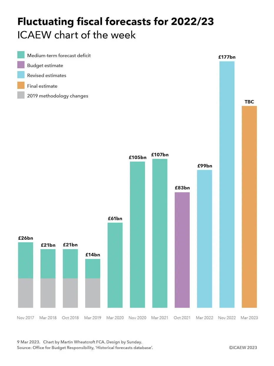
The final estimate for the deficit in the current financial year of £152bn is £25bn lower than was expected in the OBR’s November 2022 forecast of £177bn, while the Budget estimate for 2023/24 of £132bn is £8bn lower than the £140bn forecast last time. The reduction in 2022/23 reflects the benefit of a slightly improved economic outlook, with policy decisions for the last couple of weeks of the financial year by the Chancellor netting off to close to nil. This contrasts with 2023/24, where forecast upsides amounting to around £27bn have been mostly offset by a net cost of £19bn from tax and spending decisions.
Overall, the chart highlights just how much money the UK raises in tax and incurs in public spending. Tax and other receipts are expected to approach £1.1trn in the coming financial year, while public spending is anticipated to be just under £1.2trn.
On a per capita basis in 2023/24 this is equivalent to receipts and spending of approximately £1,290 per month and £1,450 per month for each person in the UK respectively, a shortfall of £160 per person per month that needs to be funded by borrowing.
The challenge for the Chancellor is that with the number of pensioners projected to increase by 9% over the next five years (with consequent implications for spending on pensions, welfare, health and social care), there is not much room to invest in public services or in infrastructure at the same time as also reducing taxes as he would very much like to do.
The Chancellor wasn’t able to square this circle in the Spring Budget 2023, so watch this space to see whether he can be any more successful in future fiscal events.