ICAEW chart of the week: pre-Spring Statement debt forecast

This week’s chart reviews the sharp increase in the national debt to GDP ratio as we reflect on the challenges facing Chancellor Rishi Sunak.
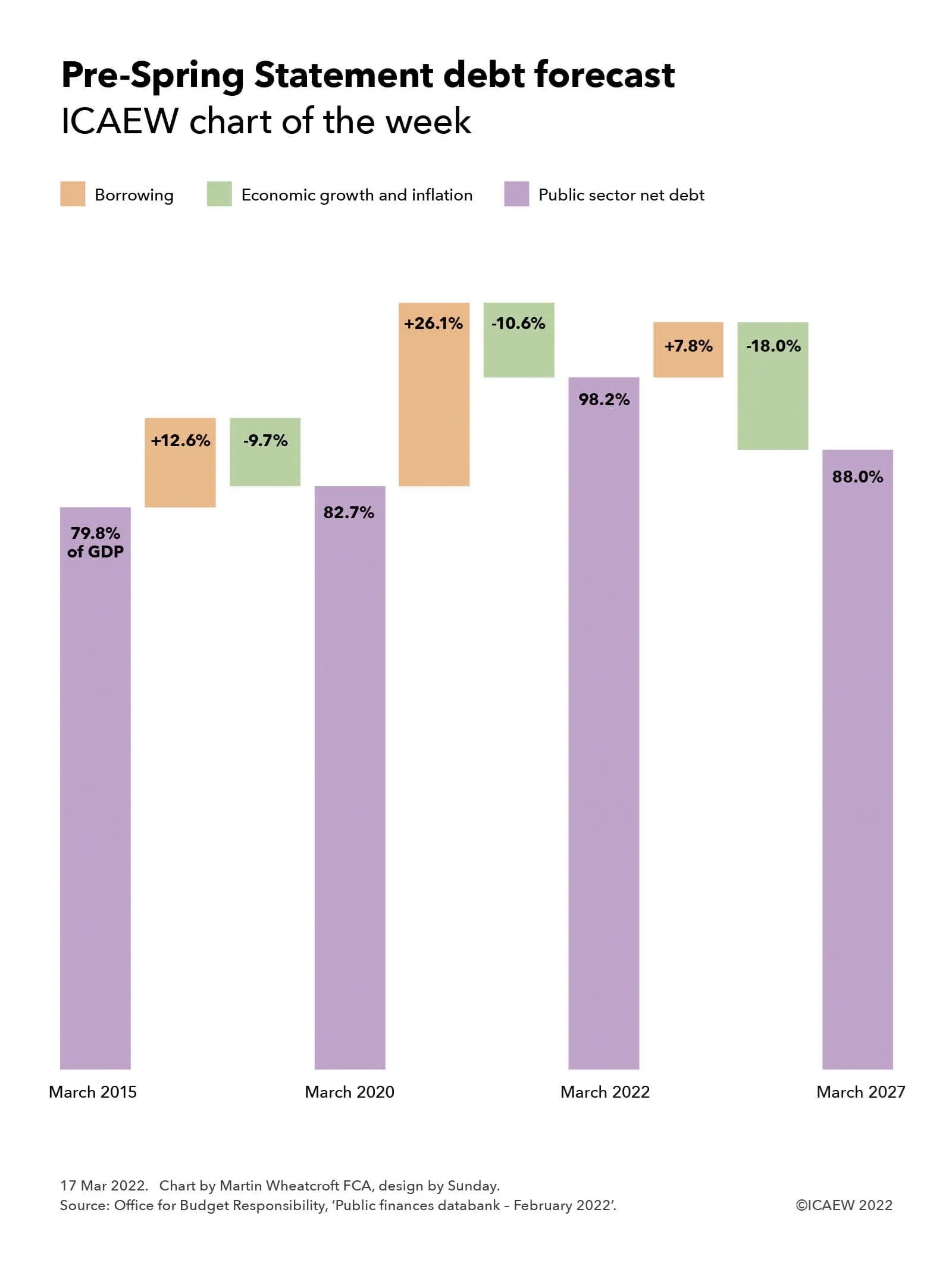
Step chart showing changes in the debt to GDP ratio.

March 2015: 79.8% +12.6% borrowing -9.7% economic growth and inflation = 82.7% in March 2020.

82.7% + 26.1% - 10.6% = 98.2% in March 2022

98.2% + 7.8% - 18.0% = 88.0% forecast for March 2027.

Better tax receipts and higher inflation are expected to contribute to an improvement in the fiscal forecasts that will accompany the Spring Statement on 23 March 2022, further increasing the pressure on the Chancellor to do more to support households and businesses facing spiralling energy prices and a cost-of-living crisis.

Our chart this week is based on the latest official forecast for public sector net debt prior to its update on 23 March 2022 at the Spring Statement. The chart highlights how it took five years for debt to increase from 79.8% to 82.7% as a share of GDP before leaping to a projected 98.2% over the two years to 31 March 2022 and then falling to a projected 88.0% at 31 March 2027.

The debt to GDP ratio is probably the most important key performance indicator used by most governments to assess their public finances, so much so that when ministers talk about reducing debt, they do not mean paying back the amounts owed to debt investors (unless they are in the German government). Instead, governments in most developed countries aim to borrow at a slower rate than the increase in the size of the economy, allowing the combination of economic growth and inflation to offset the often-significant sums of cash required to finance the shortfall between tax receipts and public spending.

This objective has been difficult to achieve over the past decade of low economic growth and low inflation, as illustrated by the increase in the UK’s debt to GDP ratio from 79.8% to 82.7% between 31 March 2015 and 2020. In cash terms, public sector net debt increased by £261bn from £1,532bn to £1,793bn over that five-year period, equivalent to 12.6% of a year’s GDP. The debt to GDP ratio only went up by 2.9 percentage points, with economic growth and inflation offsetting the increase in the amounts owed by the equivalent of 9.7% of GDP. (The objective would have been achieved but for a quirk in the choice of GDP measure used for this calculation by the Office for National Statistics in the UK, which is ‘mid-year GDP’; at 31 March 2020 this encompassed both the last six months of 2019/20 before the pandemic but also the first six months of 2020/21 and the lockdowns that occurred during that time, reversing some of the economic growth experienced in the preceding five years.)

The chart goes onto illustrate how the more than half a trillion pounds (£576bn or 26.1% of GDP) borrowed by the government in just two years over the course of the pandemic is partially offset by the economic recovery and a great deal more inflation, reducing the impact on the debt to GDP ratio by the equivalent of 10.6%.

Debt as a share of GDP over the next five years is then expected to decline, with a projected net addition of £198bn (7.8% of GDP) expected to be added to debt according to last October’s forecast. Projected public sector net debt of £2,567bn at 31 March 2027 is currently expected to be lower in proportion to the size of the economy at 88.0% of GDP, as the post-pandemic recovery and already forecast higher rates of inflation cause GDP to rise at a faster rate than the government can borrow, resulting in a reduction equivalent to 18.0% of GDP.

The official projections for the current financial year, prepared last October by the Office for Budget Responsibility (OBR), are expected to be revised upwards to incorporate the stronger tax receipts reported in recent monthly public sector finance reports and higher levels of GDP from even higher rates of inflation than previously expected. These effects are likely to combine to reduce the 98.2% of GDP forecast for debt for the end of March 2022 by several percentage points.

There is a much greater deal of uncertainty about how the OBR’s medium-term projections will deal with the potential future path of the pandemic, the cost-of-living squeeze on household incomes, and the effect of the war in Ukraine and sanctions on Russia on UK businesses. This is in addition to its normal difficulty in both measuring and forecasting the trillions of financial transactions that are undertaken every year in an economy of more than 67m people.

Many economic commentators expect stronger tax receipts and higher inflation to flow through to the projections for the next five years, even after taking account of the increased interest costs that come from higher rates of inflation and higher interest rates and the already announced package of support measures for households struggling with energy price rises. This should in theory result in a substantial improvement in the projected debt to GDP ratio in March 2027 from the 88.0% previously forecast, but what we won’t know until the Spring Statement is to what extent Chancellor Rishi Sunak intends to spend some of that improvement.

Mixed signals mean that it is difficult to tell to whether there will be an improvement to the support package to households facing large rises in their energy costs and the prices they pay for food and other essentials, whether the Chancellor will also choose to reduce fuel duties to help motorists, and how far he will opt to support businesses affected by substantially higher input costs in addition to the knock-on effects of the war in Ukraine and sanctions on Russia. Not to mention the political pressure on the Chancellor to announce increases in the defence budget now rather than waiting for the Autumn Budget.

For what was envisioned as a quiet fiscal occasion dealing with routine revisions to the fiscal forecasts, the Spring Statement has turned into a significant fiscal event. After all, even if the Chancellor decides to do nothing, that will still be a choice, with major implications for the public finances and the UK economy.

As the sage once said (or possibly didn’t), we live in fiscally interesting times.
This chart was originally published by ICAEW.

ICAEW chart of the week: NZ government balance sheet

Our chart this week delves into New Zealand’s public finances, one of the very few developed countries to have a government balance sheet with positive net assets.

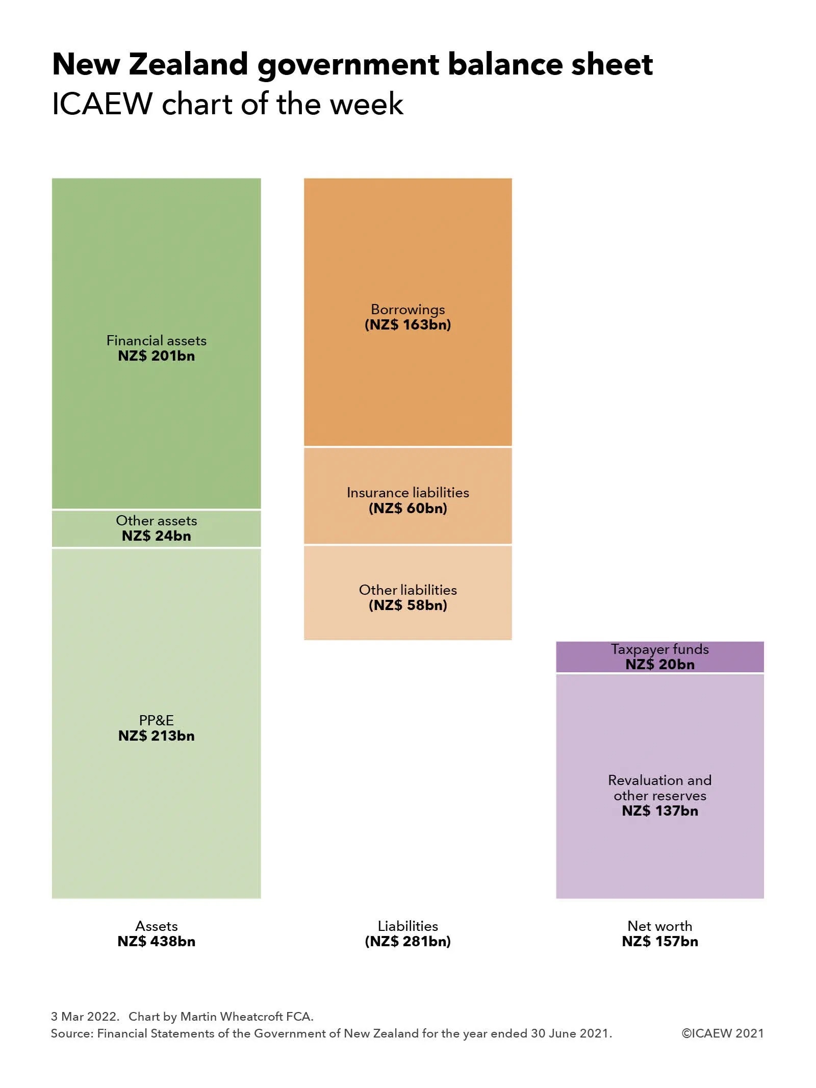
Step chart illustrating New Zealand government balance sheet.

Assets NZ$438bn = PP&E NZ$ 213bn + Other assets NZ$ 24bn + Financial assets NZ$ 201bn.

Liabilities NZ$ 281bn = Borrowings NZ$ 163bn + Insurance liabilities NZ$ 60bn + Other liabilities NZ$ 58bn.

Net worth NZ$ 157bn = Taxpayer funds NZ$ 20bn + Revaluation and other reserves NZ$ 137bn.

The signing of the UK-New Zealand Free Trade Agreement on 28 February 2022 prompted us to take a look at New Zealand’s public finances, one of the few developed countries with public assets in excess of public liabilities, and a pioneer of accruals accounting in government.

Our chart this week summarises the total crown balance sheet reported in the Financial Statements of the Government of New Zealand for the year ended 30 June 2021, comprising assets of NZ$438bn (£223bn) less liabilities of NZ$281bn (£143bn) to give net worth of NZ$157bn (£80bn).

New Zealand is a leading country in adopting accruals accounting for use in government, with the financial statements prepared in accordance with New Zealand-adopted accruals-based International Public Sector Accounting Standards (IPSAS), which are aligned with IFRS with some adaptation for the public sector. The New Zealand government not only uses IPSAS for financial accounting and reporting, similar to how the UK’s Whole of Government Accounts is based on IFRS, but they also use these standards for budgeting, management accounting and fiscal target setting. This contrasts with the UK, which uses a distinct UK-specific ‘resource’ accounting framework for budgeting and management accounting, and the statistics-based National Accounts system for fiscal target setting.

The asset side of the balance sheet includes NZ$213bn (£109bn) of property, plant and equipment, other non-financial assets of NZ$24bn (£12bn) and financial assets of NZ$201bn (£102bn). The latter includes marketable securities, student loans, residential loans and other financial investments in addition to receivables and cash.

Liabilities include NZ$163bn (£82bn) of borrowings, insurance liabilities of NZ$ 60bn (£31bn) and other liabilities of NZ$58bn (£30bn). Insurance liabilities are relatively high compared with many other countries as a consequence of New Zealand’s unique national no-fault accident compensation scheme that covers everyone in the country, including visitors.

Net worth is made up of taxpayer funds of NZ$20bn (£10bn) and reserves of NZ$137bn (£70bn), with the latter comprising a property revaluation reserve of NZ$134bn (£68bn) and minority interests of NZ$6bn (£3bn) less negative reserves of NZ$3bn (£1bn) principally relating to defined benefit retirement plans and veterans disability entitlements.

With a population of 5.1m, net worth on a per capita basis at 30 June 2021 is equivalent to approximately NZ$31,000 (£16,000) per person, comprising NZ$86,000 (£44,000) in assets per person less NZ$55,000 (£28,000) in liabilities per person. This compares with the approximate negative net worth of £37,000 per person based on the UK Whole of Government Accounts at 31 March 2019, comprising £31,000 in assets per person less £68,000 in liabilities per person.

While some caution needs to be taken in comparing these amounts given differences in accounting policies and the exclusion of local government from the New Zealand numbers, they do provide an insight into how on a proportional basis the New Zealand public sector is much better capitalised than the UK public sector.

While there are significant differences between the economies of New Zealand and the UK that no doubt explain the respective strengths and weaknesses of their public balance sheets, the presence of accountants in New Zealand’s highest office, most recently Sir John Key (prime minister 2008-2016), may also have something to do with it.

This chart was originally published by ICAEW.

ICAEW chart of the week: UK Armed Forces

Our chart of the week puts the spotlight on defence, illustrating how the UK’s regular forces have more than halved over the past 40 years. The big question is, are further reductions planned over the next few years still realistic in light of the invasion of Ukraine by Russia?

Filled area chart showing decline of the UK armed forces from 338,000 in 1981 to 149,280 in 2021.

Army - down 50% from 166,000 to 82,230 soldiers

Royal Navy (including Royal Marines) - down 54% from 74,300 to 33,850 sailors and marines

Royal Air Force - down 64% from 93,500 to 33,200 aviators.

The post-Cold War ‘peace dividend’ has been reflected in a decline in defence spending over the past 40 years, accompanied by fewer soldiers, aviators, sailors and marines, as illustrated by our chart of the week. This shows how regular force numbers have fallen from 338,800 on 1 April 1981 (comprising 166,000 in the Army, 74,300 in the Royal Navy, including the Royal Marines, and 93,500 in the Royal Air Force) to 149,280 on 1 April 2021 (comprising 82,230 soldiers, 33,850 sailors and marines and 33,200 aviators). 

There has been a small rise in numbers in the past couple of years as improvements to recruitment have helped bring the armed forces up to its planned complement.

The substantial falls in service personnel numbers since the 1980s have been accompanied by significant reductions in the numbers of tanks, ships and aircraft in operation – although technological and warfare developments mean that modern defence equipment is much more powerful than its predecessors. The two Queen Elizabeth-class aircraft carriers recently commissioned by the Royal Navy are a case in point.

The numbers in the chart exclude Army, Navy and Air Reserves of 37,420, Ghurkas of 4,010 and other military personnel of 8,170, at 1 April 2021. Also not included are civilians working for the Ministry of Defence or for the security services, who are also important parts of the UK’s national defence and security capability.

Last year’s Integrated Review of Security, Defence, Development and Foreign Policy included plans for greater investment in military equipment and cyber warfare, but it also set out further reductions in regular force numbers, with the Army expected to reduce to fewer than 75,000 by 2024.

Whether these plans will be revised in the context of a war in Europe remains to be seen, but it seems likely that the government will, at the very least, need to re-evaluate its plans. This may have implications for public finances as pressure will probably grow for spending on defence to increase from the £46bn – just under 2% of GDP – budgeted in the current financial year. 

However, as the pandemic has perhaps demonstrated, the costs of being inadequately prepared for future eventualities – both in lives and money – could end up being significantly greater in the long run.

This chart was originally published by ICAEW.

ICAEW chart of the week: Quarterly GDP per head

GDP statistics have become much more exciting, with low but steady growth in per capita GDP before the pandemic giving way to large swings as the economy adjusts to a major shock.

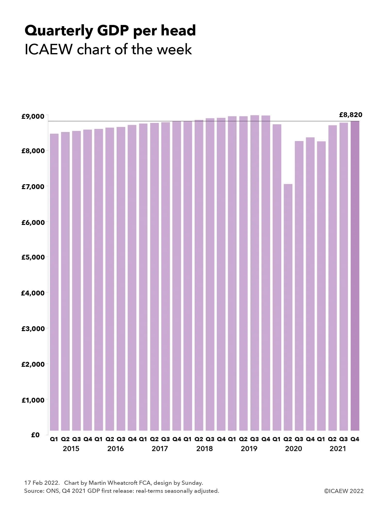
Column chart showing quarterly GDP per capita from Q1 2015 to Q4 2021 on a real-terms seasonally adjusted basis.

Showing steady growth each quarter to Q4 2109 before falling sharply in Q2 2020, recovering partway in Q3 2020 and more fully in Q2 2021 up to £8,820 in Q4 2021. This is about level with Q4 2017 and below Q1 2018 through Q4 2019.

GDP for the fourth quarter of 2021 was calculated to be £596bn by the ONS in its first estimate of this statistic measuring economic activity in the UK, bringing the provisional estimate for the full year to £2,318bn for the 2021 calendar year. On a per capita basis, this was equivalent to approximately £8,820 per person for the fourth quarter and £34,330 per person for the year.

The ICAEW chart of the week looks at how quarterly GDP has changed in real-terms over the past few years on a seasonally adjusted basis – demonstrating how boring GDP statistical releases were in the ‘before times’. Then, a relatively steady average per capita increase of approximately 0.3% each quarter reflected the low but steady level of economic growth that has been seen since the financial crisis. The arrival of the pandemic has seen all that change, with a collapse in GDP during the last half of 2020, followed by a stop-and-start recovery over the past few quarters, with provisional GDP estimate growing by 0.9% in the fourth quarter – faster than the pre-pandemic years, but slower than the revised 1.0% reported for Q3 and the 5.5% rise in Q2 of 2021.

The change in real-terms quarterly GDP per head in 2020 and 2021 illustrated by the chart were -2.7%, -19.5%, +17.4%, +1.3% and -1.3%, +5.5%, +1.0%, +0.9% respectively. It is, of course, always important to note that the statistics reported by the ONS are subject to frequent revision, especially when trying to count up the trillions of transactions entered into each quarter in a large and complex economy like the UK’s. The population estimates used for calculating per capita amounts are also likely to be revised, in particular once the results of the 2021 census are finalised in a few months’ time.

Despite the recovery in the last three quarters, GDP and GDP per capita remained below their peaks in the third quarter of 2019 and more significantly below the trend the economy was on.

With rapidly rising inflation, supply chain disruptions and uncertainty regarding how society will transition from a coronavirus pandemic to an endemic, the likelihood is that quarterly GDP releases are likely to continue to be observed with some excitement by economists (and the rest of us) for some time to come.

This chart was originally published by ICAEW.

ICAEW chart of the week: National Insurance Fund 2020-21

We take a look at the Great Britain National Insurance Fund, illustrating how the balance in the fund grew from the equivalent of 4.2 months of annual payments to 4.6 months over the course of 2020-21.

Step chart showing movements in the Great Britain National Insurance Fund in 20201/21.

Opening balance £37bn (4.2 months of payments) + receipts £140bn - NHS £26bn - payments £109bn = closing balance £42bn (4.6 months of payments).

One of the many myths about the UK’s public finances is around the use of the word ‘fund’. This is often assumed to imply there is a pot of money set aside to cover spending requirements, when in practice it tends to refer to a budget allocation. An example is the National Productivity Investment Fund that was announced in 2016, which turned out to refer to unallocated amounts within the government’s budget for capital expenditure over several years.

Despite this terminology there are some actual ‘funds’ that have a legal basis and which have money in them, such the Contingencies Fund, where cash of £425bn passed through its accounts in response to the pandemic last year (up from £17bn in the previous year). However, net assets remained unchanged by this tidal wave of money at just £2m, highlighting how many such funds are principally mechanisms to facilitate the flow of money around government on the way to its intended destination.

The Great Britain National Insurance Fund and the Northern Ireland National Insurance Fund are perhaps the most well known of these funds, being the source of payments for the state pension and contributory welfare benefits. Surprisingly, there is a balance in these funds, which caused some excitement in a House of Lords debate last year when a peer decided that this was a pot of money that could be used to fund more spending.

Before getting too excited, it is important to understand that although the £42bn in the Great Britain National Insurance Fund sounds like a large amount of money, the reality is that it is more akin to a float, representing less than five months’ worth of annual payments from the fund and a relatively small fraction of the trillions of pounds in future payments expected to be paid out of the fund over the next quarter of a century and beyond. Likewise for the £1bn in the Northern Ireland National Insurance Fund.

In addition, when you delve into the accounts, you discover that most of the balances are invested in HM Treasury’s Debt Management Account, which are in effect intercompany balances (or ‘intra-government’ to be more technically accurate).

As our chart illustrates, the Great Britain National Insurance Fund had a balance of £37bn on 1 April 2020, equivalent to about 4.2 months of expenditure in the 2019/20 financial year. National Insurance receipts in Great Britain (ie, not including Northern Ireland) amounted to £140bn during 2020/21, including £3bn from other tax receipts to make up for contributions not received for those on statutory maternity, paternity, parental or bereavement pay.

Some £26bn of the national insurance contributions was deducted and sent off to help pay for the NHS, reducing the amount added to the fund to £114bn, while payments from the fund during the year amounted to £109bn. The latter comprised £100.4bn for the state pension, £5.2bn to cover contributory welfare benefits (employment and support allowance and jobseeker’s allowance), £0.9bn in administration costs, £0.8bn in bereavement and maternity allowances, £0.7bn in transfers to the Northern Ireland equivalent fund, £0.5bn in redundancy payments and £0.2bn in other payments.

The £5bn or so of surplus was added to the balance of the fund, taking it to £42bn at 31 March 2021, equivalent to 4.6 months of annual payments.

To be fair to the noble lord concerned, it might well be possible to use some of the money in the fund by reducing the effective float balance by a month or two, at least on a one-off basis. However, in the context of public spending in excess of £1.2tn a year and public sector net debt of £2.3tn, it is not likely to go that far!

This chart was originally published by ICAEW.

ICAEW chart of the week: UK government major projects portfolio

Our chart this week is based on the Institute for Government’s recently published Whitehall Monitor 2022, illustrating how the government has already started on many of the major projects that form part of the Levelling Up White Paper.

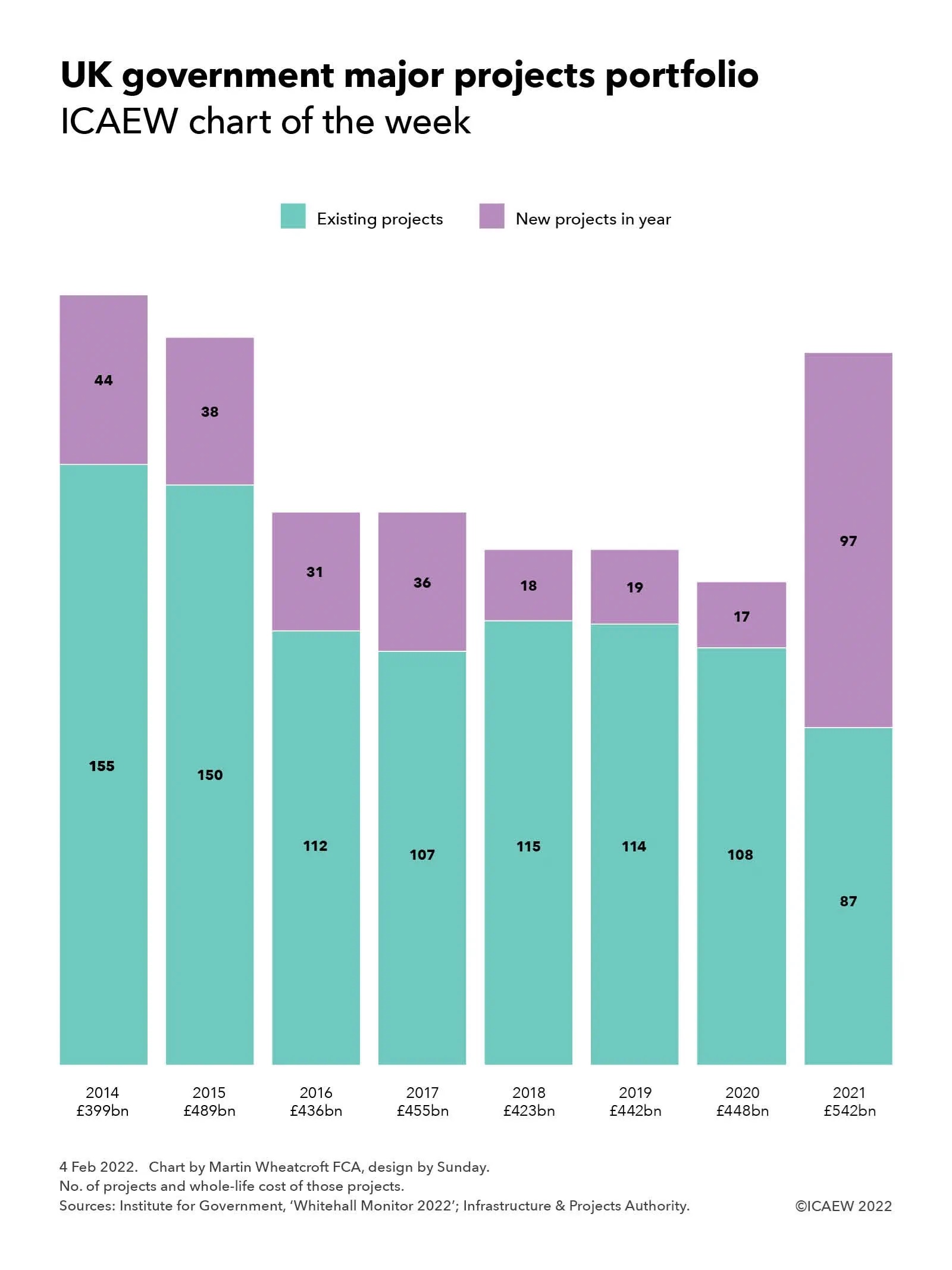
Column chart showing numbers of major projects together with the whole-life cost of those projects

2014: 158 existing projects + 44 new projects (£399bn)
2015: 150 existing + 38 new (£489bn)
2016: 112 existing + 21 new (£436bn)
2017: 107 existing + 36 new (£455bn)
2018: 115 existing + 18 new (£423bn)
2019: 114 existing + 19 new (£442bn)
2020: 108 existing + 17 new (£448bn)
2021: 87 existing + 97 new (£542bn)

On 31 January 2022, the Institute for Government (IfG) published its latest annual Whitehall Monitor, an authoritative compendium of analysis about the functions and effectiveness of central government that makes for compelling reading and contains some great charts to bring to life what would otherwise be pretty dry content.

Our chart this week draws on a couple of the IfG’s charts from pages 60 and 61 in the 2022 edition that take a look at the activities of the Infrastructure and Projects Authority (IPA). One of the IPA’s key roles is to support central government departments with their most expensive and complex projects. As the chart highlights, there was a sizeable jump in 2021 with 97 new projects added to the 87 existing projects brought forward from previous years, bringing the estimated whole-life cost of the projects being supported by the IPA to £542bn, up from £448bn in 2020.

According to the IfG, the major projects portfolio includes infrastructure developments such as the creation of a Midlands Rail Hub, large-scale programmes to improve public services such as the recruitment of 20,000 police officers by 2023, and military projects such as building a new medium-lift helicopter. This is the largest number of new items added to the portfolio in a single year since the publication of the IPA’s first annual report in 2013, with many of the projects now branded as part of the Levelling Up agenda. For comparison, fewer than 20 projects were added to the portfolio each year between 2018 and 2020. The government is currently managing 184 major projects – about 1.5 times as many as it did the year before and the portfolio is now at its largest size since 2015.

From a conventional perspective it may seem strange that the government started many of the projects in its just published Levelling Up White Paper as much as a year before setting out the plan that they form part of, but in practice the main components, such as new investment in transport infrastructure outside London and the South East, have been known for some time – as has the additional capital expenditure funding that has been provided to departmental budgets. What is new is the insight into the metrics that the government intends to use to assess the effectiveness of its levelling up plans by 2030, with 12 key objectives to be achieved.

However, as discussed in ICAEW’s Autumn Budget and Spring Budget coverage last year, much tighter budget settlements for day-to-day spending mean that departments could struggle to deliver major projects successfully given all the other pressures they are under as well as rapidly rising input costs, with the IfG commenting that: “Ministers should be careful to maintain enough administrative resources in their departments to help officials undertake these projects well, on time and to budget.”

The chart illustrates how following the IPA’s inception in 2013, there were 155 existing projects carried forward into 2014 and 44 new projects that year, a total of 199 with a whole-life cost of £399bn. This was followed by 188 projects in 2015 (150 existing and 38 new) of £489bn, 143 in 2016 (112 + 31) of £436bn, 143 in 2017 (107 + 36) of £455bn, 133 in 2018 (115 + 18) of £423bn, 133 in 2019 (114 + 19) of £442bn, 125 in 2022 (108 + 17) of £448bn and 184 projects in 2021 (87 existing + 97 new) with a whole-life cost of £542bn.

The IfG says: “Major reform is needed for government to respond to crises like the pandemic while simultaneously delivering long-term policy goals. Whitehall Monitor 2022 reveals how the government has been handling the Covid crisis while at the same time trying to make progress on priorities such as levelling up and hitting net zero. New employment support schemes and the vaccination programme were delivered rapidly, but progress on pre-pandemic priorities was limited.”

The report also warns that without fundamental reform – such as clarifying ministerial and civil service accountability, better data, improving transparency and ensuring a targeted workforce plan underpins its goal of up to 55,000 civil service job cuts by 2025 – government will continue being knocked off course when faced with shocks to the system. The IfG concludes that whatever happens as a result of the prime minister’s current troubles, with a looming cost-of-living crisis, ongoing COVID-19 challenges, and crunch Brexit deadlines and decisions ahead, 2022 will bring further strain.

The Levelling Up White Paper sets out some big aspirations, but the jury is still out as to whether they can be delivered.

This chart was originally published by ICAEW.

ICAEW chart of the week: UK quarterly public finances

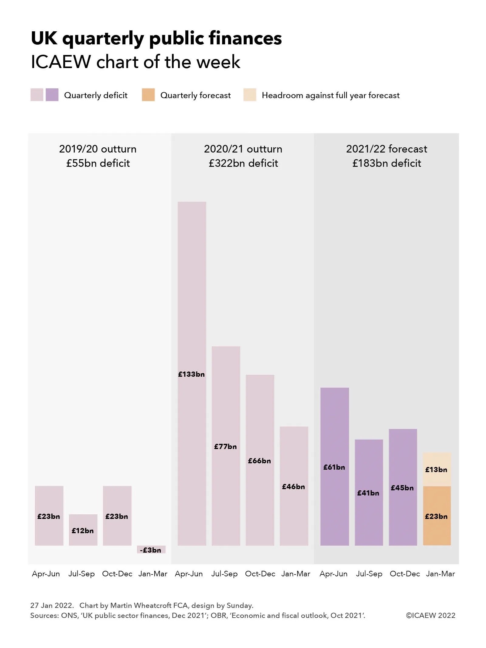
Our chart this week looks at the fiscal forecast for the final quarter of the government’s financial year ending in March 2022.

Column chart showing quarterly deficits:

2019/20 outturn £55bn deficit: Apr-Jun £23bn, Jul-Sep £12bn, Oct-Dec £23bn, Jan-Mar -£3bn

2020/21 outturn £322bn deficit: Apr-Jun £133bn, Jul-Sep £77bn, Oct-Dec £66bn, Jan-Mar £46bn

2021/22 forecast £183bn deficit: Apr-Jun £61bn, Jul-Sep £41bn, Oct-Dec £45bn, Jan-Mar £23bn, with £13bn headroom

The December 2021 public sector finances published by the Office for National Statistics (ONS) on Tuesday 25 January provided numbers for the first three quarters of the current financial year. As our chart this week illustrates, this leaves the final quarter still to go, with £13bn of headroom against the official forecast prepared by the Office for Budget Responsibility (OBR) at the time of the Autumn Budget and Spending Review 2021 back in October.

To put the current fiscal year into context, our chart shows how the deficit of £55bn in 2019/20 comprised quarterly deficits of £23bn for April to June 2019, £12bn for July to September 2019 and £23bn for October to December 2019 less a surplus of £3bn for January to March 2020. Although there was some impact from the pandemic on the last month of that financial year, it broadly provides an indication of a ‘normal’ pattern of deficits across the year, with the second quarter and more especially the fourth quarter benefiting from self assessment tax receipts – the latter despite typically higher levels of capital expenditure in the run up to the end of the financial year.

This was followed by the first full year of the pandemic and associated lockdowns which saw tax receipts fall significantly and expenditures rise dramatically, resulting in an unprecedented peacetime deficit of £322bn in 2020/21, comprising £133bn, £77bn, £66bn and £46bn for the four quarters respectively.

The current forecast is also on course for a pretty eye-watering deficit, which despite being substantially below that seen last year is forecast to be as much as £183bn. The provisional numbers for the first three quarters of 2021/22 of £61bn, £41bn and £45bn respectively are currently £13bn below the October forecast, implying an equivalent amount of headroom for the final quarter, assuming the OBR’s forecast deficit of £23bn for the fourth quarter proves to be accurate.

In practice, it would be surprising if the fourth quarter did come in on target other than by coincidence. Better than expected tax revenues are expected to continue to reduce the deficit over the final quarter but this is likely to be offset to a greater or lesser extent by higher interest costs on index-linked debt driven by rising inflation. There are also significant uncertainties around expenditures given the continuation of pandemic restrictions into January and the potential for further interventions to support businesses and individuals struggling financially as a consequence.

There have been suggestions that this headroom of £13bn is a ‘windfall’ that the Chancellor should use to support households expected to be hit by a greater than 50% rise in energy prices from April 2022 as discussed in last week’s chart of the week.

However, this perspective has also been contradicted by Carl Emmerson, Deputy Director at the Institute for Fiscal Studies (IFS), who is reported to have commented: “While borrowing last month was in line with the Budget forecast, over the first nine months of 2021/22 it is now £13bn below that forecast for the same period in the October Budget – £147bn instead of the £160bn expected in October. The latest improvement to borrowing over this period has been driven by higher-than-expected corporation tax being paid by some very large companies.

“Some have suggested better borrowing figures provide the Chancellor room to act on the cost of living by, for example, delaying the rise in National Insurance contributions planned for April. The truth is these figures make no difference to that calculation. Mr Sunak certainly could find money to delay tax rises or find other one-off ways of supporting living standards such as uprating benefits in April with a more up-to-date measure of inflation. But the long-run pressures on public services, especially health and social care, remain just the same and tax rises are likely to be needed if these are to be met. If he acts now on the cost of living, Mr Sunak will also need to find a credible means of committing to taking tough action on the public finances in the not too distant future.”

Even if the deficit does come in below the official forecast of £183bn, it will still be at a much higher level than that expected before the pandemic, when the forecast deficits for 2019/20, 2020/21 and 2021/22 were £47bn, £55bn and £67bn respectively compared with the much larger numbers reported in our chart. A variance of £13bn is also relatively small in the context of the £547bn increase in public sector net debt between March 2020 and December 2021.

All this suggests that the next fiscal event scheduled for 23 March 2022 is likely to take on even more importance as the Chancellor seeks to navigate between the rock of fiscal responsibility and a hard place of a cost of living crisis.

This chart was originally published by ICAEW.

ICAEW chart of the week: UK international trade

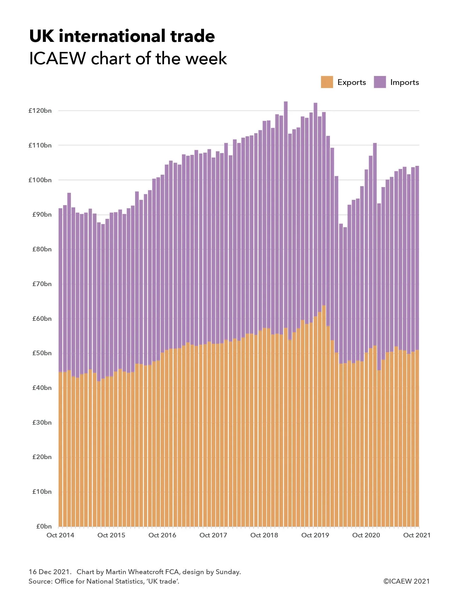
As 2021 draws to a close, our chart this week looks back on a rocky couple of years for UK international trade which has endured Brexit complications and the global COVID-19 pandemic.

A column chart showing monthly exports (in orange) and imports (in purple) stacked on top of each other, going from October 2014 to October 2021. The y-axis goes from £0bn to just over £120bn.

Total exports + imports increased from £92bn  in October 2014 to a peak of £123bn in March 2019, fell £113bn the following month before peaking again at £122bn in October 2019. 

Trade fell to a low of £86bn in May 2020, recovered to £111bn in December 2020, fell to £93bn in January 2020 and grew to £104bn in July 2021 with similar monthly totals in September and October 2021.

Our chart of the week illustrates how Brexit and COVID-19 have combined to create a rocky couple of years for UK exports and imports of goods and services, reflecting the trials and tribulations of the Brexit process as well as the impact of the coronavirus pandemic on trade since the first lockdown last year.

The monthly trade total (exports + imports) increased from £92bn (£45bn + £47bn) in October 2014 to a peak of £123bn (£57bn + £65bn) in March 2019 at the height of Brexit ‘no deal’ preparations before falling back to £113bn (£54bn + £59bn) the following month before peaking again at £122bn (£61bn + £62bn) in October 2020 ahead of the end of the transition period. Following the introduction of new trading arrangements and the run-down of inventories, trade fell to a low of £86bn (£47bn + £39bn) in May 2020 during the first lockdown before recovering to £111bn (£52bn + £59bn) in December 2020. Trade fell back to £93bn (£45bn + £48bn) in January 2020 before growing back to £104bn (£51bn + £53bn) in July 2021 where it has appeared to stabilise with similar monthly totals in September and October 2021.

The chart provides only a hint of the challenges that have faced both importers and exporters over the past couple of years as they have had to navigate new trading arrangements with our European neighbours just as the pandemic has caused massive disruption across the planet. Imports and exports to EU countries have both fallen, but the EU still remains the UK’s principal trading partner, comprising almost half of the UK’s trade in goods for example.

The stabilisation in trade flows in the last few months for which statistics are available may be a hopeful sign, but with greater customs checks on the imports of goods from the UK coming into force in January, and the continuing evolution of the pandemic, the position is still very uncertain.

This is our last chart of the week for 2021 and so we would like to take this opportunity to wish you all the best for a safe and enjoyable Christmas break and for a healthy and prosperous 2022. We look forward to seeing you again in the new year.

This chart was originally published by ICAEW.

ICAEW chart of the week: Bounce Back Loans

My chart this week is on Bounce Back Loans, one of the principal sources of financial support for businesses during the first year of the pandemic and the subject of a recent investigation by the National Audit Office.

Chart analysing Bounce Back Loans of £47bn by region and by recoverability.

London £11bn, South £10bn, Midlands & East £11bn, North £9bn, Scotland, Wales & Northern Ireland £6bn.

Repaid £2bn, recoverable £28bn, bad debts £12bn, fraud £5bn.

The recent publication of the Department for Business, Energy & Industrial Strategy (BEIS) accounts for 2020-21 contained an assessment of the losses expected on the financial provided to businesses through the Bounce Back Loan Scheme (BBLS), the Coronavirus Business Interruption Loan Scheme (CBILS), the Coronavirus Large Business Interruption Loan Scheme (CLBILS) and the Future Fund. This was followed by an updated report from the National Audit Office (NAO) on the administration of the scheme and the potential losses to the taxpayers.

The largest of these schemes was BBLS, with Bounce Back Loans of up to £50,000 provided to eligible businesses to help them weather the first lockdown in the second quarter of 2020, before being extended to the whole of the 2020-21 financial year. In the end, around a quarter of businesses took out a Bounce Back Loan, comprising 1.5m loans for a total of £47bn at an interest rate of 2.5% repayable over six years. The interest in the first year was covered by the government, with no repayments due in that period. 

Businesses can extend the loans to ten years through the Pay As Your Grow option, as well as being allowed up to one six month payment holiday and three interest-only payments to provide flexibility without going into default.

The seven main UK banks provided around 90% of the loans by value, with the rest provided by other banks and non-bank lenders, such as peer-to-peer lenders. Each participating financial institution was provided with a 100% guarantee by the government to cover any amounts not repaid. Half a million or nearly 35% of the loans were for the maximum amount of £50,000 (adding up to £27bn) with £18bn lent out between £10,000 and £50,000 and £2bn lent for amounts between £2,000 (the minimum possible) and £10,000.

As the chart illustrates, the geographical distribution of loans was weighted towards the south and centre of England, with £11bn borrowed by businesses in London, £10bn in the South (£6.5bn South East and £3.6bn South West) and £11bn in the Midlands & East (£3.8bn West Midlands, £2.9bn East Midlands and £4.5bn East of England), a total of £32bn. The balance of £15bn was split between £9bn in the North (£3.2bn Yorkshire & the Humber, £4.8bn North West and £1.3bn North East) and £6bn in the other nations of the UK (£2.7bn Scotland, £1.6bn Wales and £1.3bn Northern Ireland).

More than 90% of the loans, amounting to £40bn, went to micro-businesses, ie businesses with turnover below £632,000.

BEIS have estimated in their 2020-21 financial statements that they do not expect 37% of the loans with a value of £17bn to be repaid, comprising £12bn in estimated bad debts and £5bn in estimated losses from fraud, although the NAO says that these numbers are highly uncertain at this stage. With £2bn already repaid, this leaves £28bn believed to be recoverable over the remainder of the six years of the loans (or 10 years for those that are extended).

The fraud estimate, for 11% of the loans with a value of £4.9bn, was based on a sample of 1,067 loans as at 31 March 2021, but a subsequent analysis in October 2021 suggests that the level of fraud may be lower at around 7.5% of loans and so there is some hope that BEIS and the British Business Bank will be able to reduce the amount they will have to reimburse to participating banks under the 100% guarantees.

However, as the NAO reports, these guarantees mean participating banks have no financial incentive to chase repayment and it has raised concerns that insufficient resources are being dedicated by BEIS and the British Business Bank to recovering outstanding amounts. 

The challenge for government is that many businesses have not been able to get back to their pre-pandemic level of operation and so there is a need to be sensitive, whilst at the same time seeking to protect public money and tackle those who made fraudulent claims.

This chart was originally published by ICAEW.

ICAEW chart of the week: Spending Review 2021

Chancellor of the Exchequer Rishi Sunak found some extra money to supplement the Spending Review 2021, turning a very tough settlement for government departments into a moderately tough one.

Departmental budgets chart.

2019-20: £416bn (£346bn resource, £70bn capital)
2020-21: £570bn (£355bn, £88bn, £127bn covid-19 supplementary budget)
2021-22: £554bn (£385bn, £99bn, £70bn)

Spending Review 2021

2022-23: £542bn (£435bn resource with +£15bn health & social care and +£27bn spending review, £107bn capital)
2023-24: £554bn (£443bn with +£12bn and +£21bn, £111bn)
2024-25: £566bn (£454bn with +£14bn and +£13bn, £112bn)

The Chancellor had already announced an increase in the health budget from the proceeds of the health and social care levy, but as highlighted by our chart last week, this implied a very tough budget settlement for most other departments, including cuts for some. Instead, Rishi Sunak was able to use some of the upward revisions in the economic forecasts from the Office for Budget Responsibility to add to departmental resource budgets, ensuring that each department receives a real term spending increase in their combined resource and capital budgets even with higher levels of inflation in the coming year.

However, there was a sting in the tail, as supplementary COVID-19 funding ceases at the end of this financial year, leaving departments to absorb further COVID-related expenditure within their budgets from next April onwards. This will include catching up on backlogs built up during the pandemic in addition to any incremental costs that may continue into the Spending Review period.

The chart starts by highlighting how departmental resource and capital budgets of £346bn and £70bn in 2019-20, increased to £355bn and £88bn in 2020-21 and to £385bn and £99bn in the current year. This is before £127bn in COVID-19 supplementary budgets last year and £70bn this year.

The Spending Review period itself covers the three financial years 2022-23, 2023-24 and 2024-25, with the combination of funding from the health and social care levy and the Spending Review seeing departmental resource budgets increase to £435bn, £443bn and £454bn respectively. This is more than the spending envelope originally set out by the Chancellor last month.

Capital investment budgets remained broadly unchanged at £107bn, £111bn and £112bn respectively, continuing the significant jump from the £70bn invested in 2019-20 in the coming financial year before flattening out in the following two years.

Over the three years, the resource budget settlement implies annualised average real terms growth in the health & social care budget of 4.1% and in the education budget of 2.2%, while the defence budget is broadly frozen in cash terms and cut by 1.4% in real terms. This assumes average inflation over the three years of 2.2%, with higher inflation in the coming financial year offset by much lower rates in the following two years.

Other departments are expected to grow by 3.1% on average over the period, with central funding for local government up 9.4%, transport up 6.8%, work & pensions up 4.6% and justice up 4.1%, each receiving larger relative settlements than other departments. International trade (+0.1%), HM Treasury (+0.9%), levelling up, housing & communities (+1.1%), HMRC (+1.2%), the Cabinet Office (+1.4%), business, energy & industrial strategy (+1.4%), and intelligence (+1.7%) are the departments receiving increases below 2% a year on average.


2021-22
£bn

2022-23
£bn

2023-24
£bn

2023-24
£bn
Average
real-terms
growth
Education147.1167.9173.4177.4+4.1%
Defence70.777.079.080.6+2.2%
Transport31.532.432.232.2-1.4%
Large departments249.3277.3284.6290.2+2.9%
Other departments70.783.982.782.7+3.1%
Devolved administrations56.863.064.365.3+2.5%
ODA to 0.7% of GDP5.2
Reserves8.111.010.910.3
Total excluding covid-19384.9435.2442.5453.7+3.3%
HM Treasury, ‘Autumn Budget and Spending Review 2021’

The above growth rates exclude capital budgets, expected to increase in real terms by 1.9% a year on average over the three years of the Spending Review. Departments benefiting from higher capital budgets include small and independent bodies (+16.8%), FCDO (+16.0%), digital, culture, media & sport (+11.8%), and intelligence (+9.1%), albeit mostly from relatively small bases in each case. The 3.8% average real terms increase in health & social care capital investment is much less proportionately, but much larger in cash terms.

Perhaps just as important as the monetary amounts provided to departments as the Chancellor opened his proverbial cheque book, is the certainty that a three-year budgetary settlement provides. This will help departments plan ahead with confidence and hopefully help them obtain better value for the money they spend on our behalf.

This chart was originally published by ICAEW.