Our chart this week follows the news that China’s population has peaked at just over 1.4bn, illustrating the dramatic change that has taken place over the last 40 years.
The news that China’s population has peaked and is starting to fall prompted us to take a look at how the country with the largest population in the world has changed over the last 40 years.
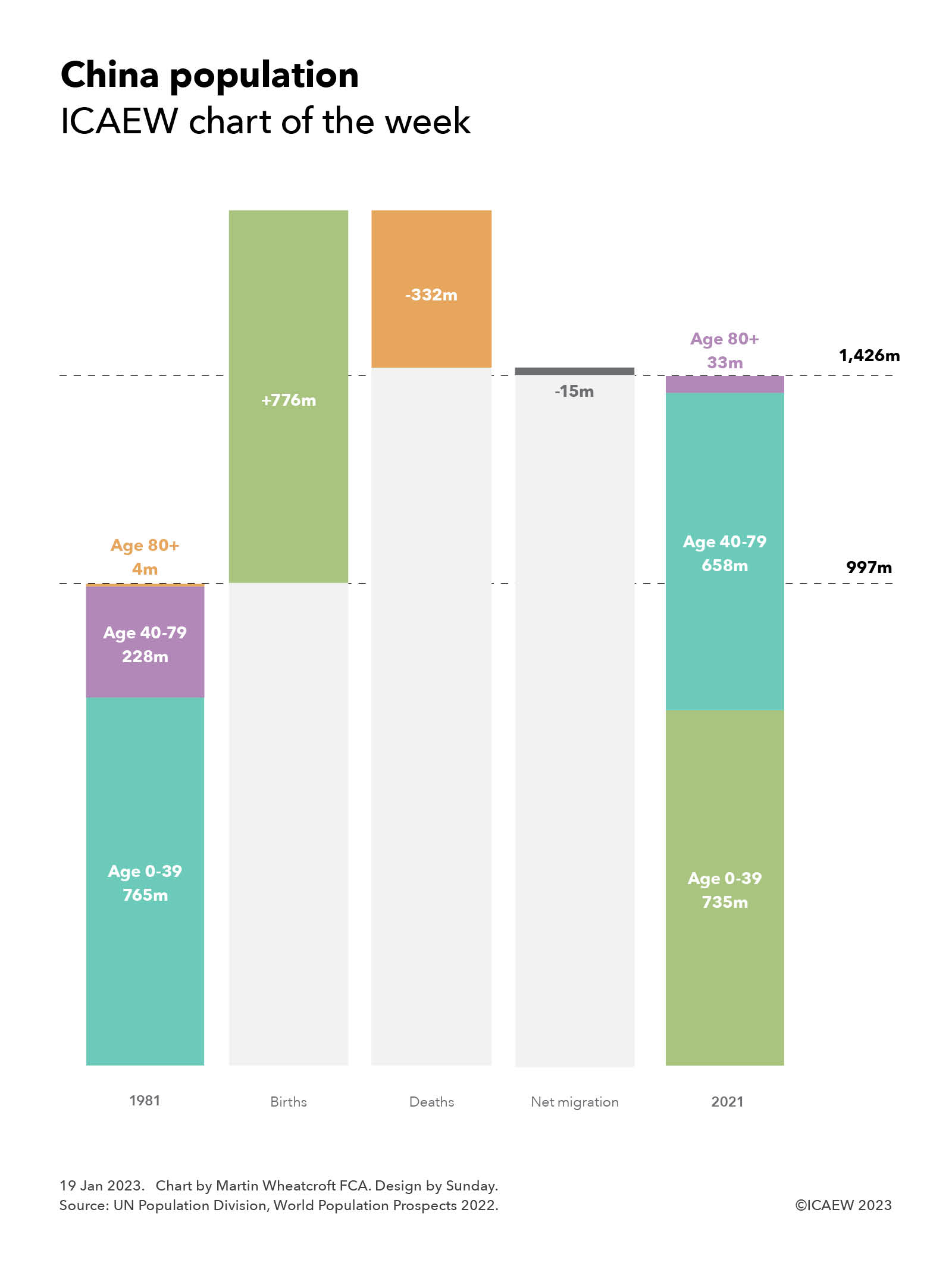
In 1981, two years after the introduction of the one-child policy, China was a young country, with a population of 997m and a median age of 21. Today it is a mature country, with a population of 1,426m and a median age of 38, approaching that of many western countries.
Our chart shows how that population has changed according to the United Nations Population Division. In July 1981, China was estimated to amount to 997m, comprising 765m under the age 40, 228m between the ages of 40 and 79, and 4m aged 80 or over. Since then, there have been 776m births, 332m deaths and net outward migration of 15m to reach a total of 1,426m in July 2021. This comprised 735m people aged between 0 and 39, 658m between 40 and 79 and 33m aged 80 or over.
The dramatic change in the age profile reflects the huge success that China has had in tackling poverty and disease, enabling many more children to survive into adulthood compared with previous generations, and to then live longer lives. Infant mortality fell from 45 per thousand births in 1981 to less than six per thousand in 2021 and life expectancy at birth increased from 65 to 78.
The rapid growth in the population over the last 40 years has slowed in recent years as the number of births has fallen and (as the population has aged) deaths have increased. There were 10.9m births in 2021 (down from 12.2m in 2020, much less than the 22.8m births in 1981) and 10.6m deaths (up from 10.3m in 2020 and much higher than the 7.4m deaths recorded in 1981). With net outward migration of 0.2m, the net increase in the population in 2021 was less than 0.1m, down from the net increase of 1.9m in 2021 and much lower than the 17.1m increase experienced in 1982 and the peak increase of 19.9m in 1990.
According to the UN’s numbers, China’s population was expected to peak this year (in 2023), with a central projection that would see the population falling by 233m the next 40 years to 1,193m in 2061, and then to 767m in 2100.
However, China’s population is now believed to have peaked already, with the National Bureau of Statistics of China announcing on 17 January 2023 that China’s population excluding foreign citizens and excluding Hong Kong, Macau and Taiwan fell by 0.85m from 1,412.6m in December 2021 to 1,411.75m at the end of 2022.
India, with an estimated population of 1,407m in July 2021 according to the UN, was expected to overtake China as the world’s largest population during 2023, but there is some speculation following China’s announcement that this has already occurred. India’s population is currently projected to continue to grow over the next 40 years and peak at 1,697m in 2064.
With the population peaking and many more people living longer lives, the fiscal challenge facing China becomes similar to those facing western nations: how to support a rapidly increasing number of pensioners at the same time as the working age population is declining.