ICAEW chart of the week: Tax burden rising

My chart for ICAEW this week shows how tax receipts as a proportion of national income have risen significantly since the turn of the century, begging the question as to whether taxes are too high or the UK economy is too small?
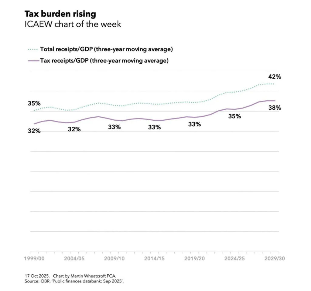
ICAEW chart of the week: Table burden rising. 

A line chart with a solid purple line for tax receipts/GDP (three-year moving average) and a dotted teal line for total receipts/GDP (three-year moving average). 

Tax receipts/GDP (solid purple line) zigs and zags between 32% in 1999/00 to 32% in 2004/05 to 33% in 2009/10 to 33% in 2014/15 to 33% in 2019/20 to 35% in 2024/25 to 38% in 2029/30. 

Total receipts/GDP (dashed teal line) broadly tracks the purple from 35% in 1999/00 to 42% in 2029/30. 

17 Oct 2025. Chart by Martin Wheatcroft FCA. 
Source: OBR, 'Public finances databank: Sep 2025'.

My chart of the week for ICAEW illustrates how tax receipts as a percentage of GDP averaged 32% over the three years to 1999/00, 32% to 2004/05, 33% to 2009/10, 33% to 2014/15, 33% to 2019/20, 35% to 2024/25 and are projected to hit 38% over the three years to 2029/30, based on data from the Office for Budget Responsibilities’ public finances databank for September 2025.

The chart also shows how total receipts including non-tax income averaged 35% in the three years to 1999/00 and a projected 42% to 2029/30.

The one caveat to these percentages is that they do not reflect recent revisions by the Office for National Statistics that increase GDP by the order of 1% across multiple years, which will cause the reported percentages to be a little smaller when they are recalculated by the OBR for the Autumn Budget 2025.

Either way, a projected rise of approaching 20% in the proportion of the economy taken in taxes since the end of last century is pretty significant, even if the projected tax burden will be lower than those of many countries in Europe. 

The chart doesn’t show public spending as a proportion of national income. This averaged 35% of GDP over the three years to 1999/00 and 45% of GDP over the three years to 2024/25, with more people growing older driving up the cost of pensions, health and social care significantly and a much higher bill for debt interest being two of the main factors driving up costs.

Public spending as a share of national income is projected to fall slightly to an average of 44% over the three years to 2029/30 as the government tries to reduce the shortfall between total receipts and spending (aka the deficit) through a combination of higher taxes (as announced in the Autumn Budget 2024) and some constraint in public spending over the next five years.

Unfortunately, a lack of fiscal headroom, a disappointing economic outlook, and cost pressures are now expected to lead the Chancellor to increase taxes even further in the Autumn Budget 2025. This suggests that taxes may be too low, at least if the government is to deliver the level of public services and welfare provision it is committed to.

If taxes are not too high, then the problem must be that the economy is too small. This is evidenced by low productivity growth since the financial crisis and successive economic shocks that have together resulted in a UK economy that has not grown at anywhere near the speed it might have.

If tax cuts are unlikely, at least in the medium-term, the principal route to reduce the tax burden must be to drive up economic growth, as called for in ICAEW’s business growth campaign. This calls for the government to focus on business growth by addressing the many factors that make it too uncertain, too difficult and too expensive to do business in the UK.
This chart was originally published by ICAEW.

ICAEW chart of the week: Productivity

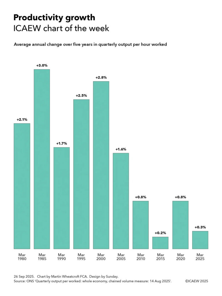
My chart for ICAEW this week looks at how productivity growth has slowed significantly over the past quarter of a century and asks what can be done to turn it around.

ICAEW chart of the week: Productivity growth

Column chart showing the average annual change over five years in quarterly output per hour worked. 

(Five years to) Mar 1980: +2.1% 
Mar 1985: +3.0% 
Mar 1990: +1.7% 
Mar 1995: +2.5% 
Mar 2000: +2.8% 
Mar 2005: +1.6% 
Mar 2010: +0.8% 
Mar 2015: +0.2% 
Mar 2020: +0.8% 
Mar 2025: +0.3% 
 
26 Sep 2025. Chart by Martin Wheatcroft FCA. Design by Sunday. 
Source: ONS, 'Quarterly output per hour worked: whole economy, chained volume measure: 14 Aug 2025'.

One of the biggest challenges facing the UK economy is the decline in productivity growth over the past quarter of a century as illustrated by my chart of the week for ICAEW. This shows how the average annual change over five years in quarterly output per hours worked in March 1980 was the equivalent of 2.1% a year higher than it was in the quarter to March 1975, five years earlier.

The chart also shows how output per hour rose by an annual average of 3.0% a year to March 1985, 1.7% to March 1990, 2.5% to March 1995, and 2.8% to March 2000.

Unfortunately, productivity growth has declined since then with quarterly output per hour increasing by an average of 1.6% a year over the five years to March 2005, 0.8% to March 2010, 0.2% to March 2015, 0.8% to March 2020 and 0.3% to March 2025.

These percentages go a long way to summarising how the UK economy has stalled since the start of the century, especially from the start of the financial crisis in 2007 through the austerity years, Brexit, the pandemic and the energy and cost-of-living crisis. We are producing less value per hour worked even as the population has grown and technology has further advanced.

While the crises we have gone through may partly explain some of the reduction in historical productivity growth over the last quarter of a century, the big question worrying many economists is why productivity has not returned to anywhere close to the levels seen before the turn of the century, or to even to those seen in the USA where, until recently, productivity growth has continued to hold up despite everything.

The Office for Budget Responsibility’s (OBR) most recent economic and fiscal forecast published in March 2025 was based on a central assumption of productivity growth averaging around 1.0% a year over five years to March 2030, significantly lower than the levels seen in the last century. There have been suggestions that the OBR intends to reduce this assumption when it updates its forecasts for the Autumn Budget 2025 in November, adding to the Chancellor’s headaches when she arrives at the despatch box.

One reason for the much lower levels of productivity growth this century may be the demographic change that has resulted in a much higher proportion of the population in retirement and a much older workforce on average. Another may be a question about whether the advent of the smart phone and ‘always on’ connectivity to the office has actually hindered rather than helped people be productive. A further reason could be the increasingly dire state of the public finances with debt rising from less than 35% of GDP in March 2005 to close to 95% of GDP, hampering the government’s ability to deliver the public services we need to thrive, in addition to raising the tax burden to historically high levels. 

However, many of the reasons are likely to be driven by the challenges identified by ICAEW’s business growth campaign. This has identified how it has become increasingly too uncertain, too difficult, and too expensive to do business in the UK and calls for fundamental reform of tax, regulation and economic policy to support stronger business growth going forward.

Read more in ICAEW’s recommendations on how we can tackle the barriers to improving productivity in ICAEW’s business growth campaign.

This chart was originally published by ICAEW.

ICAEW chart of the week: Public sector productivity

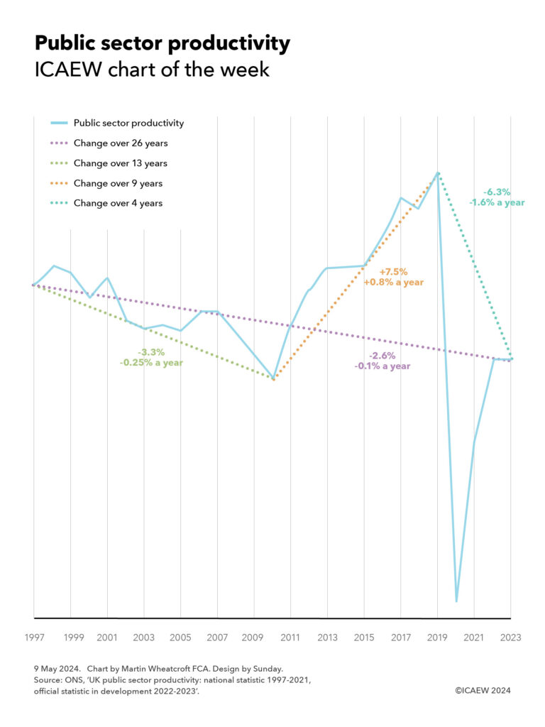
My chart for ICAEW this week suggests that the public sector is less productive than it was, but difficulties in measuring productivity make it hard to say for sure.

According to the Office for National Statistics, public sector productivity has not recovered following the pandemic and is now lower than it was in 1997, despite technological advances since then.

My chart highlights how public sector productivity fell between 1997 and 2010 as spending and investment increased – a fall of 3.3% or 0.25% a year on average over 13 years – before climbing during the austerity years until 2019 – an improvement of 7.5% or 0.8% a year over nine years. The pandemic led to productivity collapsing as public services were severely disrupted before partially recovering, with productivity flat between 2022 and 2023 – overall a net drop of 6.3% or 1.6% a year on average over four years.

Overall, this means public sector productivity as measured by the ONS has fallen by 2.6% or 0.1% a year on average over the last 26 years. It is important to note that these changes do not cover all of the public sector – in some areas such as defence spending, productivity (value of outputs / cost of inputs) is assumed to be a constant 1, reflecting how difficult and subjective it would be to attempt to measure our military preparedness for war.

Despite that, the picture shown by this metric aligns with our more general understanding of what happened in these periods. The decline in productivity between 1997 and 2010 as the then Labour government improved pay and conditions for public sector employees makes sense, while the austerity policies of the Coalition and Conservative governments between 2010 and 2019 constrained the cost of delivering public services. And the pandemic resulted in many public services being closed or curtailed, and we know that many public services – particularly the NHS and schools – are still struggling to recover from the pandemic.

The chart provokes questions about how well this statistic values outputs given that while it is very easy to measure inputs, it is less easy to assess the value produced. For example, larger class sizes might give rise to an apparent productivity improvement as measured (more children taught for the same input of teaching time), but this may not capture any deterioration in quality that may result. 

Not only is the quality of outputs difficult to measure in calculating productivity, but it also doesn’t measure outcomes, often much more important than outputs. In the health context this is whether the patient survives rather than how many operations were performed, for education it means how well-equipped our young people are for the world rather than how many hours they spent in a classroom, and for the criminal justice system how few crimes are committed rather than how many criminals are prosecuted.

Public sector productivity is an important metric, even if an imperfect one. It is helpful to understand how well public service activities are being delivered from a cost perspective – and how there is a need for improvement. But it doesn’t tell us whether those activities are improving our well-being, growing our economy, improving our environment, or building our resilience as a nation.

This chart was originally published by ICAEW.