The Chancellor was in a positive mood yesterday as he presented a budget to deliver the commitment to increase NHS spending without large tax increases.
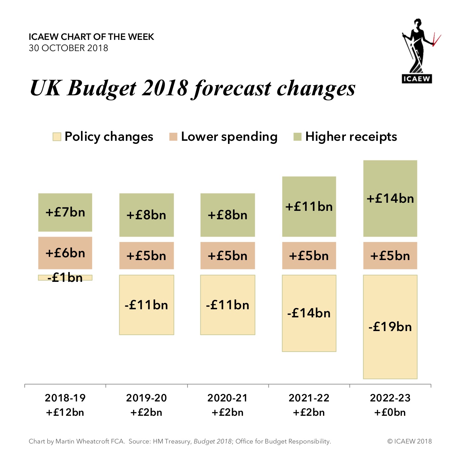
The reason was an improvement in the OBR’s fiscal forecasts. As illustrated by our chart of the week on the 2018 budget, forecast receipts have been revised up by around 1%, and previously planned spending revised down by 0.6%, to give an additional £13bn a year in this and the next two years, rising to £16bn and £19bn in the two years after that.
This is not due to significant changes in the economy. Lower unemployment and some additional revenues from higher oil prices have delivered an extra £1bn. A long period of very low interest rates and court wins on tax rules has also helped, but much of the improvement is from things not turning out as badly as forecast back in 2016.
This has let him sprinkle a little extra cash to ease some of the pressure on public services, not to mention spending a penny or two on improving public conveniences.
With the mantra of government changing from ‘austerity’ to ‘fiscal discipline’ it is clear that we are not out of the woods yet, especially with £1.8tn in net debt and £4.3tn in total liabilities weighing on the public finances for a long time to come.


