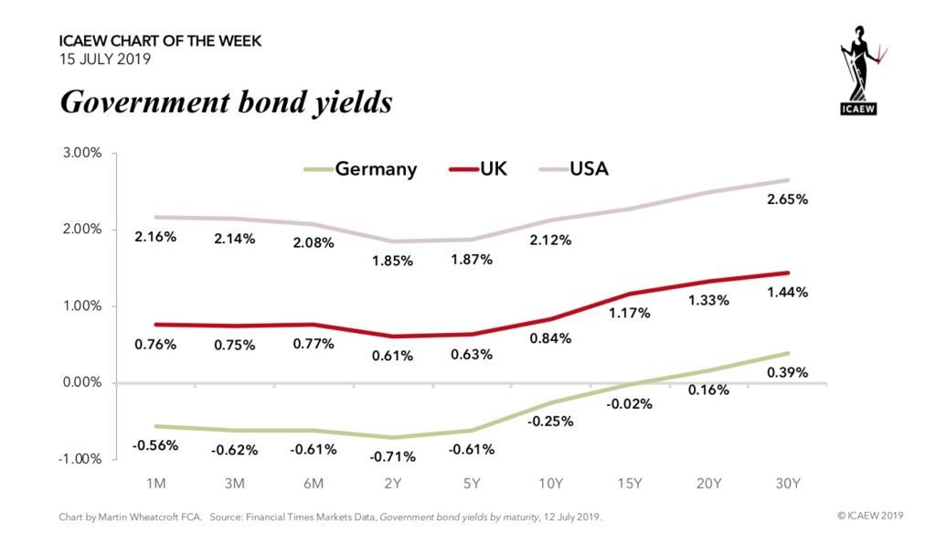
ICAEW chart of the week: Yield curves

The news that investors are running out of German Bunds prompted us to take a look at government bonds for the #ICAEWchartoftheweek.

The shortage is so severe that investors are willing to pay an annualised rate of 0.71% for the privilege of owning a 2-year Schaetze, or 0.25% to own a 10-year Bund. Admittedly, you could earn a princely return of 0.39% a year if you chose to invest in 30-year Bunds, but that is a fair amount of time to tie up your money.

Of course, Germany is unusual in running a fiscal surplus and paying down debt each year (with €52bn repaid in 2018 for example), reducing the quantity of bonds available to investors. Most Western governments need to borrow more in order to pay their bills, such as Italy where the 1.70% yield on an Italian 10-year BTP is 195 basis points higher than its German equivalent.

Despite the progress the UK has made in reducing its deficit, it still needs to raise £30bn in 2019-20 – in addition to the £99bn it needs to fund the repayment of existing debts as they mature. The good news is that the 0.84% yield on a 10-year gilt (for example) is substantially lower than in previous eras, helping to gradually bring down the weighted average interest rate payable on the national debt as gilts issued when rates were higher are refinanced.

Yields are higher in the US, in the context of stronger economic growth than both the UK and Germany in the last few years. The annualised return of 2.12% available to those investing in a 10-year US Treasury bond is 237 basis points higher than on a German 10-year bond. This is still relatively cheap by historical standards, especially in the light of the $0.9tn the US federal government needs to borrow this year to fund its fiscal deficit, not including the refinancing of existing debt or the sales of bonds by the Fed as it unwinds QE.

Yield curves are usually upward sloping, with investors demanding (and governments willing to pay) higher yields on bonds with longer maturities. However, the curves for both Germany and the UK are ‘partially inverted’ with investors are willing to accept lower yields on 2-year or 5-year bonds than they will for short-term bills, while the US is ‘inverted’ with the 10-year yield lower than 1-month and 3-month yields, admittedly only by two or four basis points respectively.

Conventional wisdom is that a partially inverted yield curve presages lower economic growth and a fall in short-term interest rates, while a fully inverted curve may signal that a recession is on its way. But these are not normal times, with ultra-low interest rates and quantitative easing making it difficult to assess their predictive value, with some commentators suggesting that these inversions may just be temporary.

Either way, the era of cheap money looks likely to continue for longer than anyone expected; we really are living in interest-ing times.

ICAEW chart of the week: BBC

The BBC released its Annual Report and Accounts last week, but you might have been forgiven for thinking that its financial results had been omitted given the media focus on the sections devoted to staff pay. We thought we might buck that trend and take a look at the BBC’s income and expenditure for the #ICAEWchartoftheweek.

The chart illustrates how the BBC generated revenue of £4.9bn in the year ended 31 March 2019. This is less than the £8bn or £9bn generated by Sky in the UK & Ireland each year, but more than ITV’s £3bn or Channel 4’s £1bn. Some £3.2bn came from the 21.4m households that pay the full licence fee, with the government providing a further £0.6bn and assorted commercial revenue streams adding up to £1.1bn.

Expenditure of £5.0bn included £4.1bn on public service broadcasting, paying for 9 TV channels and 56 radio stations in the UK, radio services around the world in more than 40 languages, and extensive online services – most notably BBC iPlayer.

Net commercial income provides a small subsidy to licence fee payers, with attempts by the BBC to start a global subscription service for British TV content yet to bear much fruit. On the other hand, licence fee payers provided £278m of the £371m cost of the World Service, with the government contributing £93m to expand services.

At the bottom line, the BBC incurred a loss of £69m, compared with a profit of £180m in the previous year. This was driven by a cut of £187m in the government’s funding for free TV licences for over-75s, while lower DVD sales led to a decline in commercial revenue.

With the remaining £468m of annual funding for 4.6m over-75s TV licences to be phased out completely by June 2020, the BBC has announced that it will continue to provide free TV licences for around 1.5m poorer households to be funded through efficiency savings. Further losses are likely in 2019-20 and 2020-21 as the BBC loses government funding before over-75s not on pensions credit start to pay the licence fee in 2020.

The fee for a colour TV licence in 2018-19 was £150.50 or £12.54 per month, with the BBC estimating that £6.92, £2.17, £1.24 and £1.08 of this respectively went on TV, radio, the World Service and BBC Online, with the balance of £1.13 paying for other services, production, licence fee collection and other costs.

The BBC faces many challenges. There is financial pressure with the withdrawal of government funding and the struggle to generate more commercial income, competition for viewers from streaming services such as Netflix, and very high levels of political flak from all sides. More fundamentally, the BBC’s business model based on a compulsory subscription is under question – will that survive in the new media landscape that is emerging?

ICAEW chart of the week: Department for Work & Pensions

The Department of Work & Pensions (DWP) published its latest Annual Report & Accounts last week, reporting that it spent £188bn in the year ended 31 March 2019 – just under a quarter of all government spending.

As illustrated by the #ICAEWchartoftheweek, £110bn of DWP’s operating expenditure went on the state pension and other support for pensioners, with £53bn going to support people with disabilities or health conditions (or their carers). Benefits to those in or looking for work amounted to £19bn, while £6bn was spent on running costs, around half of which was on DWP staff. The total includes around £21bn of funding provided to local authorities to pay for housing benefit.

This is not the complete picture for social welfare, as HMRC, other government departments, devolved administrations and local authorities also fund benefits such as tax credits, child benefit, war pensions and council tax benefit, to name just a few.

Less than half of the DWP’s spending was funded through the annual estimates process authorised by Parliament, with £102bn (including the £97bn for the state pension) coming from the National Insurance Fund. Despite the name, this is in reality the disbursement of money contributed by current workers and their employers, not from amounts ‘paid in’ by previous generations.*

The complexity of the welfare system means that benefit spending is particularly prone to fraud and error, with estimated overpayments of £4.1bn and underpayments of £2.0bn in 2018-19.  Excluding the state pension, the rates of gross overpayment and underpayment were 4.6% and 2.2% respectively, although the DWP did manage to recover £1.1bn in overpaid amounts during the year.

The front section of the Annual Report provides a detailed review of DWP’s activities during the year, including the controversial roll-out of Universal Credit, which brings together six existing benefits into a single payment. The report contains extensive discussions on the issues with Universal Credit, including a much higher level of overpayments than for other benefits (8.6%) and the expectation that 6.5 million households will be in receipt of Universal Credit by the mid-2020s.

Unfortunately, very few people will read the full Annual Report & Accounts of government departments such as the DWP. They contain a huge amount of useful information on how the government is using our money, so are well worth looking at.

* The National Insurance Fund typically contains between two and three months’ worth of national insurance receipts as a ‘float’, but apart from that there are no other fund investments available to pay for benefits.

To read DWP’s Annual Report & Accounts 2018-19 please visit:

https://www.gov.uk/government/publications/dwp-annual-report-and-accounts-2018-to-2019

ICAEW chart of the week: Deficit revised for student loans

ICAEW #chartoftheweek – Deficit revised for student loans

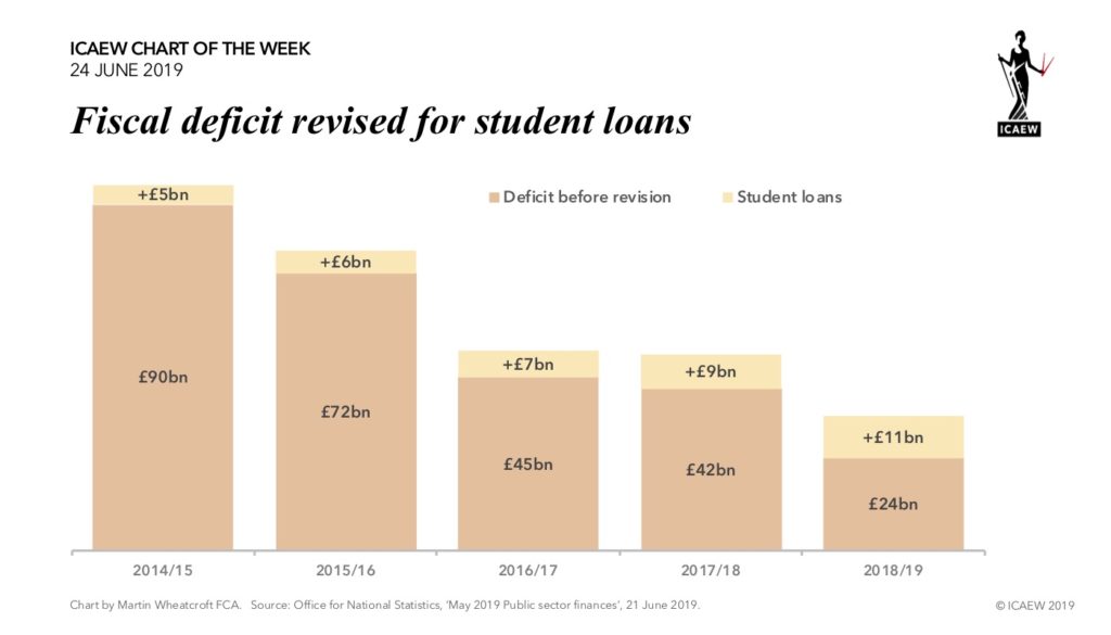
The treatment of student loans in the fiscal numbers has long been controversial, but on Friday the ONS announced that they are finally changing to an approach that better reflects the economics. This means that expected non-payments will now be recognised immediately within the fiscal deficit rather than waiting until thirty years’ time when outstanding loan balances are officially written-off.

As the #ICAEWchartoftheweek highlights this will mean revising the fiscal deficit upwards, with the deficit for 2018/19 increasing from a provisional result under the current rules of £24bn to £35bn under the new treatment. This reflects an £8.2bn expense for the estimated 52% of the new loans provided to students during 2018/19 that are not expected to be repaid, together with a reduction of £2.4bn in interest income on existing loans not anticipated to be recovered either.

This change has no effect on public sector net debt (which has never netted off student loans), but it will increase another fiscal measure – public sector net financial liabilities (which does) by £59bn. This represents the adjustment needed to get from the face value of outstanding student loans and interest to the discounted value of expected recoveries.

This brings the fiscal treatment closer to the accounting treatment under IFRS used in the Whole of Government Accounts, although there will still be some differences. In particular, accounting losses recorded on the sale of parts of the student loan portfolio will generally not be included in the fiscal deficit.

This is a welcome improvement in the way the fiscal numbers are calculated that better reflects the economics of student loans – even if not going to the full extent of aligning with accounting standards.

This is not the only adjustment planned by the ONS. Rather strangely (at least from an accounting perspective) the ONS has decided to reduce public sector net debt by an estimated £31bn for gilts held in ring-fenced local authority and other pension funds, despite the fact that the headline fiscal numbers do not include the related pension obligations. 

For more information, read the May 2019 Public Sector Finances on the ONS website.

ICAEW chart of the week: Transport for London

ICAEW #chartoftheweek – Transport for London

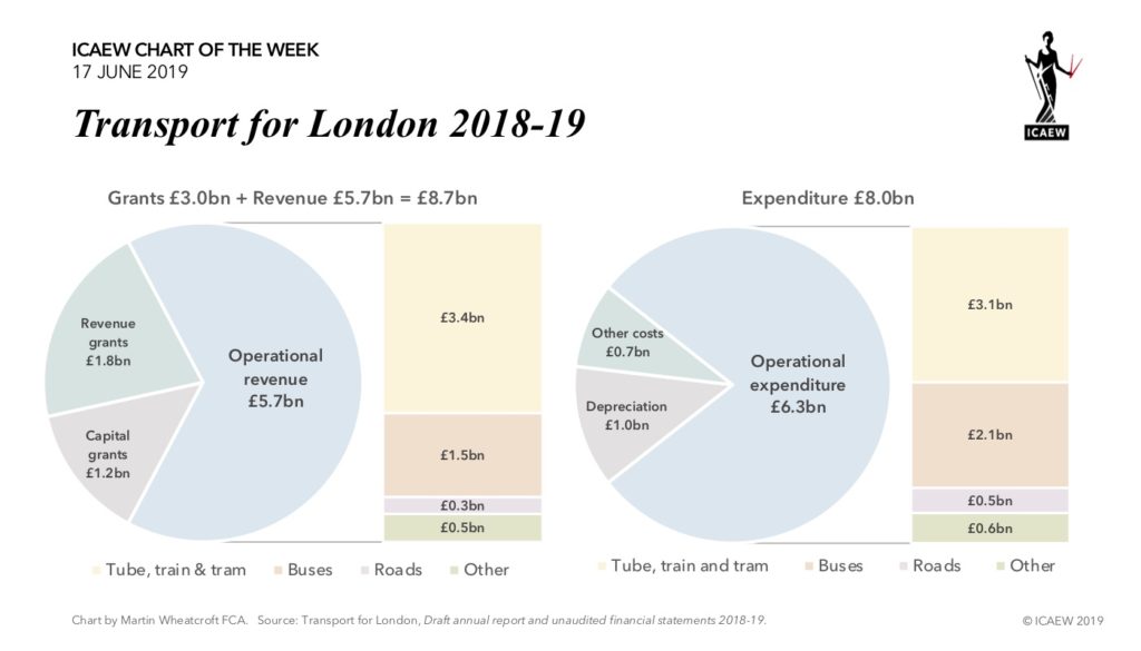
Transport for London (TfL) operates one of the largest urban transport networks in the world, as well as being responsible for the strategic road network in the capital. TfL is a major investor in transport infrastructure in the UK, with the £18bn Elizabeth Line (Crossrail) and £1bn Northern Line extension being amongst the most high profile projects, especially with the delays and cost-overruns both have experienced.

As illustrated by the #ICAEWchartoftheweek, TfL incurred expenditure of £8.0bn in the year ended 31 March 2019, comprising £6.3bn on operations, £1.0bn in depreciation and £0.7bn on other costs. Operating revenues amounted to £5.7bn, which was supplemented by £1.8bn in revenue grants from its parent organisation, the Greater London Authority (GLA), together with £1.2bn in capital grants, the majority of which also came from the GLA.

The tube, train and tram operations together generated a net £0.3bn positive contribution before depreciation and other costs, but this was offset by negative contributions of more than £0.6bn from bus services, £0.2bn from road spending (in excess of congestion and other road charges), and £0.1bn from other operational activities.

Not shown in the chart is £3.6bn of capital investment by TfL during the year. This included £1.4bn on Crossrail, £0.7bn on other major projects, £1.0bn in new capital investment across the tube, bus and road networks (including new rolling stock) and £0.4bn in capital renewals. This was funded through a combination of £1.5bn of asset sales, £1.2bn in capital grants, £0.7bn in new borrowing and £0.2bn from internal resources.

At 31 March 2019, TfL had net assets of £26.9bn, comprising £46.6bn of assets and £19.7bn in liabilities. This included £11.7bn of debt accumulated by TfL over the last decade or so as it has invested in Crossrail and in upgrading the tube, train and tram networks across the capital.

With TfL close to having ‘maxed out’ its borrowing capacity, the GLA plans to borrow a total of £1.3bn to fund the cost overruns on Crossrail, to be repaid from London’s business rate supplement and community infrastructure levies.

Similar to most urban transport networks around the world, TfL continues to rely on taxpayer support for its operations as well as its capital programmes. In London, funding is principally through local business taxation, but with ambitions to continue to expand public transport in the capital with (for example) Crossrail 2, the GLA is looking for new sources of funding. This could include greater devolution of tax raising powers, a topical subject for the debate about public finances in the UK.

ICAEW chart of the week: Infrastructure finance review

ICAEW responded last week to the Infrastructure Finance Review being undertaken by the government, in which it has sought views on greater private investment can be found to fund the nation’s infrastructure. As the #ICAEWchartoftheweek illustrates, there is £188bn of investment into the UK’s infrastructure planned over the three years 2018/19 through 2020/21.

Substantial public and private funding is needed to invest in transport, energy and utilities, social infrastructure (such as housing, schools and hospitals), digital networks, science and research, and in flood prevention. The government predicts that over half of the finance for such large scale projects will come from private companies over the next 10 years.

The review follows on from the creation of the National Infrastructure Commission (NIC) and the Infrastructure & Projects Authority (IPA), the establishment of a £37 billion National Productivity Investment Fund to target spending in critical areas, and plans to develop a comprehensive National Infrastructure Strategy to be published later this year. The strategy will respond in detail to the NIC’s National Infrastructure Assessment, and will set out how the UK can embrace the opportunities afforded by new technologies, decarbonise the economy, and create infrastructure fit for the 21st Century. 

The government would like to ensure that high levels of private investment continue to flow into UK projects, particularly in the wake of the withdrawal of European Investment Bank funding after the UK leaves the EU and the ending of the private-finance initiative. 

Our response can be summarised as follows:

Overview
• The UK continues to underinvest in infrastructure.

Finance innovation has the power to transform infrastructure investment in the UK
• An Infrastructure Growth Fund and pooled investment funds would facilitate investment.
• New public-private partnership contractual models are needed now.
• Approved peer-to-peer networks would enable citizens to invest directly.
• The UK should utilise its world-leading professional expertise in infrastructure finance.

Public investment is an enabler
• A new UK Investment Bank to replace the EIB as an anchor investor.
• The British Business Bank should support business to deliver infrastructure projects.
• Direct investment by city-regions and local authorities would engage communities.
• Local industrial strategies must make improving infrastructure a top priority.
• Centres of excellence are needed to support investment decisions and in managing risk.

Capital is available, but it needs to be unlocked
• Long-term pricing would provide certainty to investors, taxpayers and consumers.
• Tax and other incentives need to be gauged carefully, but then should be stable.
• Reforming balance sheet treatment requirements would remove contracting hurdles.
• Regulatory asset base and concession arrangements could be used more widely.
• Early-stage risks need to be tackled to draw in more seed capital.

To read our full response, click here.

ICAEW chart of the week: the UK public balance sheet

As we reported on the release of the Whole of Government Accounts (WGA) for 2017-18 a week and a half ago, the good news is the transparency that the WGA provides. The bad news is the picture of the public finances contained therein!

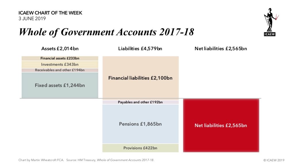
As illustrated by our #ICAEWchartoftheweek, reported liabilities of £4,579bn significantly outweigh public assets of £2,014bn to give net liabilities of £2,565bn at 31 March 2018. This is much greater than the £1,779bn reported in the fiscal numbers for public sector net debt, as although fixed assets and other assets are taken into account, the WGA balance sheet includes a much wider range of liabilities.

The £1,865bn in net pension obligations owed to public sector workers are the most prominent of these other liabilities, but the £422bn of long-term liabilities for nuclear decommissioning costs and clinical negligence (amongst others) are not insignificant either!

Some commentators argue that the accounting balance sheet reported in the WGA is not sufficient to fully understand the financial position of the government. Promises to pay welfare benefits such as the state pension, long-term sickness support, or to pay for health and social care costs in retirement, are not included as liabilities; if they were, the red ink would be a few additional trillions worse than that shown here.

Without much in the way of investments or significant natural resources to fall back on, the government is in the invidious position of either raising more in revenues or cutting back on the promises they have made. In recent years the government has mostly chosen to tackle the promises side of this equation by cutting back on public services and certain welfare benefits to try and contain costs.

With public services under strain, and an increasingly long-lived population expecting a return on the amounts they have ‘paid in’ over the course of their working lives, it is difficult to see any easy ways of cutting back much further on the promises successive governments have made to look after us into our twilight years. Similarly, it is difficult to see how any government could persuade the public of the need for significant tax rises.

Unfortunately, with no sign of a long-term fiscal strategy on the horizon, this particular fiscal circle is unlikely to be squared any time soon.

To find out more about the Whole Government Accounts, read ICAEW’s analysis of the WGA 2017-18 by clicking here.

ICAEW chart of the week: Whole of Government Accounts 2017-18

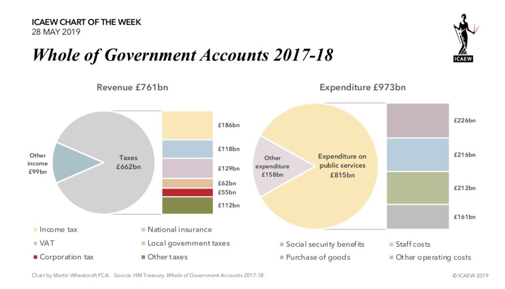
The government published its 9th Whole of Government Accounts (WGA) last week, covering the financial year ended 31 March 2018. The WGA provides a comprehensive financial report on the UK public sector, consolidating the financial results of over 8,000 organisations across the public sector, including central government departments and agencies, devolved administrations and local authorities. 

The WGA is prepared in accordance with International Financial Reporting Standards (IFRS) and is similar to a listed company annual report – unlike the fiscal numbers used in the Budget that are based on a different set of rules.

Although revenue was up by £40bn, expenditure on public services was up by £54bn and other expenditure by £100bn, leading to an accounting loss of £212bn, £114bn more than in the previous year. This was partly driven an additional £78bn for nuclear decommissioning and £11bn more for clinical negligence, which together have contributed to the £255bn increase in public sector liabilities over the course of the year. 

The good news is that the UK is one of a select few countries that prepare comprehensive financial statements in accordance with accounting standards. The government is to be commended for its transparency in publishing the WGA each year, albeit at 14 months after the year-end there is still a lot to do to meet its target to bring this down to 9 months within the next two years.

The bad news is the picture of the public finances presented in the WGA, with public sector assets of £2.0tn significantly outweighed by liabilities of £4.6tn, over £165,000 for each household in the UK. This illustrates the long-term financial context that constrains the government as it attempts to deal with near-term economic uncertainty and more immediate pressures on public spending.

For ICAEW’s analysis of the WGA 2017-18, click here.

ICAEW chart of the week: EU net contributors and net recipients

There are European elections later this week and one of the big challenges that will face newly elected MEPs will be getting to grips with the EU’s finances. 

The €148bn EU budget was the subject of a #ICAEWchartoftheweek earlier this year (click here). This highlighted the EU’s plan for spending in 2019, with €57bn budgeted for rural support, €47bn on economic development, £25bn for operating programmes, £10bn on running costs, and €9bn externally.

Our chart this time looks at how the money flows between EU member countries. It illustrates how Germany, the UK, France and the Netherlands each pay in much more than they ‘get back’ in EU spending, while countries such as Poland, Romania and Greece receive more than they pay in. 

One of the principal aims of the EU budget is to support economic development, and so it is unsurprising to find that a proportion of the EU budget contributions of better-off northern and western European countries are directed towards the less well developed economies of eastern and Southern Europe. 

There are some exceptions. For example, Belgium and Luxembourg (on a per capita basis two of the biggest gross contributors into the EU budget) benefit from hosting the core EU institutions and agencies, with around two-thirds of the EU’s €10bn annual budget for running costs being spent in these two countries. Another is Italy, the EU’s fourth largest economy and hence a large contributor, but also a significant recipient of development support for its poorer regions.

The chart is based on extrapolations of previous spending patterns and so may not take account of more recent developments, such as the move of the European Medicines Agency out of the UK this year. This should result in around half a billion euros of extra spending by the EU in the Netherlands, reducing its net contribution accordingly. 

In theory, the scale of the transfers between countries should reduce over the long-term as economic growth leads to higher contributions. Indeed, this has been the experience of Ireland, where its economy has grown to such a point that it is now a (small) net contributor.

The departure of the UK will have a big impact on the EU budget, especially given its position as a net contributor. However, it is important to put this into context: the UK’s net contribution of around €8bn a year is equivalent to approximately 0.1% of total government spending by the other 27 EU countries, while the Withdrawal Agreement envisages the UK continuing to pay into the budget for some time to come.

ICAEW chart of the week: US external trade

With the trade war between the US and China hotting up, we thought it might be worthwhile looking at US external trade for our #ICAEWchartoftheweek.

According to the US Bureau of Economic Statistics, US consumers and businesses paid $3.1tn to import goods and services in 2018, while US businesses generated $2.5tn from exports.

This gave rise to a net trade deficit of $622bn, reflecting a net deficit on goods of $891bn (imports $2,654bn – exports $1,672bn), partially offset by a net surplus on services of $269bn (exports $828bn – imports $559bn).

NAFTA members Canada and Mexico together constituted around a quarter of imports and exports, just ahead of trade with the European Union. This is an illustration of the gravity theory of trade, given that their economies are together less than one-sixth of the size of the EU’s.

However, all eyes are on the US-China trade relationship. This has expanded dramatically over the last couple of decades, with imports of goods and services from China in 2018 amounting to $576bn in 2018 or 18% of the total, up from less than 7% twenty years ago. 

China is also an increasingly important export market for US businesses, with exports to China of $231bn in 2018 equivalent to 9% of total exports, up from less than 2% twenty years ago. 

Although both countries have benefited from this expansion in trade, the difference of $345bn between imports and exports constitutes over half of the US’s overall trade deficit.

Despite the protestations of many economists, a number of politicians see large trade deficits as a bad thing. One of these is US President Trump, who has complained about the scale of the difference in the flow of goods and services between the world’s two largest individual economies.

We don’t know whether the US and China will be able to conclude a trade deal in coming weeks, or if the trade war will continue to escalate. Either way, what happens to this critical trade relationship between the world’s two largest individual economies will have implications for the rest of the world too.

Global GDP was estimated to be approximately $83tn in 2018: US $21tn, EU-28 $19tn, China $13tn, Japan & South Korea $6tn, South & Central America $4tn, Canada & Mexico $3tn, Rest of the World $17tn.