ICAEW chart of the week – Interest rate exposure

Our chart this week is from our report ‘the debt of nations’ published last week which we hope will be a ‘must-read’ for anyone affected by how our governments manage public debt; in other words everyone. 

Low interest rates mean that nominal interest on the UK’s almost £2tn of public debt is expected to fall to 1.8% over the next few years as existing debt is refinanced. With yields on 10-year fixed-interest gilts at the end of March of 1.35%, this forecast seems quite reasonable based on current refinancing plans. 

However, over a quarter (28%) of the UK’s public debt is index-linked. If inflation increases then the cost of borrowing will rise accordingly.

And although the UK Debt Management Office has been issuing debt for longer and longer maturities to lock-in low rates, a substantial proportion has been swapped by the Bank of England into variable rate debt as a result of quantitative easing. 

A return to 5%, the base rate in 2008 before the financial crisis, would cost an extra £20bn a year, roughly half the defence budget.

This poses a dilemma to the Bank of England. Unwind QE too quickly and interest rates could rise significantly. But, don’t unwind QE and the public finances will remain exposed for many years to come.

ICAEW Better Government Series: The debt of nations

Martin Wheatcroft, author of Simply UK Government Finances, has co-authored  the ICAEW Better Government Series: ‘The debt of nations’ policy insight published today. It shines a light into public debt around the world.

Ross Campbell, Director, Public Sector at ICAEW says:

“I’m very pleased to present our most recent addition to the Better Government Series: ‘The debt of nations’.

Since 2001 there has been a dramatic increase in borrowing by governments to nearly £30 trillion, a tripling in the level of public debt. Borrowing can be a valuable tool to finance capital investment, e.g. infrastructure, which creates economic and social benefits. However, increasingly governments in developed countries are borrowing to pay day to day running costs.

With the era of ultra-low interest rates coming to an end and the reversal of quantitative easing, there are real questions about whether the cost of public debt will be sustainable. Traditionally governments used inflation as a tool to reduce debt relative to the size of the economy. This policy choice comes at a cost however, eroding the value of saving and investments in the domestic currency and may be harder to implement in an era where central banks are mandated to keep inflation low.

Our report explores these issues and provides analysis and reflections on borrowing by government.

ICAEW believes we need a better public understanding of how public debt is measured and managed to know if borrowing by government is truly under control.”

Click here to read the report.

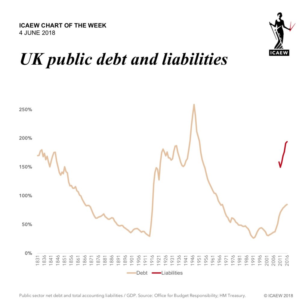
ICAEW chart of the week – Public debt

Ross Campbell, Director of Public Sector for ICAEW, writes:

“This week’s chart is on the subject of debt. Public debt.

This is the subject of a forthcoming report in the ICAEW’s Better Government Series, which examines the level of public debt around the world. It is not a pretty picture, with general government net debt (the most widely used measure) tripling since 2001 to reach almost £30tn this year.

According to data provided by the IMF, there are 76 indebted countries that together owe £42tn in gross debt, which nets to £29.4tn once cash and liquid financial assets are taken into account. £26.3tn or 90% of this is owed by just 12 countries – the US, Japan, Italy, France, the UK, Germany, Spain, Brazil, Mexico, Belgium, Canada and the Netherlands.

Proportionately, the UK has borrowed the most of the major developed countries, with an average annual increase over the last 17 years of 9.9%, followed by the US with 9.3%. This compares with more modest increases of 2.3% a year on average for Germany and 0.4% for Canada.

A decade after the corporate debt crisis, public debt is at an all-time high and continues to rise. The next debt crisis may well be one of public debt.

Do watch out for our report – it makes for a fascinating (and sobering) read.”

To comment on the ICAEW chart of the week, visit the ICAEW Talk Accountancy blog by clicking here.

ICAEW chart of the week – A trade war looms?

Ross Campbell, Director for Public Sector at ICAEW writes:

“With international relations a little fractious currently and talk of a trade war in the press, this week’s chart look at what is at stake in terms of the scale of global trade.

Exports are certainly important to the major trading countries, including the US, the EU, China and Japan, which together make up just over 70% of the global economy. As a proportion of the economic activity (compared to projected 2018 GDP) exports range from 14% for the USA to 20% for China. 

The three largest economies each export in excess of £2tn of goods and services a year. While as a percentage of economic activity this may not seem that much,   it is important to realise that the public sector makes up from 40% to 50% of the economic activity of developed economies, so exports represent a much larger share of private sector activity.  

Furthermore, disruption to the complex supply chains that are so important to global trade could have a multiplier effect on economic activity, and not in a good way.

Of course, not all of the noise made by politicians turns into anything real. Let’s hope the war of words between the US and China doesn’t become an actual trade war, as a world of strong economies needs more, not less, international trade to thrive.”

To comment on the ICAEW chart of the week, visit the ICAEW Talk Accountancy blog by clicking here.

ICAEW chart of the week – income tax distribution

Ross Campbell, Director for Public Sector at ICAEW, writes:

“Our chart this week looks where the government gets its money, or at least the element that comes in in the form of income tax, which is expected to generate around £173bn in 2017-18.

It is important to note that income tax constitutes only 24% of total government income, so this chart does not represent the full picture of how much is contributed by different groups.

The highest earning 10% (5% of the total population) contribute £102bn, almost 60% of total income tax, while the top 1% of earners pay £48bn (28%).

As a ‘progressive’ tax, the average tax rate paid by each group goes up with income, increasing from 10% for the bottom half of income tax payers (earning less than £25k).

In comparison other taxes such as national insurance, council tax and VAT are considered “regressive”, with poorer households paying a much greater proportion of their earnings on these taxes.

Interestingly, despite the impression given by a top marginal rate of 45%, the overall amount collected by income tax is just 16% of the total personal income of £1,050bn declared on tax returns and PAYE submissions.”

To comment on the ICAEW chart of the week, visit the ICAEW Talk Accountancy blog by clicking here.

ICAEW chart of the week – Changing taxes

Ross Campbell, Director for Public Sector at ICAEW, writes:

“Following last week’s chart on the changing profile of public spending, our chart this week shows how taxes have changed over the past sixty years.

Despite income tax rates being lower, the overall share from taxes on income has actually increased. Although income tax and corporation tax have declined as a proportion of total tax, the increase in national insurance (another form of income tax) more than makes up the difference.  

However, the most dramatic shift has been in customs duties. These are now less than 1% of total tax receipts, compared with the 18% they generated back in the day. At the same time, local taxation in the form of business rates and council tax (which replaced domestic property rates) has declined to less than a tenth of the total.

The revenues from these taxes have largely been replaced by VAT, now a fifth of the total, together with a plethora of new taxes, including insurance premium tax, environmental levies, air passenger duty and the bank levy to name just a few.

With tax receipts (excluding other income) in 2018-19 equivalent to 34% of GDP, compared to 31% in 1988-89 and 30% in 1958-59, the shift over time demonstrates a key principle of taxation: if one tax doesn’t get you, another one will.”

To comment on the ICAEW chart of the week, visit the ICAEW Talk Accountancy blog by clicking here.

ICAEW chart of the week – Public spending profile

Ross Campbell, Director for Public Sector at ICAEW, writes:

“With the Spring Statement already drifting into memory, our chart this week, shows how the profile of public spending has changed over the last 60 years. 

It shows how back in 1958-59, the government spent less than a quarter of its budget on welfare (including pensions) and health, but today spending in those areas has increased to around 54% of total spending.

The consequence is that the proportion of the total available to spend on all other public services has decreased significantly, with defence having had the largest reduction over time.

Because we are all living longer, spending has been increasing on pensions, health, and social care in particular. The demographic projections mean that this trend is likely to continue over the next 30 years as we continue to age as a society.

If the past is any guide to the future, the trend of successive governments choosing to prioritise health, welfare and pensions over other spending is likely to continue. So don’t expect the pressure on public spending to let up anytime soon…”

To comment on the ICAEW chart of the week, visit the ICAEW Talk Accountancy blog by clicking here.

ICAEW chart of the week – Spring Statement 2018

Our chart this week illustrates why some prudence in forecasting makes sense, given how the official forecasts for 2018-19 have changed significantly over a fairly short period of time.

The current forecast of £37bn may be £3bn better than the previous forecast and £10bn better than the shock Autumn Statement of 2016, but it is still £35bn below the original forecast made in December 2013 and is £42bn worse than the forecast of a surplus of £5bn made only three years ago.

The good news around the Chancellor’s Spring Statement was that he pretty much kept his promise of not announcing any fiscal policy changes. The numbers in the short-term are also slightly better, with a £5bn and £3bn improvements in the fiscal deficit expected for 2017-18 and 2018-19 respectively.

The bad news is that the medium-term economic forecasts remain extremely pessimistic and austerity continues. 

This caution shown by the Chancellor and the OBR is driven by concern over the continued economic weakness, Brexit uncertainties and the inherent risks attached to making forecasts.

After all, Philip Hammond is not the first Chancellor to announce that public debt (as a percentage of GDP) has peaked and will start falling from now on…

ICAEW chart of the week – A complicated tax system

The Chancellor’s Spring Statement next week has been trailed as not being a fiscal event. Consequently we don’t expect to see any changes to the tax system next week, although we there may be some changes to government spending plans – possibly to address cost pressures in health and defence. 

The benefit of just one fiscal event a year is it will give the Treasury and HMRC more time to work on developing tax policies. This is to be welcomed, given that a typical fiscal event in recent years has involved over 50 different tax policy changes. A reduction in the number of such changes and better thought-through policies will be good news for individuals and businesses. 

That is not to say that tax policy changes aren’t desperately needed. As our chart this week illustrates, there are now up to eleven (!) different tax bands on personal income depending on where you live and whether you have children or not.  How we got to this sorry state of affairs is a complicated story, but it should not be beyond the wit of policy makers to get us out of it. 

So the best thing about the Spring Statement next week may not be the absence of tax policy changes, but rather the eventual prospect of better tax policies in the future.

ICAEW chart of the week – Global public spending

This week’s chart is on the subject of public spending, which in 2018 is expected to reach £22 trillion globally.  

This is 35% of forecast global GDP for this year of £63tn. As expected, accounting for nearly 75% of the global economy, the largest spenders are North America, Europe, China and Japan.  Perhaps more surprisingly (although not to our regular readers), Africa (population 1,243m) with 3% of the global economy, spends just £0.46 trillion: only 2% of global public spending and just 7% of the £6.74tn spent by central and local governments across Europe (population 544m). 

Public spending in the USA amounts to some 35% of GDP, in line with the global average. This compares with an average of 42% in Europe, 29% in Asia-Pacific and 32% for the rest of world.  

Within Europe, the UK is expected to spend 39% of its GDP on public services, less than the 45% planned by Germany, the 49% for Italy and the 56% for France, but more than its tax revenues. 

Over a third of economic activity in the world is controlled by just a few thousand politicians and public servants.  How effectively they spend that money on behalf of their citizens is something that the statistics don’t currently tell us.