ICAEW chart of the week – RPI

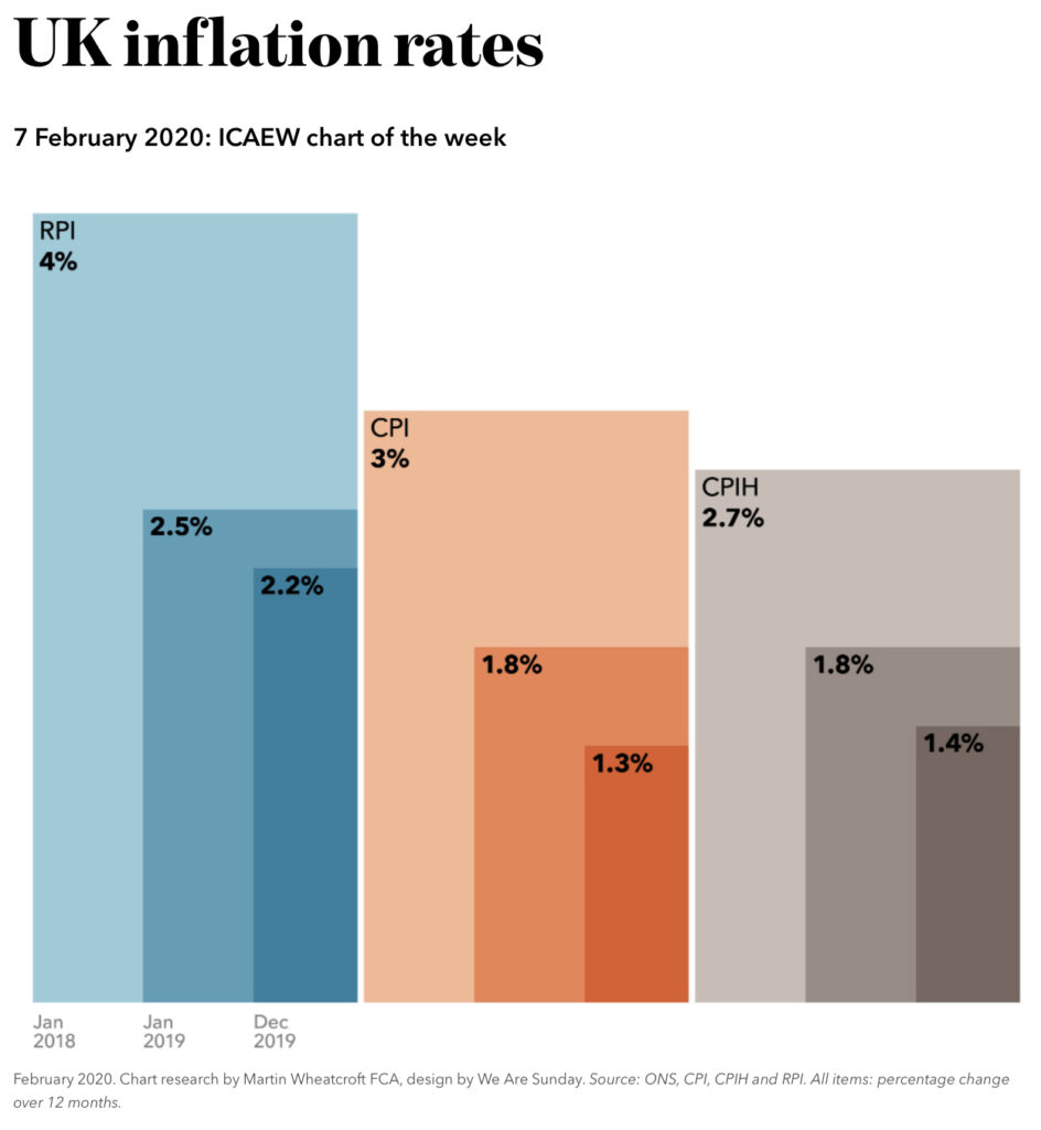
With suggestions that the retail prices index (RPI) may be on its way out, our chart this week is on the subject of inflation.

RPI is consistently higher than the consumer price index (CPI), with RPI on average 0.8% higher than CPI since 2010. Similarly, RPI was on average 1.0% higher than CPIH (CPI including housing), the even more preferred inflation measure of the statistical world (not shown in the chart).

The Office for National Statistics would dearly like to get rid of RPI given the known methodological flaws in its calculation. They might describe RPI as ‘Not a National Statistic’, but legally they have to publish it every month.

The problem is that RPI is used in many financial contracts, including £410bn of index-linked gilts issued by the government. Using CPI or CPIH instead would result in lower returns for investors and (no doubt) consequent litigation.

Statisticians and economics tend to joke about RPI as “inflation +1”, as it is close to 1% higher than CPIH. That joke could provide a solution – while a straight replacement of RPI with CPI or CPIH might not be feasible, perhaps redefining RPI as CPIH + 1% could be a starting point for a discussion with debt investors.

A potential route to sparing the statisticians’ blushes at last.

ICAEW chart of the week – What we do

Our chart this week is on the subject of what the 66.6 million people that live in the United Kingdom do.

31.6m (47%) of UK citizens, are in full or part time work, not including 0.9m students in part-time jobs. About 4.8m of those working are self-employed, while the remaining 26.8m are employees. Although 47% may sound a relatively low share of the total, children and students make up a quarter of the population and a further 11.7m (18% of the population) are retired.

Just under 10% of the working age population are not in work. With 2.0m (3%) not working because of illness or disability and 3.2m (5%) who are homemakers or who have chosen not to work for other reasons that leaves just 1.2m who are registered as unemployed and looking for work.

Many are likely to find jobs within a relatively short period – 0.7m have been unemployed for less than six months – meaning that around half a million people have been unemployed for longer. Less than 1% of the population.

This is almost full employment. What is surprising is we have yet to see any significant upward pressure on wages. Whether you blame structural changes in the labour market, Brexit or wider economic uncertainties, something is up with the usual demand and supply dynamic.

ICAEW chart of the week – Fuel duties

Our choice of chart this week is based on the news that the government is considering increasing fuel duties.

This tax is a good example of the dilemma faced by government. It is a valuable source of revenue – £28bn this year – but government environmental policy is to ban petrol and diesel cars in around 20 years’ time.

The point there will be no fuel to tax might be reached even sooner as the financial incentive for drivers to switch to electric cars is considerable.

As our chart highlights, we estimate that fuel for a small petrol car to drive 460 miles might cost £52 at current pump prices, around twice the cost of charging an equivalent electric car.

The difference is almost entirely down to tax, with around 60% of the pump price going to the exchequer in fuel duty and full-rate VAT, as opposed to the 22% of domestic electricity charges going in levies for environmental and social obligations and lower-rate VAT.

So the Chancellor’s decision will not just be about the politics of lifting an eight-year freeze in an unpopular tax. Increasing fuel duty might actually accelerate the switch to electric cars and hence the volume of fuel sold.

Suggestions for replacement taxes on a postcard (or electronic equivalent) please.

ICAEW chart of the week – Coins

After our summer pause, our ‘chart of the week’ on the public finances is back and celebrating its first anniversary.

We are easing ourselves back in with this one on the interaction of small change and big politics.

Earlier this year HM Treasury began gathering views on the future of 1p and 2p coins. There are an estimated 11.4bn 1p and 6.7bn 2p coins in circulation making up 60% of the 30.1bn total. They are worth £250m, just over 5% of the £4.6bn total for all coins.

There is a strong economic case for removing them from circulation. A 1p coin costs more to produce that it is worth and a large proportion of 1p and 2p coins are never used again after they are first handed out in change. 2p today is worth the same as one-seventh of a penny when decimal coins were introduced.

Many are to be found in shop tills or in high street banks, but many more are hiding in piggy banks, jam jars or down the backs of sofas. With prices increasingly rounded to nearest 5p, 10p or even £1, and electronic payments on the rise, abolition of 1p and 2p coins is probably only a matter of time.

Nevertheless this is a controversial matter – people are worried about ‘change’ and we don’t have the sense that our political leaders are quite ready to take the plunge.

ICAEW chart of the week – Cricket

July’s heat wave has turned our thoughts away from the public finances  to the delights of the summer this week. Hot weather and blue skies. Sunbathing in the park. Ice-cream melting into a puddle. Swimming in open-air pools. Al fresco dining. The sound of leather on willow.

Howzat? Yes, no summer (at least in England) can pass without a controversy about cricket. This time the cricketing world has been rocked by proposals for a new five-ball over competition, potentially involving more than 11 players a side! 

This just isn’t cricket! Although of course if they change the rules it will be…

Despite the melt-down on the sports pages, this proposal does need to be seen in context. Some of our older readers will no doubt remember the radical changes to the rules in 1889 when the length of an over was increased from four to five balls, while Australia and New Zealand played eight-ball overs up until 1979. Hence our chart this week: showing how many balls there are in a cricket match – from a 5-day test down to Twenty-20 and (potentially) the new 100-ball game.

Chart of the week will be taking a break during August while we work on a number of reports. It will be back in September, so until then we hope you enjoy the holidays!

ICAEW chart of the week – Fiscal forecast

With everything else going on this month, you may have missed today’s publication of the Office for Budget Responsibility’s Fiscal Sustainability Report.  This sets out the government’s official long-term fiscal forecast, projecting tax receipts and public spending over the next 50 years.

The central forecast is startling: public spending is expected to increase from 39% to 57% of GDP by 2068. Without tax increases or a major change in public service provision, public sector net debt is forecast to reach 282% of GDP by 2067-68 and continue rising thereafter. 

The key driver here is an ageing population, with the over 65s increasing from 18% of the population today to over 26% in fifty years’ time. As a consequence, spending on health, adult social care and the state pension are all expected to increase significantly.

While the OBR rightly concludes this is not sustainable on the basis of current fiscal polices, their mandate prevents them from making recommendations about what to do.  Do we want to see European levels of taxation? Or will the public accept lower pensions, fewer public services, and different models for funding health and social care?

Tough choices need to be made. Are we willing to make them?

ICAEW chart of the week – Regional imbalances

Ross Campbell, Director Public Sector, writes:

“Tomorrow we are hosting a joint event at Chartered Accountants Hall with the Fabian Society. Our aim is to explore the challenges facing Labour in realising the aspirations it set out in its 2017 manifesto, at the same time as ensuring sound financial stewardship.

The chief executive of the Fabians, Andrew Harrop, and I have set out some thoughts on how the Labour party can achieve higher public spending and fiscal sustainability, how fiscal and accounting rules can be reformed to support investment and public ownership of assets, and on devolution of the public finances.

Our chart this week touches on this latter question, illustrating the significant geographic imbalances in the UK public finances. As the chart shows London, the South East and the East of England are expected to generate £63bn for the exchequer this year while the other English regions are expected to absorb £63bn, with £37bn needed to fund the shortfall in tax vs. spending in Scotland, Wales and Northern Ireland. The shortfall of £37bn will be funded through borrowing.

Visit https://www.icaew.com/en/about-icaew/act-in-the-public-interest/policy/public-sector-finances/fabians-project to find out more about our collaboration with the Fabian Society

Given the events of recent weeks, it might well be worthwhile paying closer attention to HM Opposition’s fiscal proposals.”

ICAEW chart of the week – EU financial settlement

Last year we published a policy insight ‘Analysing the EU exit charge’ explaining the likely elements of an exit charge payable by the UK on leaving the EU.

Our higher scenario of £30bn was based on contributions until the end of the EU budget period in 2020. With a formula similar to this scenario now agreed, the Treasury estimate is that the UK will pay £37bn (plus or minus £2bn). This is £7bn more than we expected, so we decided to look at the reasons for the difference.

As with any negotiation there were some ups and downs, additional commitments of £3bn are due to the transition period. A £1bn concession on EU operating assets was offset by £3bn in timing differences and a net £1bn from revisions to estimates. Nothing like £7bn though.

The difference is the UK’s puzzling agreement to accept the return of its £3bn original investment in the European Investment Bank, rather a share of its £10bn of net assets, including accumulated profits. This results in an increase of £7bn in the net financial settlement. We still don’t know why this was agreed, or what the UK got in return…

To find out more, read our press release (https://bit.ly/2tPM5lQ) and the policy insight update itselft (https://bit.ly/2pWbnL1).

ICAEW chart of the week – Bank of England

On Thursday, the Chancellor Philip Hammond announced a £1.2bn capital injection into the Bank of England, which prompted us to take a look at its balance sheet.

As our chart this week shows, the Bank of England has equity of £4bn. This supports assets of £606bn, including £445bn in quantitative easing investments (principally government securities) and £127bn in Term Funding Scheme (TFS) loans to banks and building societies that are used to provide low cost finance to businesses and individuals.

The injection will increase the Bank of England’s capital from £2.3bn to £3.5bn (not all of the Bank’s equity counts as capital for this purpose). In turn the Treasury will no longer guarantee each TFS loan.

Initially these internal changes won’t alter the risk profile of the overall public finances. But, this will allow the Bank to take on more risk in the future, without needing to ask for permission first.

Fortunately, Treasury is still committed to recapitalising the Bank if it ever gets into trouble, ensuring that a deposit with the Bank the England remains, well, ‘as safe as the Bank of England’.

ICAEW chart of the week – NHS

The announcement of a £20bn increase in funding for the NHS in England means a rise in the NHS England budget from £115bn this year to £149bn in five years’ time once inflation is taken into account. (This excludes £14bn of other health related spending in England in 2018-19 outside the main NHS budget).

This is equivalent to an average annual real-terms increase of 2.4%. As a consequence, per capita spending is expected to rise from £171 a month to £194 a month in five years’ time in 2018-19 prices. When Scotland, Wales and Northern Ireland are included, the total is £25bn.  

Around £8bn is expected to come from growth in the economy and there are indications that another £5bn will be made from savings elsewhere in the overall budget.  This leaves somewhere in the region of £12bn a year still to find, equivalent to a couple of extra pence on income tax. 

We leave you with a cliff hanger. Will the Chancellor put up taxes? Or will he increase his borrowing, moving his deficit reduction even further into the future?  We’ll find out in the November budget!

As an aside this increase is only enough to cope with the expected increase in the numbers of people aged over 60 and to give NHS staff the pay rises they expect…